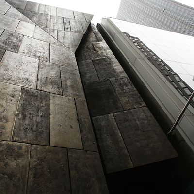
How sad. Just twelve years after it was built on W. 53rd Street next to MoMA, the former American Folk Art Museum is going to be torn down by its new owner: MoMA. WhatÔÇÖs sad is not that the building is going; itÔÇÖs that, despite near-universal rave reviews for its architecture, it was doomed to death as an art museum from the beginning. As soon as the Tod Williams and Billie TsienÔÇôdesigned building opened, it was obvious to anyone interested in it primarily as a museum that the interior spaces were absolutely unusable for the purpose of showing art. The galleries were cramped and the interior was filled with staircases, which were sometimes accompanied by corridorlike spaces and other awkward nooks for art.
When the Museum announced two years ago that it was moving back to the darkened lobby space it occupied before this disastrous turn of events, I ventured that MoMA, despite its own checkered record in building interior spaces for exhibiting art, should raze this building and start again. As soon as MoMA announced exactly this on Wednesday, the pushback was incensed. Furious lovers of the building took to the New York Times comment boxes to lambast the ÔÇ£excruciatingly poor decisions museum directors are making. My good friend and esteemed New York architecture critic Justin Davidson wrote an article charging that ÔÇ£if the museumÔÇÖs (MoMAÔÇÖs) architects canÔÇÖt figure out a way to use Williams and TsienÔÇÖs ingenious stack of rooms, that is a failure of imagination.ÔÇØ In contrast, he says, the Met is going to use the old Whitney space to exhibit art, rather than tearing it down. This is true. But the Met is only renting the WhitneyÔÇÖs space. And that space happens to be fine for art.┬á
The argument for keeping the building intact is that MoMA should show works that will fit there ÔÇö small pieces like drawings, photographs, or design. But scale is not the problem with the American Folk Art Museum. The problem is that it contains no usable spaces to show art, whether it be large, small, flat, or three-dimensional. Moreover, keeping the building would not address MoMAÔÇÖs own tragedy, which is that despite spending nearly a billion dollars on its renovation, it completely failed to build enough room for its vaunted permanent collection of painting and sculpture. The museum has been totally hamstrung and hurt by this failure of vision since its 2004 reopening. What MoMA needs more than anything is more properly scaled contiguous space for this singular collection. The boxy walled building of Williams-Tsien is sadly not that space.
The problem all along is that this building has been looked at not as a space for art but as an idea of an art museum. Never mind that visiting work there would likely involve a non-contiguous route from MoMAÔÇÖs main buidling. Try to imagine only one gallery of MoMAÔÇÖs work ÔÇö say the great gallery of eight Jackson Pollock paintings, or MonetÔÇÖs ÔÇ£Water Lilies,ÔÇØ which already look fairly crappy at MoMA ÔÇö hanging anywhere in the Williams-Tsien building other than the stone entry atrium. Put any of MoMAÔÇÖs art in that building and it will die. And certainly contemporary art does not work there. Even granting that the Williams-Tsien facade is singular (I once compared it to a Kleenex box), the proponents of this building love it as an abstract ideal of a space for art, a platonic thing apart, a fetish.
This is among the most tragic chapters in New York museum architecture I have ever seen. The doleful truth is that no one wants to be right about something this painful. I understand the bitter reaction of architects and architecture critics to the news, but they should know that virtually every person in the art world believes that the Williams-Tsien building is a terrible place to look at art ÔÇö and that it is just one of a spate of new museum buildings that put architecture before art since GehryÔÇÖs Guggenheim Bilbao. Architects: When you design an art museum, do whatever you like to the outside of your building. But please, create enough well-proportioned interior space to show art in. Art first; all else will follow.

