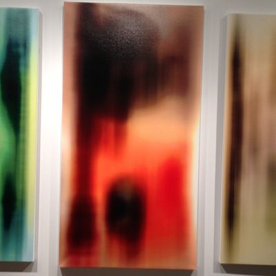
Call it Neo-Mannerism. We all know it. That ever-expanding assembly of anemically boring, totally safe artistic clich├®s squeezing the life out of the art world right now. Earlier this week, I called out one of them, in a review of the (very good) work of Bjarne Melgaard: bad-boy installations, reeking of transgression but not actually transgressing much. That got me thinking about a trend thatÔÇÖs even more widespread and just as annoying.
Scads of artists are trying to be junior postmodernists. A phalanx of work has appeared that might be called ÔÇ£Modest AbstractionÔÇØ or ÔÇ£MFA See, MFA Do.ÔÇØ ItÔÇÖs everywhere, and it all looks the same. In sculpture thereÔÇÖs Anarchy Lite. Those post-minimalist formal arrangements of clunky stuff, sticks, planks, bent metal, wood boxes, fabric, old furniture, concrete things, and whatnot leaned, stacked, stuck, piled, or dispersed around a clean white gallery. ThereÔÇÖs usually a subtext about wastefulness, sustainability, politics, urbanism, or art history. That history is almost always straight out of sixties and seventies Artforum magazines or the syllabi of academic teachers whoÔÇÖve scared their students into being pleasingly meek, imitative, and ordinary.
Looking at 2-D work, IÔÇÖm this close to that old Carter-administration-era croak of ÔÇ£Painting is dead.ÔÇØ Again. Nowadays we see endless arrays of decorous, medium-size, handsome, harmless paintings. ItÔÇÖs rendered mainly in black, white, gray, or, more recently, violet or blue. Much of it entails transfer techniques, silkscreening, stenciling, assemblage, collage, a little spray painting or scraping and the like. There might be some smooshy blocks of color or stripes or other obvious open-form abstraction or geometric motif. A few painters are doing the same thing but with brighter colors, larger areas of paint, hints of gesture, or even drips. All this work has readymade references to preapproved, mostly male painters like Albert Oehlen, Christopher Wool, Michael Krebber, Wade Guyton, Laura Owens, and Sergej Jensen*, or to the Minimalism or Pop movements, and of course it all calls up Warhol, Richter, Kippenberger, or Prince.
Then there are all the fussy collages of cut-up porn, furniture catalogues, ads, Internet screen-grabs, modernist architecture, urban wastelands, endangered species, sixties protests, or (of course) art-historical jpegs. We also see small-scale, colored, neatly framed, or cut-up photographs about photography. All of this Neo-Mannerism is an art of infinite regress. Defensive. Predictable. Safe. Well-defended. Loved by brainy magazines, websites, and curators but so far up its own ass that it canÔÇÖt breathe.
If art comes from everywhere and everyone thinks differently, why does so much of what we see these days look the same? Reams of artists influenced by and using the same art-history, artists, styles, and stuff. You know what that leads to. As Keith Richards wrote of a former dope dealer of his who got addicted to his own stuff, ÔÇ£BradÔÇÖs dead now. It was the usual old story. If youÔÇÖre dealing in this shit, donÔÇÖt dabble in it.ÔÇØ Artists making this generic work are Brad.
ItÔÇÖs spreading, too. Even our wonderful smaller galleries on the Lower East Side, in Bushwick, and the like are awash in it. All this art is dying to be understood. And it is, instantly, by everyone, in the exact same way. Never mind that Oscar Wilde said, ÔÇ£The moment you think you know a work of art, it is dead to you.ÔÇØ It fills galleries and biennials and is already so dead-on-arrival it may as well put a gun to its own head. ItÔÇÖs all intellectual wallpaper, pricey placeholders, ham-acting, and showbiz. I know artists are facing knotty times, and I say this with love, but: Enough.
*An earlier version of this post misspelled the name of the artist Sergej Jensen. Also, an earlier photo appearing with this story showed art that did not represent this trend.

