In an era where we increasingly know almost every single thing about a movie before we actually pay for a ticket, movie posters don’t quite serve the same marketing purpose that they used to … but still, there are few pleasures better known to a film fan than walking past a perfectly conceived one-sheet on your way into the theater, that single image as hype-worthy as any two-minute trailer. With that in mind, and with 2013 drawing to a close, I went over the last year in movie posters and picked out the best and worst, along with nine lessons learned.
Marvel needs some new shtick.
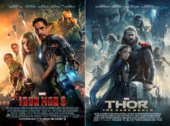
The Iron Man 3 poster wasn’t too bad — in its cast-cluttered way, it sort of looked like a live-action take on Drew Struzan. But then came the carbon-copy poster for Thor: The Dark World, which even featured Natalie Portman subserviently clutching her superhero beau in the exact same way Gwyneth Paltrow does on the Iron Man 3 one-sheet. Is this a sign of things to come for all of Marvel’s Phase Two flicks? If fan artists haven’t already mocked up a 90 percent accurate poster for Captain America: The Winter Soldier (with Scarlett Johansson leaning on Chris Evans and his buff pecs, Anthony Mackie and Robert Redford cleanly sliding into Don Cheadle and Guy Pearce slots, and Sebastian Stan’s villain looming overhead), then they’re simply not trying.
Put your premise front and center.
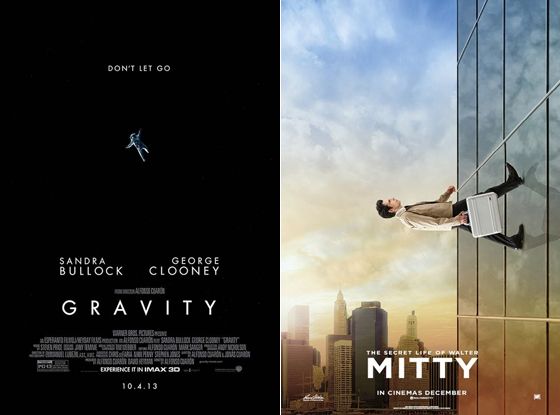
Gravity and The Secret Life of Walter Mitty were both big-budget, effects-laden gambles from their respective studios, but the thing that gave studio bean-counters such pause — how each movie is completely unlike anything in the recent marketplace — is also what clearly thrilled those same studios’ marketing teams. Gravity came up with countless clever ways to tout Sandra Bullock’s astronaut spinning off into space; my favorite advertising gambit involved two separate billboards on the Sunset Strip, one with Clooney’s character throwing out his tether, and the other, just down the block on the other side of the road, featuring Bullock’s desperate attempt to grab it. Walter Mitty’s put out a few posters, too, but this one is my favorite, a simple and striking image that immediately conveys how Ben Stiller is an office drone given to fantastical daydreams.
And don’t hide what your movie is about.
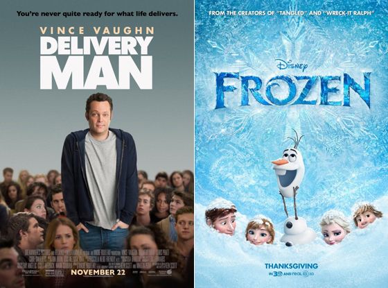
The image on the Delivery Man poster is taken directly from a scene in the film, but it still tells you absolutely nothing useful. The pose, the tagline, the title … all of it seems to be talking around the movie’s high-concept premise (where Vince Vaughn learns that as a young sperm donor, he unwittingly fathered hundreds of children), as though the studio had focus-grouped the movie’s plot and people found it too much of a turn-off. But if you’re hiding something from the audience, they can sniff that out, too: Just look at the poster for Disney’s Frozen, which literally buries the two lead characters — both women — so that it can better tout the movie’s comic-relief snowman character and two male love interests. Something tells me that if the film’s two leads were adventurous brothers rather than two sisters, they wouldn’t be hidden up to their necks.
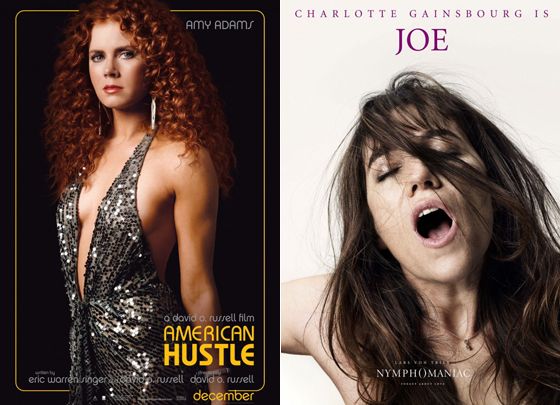
A good character poster can sum up the entire movie.
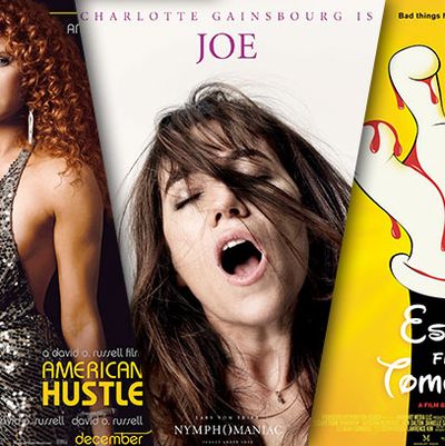
Both American Hustle and Nymphomaniac have sprawling, starry casts and issued a wealth of separate character posters, but each one feels like the movie in a nutshell, rather than a premise spread thin over too many one-sheets. This Amy Adams poster for American Hustle, for example, is an eye-catching number that communicates a lot at first glance: You get a sense of the movie’s period setting and comic tone from her over-the-top look, but that hardened glint in her eye conveys the sense that everyone is involved in some shady dealings. Meanwhile, you’ve got to hand it to Lars von Trier for pushing the envelope yet again with a series of sex-crazed Nymphomaniac posters that capture the cast in mid O-face. (Just in case you thought that title was too subtle.)
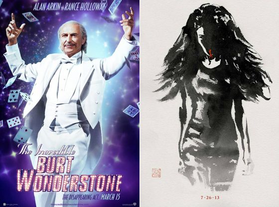
… But some characters really don’t need their own posters.
Warner Bros. really should have put Steve Carell front and center for its The Incredible Burt Wonderstone campaign, but instead they gave nearly everyone in the movie a poster, even though knowingly corny one-sheets that feature Alan Arkin and Steve Buscemi aren’t exactly enticing to a mainstream audience on their own. (My neighborhood was pointlessly peppered with posters of those two character actors, while one-sheets featuring the movie’s actual stars, Carell and Jim Carrey, were nowhere to be found.) Meanwhile, for The Wolverine, Fox issued a series of character silhouettes painted in sumi ink, but if you’ve got no idea who the villainous Viper is, this poster is a total wash. (And stop trying to make QR codes happen, poster guys. They’re not gonna.)
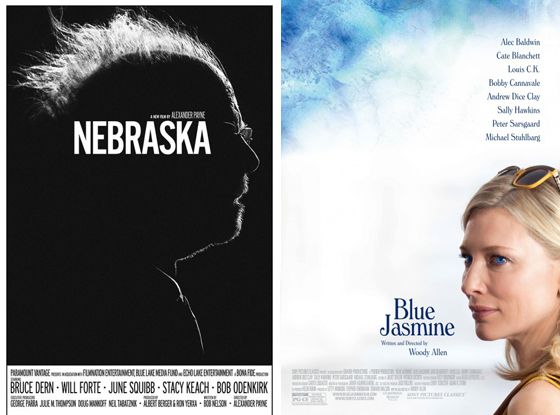
There’s a good way and a bad way to do a headshot poster.
The one-sheet for Alexander Payne’s Nebraska is fantastic, a striking advertisement for the black-and-white dramedy that seems to sum up Bruce Dern’s addled dad in one image: As dementia sets in, Dern’s character is an enigma to his son and to us, an outline of a man that we must fill in ourselves. The Blue Jasmine poster, on the other hand, looks like a Photoshop rush job. There’s nothing to it at all, beyond some groaner touches (the cerulean in Cate Blanchett’s eyes is pumped up because Jasmine is blue, get it?), and for a character who wears her Chanel like armor, it’s weird to shoot her from the shoulders up and emphasize the tacky yellow sunglasses on her head. The movie deserved better.
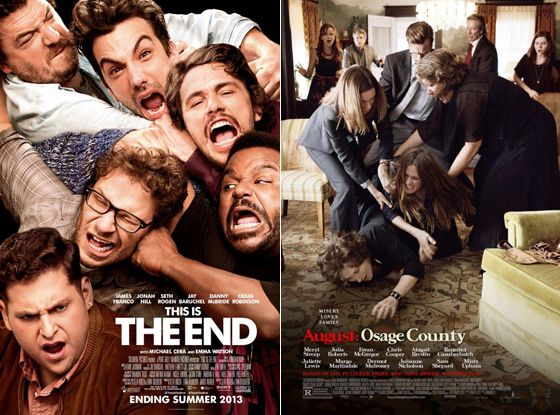
If you’ve got an all-star battle royale, lean into it.
This Is the End and August: Osage County both plop several big stars into a room and let them snipe at each other for two hours, and while other studios might have de-emphasized all that claustrophobic conflict, Sony and the Weinstein Company decided to lean in, and these royal rumbles immediately capture your interest. (I have to confess that the latter poster lost me a bet: After that first upbeat, misleading trailer came out, I was convinced that Harvey Weinstein would continue to put a happy face on August: Osage County by slapping that famous Julia Roberts smile on a one-sheet. But hey, it’s early into awards season … I still wouldn’t rule it out!)
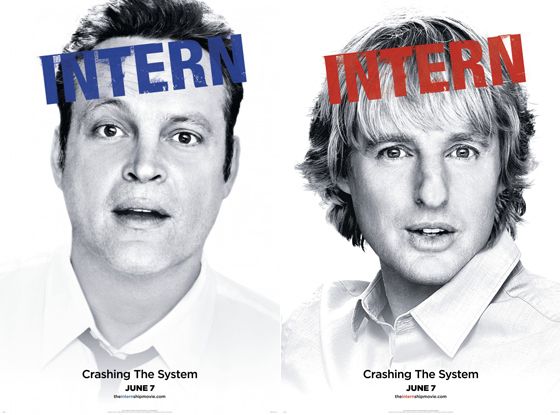
If you don’t care, audiences won’t either.
Oh boy, these posters for The Internship. Could they have found pictures of Vince Vaughn and Owen Wilson that were any less enticing? Both of these character posters look like they were haphazardly shot after a weekend bender, and the marketing is confusing besides (a week before release, several people asked if I had seen “that new Vince Vaughn movie, Intern.”) If they’re going to put that little effort into their ad campaign, why should audiences bother?
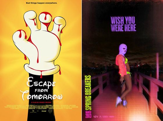
If you want to appeal to a hip cult audience, design something that would look good in a dorm room.
I leave you with my two favorite posters of the year: The clever one-sheet for Escape From Tomorrow, which presents an unnerving perversion of the Disney aesthetic that practically demands your attention, and the pop-perfect poster for Spring Breakers, which could only be better if it glowed in the dark. Your hard-to-shop-for nephew would surely appreciate either one for Christmas.

