Dear Metropolitan Museum of Art:
Congratulations on the announcement that youÔÇÖre going to rebuild the entire Lila Acheson Wallace Wing, where you keep the modern and contemporary art. Not only is it an intriguing shot across all other New York museumsÔÇÖ bows: Saying that youÔÇÖre likely to demolish the whole thing is an honest, open admission that this has long been the weakest and worst-displayed section of your glorious treasure house. It has been since the day that wing opened in 1987.
This announcement couldnÔÇÖt come at a better time. The Whitney will soon have its hands full adapting to a new building downtown (weÔÇÖre all rooting for you, Whitney); MoMA is committing death by architecture (Mr. Lowry, tear down this plan); who knows whatÔÇÖs going on at the Guggenheim; and the Brooklyn Museum, despite its fantastic space, hasnÔÇÖt a clue how to display its great collection. That your announcement comes as the eight-year lease on the WhitneyÔÇÖs old Breuer building kicks in makes it all the more gripping. (The WhitneyÔÇÖs decision to rent to you really seems like a bad unforced error on its part. Comparisons will be rampant. But fun.)
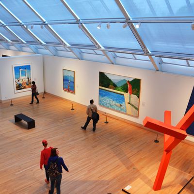
Though you havenÔÇÖt announced who the architects will be or what the general floor plan might look like, most of us in the art community sincerely have certain fervent hopes based on the many architectural failures that mar the past 20 years. In short, please donÔÇÖt take all of this wonderful space and build staircases, atriums, two- and three-story open spaces. (DonÔÇÖt worry about Richard Serra; he can take care of himself.) YouÔÇÖve got enough lecture halls and more than enough room for trustee parties. (Hello? Temple of Dinner.) Please donÔÇÖt go high-tech black box and slick shiny glass. Whatever this wing looks like from the outside is up to you. The space inside belongs to art.
I do have a one-word suggestion about your future spaces ÔÇö one shared by every artist IÔÇÖve spoken to. Rooms. Build rooms for art. Call them whatever you want to call them. Put rich peopleÔÇÖs names high on the wall. Whatever. Just let the art live in the space; show the work to its best possible advantage; allow the space for viewers to see the work, to move around it without elbowing people away. Rooms have worked tremendously for BerlinÔÇÖs Gemaldegalerie (a new building), ViennaÔÇÖs Kunsthistorisch, LondonÔÇÖs National Gallery, and your own museum. Forget theme parks and so-called social spaces. Build something that allows us to leave the town square, that lets us enter the group mind. Space is erotic.
Sincerely,
Jerry Saltz
P.S. One other thing. When youÔÇÖre done here, think about tearing down and rebuilding the equally useless octagonal Lehman Wing. Its wasted space and bad galleries with crazy stone walls are just as bad.

