On a recent afternoon, Scott Rothkopf, the Whitney curator and associate director of programs, took some time off from the marathon of galas, previews, press conferences, luncheons, Michelle Obama visits, and black-tie donor-coddling bonanzas that accompanied the weeks-long opening of the Whitney Museum of American ArtÔÇÖs new downtown building ÔÇö perhaps youÔÇÖve heard something about this? ÔÇö to dwell upon the actual purpose of the edifice: the art itself. (Well, almost took some time off ÔÇö before giving a tour, Rothkopf ran into Rashid Johnson on the sun-washed eighth floor, and the artist informed him that the Whitney needed to update its mailing list, as his lifetime-membership card arrived at his motherÔÇÖs house in Chicago.)
As a curator at the institution, heÔÇÖd thought quite a bit about how theyÔÇÖd mount ÔÇ£America Is Hard to See,ÔÇØ which was drawn from the WhitneyÔÇÖs permanent collection. Many of the works hadnÔÇÖt seen the light of day in years, and the new building gave the museum an opportunity to tell a new story by where they were placed ÔÇö which piece next to which, and why.
Here are some of his favorite pairings, and an explanation of why they belong together. Think of it as a private annotation of the museum.
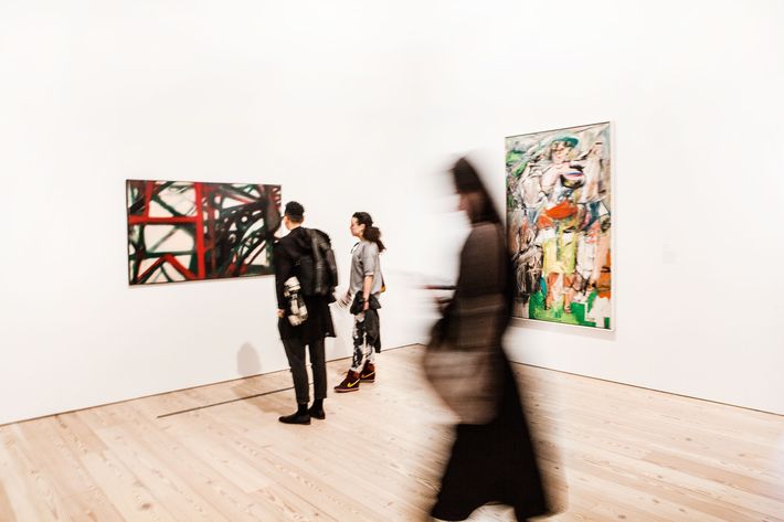
Willem de Kooning, Woman and Bicycle, and Hedda Sterne, New York, N.Y., 1955
Here you have a pairing that weÔÇÖre really excited about. ItÔÇÖs one of the most iconic works in the WhitneyÔÇÖs collection ÔÇö one of the most iconic works of the 1950s ÔÇö with a work by Hedda Sterne thatÔÇÖs made just a few years after the de Kooning, but not nearly as well known. Looking at this period, we were struck by the Hedda Sterne ÔÇö she was the only woman featured in the Irascibles, she was part of the milieu, she was married to Saul Steinberg. When we found this piece in storage, we were so struck by how contemporary its paint-handling felt. ThereÔÇÖs the use of spray, which feels sort of common in younger artists, and thereÔÇÖs this super-aggressive way that sheÔÇÖs attacking and building the picture, thereÔÇÖs the garishness of the colors, and there were relations between this and the de Kooning even though the paint-handling was so dissimilar. And we felt like forcing a pairing like this would be twisting the frame in terms of how people think about Abstract Expressionism.
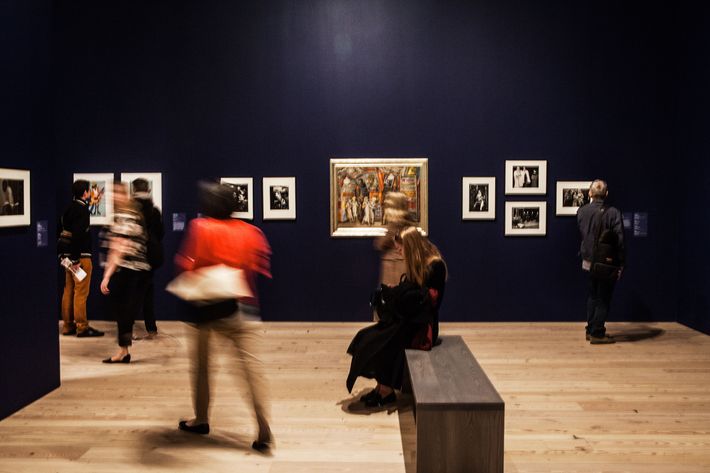
Lisette Model, SammyÔÇÖs; William Klein, Selwyn, 42nd Street, New York; Reginald March, Twenty Cent Movie; Lisette Model, Albert-Alberta, HubertÔÇÖs Forty-Second Street Flea; Weegee, The Critic; Robert Frank, Formal Reception; Weegee, Slum Clearance Project HellÔÇÖs Kitchen
We really tried to make a mini essay about urban spectacle and amusement, particularly in New York. Some of these have a sense of menace and sex appeal, this sensuality, this sense of voyeurism that pervades as people walk about the streets and canoodle in clubs. See the Lisette Model of SammyÔÇÖs nightclub, of the sailor with the young woman; you see the William Klein of the marquee of the theater; and Reginald MarchÔÇÖs painting, of another one of these Times Square theaters with all these people posing for each other and for us.
On the right side, weÔÇÖve gone into a darker edge, where you see the Weegee of a crime scene, you see a woman confronting these women on a night out, you see another Lisette Model picture of what would have been called a freak, which relates to the freak shows of the circus. And then the Robert Frank of the women going out for a night on the town.
We had this idea of social commentary and classes mixing, and the fun and danger of the night, and itÔÇÖs something we brought out by painting the walls a dark blue, to conjure being in a theater or a club.
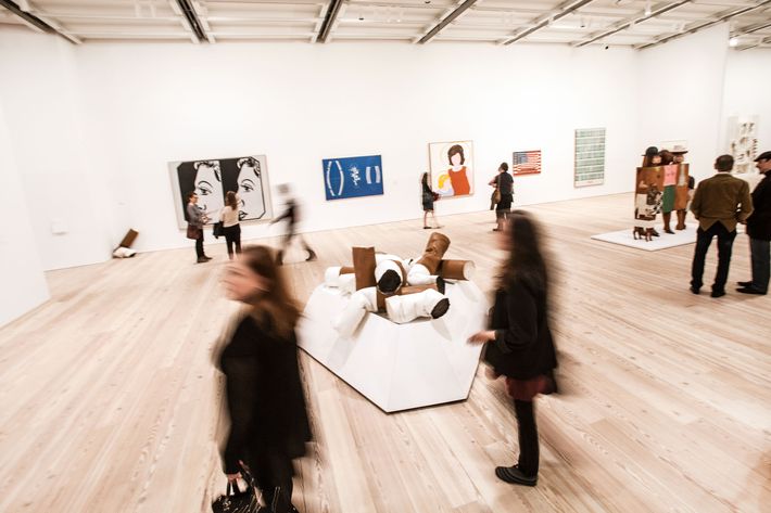
Claes Oldenburg,┬áGiant Fagends; Andy Warhol, Before and After, 4; Andy Warhol, Green Coca-Cola Bottles; Jasper Johns,Three Flags; Allan DÔÇÖArcangelo, Madonna and Child; Malcolm Bailey, Untitled, 1969
What we love about this wall is the idea of pairing some of the most iconic works in our collection with much less well-known pieces. Our idea was never to bring out works from storage just because they look eccentric or curious, but rather to make the icons look fresh, and the icons would help the less-known pieces attain a kind of context and dignity. I was joking to a friend that this is kind of the whole story of America right here. You have plastic surgery. You have the legacy of slavery as it relates to consumption ÔÇö in this case, cotton. You have religion and the sainthood of Jackie and Caroline Kennedy ÔÇö this was actually painted before Kennedy was assassinated, which gives it this strangely prophetic quality. And then the flags. And what could be more American than the consumption of Coca-Cola? That image always reminds me of going into a bodega, looking at the sodas in the fridge, and being confronted by this aggressive display of capitalism.
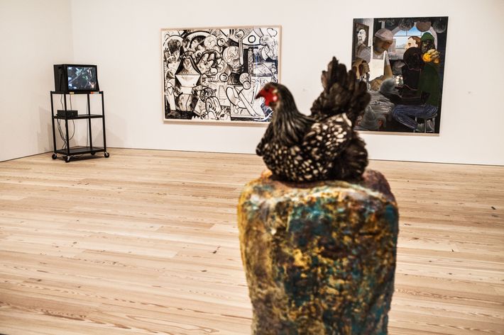
Dana Schutz, Building the Boat While Sailing, and Nicole Eisenman, Achilles Heel
The last section of our exhibition is ÔÇ£Course of Empire,ÔÇØ which takes its name from an Ed Ruscha series reflecting on Thomas ColeÔÇÖs cycle of paintings about the rise and fall of an imaginary civilization. We really thought about, like, what did it mean for artists to make work in this country after 9/11, after the threat of climate change became realized through hurricanes Katrina and Sandy, after threats of terrorism, after the financial collapse of 2008? And one of the things we noticed is there were a number of artists who were thinking about these imaginary landscapes, where a sense of desolation and anxiety permeated their work.
On the left is Dana SchutzÔÇÖs┬áBuilding the Boat While Sailing, which for us became a metaphor about trying to figure out your world and hold it all together, how to survive the flood. ItÔÇÖs full of a sense of tension and mortality. And on the right you have Achilles Heel by Nicole Eisenman, which I sometimes joke is what happens when you stay up too late at a bar in Brooklyn, looking back toward Manhattan. You have these people trying to make something ÔÇö maybe theyÔÇÖre artists stuck in the futility of squeezing at the clay balls, feeling the sense of community that happens in a bar but also total alienation, a dismal feeling but a curious and creative one. This pair really summons something about the time that weÔÇÖre in.
James Daugherty, Three Base Hit, and Joseph Stella, Luna Park
One of the reasons I wanted to talk about this pairing is you can tell these artists were struggling to make sense of their interest in futurism as they related it to American subjects. On the right, you see Daugherty depicting a baseball game, the quintessential American pastime. He was an illustrator for the New York Herald, and in 1914, itÔÇÖs kind of incredible that this ran in the New York Herald, and that a broad public would have encountered futurism in a New York paper.
On the left, you see the Joseph Stella image of Luna Park ÔÇö another kind of quintessential American site, the roller coasters in Coney Island. The idea here is, how might you capture the dynamism of the electric lights, the movement, the music? Well, the subject made it well-suited to an avant-garde approach. I love this painting because I have the sensation of being in this place at night. And you have to remember, too, that artists were interested in a setting like Luna Park because [it] was so modern and new [itself]. This was an exciting site of modernism.
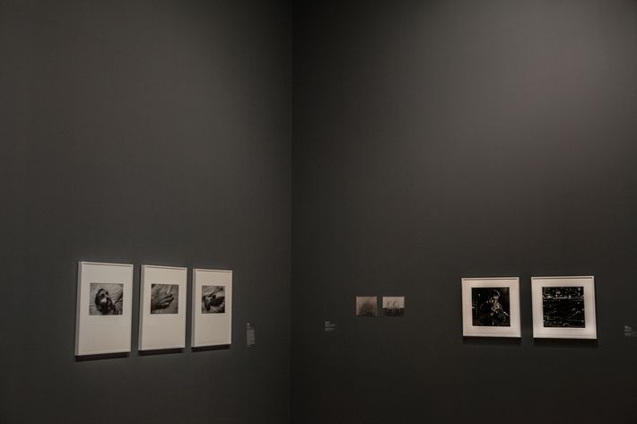
David Wojnarowicz, Untitled, and Peter Hujar, David Lighting Up
This gallery is called ÔÇ£Love Letter From the Warfront,ÔÇØ which takes its name from the Felix Gonzalez-Torres in the corner of this room. As we were curating this exhibition, we became struck by the fact that so many of the artists in our collection had died of AIDS or struggled with AIDS in their work. We wanted to find a way to reflect on the AIDS crisis and its tremendous impact in the artist community in New York [and] the United States, and it became really incredible to us to discover how many of these artists had photographed or depicted one another. Nan Goldin took pictures of David Armstrong, we have pictures that David Armstrong took of his boyfriend in Paris, and the idea that friends and lovers documented each other during this period in the queer creative community in New York was very beautiful, and it became a very heartbreaking tale.
Here you have an image by Peter Hujar of David Wojnarowicz. Peter was a great mentor to Wojnarowicz  a lover, a friend, a collaborator  and you see Wojnarowicz lighting up on the west side of Manhattan, not far from where we are now. And [on] the adjacent wall you have Wojnarowiczs photo of Hujar within moments of dying of AIDS. The idea of these two men who were both artists, both lovers, picturing each other in different stages of life and death  it was something that became very beautiful, very emotional and gripping, and really felt close in our minds to the texture that the Whitney can bring to a story about the artists community, in the way that we think of ourselves as the artists museum.

