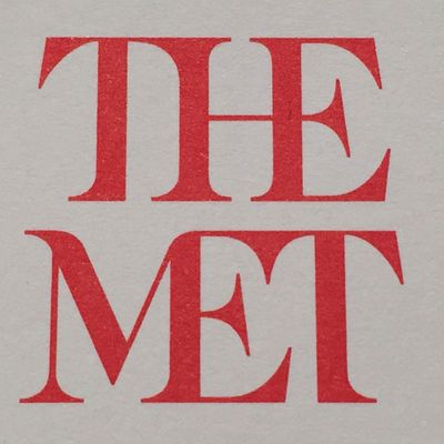
As the Metropolitan Museum of Art busts out of its Beaux-Arts shell and opens its Madison Avenue outpost in the old Whitney, the institution is trying on a fresh identity, or at least enshrining an old nickname in a new look. In its logo, the Met is now THE MET, the two short words printed in scarlet letters, stacked and squashed together. The whole ensemble looks like a red double-decker bus that has stopped short, shoving the passengers into each otherÔÇÖs backs. Worse, the entire top half of the new logo consists of the word┬áthe.
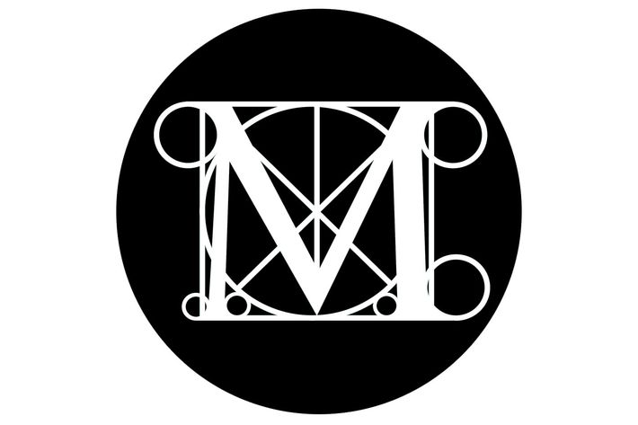
Starting March 1, this graphic misfire, designed by the London-based global-branding firm Wolff Olins, will replace the existing M, a masterwork of resonant graphics that the Met first used in 1971. From a distance, the old logo couldnÔÇÖt be simpler, just a capital letter emblazoned in a solid-colored circle. Move in closer, though, and the M sits at the center of a delicately drawn circle-in-a-square, cut by diagonals and fringed with six smaller circles. The original is from a woodcut by Luca Pacioli, a collaborator of Leonardo da VinciÔÇÖs. In this context, though, it could be an architectural plan ÔÇö the museumÔÇÖs great hall contains three square chambers topped by circular vaults. Or it could represent a diagram of a Raphael composition, or the proportional geometries of LeonardoÔÇÖs Vitruvian Man. Looked at one way, the MÔÇÖs legs resemble ionic columns; seen another, the combination of capital letter and slender lines suggests a medieval illuminated manuscript. All these possibilities swirl together in a logo that quivers with references to the history of art and architecture. (Knockoffs have also been used to sell commodities as varied as Mexican condoms and Bangkok commercial real estate.)

But perhaps so many layers of association were too much for an administration focused on friendliness. The Met will also get a new map and fresh signage, which may help neophytes navigate a notoriously confusing building and irk those who enjoy getting lost. In a statement, the museum said that the logo is part of a new graphic language, all rolling out March 1, thatÔÇÖs intended to make the Met ÔÇ£feel more available and accessible to first-time as well as frequent visitors.ÔÇØ You might think an art museum that attracted 6.3 million visitors last year might not worry much about coming off as too aloof. Or that those who feel intimidated by ceremonial staircases and neoclassical colonnades might not be soothed by a logo with stylized ax blades hanging off the E and T. Or that it might seem a little childish to grab back a nickname already embedded in the logo of another Met. (The designer Paula Scher broke the word Met / ropolitan before Opera specifically to highlight the shorthand.)
But the institution is venturing into frightening territory and may need some typographical comfort. The expansion into Met Breuer, the 1960s concrete ziggurat that Marcel Breuer designed for the Whitney Museum, opens March 18 and will last at least eight years. Meanwhile, back on Fifth Avenue, a new $600 million modern and contemporary art wing designed by David Chipperfield is in the works. (And donÔÇÖt forget the Cloisters, the museumÔÇÖs hilltop location in Washington Heights.)┬á
In the high-stakes game of international branding, physical expansion, and spiritual reorientation, the Met is relying on what it knows, and what it knows is ÔǪ the Tate. In the 1990s, Wolff Olins helped a disparate constellation of British museums ÔÇö Tate Britain, Tate Modern, Tate Liverpool, and Tate St. Ives ÔÇö develop a unifying identity, with the family name in blurred letters as if spray-painted with a nearly empty can. The Met has observed that process closely, especially since its head of modern and contemporary art, Sheena Wagstaff, spent more than a decade as chief curator at Tate Modern. Wolff OlinsÔÇÖs latest ministrations suggest that Met Breuer is setting a cool, modern tone for a shaggy historical institution. LetÔÇÖs hope the Met doesnÔÇÖt look in the mirror soon and see a wannabe MoMA.┬á


