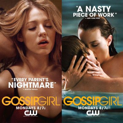
When looking back at Gossip Girl’s reign of television domination, the first images that pop into your mind might be Blair’s magnificent headbands or Serena’s cleavage rhombuses. (Or Chuck’s never-ending closet of Savile Row-esque suits.) But Upper East Side shenanigans aside, the series quickly established itself for utilizing memorable marketing artwork, which was displayed most prominently in the early seasons with va-va-voom! depictions of teens doing naughty things. With Gossip Girl celebrating its tenth anniversary this week, Vulture chatted with Rick Haskins, the CW’s executive vice president of marketing and digital programs, to learn more about the making of the show’s poster art. You know you love them, XOXO.
Season 1
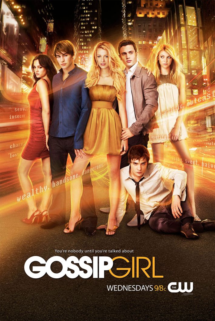
Finding the right image to debut Gossip Girl’s overall aesthetic was tricky, with the cityscape group shot ultimately chosen because the network believed it visualized the relationships between the characters well. (Not to mention, adjectives for each character are inconspicuously spelled out around them, in case you needed another identifier.) “So rather than try and do a lot of storytelling,” Haskins explained, “you set the tone for the season.” That tone? A soapy, scandalous teen series filled to the brim with the Upper East Side’s most delicious drama, which was accompanied by the “You’re nobody until you’re talked about” tagline directly inspired by Gossip Girl’s technological title. As Haskins put it. “Knowing for young adults searching for their identity, it is more important to be gossiped about — either positively or negatively — than ignored.”
Mid-Season 1
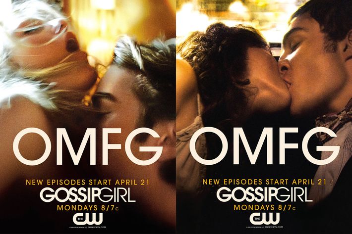
This is where things start to get sexy. After delays brought on by the Writers Guild of America strike, the network wanted to reintroduce viewers to the scandalous lives of Manhattan’s teen elite with the one thing that always sells: sex. It’s likely that this “OMFG” campaign — which features, among other images, the iconic moment when Blair loses her virginity to Chuck in the back of a limousine — was the first time a network used viewers’ online chatter for marketing purposes. “This idea was inspired by taking a deep research dive into viewer’s social-media usage and understanding how and what they were talking about the show,” Haskins explained. “The sexier tone was based on what was resonating with the audience and mirroring it back.” Unsurprisingly, parenting groups around the country weren’t amused with this approach, but Haskins believes it only “added fuel” to Gossip Girl’s rapidly growing fan base.
Season 2
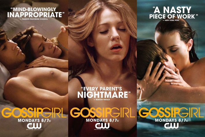
In one of the most ingenious instances of TV marketing in recent memory, Gossip Girl continued its sexualized aesthetic by pairing horrified reviews with photos that depicted high-schoolers in flagrante. The Boston Herald declared the show “every parent’s nightmare.” The New York Post considered it “a nasty piece of work.” Still, people loved it: “By playing back the negative quotes about the show using visuals from the show, we hit the perfect tone,” Haskins said. “The audience loved the juxtaposition of headline and visual, and it reinforced to them why they watched the show their parents hated.” Despite the network receiving another round of fury from parenting groups — more so than the previous “OMFG” posters — it was clear that Gossip Girl’s image as a “forward-thinking young-adult drama” was solidified at that point, Haskins added.
Season 3
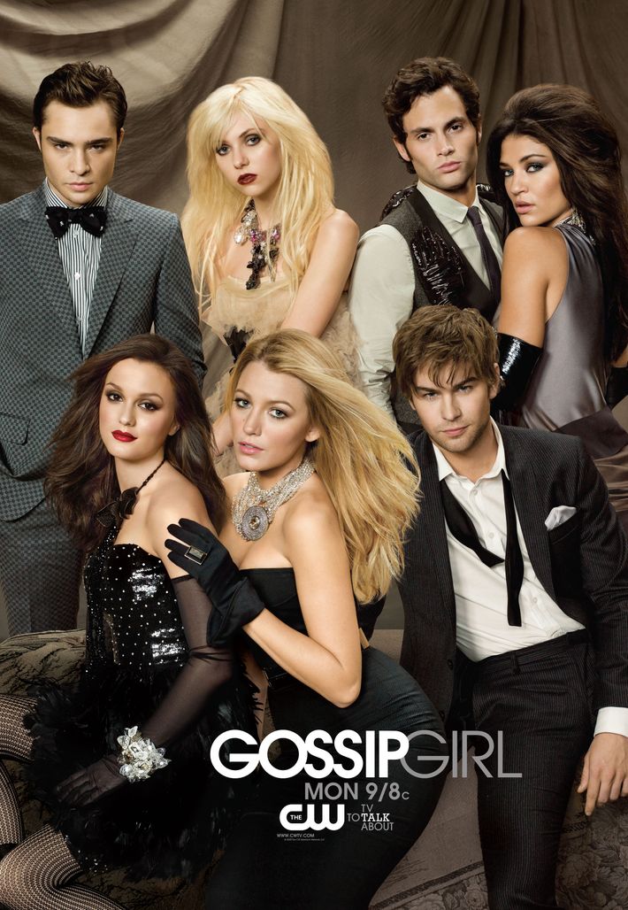
Gossip Girl’s third season brought forth a few narrative changes, most prominently with the lead characters leaving high school and beginning college — all in Manhattan, naturally. (Except for Chuck, who decides to run a hotel and booze-filled club at the ripe age of 18.) With this, the network eschewed another round of sexy posters in favor of a more glamorous and enviable aesthetic. Even Vanessa, ever the annoying Brooklyn commoner, was equally glammed up. “As the characters of the show were growing up, we wanted to convey they were sophisticated beyond their age and truly were living a life most others wished they had,” Haskins explained. “We had moved past establishing what the show was about to portraying the characters and how intertwined their lives and fortunes were.” Not everyone regularly wears diamond chokers and black chantilly lace gloves, after all.
Season 4
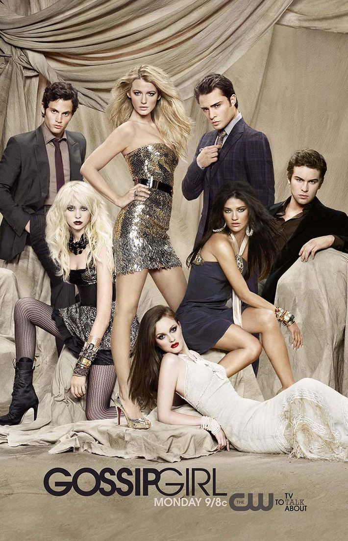
Not much deviated between the posters for the third and fourth seasons, with the CW making a conscious decision to keep the show’s “one percent of the one percent” appearance going for another year. “At this stage of the show, the lives of privilege of the Upper East Siders was in full play,” Haskins said, “and we wanted to express this in a visual that was fun but also highly stylized.” The poster also served as a confirmation of sorts that Jenny’s character would maintain her radical change in style, segueing from a more refined prep-school look to a punkish way of dressing. She and Vanessa departed later in the season.
Season 5
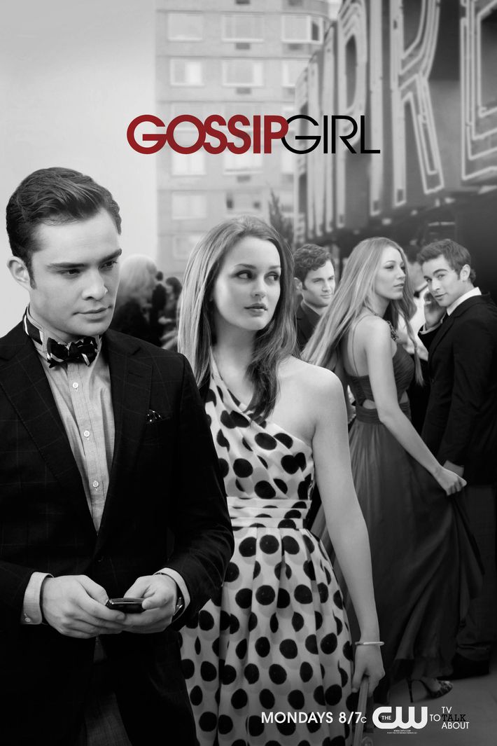
Although Serena initially established herself as the central figure in Gossip Girl’s lore, one thing became clear by season five: Blair and Chuck’s turbulent relationship was what fans loved most. This was directly reflected in the year’s poster, which featured the couple in the forefront of Chuck’s Empire Hotel with the remaining characters shooed off in the background. “Rather than doing a traditional poster for the show, we wanted it to feel more like a fashion shoot,” Haskins explained. “We had unbelievably beautiful actors who looked and acted like models, living what many felt was a model life they would like to live.” The first and only use of black-and-white coloring enhances this haute couture aesthetic even more.
Season 6
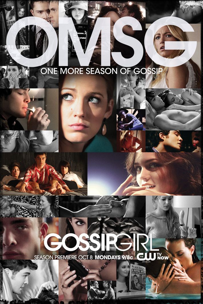
How exactly does a network say good-bye to its most popular show? With a collage of Gossip Girl’s most iconic moments with lots of sexual innuendo, of course. (Blair’s burlesque striptease for Chuck! Georgina holding up her plastic bag of drugs!) “Our final poster was a homage to all the scenes and characters that made the show so great,” Haskins said. “We wanted the viewers to relive the moments that established the characters they had come to love.” The “OMSG” tagline, as you might’ve guessed, also provided a full-circle moment that harkened back to season one’s usage of “OMFG,” which Haskins believes provided a fitting and “fond farewell to this modern day tale.” The end of an era, indeed.


