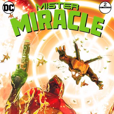
Jack Kirby wasn’t known for his realism. The late writer/artist was inarguably one of the greatest creators the comics medium has ever known, but he made his bones by crafting narratives, dialogue, and imagery that were deliberately beyond belief. Living planets, cosmic surfers, planet-devourers — these were the sorts of things he was interested in. Indeed, when he was finally unshackled from the bonds of his partnership with Stan Lee at Marvel and allowed to become an auteur at DC, one of his first creations was a series modestly titled The New Gods. The man dreamed of and traded in myths.
Therefore, it would make total sense if a realist approach to Kirby’s stories didn’t work. Trying to pluck deities from the stars to draw them like haggard nobodies and make them chat like they’re in a Mamet play doesn’t exactly seem like the best idea. And yet, that’s precisely what writer Tom King and artist Mitch Gerads are doing in Mr. Miracle, a new DC series based on the New Gods mythology. It draws its title from its Kirby-created star, a “super escape artist” who was born to one of the good gods but traded to one of the bad gods when he was young.
Named Scott Free, he was raised in the fires of the hell-planet Apokolips, tortured by a sadistic woman god named Granny Goodness (Kirby had a way with monikers). Eventually, he made his way to Earth, where he became a crime-fighting escape artist. Clad in an outlandish costume of yellow, red, and green, he’s fought the forces of evil ever since he first appeared in his own series in 1971. Now, one page of the second issue of his new series is among the best printed by any superhero publisher this year.

The new Mr. Miracle finds Scott Free at a weird point in his life. (Read no further if you don’t want spoilers.) The tale has a whiff of Lynchian dream logic to it, so it’s hard to know, exactly, what’s real, but it appears that he tried to commit suicide in a bid to make the ultimate escape — one from death itself. After recovering, he is contacted by Orion, a superhero whose life was his mirror image: He was born to a bad god and raised by a good god. Despite that upbringing, Orion is a real hard-ass, and in this new story, he recruits Scott to do battle with the forces of the bad god, the cosmic tyrant known as Darkseid.
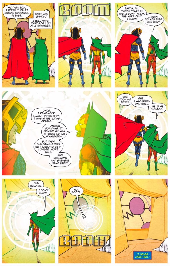
The page in question features Scott and his partner in love and war, Big Barda, preparing to use a teleportation device known as a Boom Tube to travel on a mission to kill Granny Goodness. For the most part, it adheres to the strict nine-panel grid that King and Gerads employ throughout the issue: a three-by-three layout of vertically oriented rectangles. That approach is a time-honored tradition in comics and is particularly well-known for its use in Alan Moore, Dave Gibbons, and John Higgins’s mid-’80s masterwork Watchmen and in Moore and Eddie Campbell’s From Hell. (King also used this panel grid in his collaboration with Barnaby Bagenda and Romulo Fajardo Jr., The Omega Men).
When it’s done properly, the nine-panel grid’s rigidity can be a showcase for a talented artist — which Gerads most certainly is — because it forces the reader to focus on small details and minute motions. It removes the potential distractions of flashy panel shapes and wild layouts, making each individual pencil stroke the center of attention. The sheer number of panels also forces you to slow down your reading pace, which can encourage even further inspection of what you’re seeing. Throughout Mr. Miracle No. 2, Gerads employs these aspects of the grid to great effect, taking the challenge of the reader’s focus and making the smallest changes of a facial expression or movements of a body fascinating to behold. This page is no exception — just look at the way Scott and Barda’s capes move in the wind of the Boom Tube. Look at the way Scott scratches his head in confusion. Look at the way Barda confidently takes her first step while the tentative Scott stands in his previous position.
I said this page was no exception, but it represents a huge exception in one regard: It’s the only page in the entire issue that has eight panels. On a cursory read of the comic, that’s an easy thing to miss, especially because the double-sized fourth panel is bisected here by Scott’s dialogue and because you haven’t gotten to the end of the comic and therefore don’t know that no subsequent pages will break the pattern. That divergence from the norm is purposeful. It’s another powerful aspect of the nine-panel grid: When you break it, it can offer great thematic and artistic weight.
Here, that unusual panel is a close-up of Barda and Scott, and the moment it captures packs a wallop. The aforementioned removal of distracting flashiness means the reader can have a greater focus on narrative detail as well as artistic detail. And boy, the narrative details of this page are gripping. The realism comes into play in the form of Scott’s stilted dialogue about the abuse he and Barda both endured as victims of Granny Goodness. With tentative dashes and ellipses, he recounts a short-story-within-the-story on the topics of gratitude and confusion. As the Boom Tube and the horrors of war approach, Scott takes a moment to ask if Barda ever even liked Granny.
Without waiting for a response, he eases into his tale. It’s worth transcribing here in full, just to see the visual nature of all those typographical signals for fear and hesitation. “Once, I remember, I mean — in the X-Pit, I was in the Judas Cradle,” Scott recounts. “Hanging for days. I’d spilled my milk at breakfast or whatever — but then she came — I was supposed to be in longer. More days. And she came and she — she came early. She took me down. She … I was down and she … held me. I guess. She held me. I don’t know.” Barda’s reply is firm: “No, Scott. I never liked her.” It’s a chill-inducing, tear-jerking bit of frankness about what it’s like to be a survivor of trauma, and the break from the nine-panel grid as he begins his story subconsciously forces the reader to perk up and pay special attention to what’s going on.
And what’s going on is made all the more remarkable by the fact that it’s presented in such a non-splashy way. Therein lies the final reason the grid approach works so well here: It can convey the mundanity of life in a way that a more dynamic layout can’t. That may sound like a disadvantage — we tend to read superhero comics to escape — but when executed by top-notch creators, it’s a great strength.
The near-uniform structure conveys the fact that survivors of abuse don’t spend every waking moment in overwrought external agony, clenching their fists and cursing the god that would allow their pain to happen. They simply go on living, each moment passing by in much the same shape as the last one. Sometimes, a moment feels especially large, but then you go back to your little grid, searching for meaning in the details.

