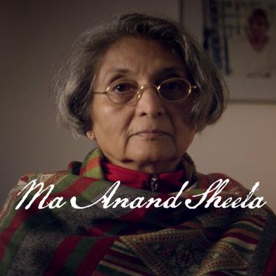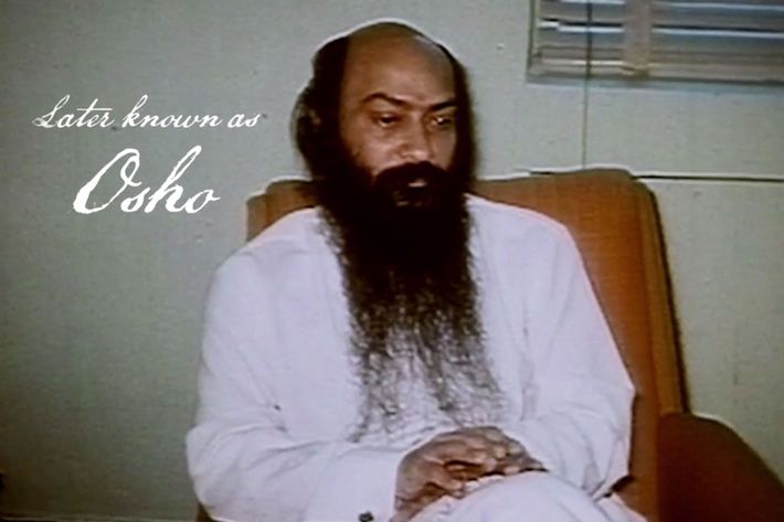
The latest Netflix documentary series to make a big splash, ├á la Making a Murderer or The Keepers, is Wild Wild Country. Like its predecessors, this deep dive into the Indian guru Bhagwan Shree Rajneesh and his move ÔÇö along with all of his followers ÔÇö to a tiny Oregon town, is absolutely fascinating. It has many in-depth interviews with the key players and weaves in an abundance of archival footage, newly created animation, and stark, gorgeous shots of the Oregon wilderness. As the story unspools, the viewers will have many, many questions, but the biggest one of all is, ÔÇ£Who the hell chose this font?ÔÇØ
Now, IÔÇÖm not really one who pays a lot of attention to graphic design, but the text in a documentary is really important. When I watch The Big Bang Theory I donÔÇÖt need words on the screen to tell me which one is Sheldon and that he just said ÔÇ£Bazinga!ÔÇØ (Just kidding, I donÔÇÖt watch Big Bang.) But in a documentary, we need to be introduced to the subjects and told their significance to the narrative, sometimes repeatedly if there are a large number of interviews. We also need to know vital information thatÔÇÖs not covered, like the year events are taking place, the location a certain video was shot in, or whether or not something is a re-creation.
Like most documentaries, Wild Wild Country delivers all the information that we possibly need, but it does it in a font that is so ornate itÔÇÖs nearly illegible. ItÔÇÖs sort of in cursive, but one that looks like it belongs on an old Wanted poster, or one of those fake Victorian pictures you take with costumes and parasols on the boardwalk at the beach, or maybe a poster for a movie with Jodie Foster in period costume and a war. The white letters arenÔÇÖt entirely solid and look sort of like they were painted by a brush with only three bristles left.
While watching episodes on my high-def television, the largest one that I could get delivered to my house by Best Buy, I have to pause every time someoneÔÇÖs name comes up just so that my eyes can adjust to the lettering and I can decipher it. During the first episode, when we meet Bhagwan, the show tells us in its signature script ÔÇ£later known as Osho.ÔÇØ I didnÔÇÖt catch that the first time and it took me until episode three to figure out that Bhagwan and Osho were actually the same person. This is a problem!

And thatÔÇÖs on my giant television screen. The series made its debut at the Sundance Film Festival, and I could see using this script if it was only intended for the big screen. However, this is a Netflix series. Most people arenÔÇÖt going to watch it on a giant television screen like mine. TheyÔÇÖre going to be on a laptop or a tablet where the lettering will be even smaller. God help those who are streaming this on their phones. TheyÔÇÖll just see a series of white squiggles, sort of like the reverse of when you try to sign your name on an iPad at the coffee shop using just your finger.
I can totally understand why the filmmakers, Chapman and Maclain Way, would choose this font. ItÔÇÖs stylish, and it adds to the Wild West vibe of the ranchers and scrub-brush covered mountains where Rajneesh and his people decide to relocate. It also brings a pleasant aesthetic to the somewhat stark framing of the interview subjects. However, the main job of the text is to deliver information. Worst of all, the story they uncover is so complex and bonkers that viewers will want to spend their time wondering about that rather than ÔÇ£Who let these awful letters happen?ÔÇØ


