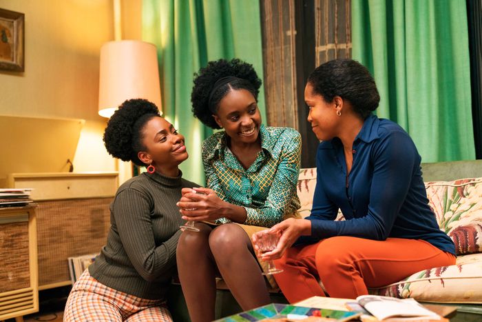
While TV dramas continue to look like they were lit by a sponge, 2018 gave us a wealth of beautiful film images. In the hands of Alfonso Cuarón, Roma’s black-and-white feels anything but desaturated. Robbie Ryan’s work on Yorgos Lanthimos’s The Favourite introduced a whole new generation to the wonders of wide-angle lenses. And Sean Bobbitt and Steve McQueen gave the Chicago of Widows a look as cold as Viola Davis’s withering put-downs. But few recent movies have gotten as much out of the entire color spectrum as Barry Jenkins’s If Beale Street Could Talk. Every frame of the film is a feast of gorgeous shades, as Jenkins and cinematographer James Laxton conjure a vision of ’70s New York filled with rich greens, romantic reds, soulful blues, and eye-popping yellows.
The aesthetic is a vivid departure from the usual depictions of the city’s dark days, when the decade’s bankruptcy and debris — what Laxton calls a “dusty, dirty era in American history” — are paired with a drab color palette full of browns and grays. (See Donnie Brasco or American Gangster.) “We didn’t want to rely on period tropes — soft contrast, milky shadows, and a faded color palette,” says the film’s colorist, Alex Bickel. Another filmmaker might have adapted James Baldwin’s novel with such kitchen-sink realism, but that’s not Jenkins’s style. The director’s first film was famously desaturated, but he has since become known for his intense colors and high contrasts. His Beale Street is a romantic melodrama, and it needed a color palette to match the emotional peaks.
“I’m not someone who totally buys into the color-theory discussions of, like, yellow means wisdom and green means envy,” Laxton says. “But thinking about love, and thinking about young love especially, what comes into my mind is warmth. Memories of past loves, I think of reds and yellows and oranges.”
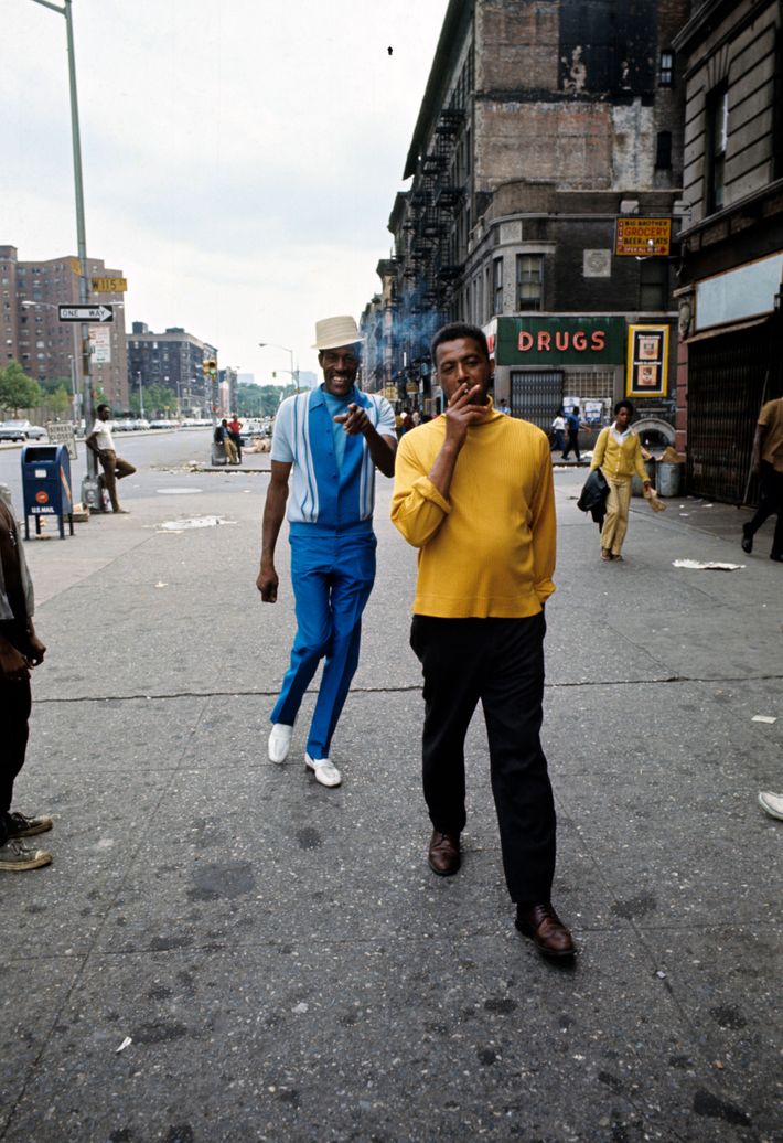
Art from the past provided two channels of inspiration. Though Beale Street is set in the era of New Hollywood, the film’s cinematography looks instead to the intensely saturated Douglas Sirk melodramas of the 1950s and the Technicolor romances of the 1940s. But when it came to the depiction of everyday life in ’70s Harlem, Jenkins and Laxton drew from the work of two photographers who were active at the time: Chilean academic Camilo José Vergara, famous for tracking changes to urban environments over the decades, and Jack Garofolo, street photographer for Paris Match, who chronicled the neighborhood in the summer of 1970.
With the advent of digital filmmaking, directors and cinematographers are now able to create what’s known as a lookup table (LUT), a color-grading profile that allows them to emulate the precise look of film stocks from the past. While many period pieces attempt to evoke the past by re-creating the sepia look of photos that have faded with time, the Beale Street team instead decided to mirror the look of Vergara and Garofolo’s photos as they must have looked fresh out of the lab. Particularly, says Laxton, “there was a hue in their work, particularly in the greens and especially in green shadowy areas,” that evoked the period as much as the hair and makeup department’s sideburns and Afros do.

Color was such an important part of the project that Bickel came aboard the film in preproduction, unusual for a colorist. “James and Barry have this language between them — they can read each other’s minds,” he says. “One of the fun things about when the three of us get together in the grade is we’re all trying to push the image and maybe surprise each other.” On Beale Street, he was tasked with building a color grade that would re-create the look of Provia, the Fujifilm brand that Vergara and Garofolo were using at the time. Compared to other film stocks, “Provia is more unhinged, and very rich,” he says. “It’s kind of unexpected. You take a photo of a color on Provia film, and when you reproduce it, it becomes something that you hadn’t quite remembered.”
The Provia look didn’t just subtly induce a sense of a bygone age; it also brought the deep colors and high saturation that Jenkins was looking for. There was a romantic softness to it, too. “It took to the midtones and pushed them to a warmer place,” says Laxton. “It would take a blue sky and push it to more of an aqua kind of color as well.”
Once production began, Laxton set about bringing this sense of warmth to the film’s lighting, which was meant to evoke New York’s romantic street lighting, and the homes that provide solace from the brutal world outside. “I’m from the West Coast, and what I love about spending time in New York is what happens when the sun dips behind tall buildings,” he says. When the direct sunlight goes down, “you get these lovely sort of bounces off of other buildings. There’s a sort of soft bounce that occurs every day in New York that I find very unique to the city.” That lighting ended up making its way into the film in scenes set in Fonny’s West Village studio, where the DP created a hazy orange lightscape with “a wash of ambient light from the streetlights outside that comes across the back wall.” You see it at work in the scenes when Fonny and Tish finally go to bed together, when it creates “this bubble of warmth where we could watch these two characters fall in love with each other. There’s a yellow reflection in Tish’s skin that works quite well.”
But it’s also at play in a much-heralded scene where Brian Tyree Henry, playing an old friend of Fonny’s, gives a monologue about the pain of being in prison for a crime he didn’t commit. “There’s a real deep-blue ambient soft light pushing down into Fonny’s basement,” Laxton says. Unlike the love scenes, which are filled with yellows and oranges, “the blue provides the painful context by which Daniel is expressing the last couple years he’s had in prison and the difficulty of being black in America.”
Another flash of cold light interrupts the warm atmosphere as Ed Skrein’s racist Officer Bell makes his first appearance. The scene takes place in front of a convenience store in the West Village, where the red tones of the neighborhood are broken up with a neon-green glow. “There’s this really kind of eerie green fluorescent vibe coming out of the grocery store,” Laxton says. “It’s on Fonny and Tish, but only in backlight. And it falls on the officer’s face in a way that gives the character a little bit of an aggressive ugliness.”
But not every scene presents this straightforward of a color story. Take the shot of Tish looking at Fonny near the West Side Highway, which gets prominent placement in all of the film’s trailers. One of Jenkins’s trademark into-the-lens shots, it’s lit almost entirely with natural light, but the combination of careful blocking of the sunlight and the Provia color scheme works magic with the star power of KiKi Layne’s face. “I didn’t want it to just be flat light on her face, which might have been maybe more flattering,” Laxton says, but would have wiped out the bit of aqua in her hair, the green in her forehead, the reflection of her yellow jacket near her chin. “There’s something really unique to me about Tish’s skin tone there. It’s very complex; it’s not one thing or the other.”
“If you’re an actor of color, there’s such a spectrum in there,” says Laxton. “And that’s what I wanted to make sure I was capturing in that close-up of Tish. There’s a complexity to it that I find is almost symbolic of the movie at large. It just references all the different emotional values that are ever-present in her face, in her expression, and in her performance.”


