As any Game of Thrones viewer knows by now, Sunday’s episode, “The Long Night,” was too dark. Or it was exactly as dark as it was supposed to be, except all of our TVs and computers were not calibrated correctly. Or they were calibrated correctly, but the ideal viewing experience is really in a theater. Or, they were just as dark as they should’ve been, because realism. Whatever the case, much of the long-awaited Battle of Winterfell was, for many viewers, too dang hard to see.
So we wondered, what if you could see? What if we lightened some of those images? What could you see in the battle that maybe you otherwise missed? Slide on below for a brightened view of some key scenes from “The Long Night.” (And for those who can make out things just fine in the original images — congratulations on your A+ monitor calibration skills!)
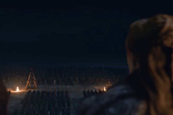
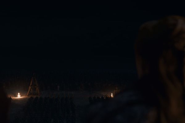
Here’s Sansa looking out over the battlements before the White Walkers arrive. In the original image, you may be able to grasp that this is Sansa — that hair — and that this is what she’s doing. But in a lighter version, you get much more information about the scene. The distinct array of troops below her would seem to be the whole point of this shot, but it’s hard to see each separate grouping in the original. In a lighter version you can even see the horizon line, which is really helpful when you’re trying to get a sense of scale and distance.
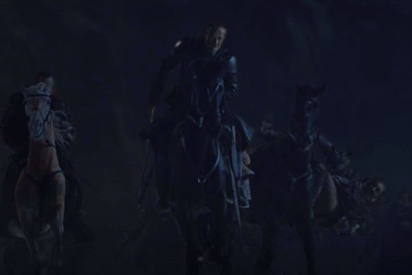
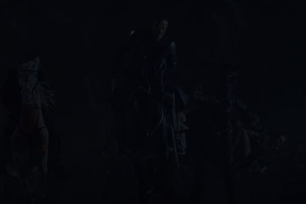
This is a plot point I missed entirely when I watched the episode on my TV. I’d caught Jorah’s face riding out with the Dothraki, and then when their flaming swords disappeared, I assumed he had as well. I had no idea how he got back to the main action when he showed up later! Turns out there’s a shot where you can see him riding back to the castle! Who knew!
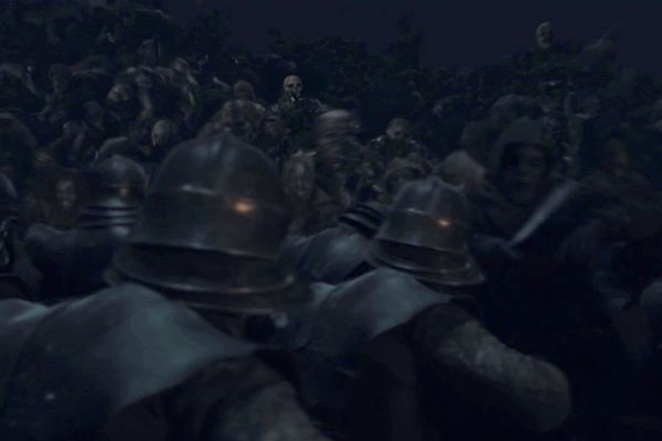
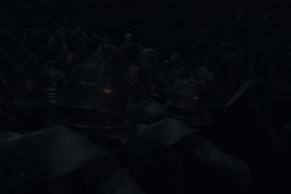
The lighter image here doesn’t dramatically change what you know about events. It’s a skirmish between White Walkers and the Unsullied. But one of the great visual elements of that clash is that when they fight one another, you can only see one set of faces. Thanks to the Unsullied’s helmets, the only faces you see belong to the White Walkers. Except, if the image is so dark that you can hardly see any faces, that very creepy facet of the battle has less impact.
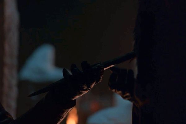
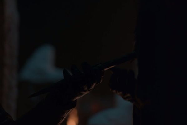
Another plot point made unnecessarily confusing by a lack of decent lighting. Arya, very pointedly, hands Sansa something, and you can tell from the context of their dialogue that it’s a dagger. But daggers are important on this show, so … which dagger was it? No way to know, really! The lightened image isn’t that much more helpful, but at least you can sort of see it’s a dagger, and that it has rough edges, suggesting one of Winterfell’s newly forged dragonglass weapons, rather than the curved blade of Arya’s Valyrian steel. But if the original were all you had to go on, Arya could’ve been handing Sansa an overnight-size maxipad for all I could tell.
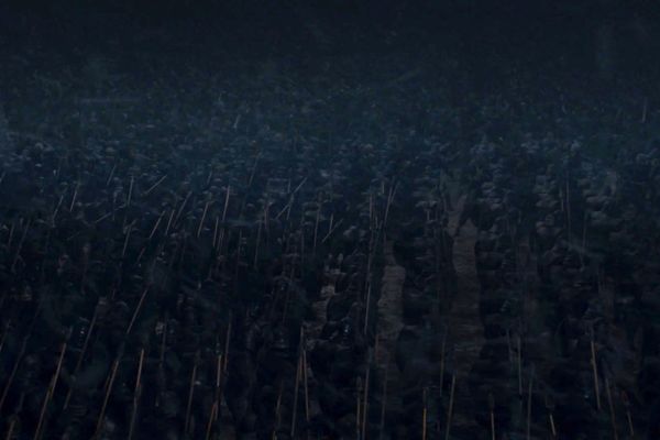
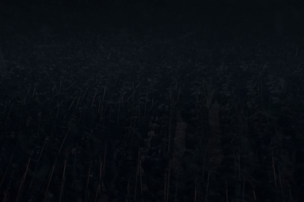
Who knows what this field of mottled blackness might be. Maybe it’s … all good guys? Or bad guys? Maybe it’s a wall? Maybe it’s an empty field? Oh look! It’s the Unsullied trying to protect the retreat of the ground forces from the oncoming wave of White Walkers!
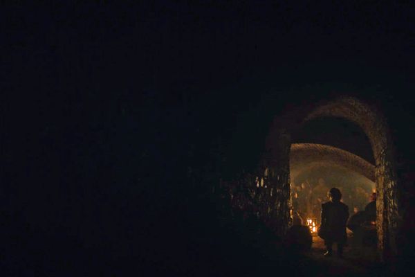
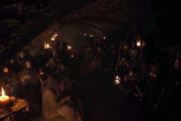
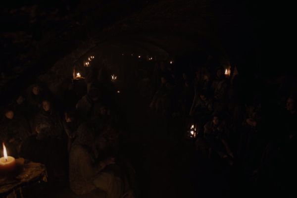
This is less about plot awareness and more about frustration with truly lovely cinematography that’s just not calibrated for a typical viewing experience. Every shot inside the crypts could’ve been this beautiful glowing image of humanity trapped in an underground tomb, and on most televisions all viewers could see was murk.
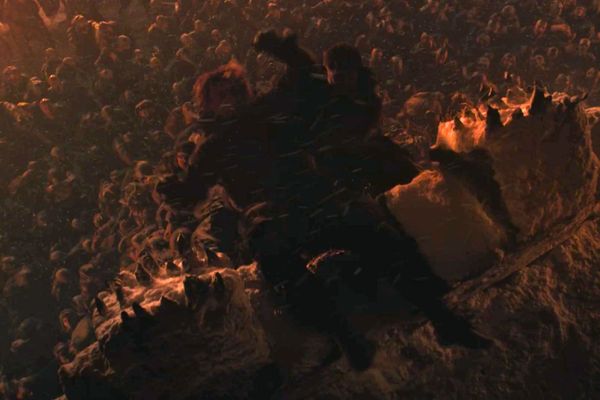
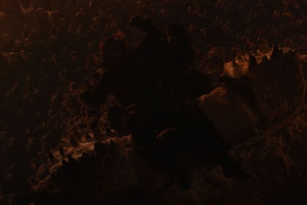
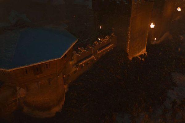
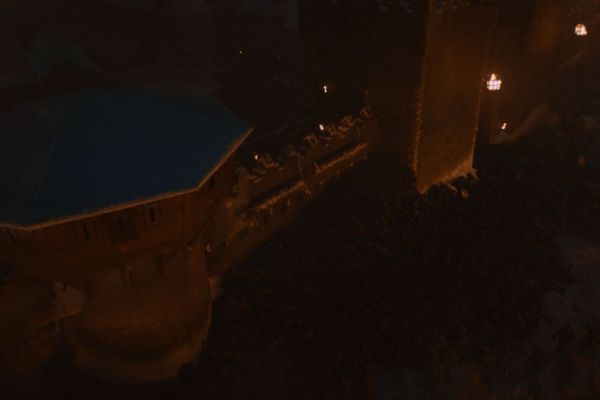
When you watch this sequence in the episode, there’s enough motion that you can see what’s happening: White Walkers have taken someone out and tipped them over the battlements into the waiting horde of wights below. When the image is lightened, though, you can actually see the horde. You can even see the terror on this poor person’s face!
Yes, I can tell that this is an image of the groups beneath the crypts in the original lighting. But I’m definitely missing at least a third of the people in the blackness, and it’s also hard to see how carefully they’ve been arranged so that the groupings reinforce the arc shape of the crypt’s ceilings.
This one’s too bad because you can’t see it very clearly in the original or in the lightened version, but it’s one of the moments I most wish had been more carefully calibrated to be visible on lots of different screens. The Night King dies, bursts into a billion ice chips, and then all the White Walkers also collapse. This sequence is of the White Walkers who’ve started climbing over the walls of the castle, and from the motion, you can see that the wave of them suddenly crests and falls backwards, almost imploding on itself. I want more detail! I want to have seen all their faces crumpling away! The effect was lovely, and I so wish there were more of it to see.


