Few filmmakers working today are as skilled at creating their own cinematic world as Quentin Tarantino. The director’s latest, Once Upon a Time in Hollywood, takes place in a loving recreation of late-’60s Los Angeles, as former TV cowboy Rick Dalton (Leonardo DiCaprio) grapples with a career that’s gone to seed, his stuntman Cliff Booth (Brad Pitt) takes a fateful visit to an old movie ranch, and Rick’s neighbor Sharon Tate (Margot Robbie) basks in her newfound stardom. You get the sense that, for Tarantino, the opportunity to wallow in the mire of the period was the whole point of making the movie. This is a world where Old Hollywood exists in uneasy tension with the new counterculture, as unshaven hippies scrounge for food alongside old drive-in theaters and legendary industry lunch spots, and the best possible Friday night is a pool party with Mama Cass. Until the very end, there’s not much plot; instead, Tarantino just wants to tune in, turn on, and drop out.
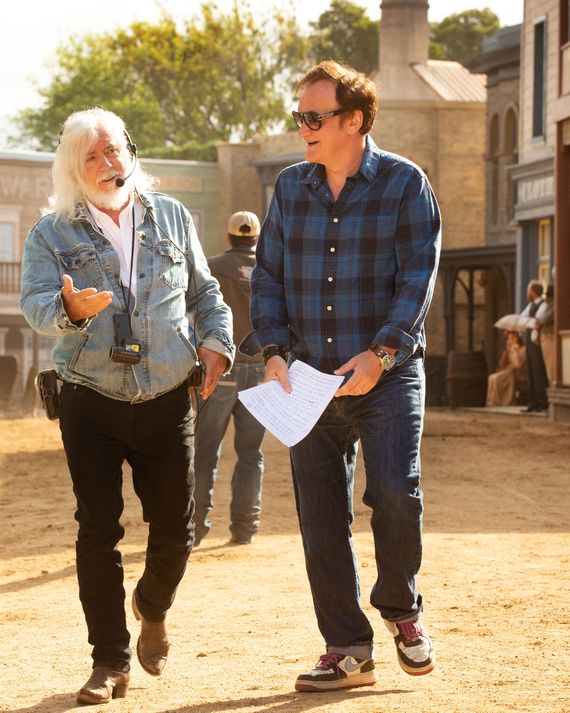
Even the most auteur-y of auteurs doesn’t work alone. The director’s vision would not have been possible without the work of collaborators like cinematographer Robert Richardson, working on his sixth Tarantino film, and production designer Barbara Ling, her first. Coincidentally, the pair both worked on Oliver Stone’s The Doors, making them experts on cinematic recreations of late-’60s L.A. Over the course of two separate phone calls with Vulture, Ling and Richardson explained how they brought the dream of the ’60s back to life.
Production Design
Pre-production on Tarantino movies often takes the form of one-on-one conversations at his home, where the filmmaker breaks out a copy of his latest script and outlines his vision for the project. (In this case, the script didn’t include the film’s ending, which wasn’t revealed until weeks later.) “He knows how he wants to see something,” says Ling. “He’ll say things like ‘Imagine an 8-year-old laying in the back of a car and looking out the window, what would he see?’”
Both Tarantino and Ling grew up on the outskirts of Los Angeles, and had pivotal memories of the city in the 1960s. As a child, Tarantino was entranced by the town’s light-up theater marquees, which get a third-act montage all to themselves in Once Upon a Time. Ling, who was a teenager at the time, remembers hitchhiking around to different neighborhoods with the sense that the entire city was open. Together they were able to create a mental topography of a vanished Los Angeles, ready to be resurrected.
Fortunately, some local landmarks from the era were still standing. Musso & Frank’s, the restaurant where Dalton has lunch with a pushy agent played by Al Pacino, has barely changed its interiors over the years. El Coyote, the Mexican restaurant Sharon and her friends visit on one fateful August night, let production film in the same booth the real Tate sat in. Location scouts even found a vintage Taco Bell in Orange County that was about to be torn down, because would the ’60s even be the ’60s without a little kitsch?
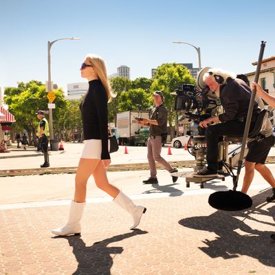
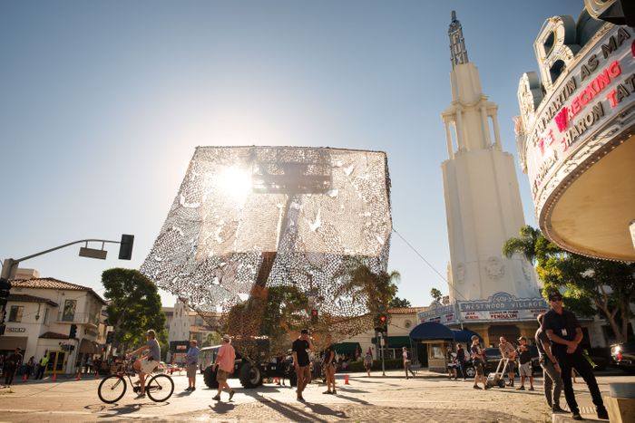
It sometimes feels that half of Once Upon a Time’s 165-minute runtime is filled with characters driving from one place to another — Cliff cruising down Hollywood Boulevard, Sharon zipping over to the Playboy Mansion — and since the real L.A. landscape was often created to be seen through a car window, the film’s version would have to be, too. That meant transforming a four-block stretch of Hollywood Boulevard into an impeccably researched 1960s time capsule — not just putting up false fronts and facades of the stores that used to line the street, but in the case of theaters like the now-gone Pussycat, building a fake marquee off-site, moving it overnight with cranes, then adding the neon on location. Since blocking off storefronts for film shoots can sometimes bring resentment from local business owners, that didn’t happen until the last possible moment, at which point the props department would come in and fill each window with period dressing.
Working with the city, they came up with a plan to film one side of the boulevard at a time, coming back months later to shoot the reverse angles. “It would’ve stopped traffic in the middle of the city if we had tried to close down all of it,” Ling says. “Hollywood Boulevard is 24 hours of tourism, every day of the week. I kept thinking, Don’t these kids go to school? There’s so much tourism that you can’t stop it, we just had to separate it. You always had to have people watching the tourists and making sure nobody hit them on the head with a ladder.”
Still, while turning back the clock on Hollywood Boulevard might be the film’s most impressive feat of production design, Ling finds herself struck by a smaller piece of work. In perhaps the surest sign of how much clout Tarantino holds in that town, production was able to shut down a couple of freeways. In the same way effects artists on Lord of the Rings would sculpt details no one but themselves would ever see, Ling’s team worked hard to make highway scenes period-accurate, from the street signs to the overhead lights. “We did it all practically, which is not done much anymore. That’s why it stands out, because it’s not footage, and it’s not CGI.” Ling says. The level of detail extended to the vehicles on the road, as well. “Not only period cars but period services: ads for diapers, plumbers that you saw in commercials, the buses with the TV ads, which is what L.A. is all about. Sometimes on set you’re racing to do things, and until you see it all together in the end you’re like, Wow, I hope this works. And it did. We really captured the feeling of driving on freeways in California in 1969.”
Cinematography
While Tarantino’s talks with Ling centered on driving culture, his pre-production discussions with cinematographer Robert Richardson revolved around the period’s generation clash — “that zone when the cinema changed from old Hollywood to new Hollywood,” says Richardson. The DP would be responsible for emulating both aesthetics. Scenes from Dalton’s career would be brought to life through the cinematography of the earlier period, which meant an Academy ratio and ultra-grainy black-and-white for the early-’60s TV Western Bounty Law (made even grainier by Richardson pushing the look up one stop), and a faded Dirty Dozen-style look for the WWII picture The Fourteen Fists of McCluskey.
The present-day scenes, meanwhile, took visual inspiration from late ’60s Westerns — as in Sergio Leone’s Once Upon a Time in the West, overhead crane shots feature prominently — but also, in the grain and saturation, ’70s films like the ultra-bloody revenge flick Rolling Thunder. “He wanted it to feel old-school,” Richardson says. (Besides their aesthetic similarities, both Once Upon a Time and Rolling Thunder also share a predilection for crotch-based violence.)
That throwback aesthetic was aided by Tarantino’s particular process. “For Quentin, film is the lifeblood,” Richardson says. “He shoots on film. He screens all his dailies on film. I knew I had to come up with a look on film that I would be able to give him.” For the look of the 1969 scenes, he turned to The Hateful Eight, for which Richardson and colorist Yvan Lucas had already devised a color grade that evoked Tarantino’s beloved spaghetti Westerns. They built on that scheme for the new movie’s rich skin tones and deep blues. “This is Quentin’s Western,” says Richardson — an appropriate description for a movie that features a horseback chase, a showdown at a ranch, and an overall wistfulness for bygone glory days.
When it came time to shoot the film’s actual Western scene, Tarantino decided to break from the pattern set by the other TV series within the film. The director had the idea to shoot Dalton’s pivotal guest stint on the pilot of Lancer not in the manner of TV Westerns of the time, but in the anamorphic widescreen typical of the period’s film Westerns — highly stylized and melodramatic, with plenty of tense zooms into furrowed brows. It not only underlines the stakes of the sequence (for Rick, this paycheck gig might as well be life or death), it also lets the viewer fully engage emotionally with Dalton in the moment.
“That sequence is brilliantly choreographed, but also brilliantly edited,” says Richardson. “It doesn’t cut to anybody. It continues to flow until he’s totally upset, and then it repeats the same camera movements. I think that if you had made the choice to go 1.33 with Lancer, and then you cut out to 2.39, you would have lost the impact. The shift in dynamic would have failed. It just wouldn’t have worked.” The lack of a cut also left room for DiCaprio to go absolutely hog-wild, and the cinematographer is filled with praise for the movie’s leading man. As Richardson put it at the very end of our conversation: “I think it’s his greatest performance.” Maybe even the best acting he’d ever seen in his whole life.


