When I ask Damon Lindelof, showrunner for the upcoming HBO series Watchmen, about John Higgins, his mind goes straight to the Beatles. “John Higgins remains one of the unsung heroes of Watchmen,” he says. “Certainly Moore and Gibbons were John and Paul, but Higgins was George and Ringo combined, and his striking colors reinvented the genre every bit as much as Alan’s words and Dave’s pencils.”
Higgins was indeed a hero of the graphic novel that Lindelof’s show riffs on, having been the man who did the coloring for the book. That makes him one of only three collaborators who created the Watchmen comic, along with writer Alan Moore and artist Dave Gibbons, and he is indeed underappreciated, even by the book’s supporters. But even that bold analogy isn’t enough: It’s more as if Beatles fans assumed the band consisted only of John and Paul and didn’t even know George and Ringo existed, much less that they created music of their own.
Higgins seems only slightly perturbed by the widespread gap in cultural knowledge about his contributions to Watchmen. Speaking over the phone from his home in the coastal English town of Rustington, he simply expresses gratitude for those who do appreciate what he did for the book. “People are very generous when they come up to me at conventions and say how much they appreciate my coloring,” he says in his Liverpudlian brogue. However, he follows that with the tiniest bit of frustration: “Sometimes I do feel like the other aspect of my career, that I’m an artist in my own right — penciler, inker, et cetera — has been slightly sidetracked.” Then it’s back to the gratitude: “I feel very lucky because of the support of my other two collaborators. They’ve been incredibly supportive, and they always spoke about me when they talk about Watchmen.”
Welcome to the humble, talented mind of John Higgins, the forgotten hero of Watchmen. Though he’d never be so presumptuous as to demand it, it’s long past time for attention to be paid.
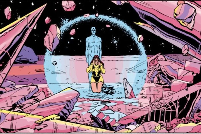
As anyone who has read and loved the book can tell you, the colors are a stunning and essential component of the story, even if they can’t tell you who was responsible for them. The graphic novel, released serially in 1986 and 1987 by DC Comics, was an immediate critical and commercial smash and has continued to be so ever since. A deconstructionist take on superhero fiction, Watchmen depicts costumed crime fighters as perverse, bumbling obsessives with deficits of self-awareness who cannot help but cause pain and engender chaos in the world around them. It is also a work of intricate visual formalism, expressing its narrative and themes not just in the words people say but in the architecture of the artwork around them. There are famous and obvious examples in Gibbons’s layouts and images, such as the chapter in which every page in the front half is mirrored by its opposite number in the back half, or the recurring variations on the image of a circle with a diagonal line in its upper hemisphere. But pay attention and you’ll notice that Higgins’s colors, too, are meticulously chosen to provide subtle commentary on the action.
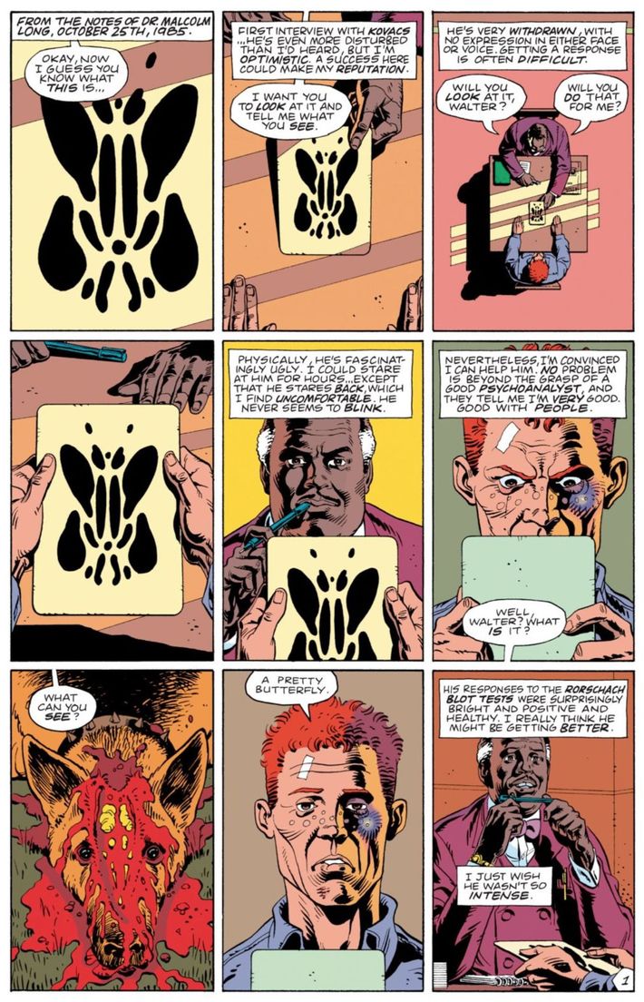
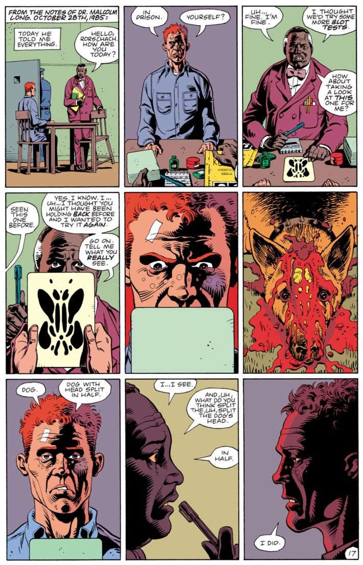
One of the supreme examples of this comes from chapter six, entitled “The Abyss Gazes Also.” In it, the brutal vigilante Rorschach is questioned and examined by a prison psychologist. It begins with the psychologist feeling optimistic about his ability to understand and possibly even cure Rorschach, and the colors for the first page are warm oranges, reds, and yellows, comforting to the eye.
But as the chapter moves along and the psychologist hears more of Rorschach’s life story, he starts to feel unnerved and his patient’s cynical worldview starts to dominate their conversations. The warm colors are increasingly interspersed with cool blues, violets, and greens, even in the walls of the same interview room we’d seen earlier.
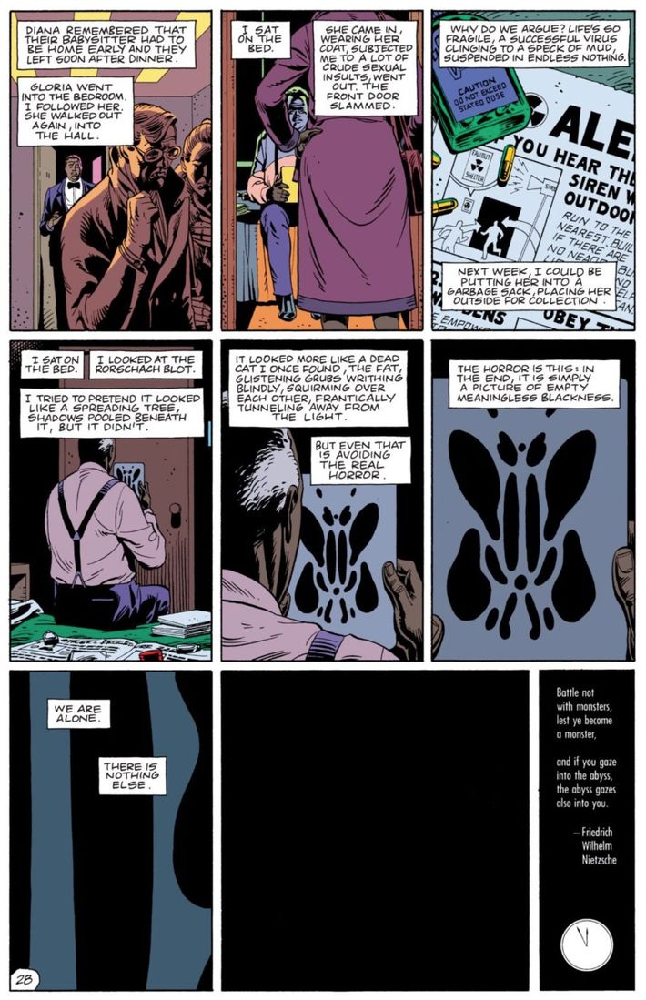
Finally, by the last page, the psychologist has lost all hope of accomplishing his goals and is sucked into Rorschach’s nihilism. The colors are ice-cold.
If you read these chapters in black and white — and DC has released special editions of Watchmen that present them that way — you miss out on an enormous amount of thematic and aesthetic weight. But don’t ask me, just listen to Gibbons, with whom I spoke via Skype. He says he chose a few of the colors at the outset but left Higgins to do the lion’s share and was astounded by what he saw. “I gave John color guides as to how the costumes were colored,” Gibbons says. “But his color choices outside of that sometimes almost frightened me.”
Case in point: That trick from “The Abyss Gazes Also” was entirely Higgins’s idea. “I questioned John about the way that was colored and he had this plan where everything got colder as you went through the book,” Gibbons recalls. “He, in his own right, had a perfect justification for every patch of color that he put down. Really, he brought the same degree of planning and focus to it that Alan and I did.”
Not bad for a guy who got his start drawing medical diagrams. Born and raised in Liverpool — Lindelof’s Beatles analogy is all too appropriate — Higgins was a sci-fi and comic-book geek, but he went to art school to study traditional illustration. “Other than the fact that I thought comics were entertainment and I recognized it was great art and it was great figurative art, I never really thought about getting a job in comics,” he says. He loved anatomy, especially the anatomical works of Leonardo da Vinci, and a tutor pointed him in the direction of medical illustration. He went on to study anatomy at university. “I wasn’t allowed to touch the bodies, but I went into the anatomical classes that the medical students were being trained on, they were the ones dissecting these cadavers,” he recalls. “I was there sketching, and it was a real eye-opener for me. It showed me how form and shape and function all became one thing.”
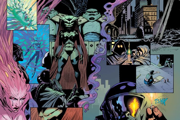
Higgins wound up getting work as a medical artist, but his eye wandered. “As much as I enjoyed medical anatomy and working within the hospital services, the thing I wanted to do most was to do fantastical subjects,” he recalls. So he started drawing comics and illustrated covers for sci-fi novels on the side. Eventually he took the plunge and left his job to indulge his passion full-time. It was around this time that the U.K. comics scene changed irrevocably with the 1977 debut of 2000 AD, a magazine devoted to comics-format science-fiction adventures. Higgins became an obsessive 2000 AD reader and soon realized that it was “a realistic touchstone of where I could actually go and possibly get some work.” He started sending work to them and getting it published regularly. What’s more, he became part of the burgeoning U.K. comics scene, meeting fellow obsessives and creators at gatherings held in a London pub called the Westminster Arms. Among these young-gun compatriots were Alan Moore and Dave Gibbons.
One day around 1985, Gibbons realized he needed help on this little project he and Moore were working on for DC called Watchmen. “Alan and I were in the position where we could virtually control everything about Watchmen,” Gibbons recalls. “And we thought, ‘Well, it only really makes sense to have somebody that we know in England color it.’” Higgins had done so much lush coloring in his painted work that Gibbons thought he’d be just right for the job, especially since he didn’t want the story to look like a conventional American superhero comic. “Most American comics are based on the primary colors, blue and red and yellow,” Gibbons says. “Whereas a lot of European comics tend towards less garish colors and have a lot more purple and orange and green — the secondary colors, which are a bit more interesting.” He told Higgins he wanted to veer toward the European approach, which “would make Watchmen look unlike any other American comic,” Gibbons says. “And John absolutely got that.”
Gibbons and Moore had another stipulation: To tell the reader they had one foot in realism and another in the surreal, the covers would have realistic, painted, 3-D gradations of color and the interiors would be deliberately flat to indicate that you were in, as Gibbons puts it, “comic-book world.” Gibbons says Higgins got it all right away. “I don’t think John did any samples,” he says. “I just trusted him to do it.”
Back then, in the pre-digital days, comics coloring was an arduous process, made all the more difficult by the fact that it was done differently in the U.K. and the U.S. In the former, comics were typically black and white, and when colors did appear, they were usually painted onto the actual artwork. In America, one had to indicate which colors one wanted on the inked artwork and then hand it off to so-called “hand separators,” usually a single shop in Sparta, Illinois, where a team of people would apply the requested shades. “That really blew my brain apart,” says Higgins, “because I found it an incredibly difficult discipline. It was not as intuitive as my fully painted stuff.”
Given all of that, “the first couple of issues are pretty dire,” Higgins admits. “We made some mistakes with the gray tone, and there were things we shouldn’t have done, and unfortunately we didn’t realize this until we saw them printed, because they didn’t give us proofs” — that is, preliminary copies of what the colored pages would look like. “When Dave and I saw the way the first couple of issues were being printed, we changed certain aspects of the way I was approaching the coloring.”
At that point, Higgins says, “something came a bit more apparent in my brain.” He made changes to his process based on the technical mistakes in the first pair of issues, but he also started to think bigger. “I knew initially I wanted to use mood and sense of mood with the color, but once I understood the complexity of the story that Alan and Dave were telling, then it all really made sense to me,” he says. He thinks he finally hit his stride with the aforementioned psychologist chapter. “From that point onward,” Higgins says, “it really all makes sense.” Indeed, he remains so proud of what he did with the technology available at the time that when DC hired him to redo the coloring for a mid-aughts reprint of the comic, he made little tweaks here and there — especially in issues one and two — but left the overall color scheme exactly the same, complete with the flat affect that is so uncommon in today’s more realistically toned comics.
Watchmen became a sensation upon its serialization in the ’80s. But Higgins’s name — as is sadly still true for most colorists — was not on the collected book’s cover when it was published in 1987, nor was it shouted from the rooftops by the press and superfans the way Moore’s and Gibbons’s were. He continued his coloring work, which included the colors for Brian Bolland’s pencils in Moore’s lauded 1988 story Batman: The Killing Joke, but he also grew as a penciler and even as a writer. He did pencils for an array of stories about the famed 2000 AD character Judge Dredd and eventually created his own series, Razorjack, at Jack Publishing, a company he established himself. More controversially, he also returned to the Watchmen universe in 2012 by working on DC’s much-maligned “Before Watchmen” project. The short version: Moore and Gibbons signed a deal when they made Watchmen that would make the rights to the underlying intellectual property to revert to them when the collected edition went out of print, but it was such a hit that it never did go out of print and, rather than honoring the spirit of the original agreement, DC didn’t give back the rights, infuriating Moore and contributing to his decision to swear off working with DC ever again, much less on a Watchmen initiative. When the company opted to tell a series of Watchmen prequels in 2012, Moore was nowhere to be found, but Gibbons and Higgins gave it their blessing and the latter did the artwork for a serialized backup story called “Curse of the Crimson Corsair.”
Higgins feels no regret about participating in “Before Watchmen,” though he understands why Moore — whom Higgins says he hasn’t seen in at least five years, and who declined to comment for this article — disapproves of it. “Maybe DC has treated Alan in a way that he feels very badly treated,” he says. “The purists will always debate and argue and say it’s wrong. I can’t see how it’s wrong. As long as they keep the quality up, nothing is going to affect the integrity of the original piece of work. I have no problem with how they exploit it, as long as they keep the integrity and the best creators around.” He tentatively approves of the new show, as long as it shares the spirit and quality of the book. However, Lindelof and HBO have never been in touch with Higgins, which miffs him just a bit. “It’s really weird,” he says. “You’re sidelined once something goes into a different medium, especially if you’re not particularly involved as a creator.”
Still, Higgins doesn’t complain when you ask him how things have gone since Watchmen put his work in front of millions of eyeballs. He’s still out there in the comics hustle, working on a top-secret project for 2000 AD. He’s also gotten prestigious work in other mediums, such as creating a quasi-comic about the 1666 Great Fire of London, told in the form of six official U.K. postage stamps. And in 2017, there was a gallery showing of his work, entitled “Beyond Watchmen and Judge Dredd: The Art of John Higgins,” in his hometown of Liverpool, and it spawned a retrospective coffee-table book of the same name. When I ask him if he has any final thoughts about the way his life has gone, he keeps it sweet and simple. “I think that’s about it, really,” he says. “Keep reading the funny pages and look out for me.”


