At Snapchat’s New York offices this winter, members of the creative team behind the popular reality series Endless were feeling the limitations of mobile storytelling. The episode they had gathered to edit included a big set piece: Star Summer McKeen and her friend Jessica Matis walk through Times Square without realizing that McKeen’s ex-boyfriend, Dylan Jordan, is there at the same time. As McKeen disappears into the crowd, there is a Sliding Doors moment; behind her, Jordan appears on a billboard-size screen, filmed by a camera that captures footage of tourists. On a reality show made for TV, this is where you would cut to a wide shot, measuring the distance between the two exes. But on one made for a phone-size screen, it didn’t quite … fit.
The team knew this posed narrative problems. How close were McKeen and Jordan supposed to be? Had she seen him, or hadn’t she? “There’s no time for slow builds on mobile,” Snapchat head of content Sean Mills, explained later. He mimicked panning a camera around the room. “You’ll lose people right here.” His hands stopped long before the camera would have come to focus on our conversation.
For months now, a mobile-storytelling platform called Quibi has loomed on the content horizon, promising that, when its app launches this spring, it will be a home to a huge library of short-form shows made specifically for your phone. But Snapchat has been operating in that space for years. According to its numbers, 218 million people use the app daily. With over 38 million viewers, Endless (previously called Endless Summer), created by Michelle Peerali and Andrea Metz, is the most watched of the 95 original shows that have appeared on the platform in the past few years. It’s now in its third season, and most of its audience is between 13 and 24 years old (by Snapchat’s statistics, 90 percent of people in the U.S. in that age range have the app on their phones). The company has studied what works on a phone and what does not, and from those lessons, it has invented mobile storytelling as a new art form.
It’s tempting to define Snap Originals by comparing them with more familiar formats, but they’re not TV and they’re not movies chopped up into little pieces. They’re not YouTube videos, either, or half-baked snippets of other content spliced for Facebook. They share some qualities with TikTok, but that platform’s user-generated, ultra-short home-movie-style videos don’t have the money, production value, or long-arc storytelling of a Snap series. None of those mediums have radically rethought how episodic narratives can exist on mobile in the way Snapchat has. YouTube videos, for instance, can be of any length, and they’re made for a standard horizontal frame; Snap shows are designed for a vertical one, and they play without asking viewers to flip their phones sideways. This may seem minor, but in practice it has been an enormous shift, requiring the company to completely reconsider the directing and editing process. Since film was invented, vertical framing has been seen as incongruous with cinematic storytelling. For Snapchat, it means using rigs that turn cameras onto their sides, new scene transitions, carefully calibrated blocking, and a visual aesthetic designed expressly to fit its digital platform. It’s a level of challenge that could make the platform’s creative partners throw up their hands in frustration. But it’s also exactly the type of constraint that can lead to remarkable innovation.
It isn’t the only major obstacle, either. Snap Originals must be hypercondensed, each episode edited down to a few minutes of ultralean narrative machinery. If a movie is a mansion, a Snap Original is a Pinterest-worthy tiny house. If TV is a semi-truck, capacious and capable of traveling long distances, a Snap Original is a moped, fun and fast, carrying little but zipping through traffic. Mills spoke about his mission as if it’s both world changing and painfully obvious. Of course, mobile content deserves to be considered with care and attention. Of course, something made for a phone should be designed to play on a phone. “This opportunity doesn’t come around often for a medium to tell stories in a new way,” Mills said. “As much as that stuff can be a convenient talking point, for us, it’s religion.”
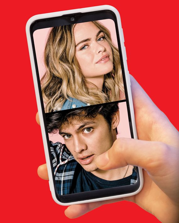
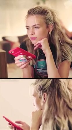
There are hallmarks to a Snapchat show. Episodes run five minutes on average and ideally no longer than eight. While your typical half-hour sitcom needs to grab a viewer’s attention in the first three minutes, on Snapchat, the goal is closer to three seconds. A show might tell a story with several characters — in the case of Endless, McKeen and Jordan are joined by a small constellation of friends and love interests — but a single scene rarely shows more than two or three. Vertical frames don’t have room for two faces unless the subjects are sitting unnaturally close to each other. To get around this, Snap series rely heavily on split screens.
Shows are structured so that one scene tumbles into the next without a break, but they are not defined by speed. Characters don’t speak unusually fast, and plots don’t move at a breakneck pace. They are distinguished by a feeling of density that has more to do with what’s missing: Every bit of stillness has been excised to optimize how much gets packed into each episode. In some ways, this is the same as any TV series or movie — all storytelling involves cutting out parts that don’t pull their weight. But in a three-hour extravaganza of The Bachelor, or the C-plot of any sitcom, there’s space for filler Endless could never afford. Silly faces, talking-head-style interviews in which the subject trails off in the middle of an idea — you don’t realize how fundamental that stuff is to the experience of watching TV until it’s suddenly gone.
These features are in every Snap Original across genres. There’s the zombie drama Dead of Night and CoEd, a show about high-school friends going to different colleges. Dead Girls Detective Agency is a YA adaptation about, yes, four dead girls who team up to solve a murder. All these shows move with the same heightened efficiency.
Operating creatively from a place of scarcity also demands a particular aesthetic. The “Snap product is a lot about stimulating the visual,” said Julie Pizzi, the president of entertainment and development for Bunim/Murray Productions, the company behind Endless and other genre-defining reality shows like Keeping Up With the Kardashians and The Real World. She compared it to a video of many colors of paint swirling together or a body leaping into a pool full of foam. Endless is a moving mosaic of the most appealing images of McKeen and Jordan’s lives. In a worrisome scene in which Jordan starts drinking at a party, the buildup is a run of beautiful establishing shots: a stunning California day, Jordan pulling a bottle of vodka from a cooler, hot dogs being thrown on a grill. The effect is hypnotic.
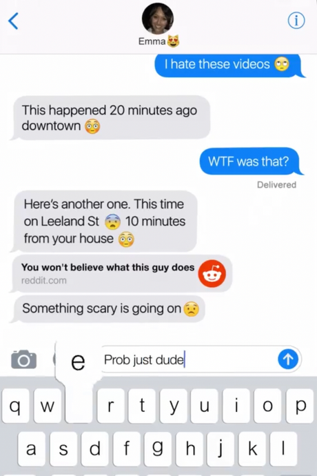
Nowhere is it more so than in a visual technique Snapchat calls “screen reality” — essentially a phone’s-eye view that tells a story through text messages and apps. It sounds gimmicky, but it’s curiously effective when you experience it. The best example is Dead of Night, an unlikely show for the platform. Snap Originals are terribly built for the horror genre’s most familiar tropes. Wide shots of the series’ zombie army don’t read well. There’s no time for the slow-building dread of a shot that pans around a room. Vertical frames are not ideal for showing a person fleeing from something. The only place to run is toward or away from the camera.
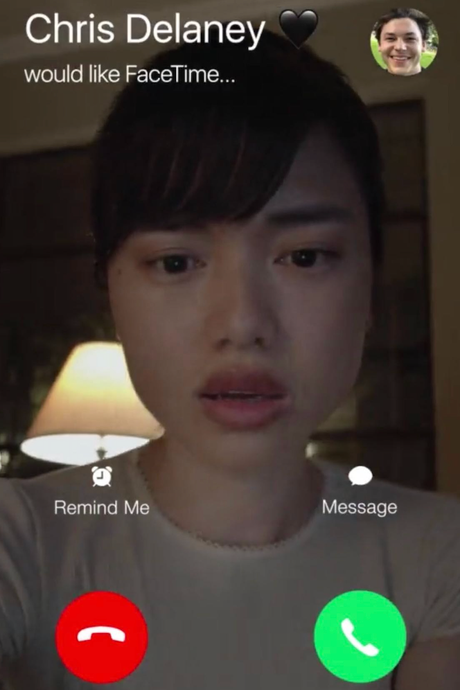
So Dead of Night leans into its limitations. The viewer’s phone becomes the protagonist’s phone, displaying exactly what she sees in the early moments of the zombie outbreak. The pilot episode starts with the main character receiving a link from a friend in the iMessage app. She opens it to see a grainy phone video of a zombie pounding on the glass door of a restaurant. “WTF was that?” she types. “Something scary is going on,” her friend responds. But as the viewer, you can’t see the main character. You don’t see her hands or the room she’s sitting in. All you see is a perfect replica of her phone screen, which is playing on the phone you hold in your hand. The only time you see her face is a brief moment when she gets a FaceTime call, which she quickly dismisses so she can answer a text message instead. You see her face the same way you’d see your own if you got a video call. You become her.


That opening sequence happens in just 40 seconds; Dead of Night tells its entire zombie-apocalypse story, from outbreak to conclusion, in ten episodes with a total runtime of 40 minutes, without ever leaving its screen-life perspective. It’s a demonstration of how artful and new this form can be.
Snap Originals ask to be watched in a way that reminds me most of spending time on social-media apps: endlessly refreshing, moving rapidly from one platform to the next. “A scene isn’t necessarily moving fast,” Endless producer Dave Henry explained, “but for you to be able to do some active work with your eyes, it gives the perception that things are moving a little quicker.”
There’s a reason for that. Radios, theaters, movies, TV screens — in each case, the starting presumption was that audiences would pay attention to the thing playing on them. Even now, distractions come from the addition of a viewer’s second or third screen. On Snapchat, the pull away from an original series and toward something else comes from inside the house: Audiences are barraged with messages, notifications, calls, emails, all on the same screen and likely from within the same application. Snapchat users open the app 20 or 30 times a day, and it’s not because they’re returning to watch original programming every time. It is first and foremost a messaging platform. Any brief gap when nothing happens on a Snap Original is an invitation to stop viewing, so the creators must aim to make you stay (or at least come back when you inevitably leave to answer a message).
It’s an aesthetic that suits the medium. When you get notifications from outside the show, they don’t feel like intrusions. The rest of the phone is another layer of rapid-fire information arriving constantly and simultaneously along with everything else. The experience of the phone and the experience of the video playing on the phone bleed into each other. They make sense together. More than anything I’ve seen, Snap Originals are a form of storytelling that replicates the rhythms of digital life.
Snap Originals are so well suited to the app they exist in it’s almost astonishing how poorly their platform supports them. When you open Snapchat, the entry point is a forward-facing camera, an invitation to join its messaging ecosystem. Hitting the Discover button shuttles you out of the world of content creation and into content consumption. But the Discover page is an impossible morass, an unending wash of forms mixed together. There are original series, stories from Snap’s publishing partners, videos by popular users, all in one stream. If you’re looking for a Snap Original, there are two options: stumble upon it by chance, or already know it exists so you can type its title into the search bar.
Then there are the ads. A five-minute episode can’t support lengthy interstitials, so Snapchat supplies brief, unskippable commercials. They arrive abruptly in the middle of a story, last for five to ten seconds, and disappear. Take the docuseries While Black, with MK Asante, which examines the experience of blackness in America. The first episode is a conversation with a man whose family was racially profiled by a store manager and police. “These are not isolated incidents,” Asante explains. “We are racially profiled all the time. They’re happening even when you don’t see the footage, even when there’s no video …” — a pink, sparkling ad for OkCupid cuts him off for five seconds — “and even when there’s no body camera,” he continues. How much can careful editing matter when an advertisement can shout about dating apps in the middle of a sentence about police discrimination?
The company knows some of these things are problems. Last year, CEO Evan Spiegel compared the current state of the Discover page to wandering through a grocery store “without the aisles labeled.” Snapchat is testing ways to rearrange the page. And Mills insists Snapchat cares most about “engagement.” He touts the stats for Two Sides, a series about a breakup. (Of the viewers who watched the first episode, about 20 percent went on to watch the season in one day.) But users come to the app mostly for its social-media functions. Ultimately, Snapchat is relying on its audience’s desire to share stories to overcome the platform’s deficits.
There are no great Snap Original shows — not yet. The form is full of promise, but watching it can feel like observing the construction of a beautiful, trendy box. The walls are there, and it’s a distinctive shape; you can see why lots of people would like this box. But nothing inside it feels indispensable.
It’s still early. When televisions were popularized, it took time before the storytelling solidified into what we now recognize as a “TV show.” Those first days were rocky. Plot timing, what visually worked onscreen, how many cameras to use, how to incorporate sponsorships, what genres worked best — all of it took years of development. I Love Lucy is widely credited with inventing the three-camera setup, but that didn’t happen until 1951, four years after sitcoms like Mary Kay and Johnny blazed a trail. It takes time for a form to become itself.
Snapchat is hoping that, as its profile grows, more storytellers will be curious to play in the box the company has created. Their curiosity may be sparked by other platforms, however. Even before its release, Quibi has used an immense marketing budget and high-profile names to produce the kind of buzz Snap Originals has never had. Mills hopes that, rather than being a zero-sum game, Quibi will make all mobile shows more visible, Snapchat’s included. “We’ve been a pioneer in mobile-only storytelling, and to the degree that they’re doing that, it’s going to be to our benefit,” he said.
There are crucial differences between the ways Snap and Quibi approach storytelling. Whereas Quibi is aimed at traditional TV viewers, who tend to skew older, Snapchat is laser focused on its primary under-34 audience, especially teenagers. Quibi’s shows will be viewable horizontally and clock in at seven to ten minutes — practically longform for mobile. It calls some of its titles, like the thriller The Stranger, “Movies in Chapters” and sound closer to what’s already out there than Snap’s reimagining of the form.
But both are interested in bringing auteurs to their platforms. Quibi has a head start; it will offer programming from Steven Spielberg, Steven Soderbergh, and Ridley Scott, while Mills cited Donald Glover as a creator Snapchat would like to partner with. What could someone like Glover, whose work exploits the boundaries of TV, do with this form? The metacommentary that has defined his work on Atlanta could work here, too — a Snap show about race in online communities, maybe, or a series that turns a piratical eye back onto the privileged white digital voices that so often co-opt the language, style, and creativity of young black talent online. What might it look like when the rules for mobile storytelling are familiar enough that artists can begin to mess with them? The claustrophobic space of a phone screen could be an inspiring box for a Jordan Peele–style horror series. But it could also be a window of freedom in a Ramy Youssef show about Muslim teens using their phones to find one another. What stories about life online can you tell when you’re working with a form designed to reflect it?
Any new medium is a system of gains and losses, and while the potential gains of Snap Originals are huge (truly harnessing phones as a storytelling platform would be a massive industrial sea change), there are also losses. Critical theorist Franco Moretti wrote that when the novel coalesced into its own form, sometime during the 18th century, “filler” was one of its defining features. Unlike theater or poetry, novels made space for scenes that didn’t directly move the plot forward, make moral arguments, or advance the aesthetic design of the work. People in novels had boring conversations; they went on errands and did chores. This helped make the novel remarkable. More than other literary forms, it could be a closer reflection of lives as they were lived.
TV and film have whittled away at the role of filler or have found more efficient ways to represent it than the pages-long descriptions of making a canoe in Robinson Crusoe, for example. A minute-long montage may get the same idea across, but the experience of watching it feels quite different from battling through the many paragraphs of Crusoe’s trials. For a TV showrunner or film director who wants to, though, there’s nothing in the form of a movie or TV series that prevents him or her from dedicating many minutes to purposelessness. David Simon’s TV work is full of plotless snippets that slowly build into something bigger. There’s an entire genre of hangout comedy, from Cheers onward, predicated entirely on the resistance to narrative momentum.
Snapchat doesn’t have that luxury. Back at the office, showrunner Andrea Metz and the rest of the creative team knew they’d need a few more seconds to let Endless’s Times Square scene play out. To get that space, they would probably cut a sweet, ultimately unnecessary moment in which McKeen and Matis place orders at a Wafels & Dinges stand. Matis asks for whipped cream on her almond-milk latte until McKeen reminds her she’s supposed to be “dairy free, beetch!” How much could be lost without sacrificing something essential, they wondered? It’s easy to cut a story down to a skeletal frame for the sake of peak mobile performance. But like so much of life in the digital age, it’s hard to find a balance between ruthless optimization and messy humanity.
This is the most crucial task for this new art form. “The dance” of editing a Snap show, Metz said, is about “not cutting too much where you’re not feeling any emotion.”
*A version of this article appears in the March 2, 2020, issue of New York Magazine. Subscribe Now!


