This article was published on July 8, 2020, after Couples Therapy’s first season. Since then, the set has been modified, but the principles of the office’s realistic design and how the cameras are hidden have remained in place.
The premise of Couples Therapy is deceptively simple: The creators of the Showtime docuseries just wanted to film couples as they had sessions with a really great therapist. If their cameras could be as unobtrusive as possible, they might even capture the intimate, compelling discoveries that can happen in therapy. All they had to do was design a set that didn’t feel like a set, so that even though the couples all agreed to be filmed, they’d be comfortable enough to forget the show and concentrate on the therapy.
It wasn’t so easy. If the couples didn’t act naturally while they met with therapist Orna Guralnik, the whole concept would fall apart, which meant Couples Therapy needed to find a way to film in a small, controlled space without the participants ever seeing any cameras. “We knew from the get-go that we were not going to be able to have cameras or any other people in the room,” says Josh Kriegman, executive producer and director. They also needed to be able to catch every moment immediately, without redos or second takes. Perhaps most crucially, the room itself needed to feel like a real therapist’s office. And the producers and photographers wanted it to look good, with thoughtful cinematography, attractive lighting, and cameras that could move in response to what was happening.
So the question became, how do you take beautiful footage of what happens inside a therapist’s office without ever being inside the room? “There’s something very fragile and delicate about what goes on in couples therapy,” explains Wyatt Garfield, the show’s director of photography. “The directors were very concerned that any intrusion would disrupt it, or that people wouldn’t feel as comfortable opening up.”
They thought about using an actual therapist’s office, Kriegman says, but there just wasn’t enough room for the cameras and a film crew. They considered building a room that was shot from only one side, like the three-cam setup of a sitcom stage. Ultimately, they rejected that, too. “We wanted to be able to capture anything that was happening with our subjects, any time, from any direction,” says executive producer and director Eli Despres. “That really put us in this 360-degree shooting setup. That need dictated everything that followed.”
Next, they proposed using two-way glass to solve the maneuverability issue. But the problem with two-way glass, production designer Nora Mendis explains, is that it looks like a mirror. “The initial ideas that we were talking about looked like an interrogation room,” she says. The other complication was that the creators wanted a set where couples would never feel like they were crossing through the backstage space of a film production. “We wanted them to be able walk in off the street, directly into a space that was already a therapist’s office,” Mendis says.
For the location of the set, the crew found a studio space in Greenpoint with a door leading onto the street. Then, they decided to build not just a therapist’s office, but a waiting room and hallway that led directly to that exterior door. The door, Mendis says, is “already a built set,” as was the hallway that couples walked along before getting to the waiting-room space. (The hallway even included other doors to other therapist’s offices, although none of those offices existed.) For the couples, the only reminder they were being filmed came quickly after entering, when crew members put mics on them and then left the room.
The camera solution, meanwhile, was both elegant and exacting. “It’s wonderful how straightforward the camera concealment ended up being,” Kriegman says. “It’s an old-fashioned trick, just a 45-degree angled piece of reflective glass.”
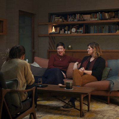
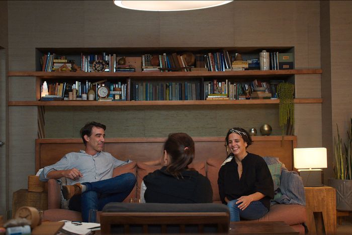
“Essentially, the mirrors are at an angle so they reflect what they see,” Mendis explains. When the audience sees a bookshelf or a strip of wallpaper in Guralnik’s office, for instance, half of what they’re looking at may be a mirrored image, carefully disguised into the set. Garfield and the photography crew then built sliders behind the walls, so that each camera could still have a range of both horizontal and vertical motion while shooting through the narrow glass windows.
There are a few deliberately visible mirrors in the set design, which are made of two-way glass so that cameras can look into the room. But they’re carefully located in places where it would make sense to put a mirror, like in the waiting-room area. “In one of the episodes, you can see someone checking themselves in the mirror before they leave, which I found very funny,” Mendis says. Solving the two-way glass problem also involved carefully adjusting the lighting so that the room was bright enough to shoot into, but not so bright it looked unattractive.
After that, it was largely a matter of set dressing to create a convincing space. Guralnik provided lists of all the books she would and would not have on her office shelves, and the production team made high-quality scans of her diplomas to frame on the walls. Mendis made a trip to the MoMA Design Store to find tchotchkes for the tables and shelves; she even picked up an attractive dog bed for Guralnik’s Alaskan Klee Kai, Nico, who often sits in sessions with her.
“Even something like the length of the couch was something we agonized over,” Mendis says. Because the cameras had such narrow viewing angles, a smaller couch was easier for cinematography, as a way to control exactly where the bodies were likely to sit for framing. But it didn’t work for the couples, so they had to keep tweaking. “With a small couch, people would always be straining to the outside,” Depres explains. “When we gave them a little more space, it allowed them to be more expressive with their bodies.”
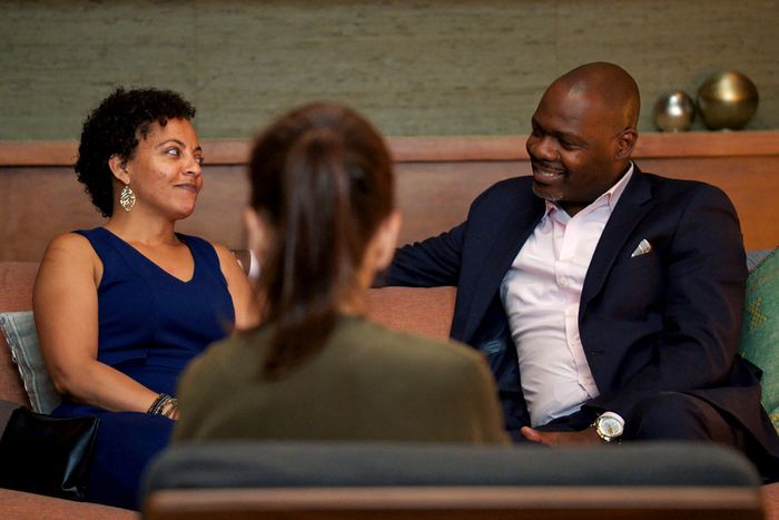
If there’s one scene that best demonstrates how that design functions in the show, it’s the sequence from episode three in which a couple, Elaine and DeSean, talk through a recurrent, frustrating pattern of miscommunication. “I love how it opens with the waiting room,” Despres says. “It’s such a formal shot. Their emotion jumps off the screen at you when you’re sitting there, despite the fact that it’s such a buttoned-up piece of set dressing.” Then, as the scene cuts to Elaine and DeSean inside the office, the mastery of the set design becomes obvious, mostly because of what the audience cannot see.
“They start on a wide shot of the room where you can see everything,” Garfield says, “and then they start cutting around the room from camera to camera. If you start doing the math in your head, you realize that all of the cameras should be seeing one another, because they’re all pointing at each other. The cameras are moving, they’re cutting back to the other side, and there’s nothing there. It’s a pretty remarkable illusion.”
Because of that set design, Couples Therapy is one of the most aesthetically lovely docuseries on television. But it’s goes further than that: The set design was absolutely fundamental to making the show work at all. When I talked to Elaine and DeSean last year about their experience on the show, they were clear that the physical space of the set was crucial. “It really made you feel like you were in Dr. Orna’s office, [and] that allowed us to forget that we were being filmed,” Elaine said. “It doesn’t occur to you because there’s not a camera in your face. Although we knew, right? But they did an excellent job of creating the space for us. It allowed the authenticity to be able to happen.”


