In the candy-coated black comedy Do Revenge, payback is best served in pastel with a side of “Glennergy.”
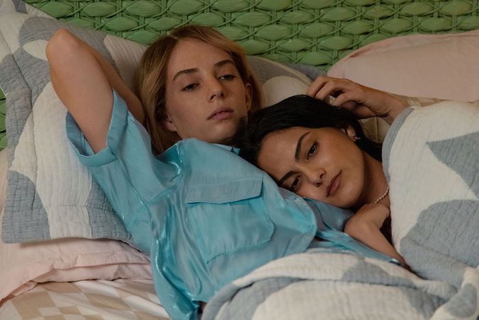
The campy teen satire highlights the deliciously duplicitous and unlikely bond between Drea (Camila Mendes), a dethroned queen bee who wants to exact revenge on her ex-boyfriend for leaking a sex tape, and Eleanor (Maya Hawke), an awkward transfer student who wants to get even with the girl who outed her at summer camp. Cue a series of impressive attempts to take down the bullies who wronged them: drugging the entire senior class with mushrooms, exposing Drea’s golden-boy ex as a cheater, and a lot of blackmail.
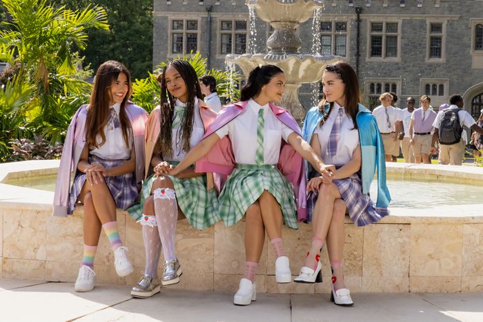
Embedded within the film’s palm-tree-littered Miami backdrop is a well of obvious homages to teen-movie nostalgia — from the posh plaid uniforms that evoke Cher and Dionne’s stylish ensembles in Clueless to Sarah Michelle Gellar’s presence as a headmaster in Cruel Intentions — and a Gen Z–friendly soundtrack that includes Olivia Rodrigo, Muna, and Billie Eilish.
Writer-director Jennifer Kaytin Robinson — the mastermind behind the buddy-comedy rom-com Someone Great and the canceled-too-soon TV series Sweet/Vicious — channeled a ton of deep cinematic and style references along with easier-to-spot visual tributes to rom-com classics. Here, she walks us through her inspirations in her own words.
The style: Winona Ryder grunge meets Fran Fine couture.
I didn’t want to chase trends. It was way more about interrogating Clueless and Cruel Intentions and the movies that inspired me. Where did those movies take inspiration from? The costumes weren’t necessarily inspired by those films. Drea’s were inspired by ’90s runways. And Eleanor was always meant to kind of evolve through the three acts of the film, so she starts with ’90s grunge and young Drew Barrymore in terms of her “before” look. Winona Ryder was another one with that very “deconstructed but constructed” look with the rocker tees, the backward hat — that effortless anti-Establishment feeling is what we really wanted Eleanor to have. When Drea made her over, it was very important to me and Alana Morshead, the costume designer, that Drea didn’t just make Eleanor into Drea. Drea is smarter than that, so she made her into the version of Eleanor that would entice Max and Max’s group. We took a lot of inspiration from ’70s mod, but the idea was always to make Eleanor a Twiggy-style Warhol girl. For the end of the film, because Eleanor had the three-act character-arc structure more than Drea, it was about creating a “femme fatale.” So what is the Do Revenge version of that? I looked at Sharon Stone in Basic Instinct. I looked at a lot of those really fun, heightened ’90s femme fatales and wanted Eleanor to live in that space but to also always feel like she was never losing her queer identity.
The other thing from which I took a lot of inspiration for Drea was The Nanny. There’s this Instagram for all of Fran Fine’s costumes, and she wore a ton of couture. That was something that I personally drew inspiration from in terms of how alive Fran Fine feels but also how it always feels very true to her. I wanted Drea to feel the same way: really high fashion, but I also wanted it to feel like, Is it couture, or did she make it herself?
The setting: Out of Sight in The Birdcage’s Miami
Two films that were very influential for myself and production designer Hillary Gertler were Out of Sight and The Birdcage. They’re such textured Miami films. They never felt like sets. For me, details are everything. Each of the homes in the film is filled with very specific details for the characters. With The Birdcage, the comedic story is told through Armand’s apartment above the nightclub, and there’s so much storytelling done through the way that space changes. So I was not only inspired by the aesthetic but also by the way in which the spaces continue to tell the story.
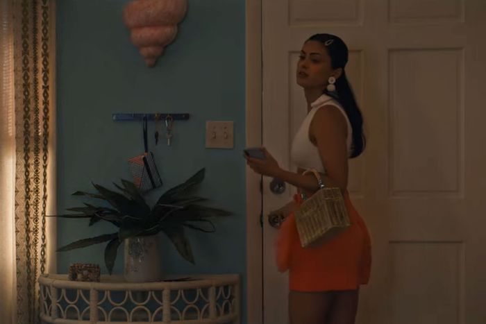
The thing we took from Out of Sight was the way Soderbergh and the production designer worked with Miami Deco and color to create a space that feels like it’s out of time. Eleanor’s and Max’s houses don’t make sense for that. But Drea’s house is something that has been in South Miami for years and hasn’t really been touched. Her mom has probably lived there forever. We wanted Drea’s house to become a little bit spooky for the Eleanor reveal. I wanted to play with shafts of light and how that bright, beautiful home morphs into this dark, almost scary place when Eleanor shows up in Drea’s living room after the reveal. So we copied the smoky windows from Catherine Keener’s apartment in Out of Sight and put them into Drea’s apartment. There’s literally a direct lift into our film.
The look: “Like John Hughes fucked Wes Anderson.”
In terms of direct inspiration, that first shot of The Birdcage, where the camera goes over the water into the club, is such a beautiful way to kind of take you into a world, and I knew that was how I wanted to take us into the story after the Drea prologue. I see the first ten minutes of Do Revenge as a prologue, and when we smash to the water after Drea says, “Peaking in high school is cringe anyway,” that’s when the movie really starts for me. I went to the DP and I was like, “I want to re-create this shot.” It’s a mix of practical helicopter over the water and, once the camera lifts and starts to push toward the bridge, a fully CG shot when we go into Eleanor’s car. That bridge is entirely CG.
Wes Anderson is obviously the king of the symmetrical wide shot. The look of his films really inspired me in how I approached shooting. I wanted every frame to feel like a painting or a picture. I wanted the world to feel intentionally beautiful and perfect — and to juxtapose the duplicity of the characters. Like, we’re giving you this really pretty picture, but if you look beneath the surface, all is not what it seems. When one of my executives from Netflix watched the movie, he said, “It was like John Hughes fucked Wes Anderson,” which I loved. But that was exactly what I was going for: somewhere in between the melancholic beauty of John Hughes and that Wes Anderson, “of a different time” style of filmmaking and Amy Heckerling mixed in there. All of these directors very directly influenced the look of the film, to the point that we used anamorphic lenses. Those lenses, especially old ones, can distort the picture, and I wanted it to feel really crisp, beautiful, and clean. We found these newer anamorphic lenses that could lend themselves to achieving that “Wes Anderson look,” pushing the vibrancy and color without distorting the image.
The twists: More than just the usual suspects.
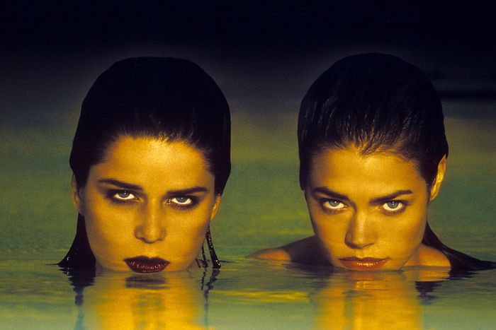
Wild Things is another Miami film with an insane amount of twists. But the thing about that movie that really helped me create Do Revenge is how it sets up the tone so well that when you get to all of the twists, you buy them. Wild Things does that really well even as it continues to turn in on itself — way more times than I would say Do Revenge does. The other thing I watched that helped less with building the story than it did with building Maya’s performance was The Usual Suspects. I think Eleanor is definitely a bit of a Keyser in that she’s an unassuming beta and a completely unreliable narrator. For me, it was about building a film that you could watch again and it would be completely different once you understood what was going on. Fight Club also helped, seeing how they threaded the needle. Again, very different story, different twist and reveal. But I love the subtle ways in which Fincher builds the twist and seeds little bits and pieces so that if and when you rewatch the movie, you’re able to experience it in a different way.
The voice-over: Think Tracy Flick in plaid and pastels.
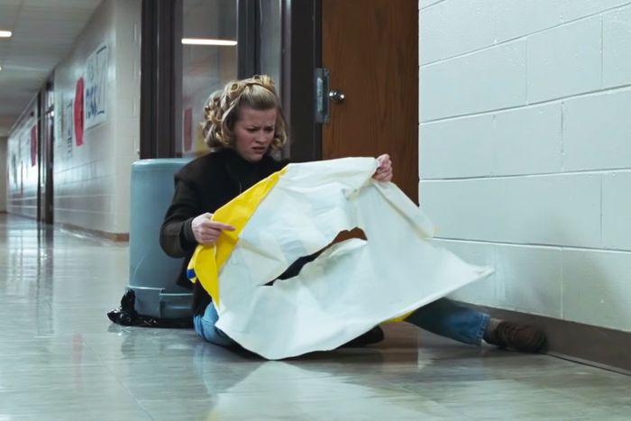
We didn’t shoot the movie thinking there’d be voice-over, but when I got into the edit, I felt like we needed to have a deeper connection to not just Eleanor but Eleanor and Drea. I wanted to be inside their heads more. A film that did a really good job of that was Election. I heard — and maybe this is Hollywood lore that isn’t actually true — that Election also created its voice-over in the edit for this exact reason. What I loved is the way that film uses its voice-over to push the comedy and make you feel close to the characters while also ominously teasing that the story isn’t going to end well. They make subtle remarks hinting that this has already happened and they’ve already learned the lesson. It adds a little bit of uneasiness to the story.
Easter egg: Hitchcock on the tennis court.
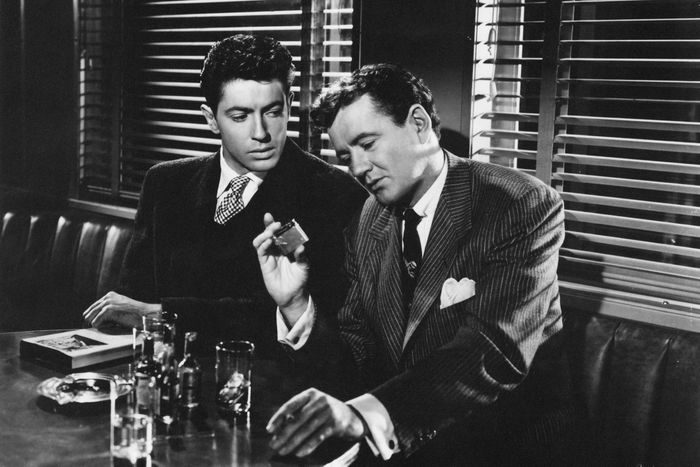
There are obviously a lot of teen-movie threads, but there are a lot of Strangers on a Train references throughout too. My co-writer, Celeste Ballard, had the idea of having Eleanor and Drea meet at tennis camp as a nod to Guy Haines, one of the main characters in Strangers on a Train, who is a tennis player. Hillary Gurtler, the production designer, took that one step further, so the tennis camp is called Guy Haines Club and Court. There are no trains in Miami, so we figured out this conceit where Eleanor drives Drea home from tennis camp. In Strangers on a Train, the characters meet, hatch this plan, and talk about their lives on a train, so we wanted our scene to be set in a moving vehicle.
The party: Glamorous enough to impress Jay Gatsby and Marie Antoinette.
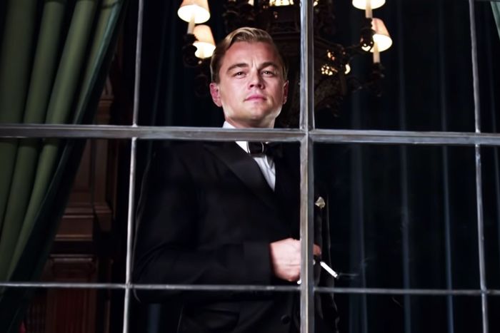
The light tunnel that the girls travel down before they get into the admissions party was our Do Revenge version of the “Tunnel of Love” scene from Strangers on a Train. I watched Baz Luhrmann’s The Great Gatsby when we were leading into the admissions party because I didn’t want it to feel like a high-school party you had seen before. I wanted to feel very bacchanalian and debaucherous but incredibly glamorous. Gatsby, to me, felt like the best encapsulation of what I wanted to put onscreen. So we have the witch room and we have that beautiful cloud room with all of these beautiful different-colored lights in them. Another movie that inspired me for the admission party was Sofia Coppola’s Marie Antoinette. I wanted it to be dripping with opulence but in a very candy-coated, glittery way.
This interview has been edited and condensed.


