All art is an act of translation. Consider how Henri Matisse translated one thing into something totally different and changed art history. In 1903, the 33-year-old Frenchman spied a piece of cloth in a Paris shop window while sat atop a horse-drawn bus. This was a textile with blue leaves and flower baskets on a pale background. The toile de Jouy, a fabric design based on 18th- and 19th-century motifs, became part of the collection of fabrics inspiring his works ÔÇö kimonos, feathered hats, Algerian rugs. Some of his greatest early masterpieces feature the toile de Jouy. In Still Life With Blue Tablecloth (1909), it is draped in such a way that it is both tablecloth and wallpaper, forming a nearly unbroken background that is one of the great hallucinations in all painting.
MatisseÔÇÖs translation of the details of the source material, the way its pattern seems to explode across the canvas and nestle the objects on the table, is alive. He said that observation is ÔÇ£constructed from a convergence of forces that has nothing to do with the direct copyingÔÇØ of what is being looked at. Thus this plain abstract decorative fabric helped him rupture the fabric of art history.
Like Matisse, the 59-year-old artist Marlon Mullen is concerned with how the act of looking transforms sources into new visions. These sources include old art magazines, ads for gallery exhibitions, and picture books. Mullen sees in a highly abstracted, enveloping way, rendering a recognizable form like a magazine cover into something even flatter, a two-dimensional topological anomaly, almost alien. Shapes liquify, wobble, and congeal into new configurations whose connection to the original object is almost unrecognizable. All these different things become refracted through the prism of his sensibility; they become his.
Mullen is autistic and nonspeaking. I met him once; he had the quiet intensity of the Rock of Gibraltar. Since the 1990s, he has worked under the auspices of NIAD, a great program for people with developmental disabilities. After being identified in 2011 by curators Lawrence Rinder and Matthew Higgs, he has appeared in shows all over the globe and, in 2019, shined in the Whitney Biennial. In his current show at JTT gallery, we see figurative works with elements mutating into amorphous arrangements and also nearly pure abstractions that are vaguely recognizable. There is a constant push and pull between known and unknown.
In the same way that Matisse stretched the physics of his piece of fabric, Mullen enlarges or shrinks what he sees, melts edges, leaves out horizons. Some paintings look like cloud configurations; others are oceans floating with intricate fragments and bits of text. It is remarkable that so many of these images are based on the covers of Artforum and Art in America. Art magazines are such sexy, shiny objects, fetishizing both art and artists. Mullen subverts their glossy appeal and in so doing reconstructs their content.
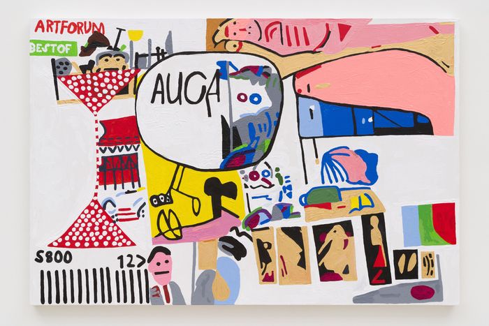
Consider a painting based on an ArtforumÔÇÖs ÔÇ£Best of 2003ÔÇØ issue, which had 17 small pictures in an uneven grid. In the upper left-hand corner of the painting, we read the shrunken, elongated word ÔÇ£ARTFORUMÔÇØ and the phrase ÔÇ£BEST OF.ÔÇØ The lower left corner is an exaggerated barcode like a crosswalk with an ÔÇ£$8.00ÔÇØ price tag. In the warped grid we spot a flesh-colored form that represents Jenny SavilleÔÇÖs portrait on that spot of the magazineÔÇÖs cover. On the lower right thereÔÇÖs a horizontal set of rectangles in semi-perspective that might be the photo of the Picabia show on the cover.
In another painting, MullenÔÇÖs source image came as a shock to me. (The gallery hands out a selection of source images for anyone who asks.) Mullen gives us a thick geometric abstraction: a horizontal gray rectangular band beneath three vertical rectangles. It looks like a 1970s post-minimalist reduction. The image turns out to be a magazine article on film displaying four photographs. In eliminating the text, Mullen turns things on their side.
The best painting here looks like a kind of hammerhead on a torso. The words ÔÇ£ARTnewsÔÇØ tip us off that this is a magazine. As with most of MullenÔÇÖs work, his palette is highly colored, with rivulets and ridges of creamy surface, almost Pop-inflected. The source is a de Kooning portrait of a seated woman. You can make out the head and hair, the yellow dress, and a flesh-colored chair.
Mullen crawls inside art-world advertising and translates it ÔÇö without the lionizing, fame, or money implied in these vehicles of information culture. He strips away the propaganda. In his hypersensitive way, he renders the secret visual regions found in these objects. His art pulls reality apart and puts it back together again, so it feels like he has set us down in a different place. As with all great acts of translation, MullenÔÇÖs methods may be unknowable to us. But his optical world is a magnifying glass of internal experiences as finely focused and original as any artistÔÇÖs.

