Much praise has been lavished upon the swoon-worthy mod-style costumes and graceful production design of the Netflix miniseries The Queen’s Gambit. But its cinematography was no less instrumental in fashioning the sophisticated feel of the show, which navigates the 1950s and ’60s as the story’s fictional heroine Elizabeth Harmon (Anya Taylor-Joy) — a brilliant yet self-destructive chess prodigy raised in an orphanage — rises to international fame.
Reuniting with director Scott Frank after Netflix’s Godless, cinematographer Steven Meizler says his visual sensibilities align with Frank’s in any project they embark on together. For the wildly popular miniseries adapted from Walter Tevis’s 1983 novel, the duo were artistically in sync from the start, agreeing on Jonathan Glazer’s Birth as a visual road map of sorts. Indeed, Birth’s austere, smooth, otherworldly textures, lensed by the late DP Harris Savides, were highly influential on their work. And so was the tense way that film telegraphed the strangeness of Nicole Kidman’s character, a quality they tried to emulate.
While the tale spans the globe, most of The Queen’s Gambit was shot in Berlin, with the exception of some suburban exteriors that were filmed in Toronto and Cambridge. The crew used Red Ranger cameras and Zeiss Supreme lenses for nearly everything apart from a 16-mm segment — a reel on the fictional Russian grandmaster Borgov, Beth’s eventual chess opponent. Operating the A Camera himself (“operating it calms me down,” he says), Meizler took great care in preserving the show’s elegant cinematic identity throughout, allowing the characters to evolve organically within the frame.
Here are the moves he used to pull it off.
Let Beth’s perspective and headspace inform compositions.
Everything in The Queen’s Gambit honors Beth’s point of view. “The story lent itself to this [visual quality] since this character is on the outside. We [often] see what she sees, then come back to her close-up,” Meizler explains.
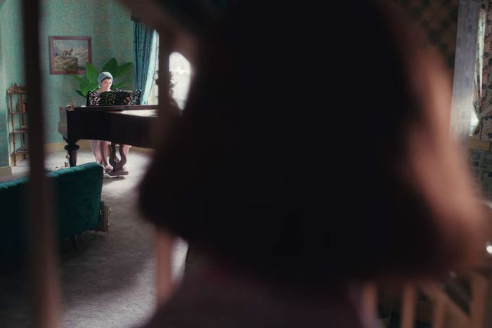
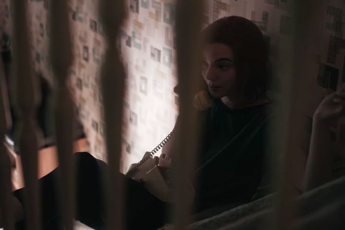
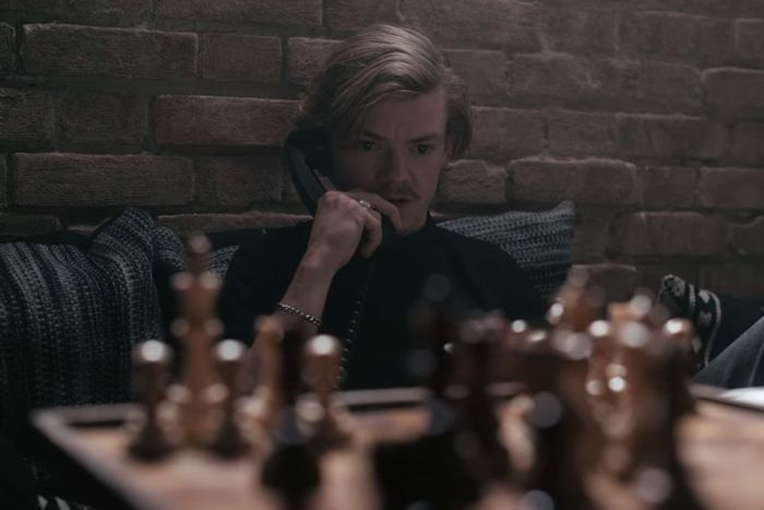
An expressive instance of Beth’s perspective is seen in episode two, “Exchanges,” as she sits on the staircase of her adoptive home and converses with her mom, Alma Wheatley (Marielle Heller), who plays the piano in the distance. “They each have something between them. You see a yearning to get closer. Our production designer Uli Hanisch built a mini three-dimensional set and I tried to get [that shot] with my iPhone,” Meizler recalls. “We wanted that specific angle of [Beth] looking at the piano, which is Alma’s [emotional] wall. And the staircase [is Beth’s].” In episode seven, “End Game,” the staircase motif returns while Beth sits behind the same railing and has a phone argument with her chess opponent turned ally Benny (Thomas Brodie-Sangster), with the young man positioned behind a chess board. “That [symmetry] was intentional. They’re both in a prison of stubbornness.”
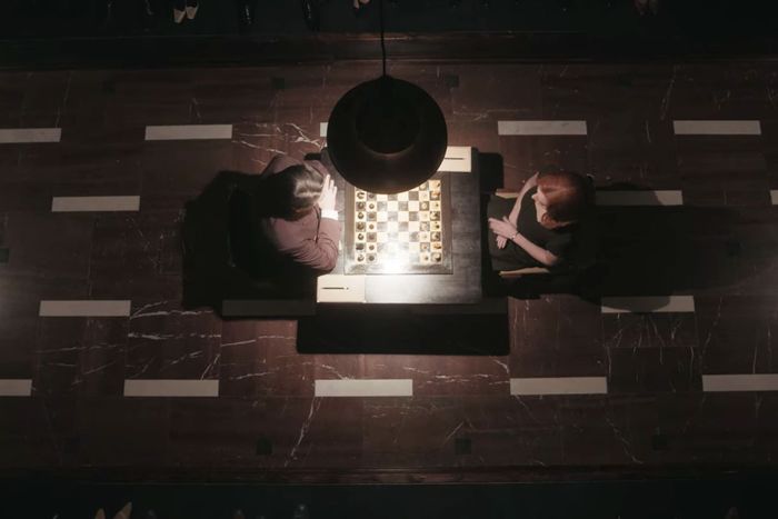
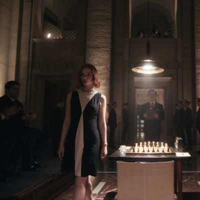
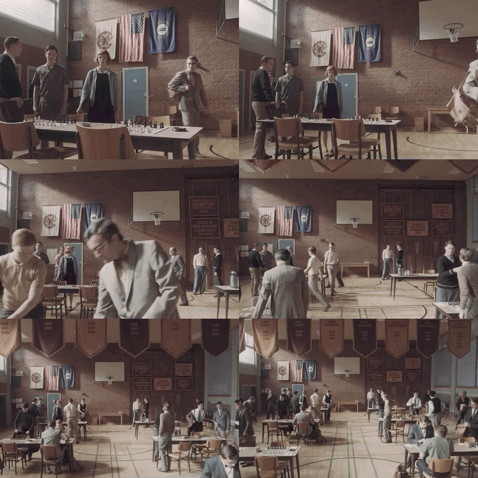
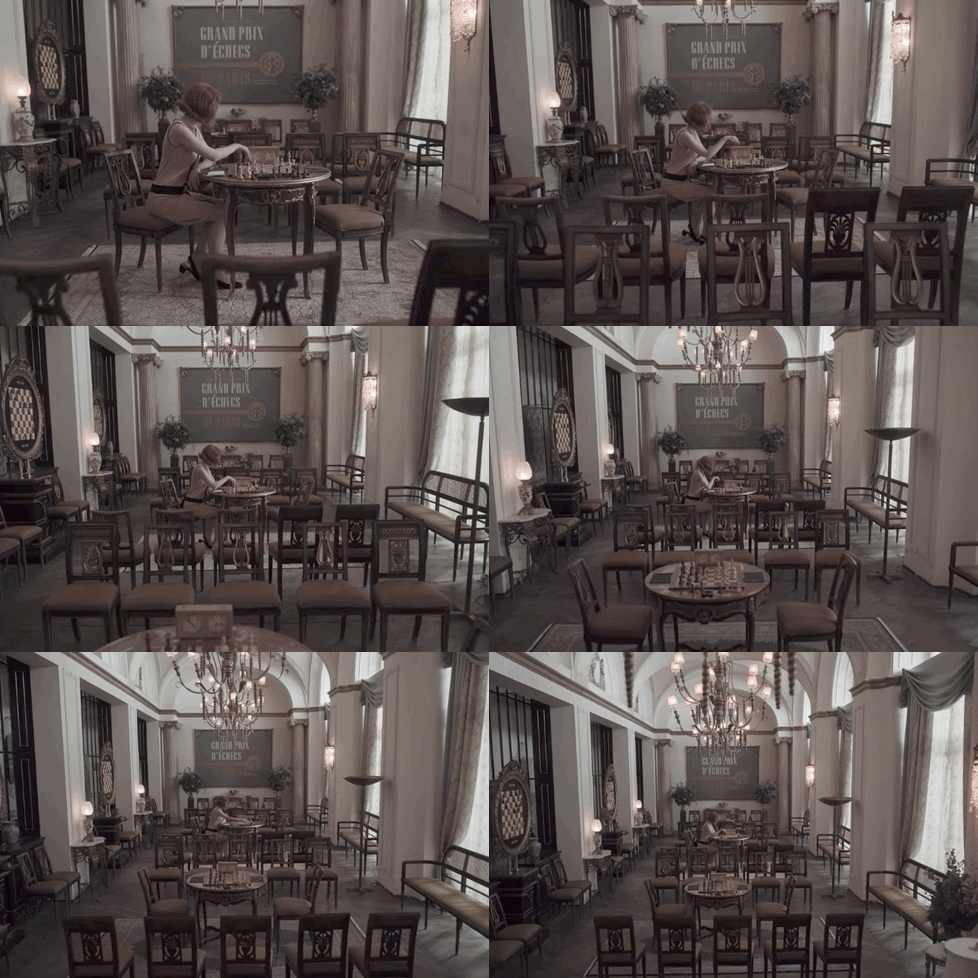
As recurring patterns of perspective go, Meizler is particularly fond of one in “Adjournment,” the series’ sixth episode. “After a [successful] match, [Beth] looks at the chess board and we pull back on the camera, [revealing] a chandelier at the top of the frame. It’s similar to the shot where she first walks into the high school in episode two, and we dolly back the same way through all the chess boards, [revealing] banners at the top. It’s a nice reflection of her journey.”
Demonstrate Beth’s progression through immersive long takes.
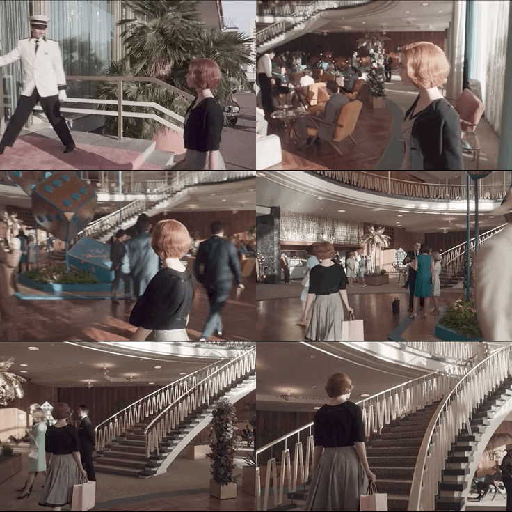
Instead of interrupting the action with frequent cuts, The Queen’s Gambit favors thoughtful long takes, particularly when Beth makes a poised entrance or exit. “Anya is into dance, so she brought a rhythm along,” Meizler says, discussing a glorious one-take sequence in episode three, “Doubled Pawns,” when Beth enters the Vegas hotel she’ll play chess at. The inspiration for it came from an unusual place: Full Metal Jacket’s “These Boots Were Made for Walking” scene. “It’s an empty frame of Vietnam, a woman walks into it, we follow her. We mimicked that a bit.”
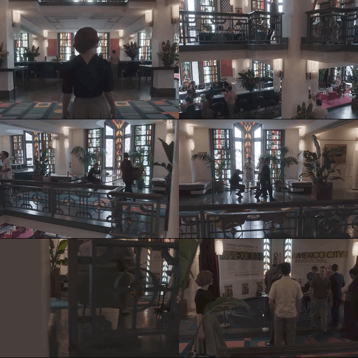
In episode four, “Middle Game,” Meizler similarly chose to film Beth’s entrance into the Mexico City hotel in an unbroken take. “That was tricky technically because we used a 50-foot Technocrane. We had to break it apart to bring it into the bottom floor. The bucket of the crane was just inches away from hitting, but it seems like an effortless shot.”
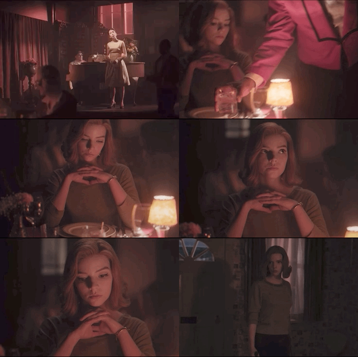
Another noteworthy long take was a relatively pensive one in episode six, “Adjournment,” following Beth as she enters a hotel bar and orders a Gibson. “It was all one shot: bringing her in, panning to the bar, the singer, the waiter … A quiet shot of such emotional resonance, [followed by] a great cut to her smashing through the door drunk, [realizing] the destruction she will go through.”
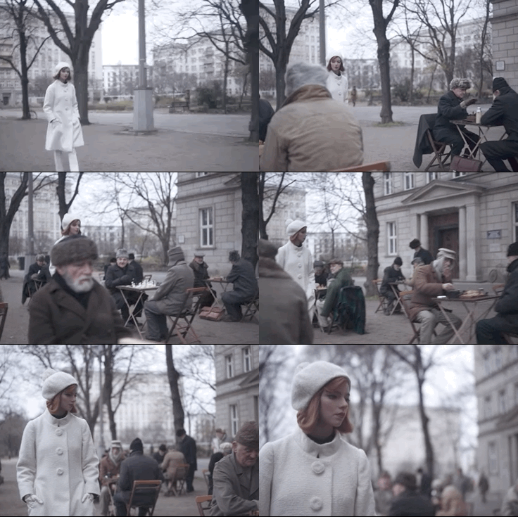
Beth concludes her triumphant journey on a mature note in “End Game,” as she exits the car and walks toward a public park of chess players in Moscow. Meizler went with a handheld camera there to emphasize Beth’s newfound sense of self, with the final scene of Pawel Pawlikowski’s Ida (featuring a similar walk) top of mind as a guide. “It became such a grounded walk. The handheld elevated [her] connection with the camera.”
Mirror German Expressionism through light and shadow contrasts.
“Something magical, but still rooted in reality,” Meizler describes the way The Queen’s Gambit echoes the early 20th-century movement, one of the first things he and Frank discussed as a visual palette. Consequently, the play between radiance and darkness is distinctly noticeable throughout the series: starting from Beth’s orphanage ward (built in a high-school auditorium) and the yellow-tinted basement where she learns chess from the school janitor Mr. Shaibel (Bill Camp), all the way to the nighttime scenes in Moscow.
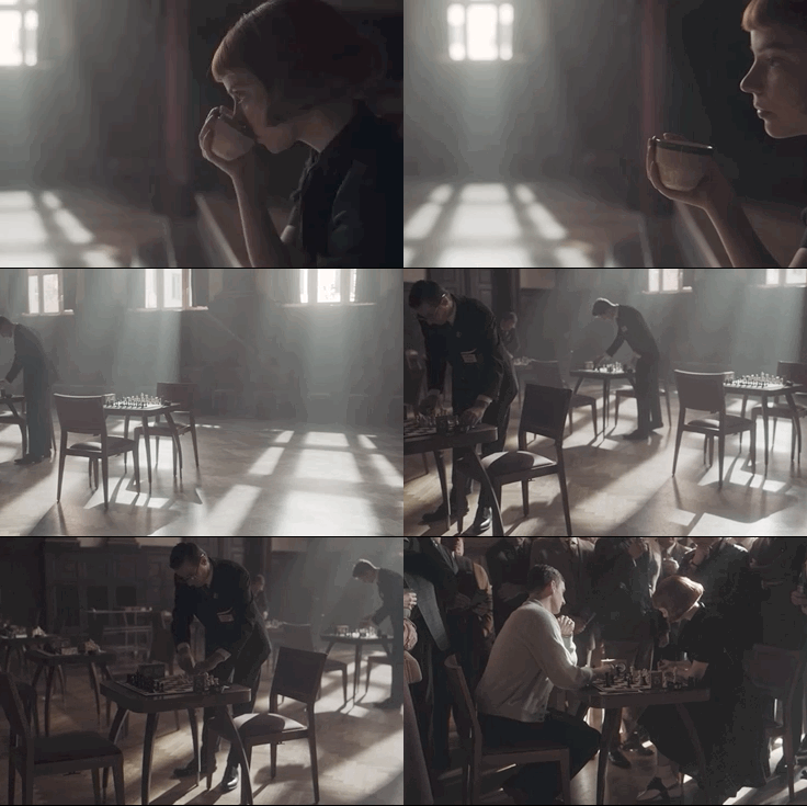
But winter in Berlin didn’t provide ample opportunities to capture natural light, something Meizler aimed for when possible. Illuminating grand halls with high ceilings and large windows presented an especially complicated challenge. But Meizler and his gaffer Sascha Wolfram overcame this by setting up multiple 18K lights on Condors outside, like they did in “Doubled Pawns” for the Cincinnati chess scenes. “We push inside to her profile. Then [the camera] pans around and does a time lapse to her playing,” Meizler notes about the shot that captures multiple sunbeams in the hall, obliquely resembling Hal Morey’s Grand Central Station photograph. “Or the Grand Central scene in The Fisher King,” he adds. “The one ray of light going a different way is the actual sun. And luckily they let me have smoke in there.”
When the time came for Beth’s closing Moscow-based matches in “End Game,” Meizler and his team decided to simplify their moves, making a conscious choice not to bring in additional lights to the set, relying on the overheads above the chess tables instead. “That specific light is so different on how it reacts on a male versus a female face. The graceful way she [embraces it] is a testament to Anya.”
Make chess look dynamic and interesting.
In a conversation with Vulture, chess author and coach Bruce Pandolfini and The Queen’s Gambit editor Michelle Tesoro already shared valuable insights into how the series made chess look believable and exciting. That task was also shouldered by an initially intimidated Meizler. “It was the most difficult challenge heading in, the one I was most afraid of. Scott and I spent a good part of the prep trying to figure out [how] to approach each tournament with a [unique] personality,” he remembers. Edward Zwick’s Bobby Fischer biopic Pawn Sacrifice was eye-opening for the duo — they realized one doesn’t have to see the chess board constantly. So they decided to emphasize deliberation, triumph, and defeat via the characters’ faces. “That’s where you can really create tension. It’s nice to know what’s going on in the chess and to get the camera on a level with the pieces with interesting angles. But the visual language we set up was [all about] getting into [Beth’s] head, especially against all these men she’s beating. That in itself was interesting.”
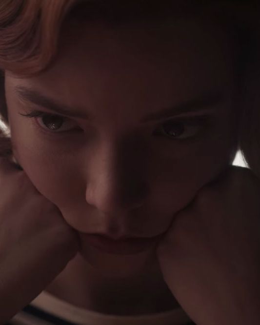
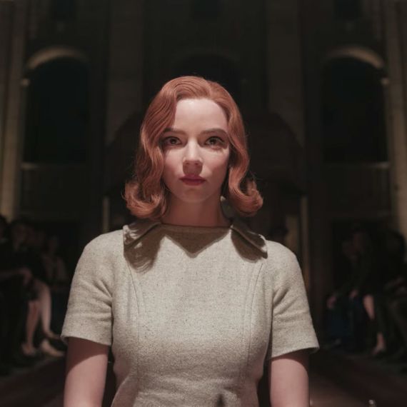
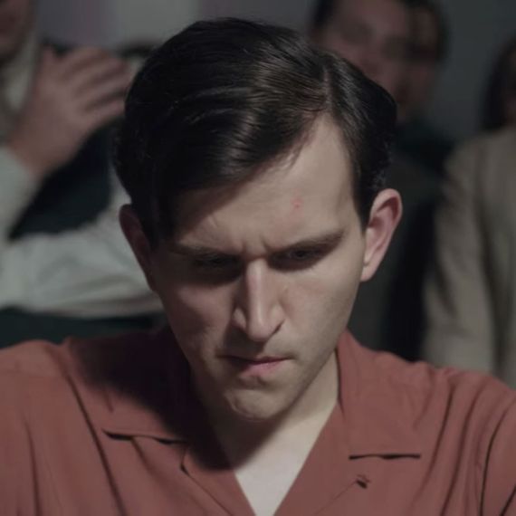
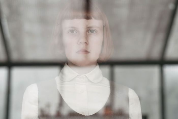
Above all, Meizler credits Taylor-Joy’s thrilling performance and deeply expressive face as vessels of Beth’s POV. “She has a very intense stare, it’s kind of daunting. With any angle, it’s something captivating she [conveys] without saying anything.”
Embrace happy accidents.
When something doesn’t work out exactly as planned, there might be a silver lining. And Meizler simply lives for those serendipitous surprises. “It’s more about leaning in and accepting them. In any project, you want to go in prepared. Then when you get to the set, you can open yourself up to these accidents and say, ‘This is going to be the shot.’ You have to do that on the go. That’s the exciting part of it.”
He recalls a moment in episode one, “Openings,” when young Beth longingly looks into the pharmacy cabinet of tranquilizers she’s become addicted to, with a cross appearing over her face. Turns out, that spiritually loaded image was a happy accident. “I’m always looking for the best place to put the camera to tell the story. And that was the right place.”
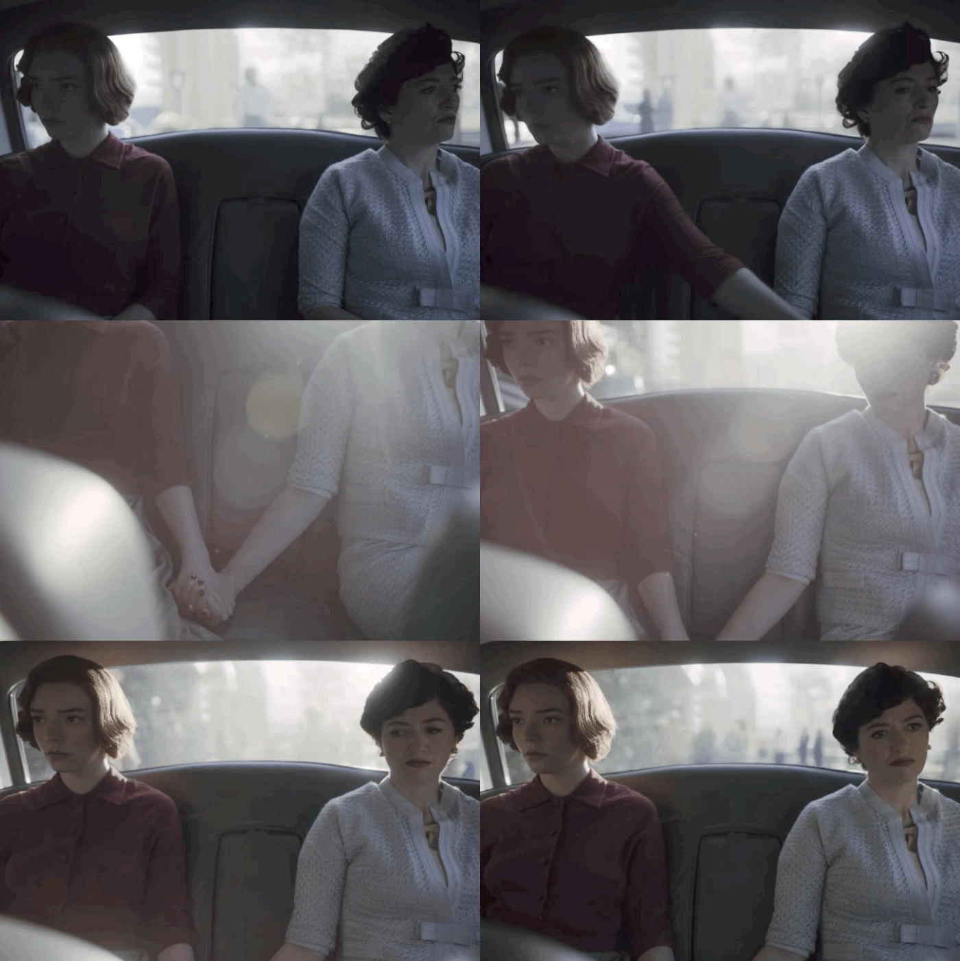
Another fortuitous choice resulted in one of Meizler’s favorite shots in the entire series. In the last scene of “Doubled Pawns,” we follow Beth and Alma on the backseat of a car where Beth reaches for her mom’s hand in an abruptly rousing manner. “I was in the front seat operating the camera. It tilted down to their hands and [we had] that flare at the end. I got emotional seeing it happen. I knew where the sun was going to be. I knew there was a chance. Still, that doesn’t always happen. But it magically did.”
Be unified with all other visual crafts.
Frank was all about cohesiveness across the departments. To help set the tone of the series, Hanisch prepared a color book for the team early on, which Meizler and costume designer Gabriele Binder worked off. Everyone was on the same page about the general lack of color in episode one (with the exception of Beth’s distinct red hair) as well as the vivid, Douglas Sirk-ian interiors of the Wheatley home later on, with eye-popping, heavily patterned furniture and wallpaper. “It’s really hard to find 1950s and ’60s American props in Germany,” Meizler says. “So it [was] interesting to get a German perspective of America; a parallel that really worked for me — [not exactly] a reality, [but the way] Beth sees things in her mind. It is just a bit different because she’s a bit off.”
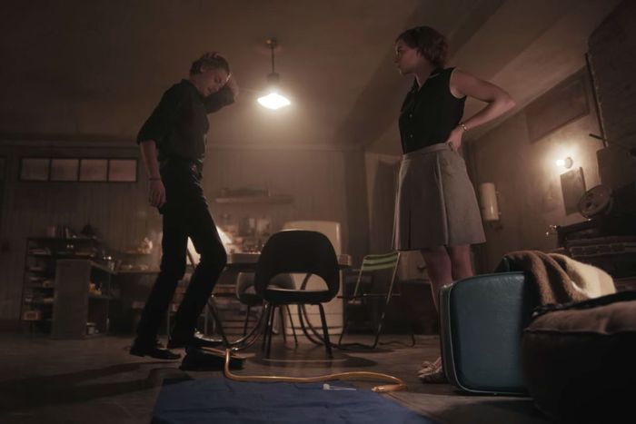
Among the most notable interplays of cinematography and production design unexpectedly happened in Benny’s New York apartment, which Hanisch built in the same high-school auditorium as the ward. Oddly enough, that particular location had a tilt to it, so the whole apartment was on an incline. “I was doing complicated shots and it was very hard to keep all the dolly tracks straight. But I have to admit, that also lent itself to something which goes back to German Expressionism and The Cabinet of Dr. Caligari. There’s not a straight angle in that film, which is a fascinating [parallel].”


