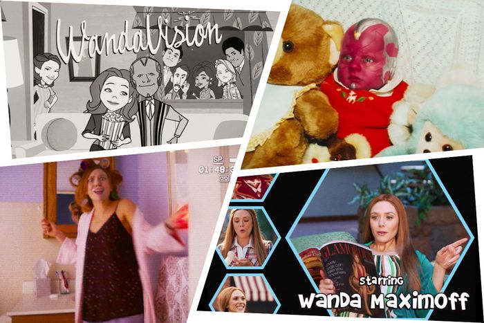
Our current golden age of TV is also a golden age of TV title sequences. From the overlapping moody silhouettes of True Detective to the dripping wax-figure goop of Daredevil, from the board-game relief maps of Game of Thrones to the neon hues of the synth-drenched Stranger Things, splashy, expensive-looking title sequences have become an expected element of high-profile series. It’s somewhat ironic, then, that Disney and Marvel’s enormously popular new marquee superhero series WandaVision not only forgoes the fancy, ultra-sophisticated title treatment trend, it completely upends it, with a series-long celebration of outdated titles from television’s less prestigious past.
Series showrunner Jac Schaeffer and director Matt Shakman have put a tremendous amount of effort into making WandaVision look, sound, and feel like sitcom history, as Elizabeth Olsen’s Wanda Maximoff deals with her grief by meticulously imagining a better life for herself that borrows from life on the tube. To that end, Shakman staged, shot, and edited each episode of WandaVision to resemble the shows of a particular era of American TV sitcoms, beginning with The Dick Van Dyke Show and I Love Lucy in the 1950s and continuing through to Modern Family as we converge on the present day.
The recreations are meticulous, and resemble their eras down to the smallest detail. The finishing touch — and one of the most strictly delightful elements of WandaVision — is every show-within-the-show’s title sequence, each replete with its own catchy theme song. “I’m so proud of all of them,” Shakman says of this string of standout opening titles, in an interview on Zoom a few days before the release of the show’s much-anticipated season finale. “They make me so happy.” The results are the product of an incredible amount of technical diligence and creative process, which Shakman walked us through, episode by episode.
“Filmed Before a Live Studio Audience”
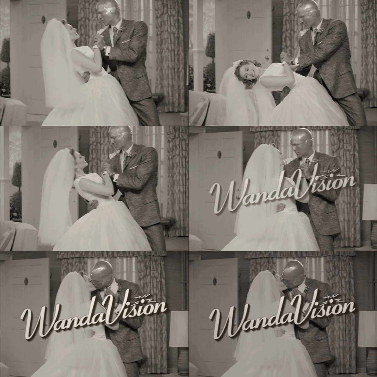
WandaVision’s series premiere established its unusual stylistic template right away, faithfully emulating the look of classic postwar American sitcoms by shooting on a studio sound stage in black and white and in a conventionally boxy 4:3 aspect ratio. It also introduced the running convention of the period-specific title sequence, using its throwback credits to prove the show’s commitment to the bit. Giving each episode its own unique title sequence was part of the plan from the very beginning, Shakman explains. “That was decided before I even joined the project. Jac and her amazing team of writers knew that there should be title sequences that would go along with each era of sitcom,” he says.
The style and scope of each title sequence was dreamed up well in advance: The show’s writers actually wrote their own versions of what these sequences might look like into the original scripts, brainstorming ideas for the period credits and matching theme songs. “Once I joined I realized we needed to get a songwriting team in to create those,” Shakman says. “I knew Bobby Lopez from college — he’s an old friend, and we used to work together on stuff back in our theater days. So I reached out to him and his amazing wife, Kristen Anderson-Lopez. That’s how we got them onboard.” Robert Lopez and Kristen Anderson-Lopez, the Oscar-winning team who also wrote songs for Disney’s Frozen and Coco, wrote all of the theme music for the series.
“Don’t Touch That Dial”
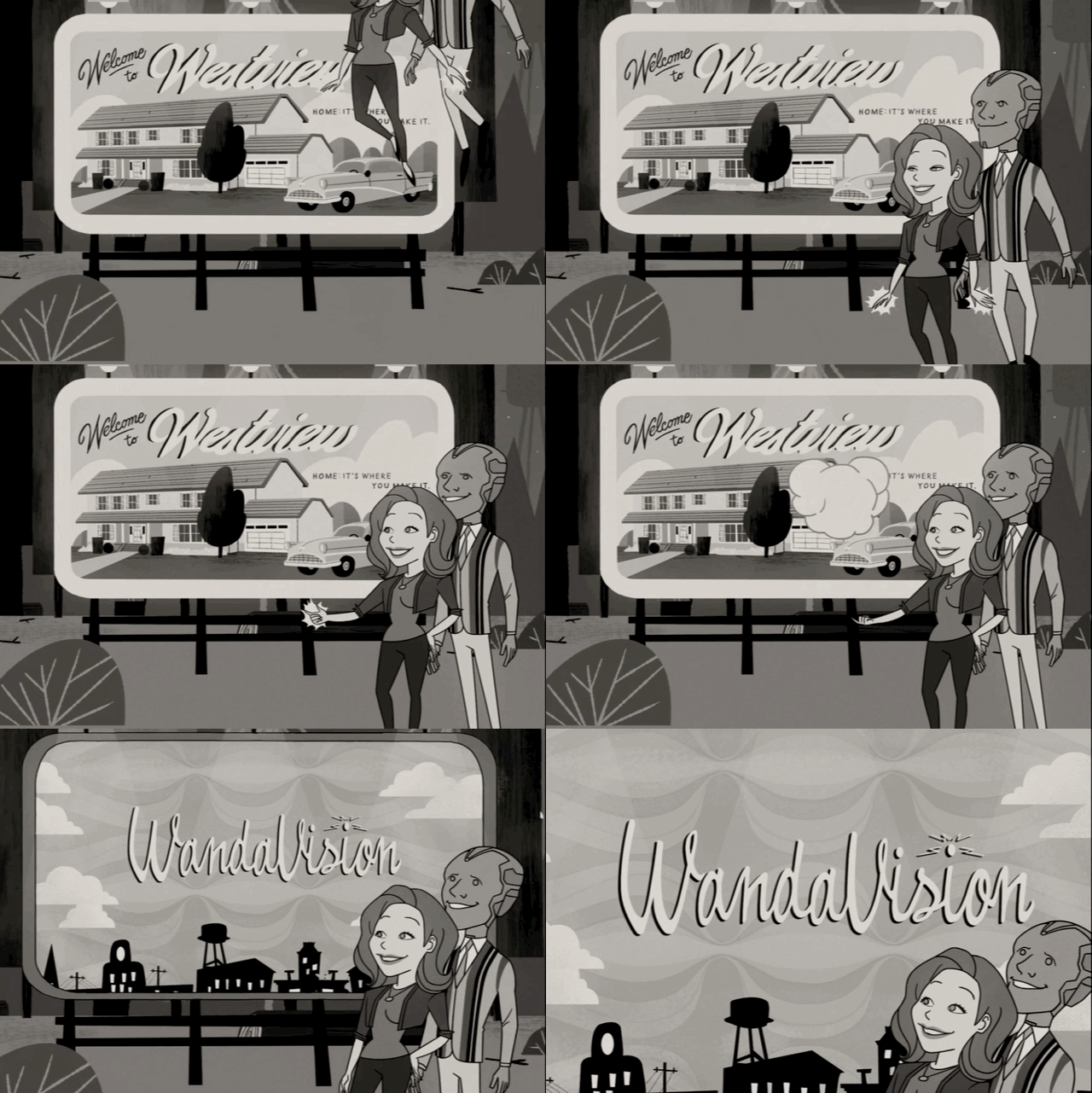
The second episode of WandaVision moves ahead about a decade, leaving behind the 1950s to imitate some of the more fantastical sitcoms from the 1960s, especially Bewitched and I Dream of Jeannie. The opening titles are modeled on the former’s iconic animated credits, showing Wanda and Vision going through the motions of comic marital bliss as a full-blown two-minute cartoon. To pull off this animated coup, Shakman commissioned Titmouse Inc., a boutique animation studio based in Vancouver primarily known for working in the short-form children’s animation space.
For the episode’s titles, they were “obviously riffing on Bewitched and stuff,” Shakman says. Getting it right was a long-term process that involved a great deal of back-and-forth collaboration. “We built that opening sequence first in the writing, and then met with Titmouse to figure out exactly what we wanted, beat by beat, to begin with. We had a bunch of ideas to pitch them, and then they started storyboarding it. We revised it, and then once we got into post-production I kept working with them to fine-tune it all the way through to the end. It changed and evolved a lot over time.”
“Now in Color”
When WandaVision enters the 1970s, the show makes the leap from black-and-white to living color, as Wanda and Vision prepare to welcome twins in a groovy riff on the era’s family-friendly network staples, such as Good Times, The Partridge Family, The Mary Tyler Moore Show, and, of course, The Brady Bunch.
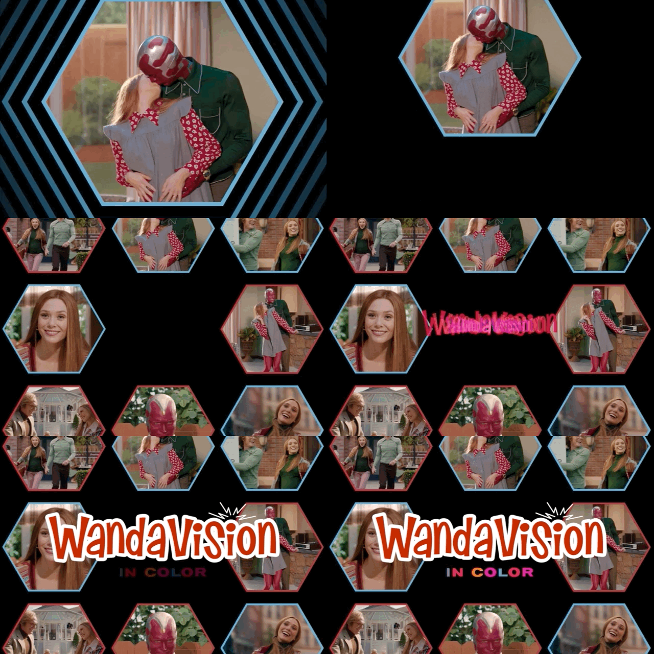
In keeping with the familiar Brady spirit, the writers considered a title sequence that would relegate the cast to a series of interlocking Brady-style boxes, but they couldn’t quite get it to fit. “There aren’t a whole bunch of kiddos in the family in episode three, so the boxes that were designed for The Brady Bunch didn’t make sense for us in our world,” Shakman says. “So instead we came up with our version that was a little bit Mary Tyler Moore, a little bit Brady Bunch, and some of our invention too.”
The sequence does culminate in a series of hexagonal boxes, each showing a still from a scene from the show. But where a real ’70s sitcom might draw those stills from actual scenes from the series, Shakman and his team had to manufacture them from scratch. “It meant that new period costumes had to be made, new locations had to be found, hair and makeup had to be done, and the actors had to be brought in,” he says. “There’s so much work that goes into those titles, but we knew that they were a key part of the storytelling, and we knew we had to get them right — it wasn’t something we could just toss off.”
“On a Very Special Episode …”
WandaVision’s fifth-episode foray into the sitcoms and family dramas of the 1980s and early 1990s had a special place in Shakman’s heart — because as a child actor, Shakman was actually in a lot of the shows of the era, including The Facts of Life and a Growing Pains spinoff called Just the Ten of Us. “That was the easiest one, because I used to be a kid actor in those shows,” he says. The whole creative team, including the Lopezes and Schaeffer, grew up watching those shows, too. “We had so many common references for that. It’s just in our DNA.”
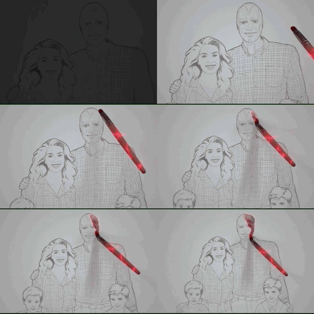
The title sequence begins with a clear reference: an illustration of the family being elaborately painted, exactly like Family Ties. “We had illustrators draw the picture, but what we really wanted to do was copy how the Family Ties portrait is done, which when you watch it you can tell was not actually a line drawing, but has been made from a photograph. The painting at the end is a photograph that’s just had, like, a paint application done on top of it.” Naturally, Shakman followed suit. “It was important to us to capture that vibe. So we took photos of the family, created a line drawing from that, and then we created the final painting from the line drawing from the photograph and filmed it.”
But it’s not just Family Ties. A couple of shots in the sequence — a crane shot pulling away from the family, and a shot of the camera running through the park toward them as they run by — are direct homages to Full House. “We wanted the homage to Full House both because it’s a great show of that era, but also because of Lizzie’s connection to it from her sisters [Mary-Kate and Ashley],” he explains. The crane itself is a basic tool on big-budget Marvel blockbusters, but not so much on sitcoms. But they had to have the crane for this, Shakman says, “because they had it on Full House!”
And finally, there are the photographs: baby pictures shown in montage, in keeping with the family feel of the era. The pics of young Wanda are real snaps of Olsen, but the photos of Baby Vision are another story. “We were struggling to find pictures to turn into Baby Vision, but Scott McPhate, one of our VFX coordinators, has kind of a Paul Bettany-ish look,” Shakman says. “He offered, sweetly, some of his baby pictures, and they were perfect.” When he first got the temp VFX mocked up for them, he remembers, he lost it. “I just laughed and laughed and laughed, seeing the Baby Vision shots. I showed them to everyone on set on my phone.”
“All New Halloween Spooktacular!”
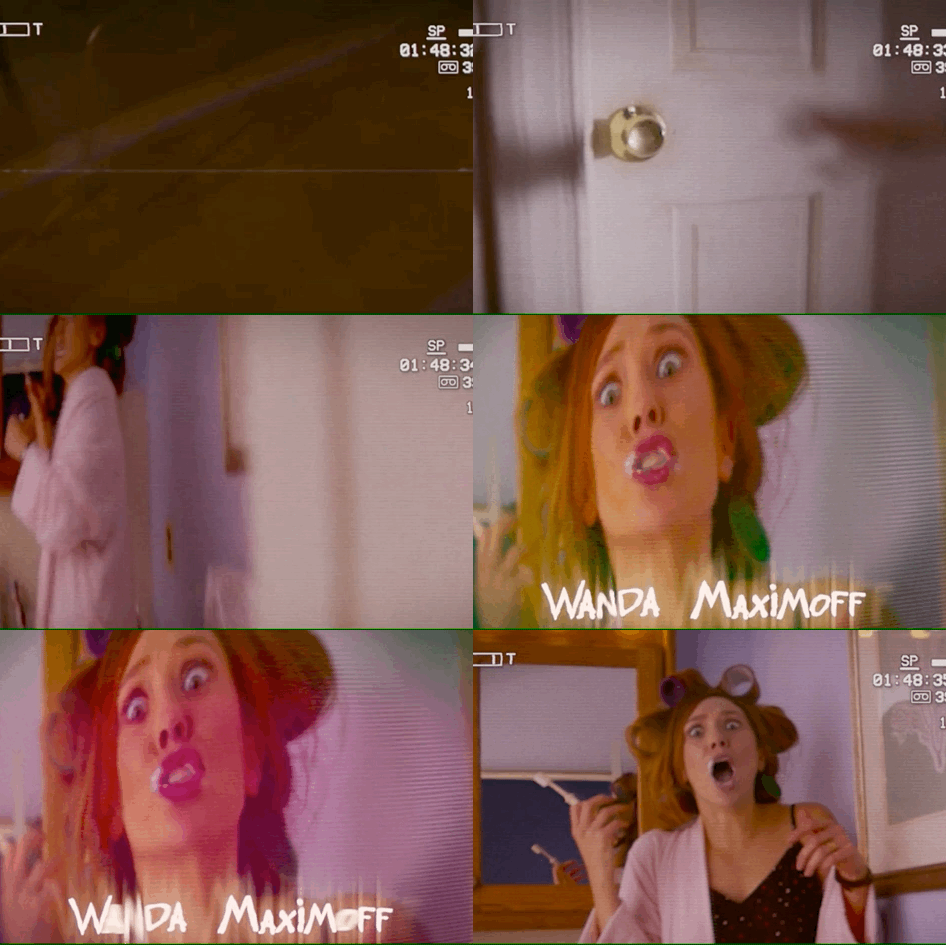
For viewers of a certain age, the most instantly recognizable title sequence homage comes in episode six, when WandaVision reaches the late 1990s and early 2000s. The reference? The punky, chaotic titles of beloved Frankie Muniz sitcom Malcolm in the Middle, which WandaVision replicates right down to the typeface. For Shakman, nailing these specific details was critical. “It was so important. Everything had to be authentic,” he says. “But these worlds are not parody. They’re not spoofs. Wanda has created these worlds to escape her grief, and therefore they needed to be perfectly put together — no detail spared.”
For many of these title sequences, Shakman enlisted the help of Perception, a title design studio who also did the main-on-end sequence for Avengers: Age of Ultron. “For instance, the title sequence for episode six, which was loosely inspired by Malcolm in the Middle, was always designed to be this oner from Tommy’s point of view, with the family camcorder,” he says. “But then Perception came in and added all of the great treatments and effects that felt like the late ’90s, and the title design itself.”
“Breaking the Fourth Wall”
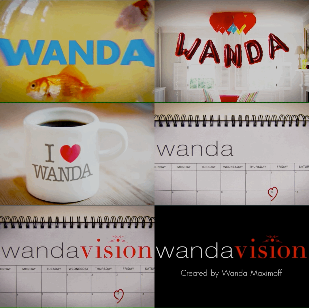
The final episodic sitcom parody of WandaVision’s first season brings the show right up close to the 2010s, riffing on “mockumentary”-style sitcoms such as The Office, Parks and Recreation, and especially Modern Family, including one-off cut-aways and talking head interviews. Notably, however, the episode’s title sequence doesn’t mimic Modern Family’s. “There was discussion for that episode about whether we wanted to pull out from frames and do the frame within a frame within a frame thing,” Shakman says. “But it just didn’t make sense for us.” Instead, the episode uses the rapid-fire title treatment of Happy Endings and a jaunty tune reminiscent of the U.S. version of The Office.
This is also the first episode of the season to include one of the customary Marvel mid-credits stingers — a small extra scene teasing the story to come, made famous by Samuel L. Jackson’s end-of-film cameo in Iron Man. That the show would start using stingers once it reached the 2010s was deliberate. “By the end of that episode, we’ve busted out of the television construct. Wanda is aware of Agatha, so we can now introduce the Marvel language of the teaser scene,” Shakman says. “This is where the device seemed to fit, and that it happened to be when that device was invented made sense for how we were evolving the storytelling as well.”
“Agatha All Along”
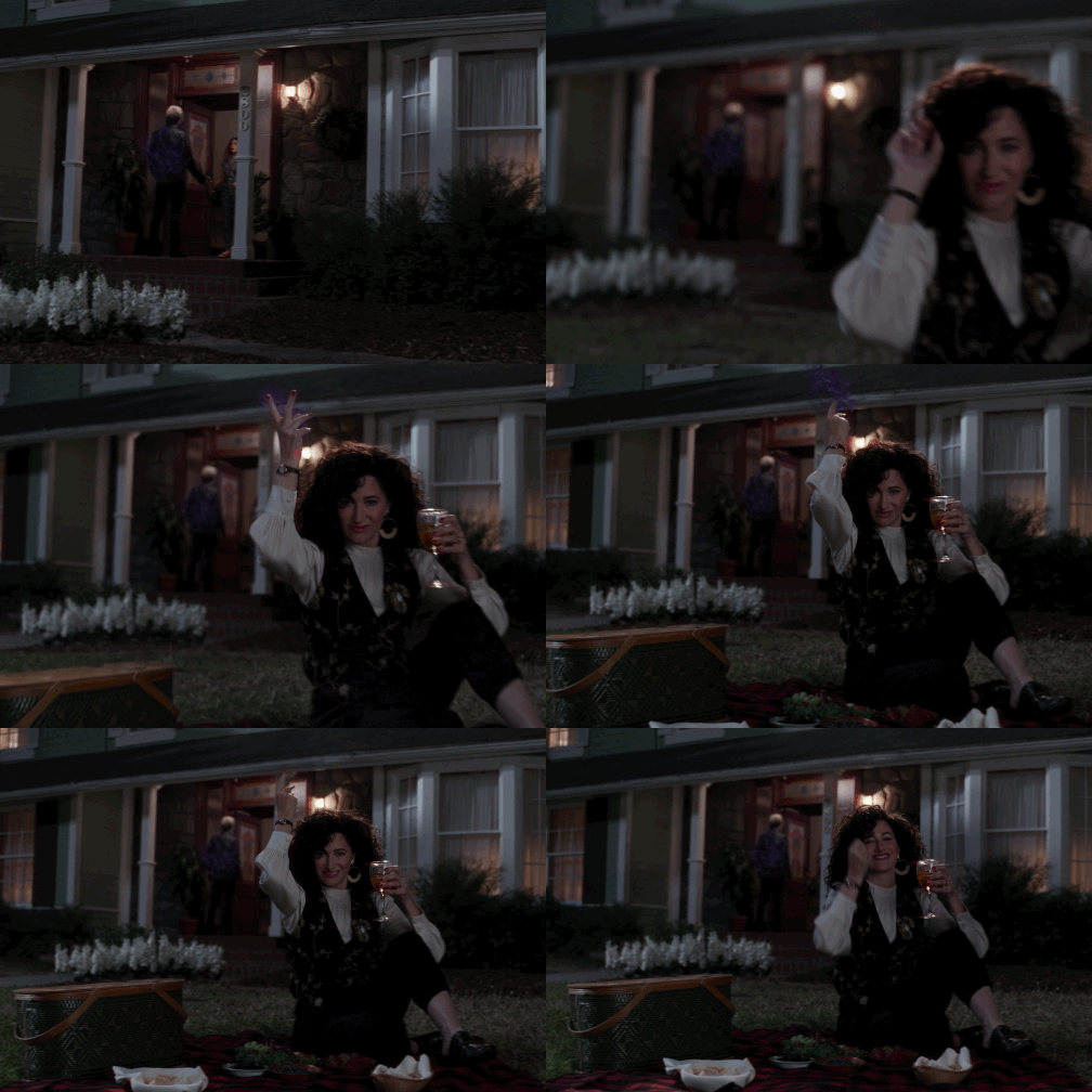
WandaVision’s ultimate title sequence actually arrives at the ending of its seventh episode, after friendly neighbor Agnes is revealed to be none other than Agatha Harkness, the nefarious witch behind much of the season’s antics. Just what has she been responsible for, you ask? Allow Kathryn Hahn herself to demonstrate, in an irresistible sequence that plays like the opening credits to an entirely different show than the one we’ve been watching. “I just loved everything about Agatha All Along,” Shakman laughs.
Typically, in designing these title sequences, Shakman would work with storyboard artists to “riff on different ideas of how to put things together” before shooting. For Agatha All Along, though, “I planned and storyboarded it, but there were also so many ideas that Kathryn came up with that were super fun,” he explains. “I remember her coming up with the idea that she should be having a picnic on Wanda’s lawn while she’s controlling Pietro — two minutes before we shot it. So our poor, wonderful prop guy, Elliot, had to go create a picnic out of nowhere in about five seconds.”
(If you subscribe to a service through our links, Vulture may earn an affiliate commission.)


