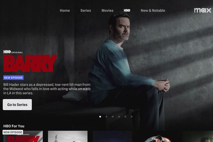
Max’s big move doesn’t look that big after all, at least not on the surface. Starting today, if you pop open your HBO Max app to try to watch the latest episode of Succession, you might be greeted with a revised layout — or a prompt to download a new app in its place. The new Max app is a little bluer and feels slimmed down, which is somewhat counterintuitive because a lot of content has been added from corporate cousin Discovery+ (which isn’t going anywhere). In the end, Max doesn’t look that different from HBO Max.
“We really wanted to make sure that it was an evolution and that it would be familiar to all of our customers, but improved,” said Tyler Whitworth, head of product at Warner Bros. Discovery, who oversaw the service’s design and user-interface makeover. Subscribers who had Discovery+ but are switching to Max for the sake of convenience may find the new service a little different, and HBO Max users will see a layout they’ll mostly recognize. Said Whitworth, “We wanted that transition to not be jarring or shocking, to make sure that customers could feel familiar with it, but hopefully, take advantage of a number of improvements.”
Users will spot some changes immediately:
➽ Its website already redirects from hbomax.com to max.com and already houses plenty of content from the likes of HGTV, Discovery, TLC, and the Food Network.
➽ If you’re using one of its TV apps, Max opens on a blue screen, zooming in on a bit of refreshed logo animation accompanied by an echoey sound effect punctuated by a couple of percussive thumps. (How Tudum of them!)
➽ Max spotlights user accounts in much the same way HBO Max did but with blue highlights instead of purple, and if you have just signed up for a new Max account, a kids’ profile will have been added automatically — one of Max’s many signals that they are catering to all demographics.
➽ On the home page, you’ll notice the two main navigation bars have changed: The side navigation hidden in a left rail has been winnowed from dozens of categories and hub pages to just three — “Search,” “Home,” and “My Stuff” — and the top nav is more prominent with tweaked options of its own — “Home,” “Series,” “Movies,” “HBO,” and “New & Notable.” Yes, they cut “HBO” from the name of the service but kept it high onscreen, where it sits inches away from the Max logo in the top-right corner.
For the foreseeable future, we can expect to see the HBO logo pinned in that spot on the home page. “We wanted to make sure that while the name isn’t in the service name, we really protected and privileged the brand and made sure it was easy for customers to quickly find their favorite HBO content,” Whitworth said. There are no plans to swap it out when Shark Week or other Discovery franchises circle the waters, other sources familiar with the service told us.
App stability was another major concern. “We really focused on just making sure the new product worked well for customers, did all the basics better — that it was fast, it was reliable,” Whitworth said. “Obviously, that’s the main thing customers want at the end of the day. They want it to work well.” Bugs are common on any new app’s launch day, and DownDetector.com, which tracks user reports of site outages, logged a peak of 438 outages at 9:11 a.m. ET, which petered out later in the morning. As part of the rollout, Max’s team has assembled war rooms of technical staff to address issues as they arise.
The content presentation itself looks nearly the same, down to the font choices, but it has been streamlined significantly with a series of quality-of-life adjustments that attempt to attack HBO Max’s engagement problem. “We found in some of our testing that when you give customers a number of different calls to action or actions they can take, that can be confusing,” Whitworth explained. The revised app addressed that by dramatically reducing the number of different ways you can click on the screen. “You may notice even in the main buttons and the main calls to action, we took a monochromatic approach, so they’re really clear, really easy to see,” he said.
Max has more tricks baked in, too. You can finally use a QR code or Wi-Fi to sign in, instead of typing a password on your remote. There are subtle rotators that indicate how long an autoplay trailer is running. You can now quickly add or remove any title from your queued watchlist or keep watching with a dedicated click or hold of a button (this varies depending on the remote). It has removed an unnecessary step that used to take you to a separate page before you could play an episode. Episode pages now deliver details like rating info, language options, and credits in a text box you can toggle on or off, rather than burying them at the bottom of the screen. And home-page collections present what look like a mix of editorialized curation (“All the LOLs,” “Drama! Drama! Drama!”), much simpler tagged directories (“Popular Movies,” “Food & TV”), and an especially dirt-simple “Brand Spotlight” lane devoted solely to logos. After about 30 rows of scrolling, the home page bottoms out on a row of genre tiles that link away to pages of their own.
“No dead ends,” Whitworth said, citing a mantra his team repeated as they worked on the new service. “As you’re going through the experience, we want to always be surfacing new content, new opportunities for you to find something that might be interesting.”


