
If you’ve been feeling compelled lately to hang a giant, scroll-framed mirror over your coffee table, or wallpaper your dining room in Roman stripes and florals as big as your head, don’t be alarmed. You are just tuning in to the increasingly insistent Dorothy Draper vibrations currently making themselves felt. It makes sense, of course, that the pendulum is swinging away from mute, chilly Minimalism and toward Draper’s explosion-in-the-Pantone-factory colors, confidently oversize prints, and aristocratic flourishes like big, Baroque plasterwork and chessboard tiles. It doesn’t hurt that she’s got an influential young fan base furthering the message (Kelly Wearstler, Miles Redd, Jamie Drake, Diamond Baratta). This month, a new coffee-table book, In the Pink: Dorothy Draper, America’s Most Fabulous Decorator, is coming out, and a retrospective at the Museum of the City of New York called “The High Style of Dorothy Draper,” opening May 2, will further her influence.
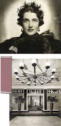
A six-foot-tall debutante from Tuxedo Park, Draper (pictured) was an autodidact decorator. Her society friends admired her particular blend of French and English elements, the refined (fresh flowers, family portraits) and the humble (a roaring fireplace, overstuffed chintz chairs). Draper started a business in the twenties, but when her husband, a well-known doctor, asked for a divorce in 1930, her ambition went into high gear, and she scored huge, highly visible commissions. That same year, she did the lobby of the Carlyle; in 1933, the Phipps family enlisted her to renovate a row of tenements on Sutton Place. She oversaw every aspect of the Hampshire House’s visuals, from the carpet to the restaurant. She installed a reflecting pool topped by skipping sprites in the restaurant at the Metropolitan Museum of Art and hung a hot-air-balloon light fixture inside the restaurant at the Carlyle, where she lived. She decorated the sprawling Greenbrier Hotel in West Virginia and the Camellia House restaurant at the Drake Hotel in Chicago.
Although her commissions were mostly commercial, Draper infiltrated the nation’s domestic sphere as well, positioning herself as an expert on home decorating and entertaining through briskly opinionated newspaper and magazine columns. Her 1941 book, Entertaining Is Fun! How to Be a Popular Hostess—with its hot-pink, polka-dot cover—was a massive best seller.
“It is just as disastrous to have the wrong accessories in your room as it is to wear sport shoes with an evening dress.”
Donald Albrecht, the curator of architecture and design at the Museum of the City of New York, who is curating the show, sees Draper’s influence everywhere from Frank Gehry’s architectural forms to Philippe Starck’s Ghost chair. “Taking an eighteenth-century chair normally done in wood and making it in clear plastic is a Dorothy Draper kind of thing,” he says. “And she is a fascinating person. All of her tips must have been really great for housewives in the fifties. To have this woman telling them, ‘Don’t be afraid! Paint the door green!’ ”
“The sense of play in her interiors is infectious,” says Wearstler.
Some of Draper’s New York interiors remain intact, like the crisply Art Deco lobby of 770 Park Avenue. But getting the Draper feeling at home is fairly simple. New slipcovers, some rococo scrollwork, and a few black and white floor tiles are all you need.
Next: The Elements of Draperism
Bright Colors, Big Chintzes: The Elements of Draperism
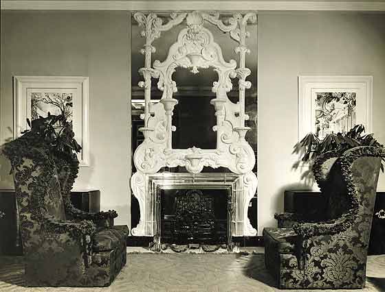
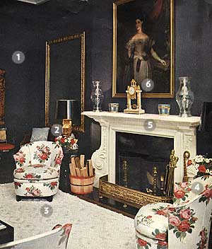
1. Intense color.
Forget white or even pastel. Draper went for intense; her living-room walls, seen here, were eggplant, and the lobby of the Hampshire House, left, was turquoise.
2. Plant life.
Well-maintained plants and flowers were obligatory. “They are as much a part of a decorative scheme as beautiful curtains,” she said.
3. Dense, textured carpet.
For homier ambience, Draper laid out thick, tactile rugs whose neutral colors wouldn’t compete with other elements.
4. Striking details.
Draper preached the value of a few bold accessories—but never clutter.
5. A roaring fire.
The fireplace “is the heart of any room and should be kindled on the slightest provocation,” Draper said.
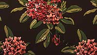
6. Exuberant prints.
Decades before Buatta, Draper championed enormous florals and fringe.
Next: How to Do It at Home
How to Do It at Home
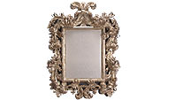
Big Mirrors
The more flourishes, the better ($46,000 at H.M. Luther Antiques; 212-505-1485).
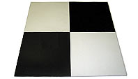
Chessboard Tiles
At least twelve square inches to get the full effect (White, $20.08 per square foot; black, $11 per square foot at Artistic Tile; 212-727-9331).
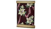
Statement Wallpaper
This is not about being discreet. Big patterns! ($300 for a double roll at Secondhand Rose; 212-393-9002.)
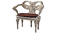
Romantic Furniture
At least one touch of whimsy per room ($1,200 at Century Designer Showroom; 212-479-0107).
Color Contrast
You can still get the oddly harmonious fabric Draper did for the Greenbrier ($84 per yard at Carleton V.; 212-355-4525).
Next: Modern-Day Drapers
Modern-Day Drapers
As Minimalism loses its novelty, a new generation of designers is keeping the flame alive. Miles Redd and Kelly Wearstler channel Draper via interiors filled with overscaled elements (elaborate door frames, neo-Baroque furniture) and a general sense of joie de decorating. Jamie Drake, creator of the bold Gracie Mansion redecoration, is an acolyte of the strong color scheme, and the firm of Diamond Baratta has fearlessly piled pattern upon pattern for a new definition of over-the-top. Don’t say gaudy, say exuberant!