LetÔÇÖs say you have a show about a somewhat gruff character who thinks itÔÇÖs better to be feared than loved. And plenty of people do indeed fear them (with good reason). They take out most of their frustrations on a skinny brunette, whom they frequently try to intimidate, although it only occasionally works. The show uses ripped-from-the-headlines characters and stories. Chris Messina is there sometimes. For shows as different as Damages and The Newsroom, there are some surprising overlaps, but the most vivid point of intersection between the shows is their set design and aesthetics. Damages, which returns for its fifth season Wednesday, has been at it a lot longer than Newsroom, but Jeff Daniels didnÔÇÖt crib Glenn CloseÔÇÖs style. Rather, both shows answer the same questions with their scenic design: How do you make someone seem powerful? How do you make something look official? How do you yell at birdlike associates and yet make them return to you over and over?
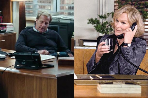
To make someone look powerful and and slightly grand, give them a shiny, shiny desk. The shinier the better! Keep the rest of their office as generic as possible, though.

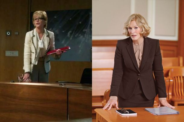
Alternately, get an imposing chamber of some kind. (Again, bonus points for shiny surfaces.) Throw in a smart ladyblazer and a look of indignation and youÔÇÖve got yourself a climactic scene!

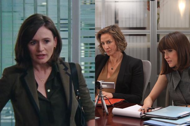
Finally, situate your object of intimidation in front of some stripe-frosted glass. This is the perfect venue for yelling at her, and also for her to yell back and be right. Brushed aluminum makes everything feel sleek and modern.


