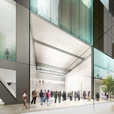
The word art barely came up. Maybe thatÔÇÖs why midway through this excruciatingly verbose three-hour closed-door briefing about MoMAÔÇÖs second major rebuilding in less than ten years, I felt my eyes tear up and my stomach turn. (The breaking news, as you may have read in my colleague Justin DavidsonÔÇÖs review earlier today, is that the American Folk Art Museum is going to be demolished. He and I disagree about this, but I say itÔÇÖs a building that was regrettably useless for art.) Meanwhile, the namesakes of the starchitecture firm Diller Scofidio + Renfro, joined by MoMA director Glenn Lowry, whirred on about accessibility, flow, institutional interfacing with the city, connectivity, navigational legibility, surgical interventions, gestures of variation on the white cube and the black box (donÔÇÖt ask), social and performative space, micro-galleries, auto-critique, and ÔÇ£a large new architecturally significant staircase.ÔÇØ The more I heard and saw, the sicker and sadder I got. Somewhere inside me, I heard myself saying my good-byes to MoMA. I thought, I have seen the best modern museum of my generation destroyed by madness.
ItÔÇÖs a lot like the last expansion plan. Only this one is even more snazzy, with a lot more glass ÔÇö sorry, ÔÇ£transparency to the street ÔÇ£ÔÇö and spaces designed primarily so people can look at other people looking at other people looking at people. There are some weird staggered floors where you can see one story from another through cutouts. In other words, the plan is basically pseudo-intellectual razzle-dazzle theatricality. The staircases and event spaces and open boxes seemingly intended to serve buzzy art forms reveal to me that DS+R are not museum designers. They should stick to tourist attractions and event architecture.
How will it all end? Around or after 2019, what youÔÇÖll get in place of the Folk Art Museum will be two 2,000-square-foot double-story glass boxes. They look like glass squash courts, one atop the other, and the front can be opened to the sidewalk. DonÔÇÖt even think about MoMAÔÇÖs permanent collection hanging on the walls here; nothing can. The slide I saw of the ground floor space showed Charles RayÔÇÖs Firetruck installed with its front end extending onto West 53rd Street ÔÇö a weird choice, given that MoMA doesnÔÇÖt own this work. DS+R call the space an ÔÇ£art bay,ÔÇØ I guess because that sounds better than ÔÇ£galleryÔÇØ or ÔÇ£room.ÔÇØ It most closely resembles a Chelsea megagallery with a glass garage door that rolls up on warm days. My eyes are tearing up again as I write this.
The upper cube room is going to be called the ÔÇ£gray box.ÔÇØ It was explained that it will be called this because ÔÇö no kidding ÔÇö itÔÇÖs sort of a cross between ÔÇ£the traditional white cube and a black box.ÔÇØ It will be used for the same sort of stuff the downstairs one can, plus more performances and the like. DS+R and MoMA evidently love performance. They all kept reminding me that they have ÔÇ£a new performance curator.ÔÇØ ThereÔÇÖs also going to be a long glass-fronted second-floor gallery on 53rd Street. IÔÇÖve seen a batch of these sorts of galleries before, and ÔÇö except in architectural renderings and meetings where they seem to please trustees and board members ÔÇö they never, ever work. TheyÔÇÖre glorified corridors with one long wall. They encourage only cursory looking, or aimless people-watching. All this avoids MoMAÔÇÖs basic problem, which IÔÇÖve written about before: that the museum needs to triple the amount of space for showing its permanent collection of art made before 1980. It didnÔÇÖt in 2004, and it isnÔÇÖt now.
Admittedly, there will be some space added for that permanent collection, in the base of the $1.3 billion condo tower thatÔÇÖs going up down the street. The net gain, as far as I could make out ÔÇö although I was continually reminded that ÔÇ£all plans are in flux,ÔÇØ maybe trade talk for, ÔÇ£We still donÔÇÖt know what weÔÇÖre doingÔÇØ ÔÇö will add up to about 30,000 square feet. ThatÔÇÖs about one Gagosian. On the good side? I imagine that ÔÇ£crowd flow,ÔÇØ which all these people talked about, will be better. If uglier.
From the days both the new MoMA and the American Folk Art Museum opened, it was clear to almost all in the art world that they were tragic failures in terms of their primary missions. Now those disasters are joined forever. Perhaps this is as it should be. I suppose a lot of design critics will rave about MoMAÔÇÖs new showy event spaces, just as they did when these museums opened a decade ago. It kills me to write this, because IÔÇÖll be visiting MoMA for the rest of my life, but I left that meeting knowing for certain that I will never get to see its incredible collection shown properly. Good-bye, MoMA. I loved you.

