Davidson: MoMA Reveals Its Expansion Plans
The Museum of Modern Art is on the march again, advancing westward down 53rd Street, sweeping away the old American Folk Art Museum and planting its flag in the base of a future skyscraper. Previous iterations trail behind it like a supply chain: Goodwin and Stone’s 1939 original (which now looks like a dollhouse version of an art museum), Philip Johnson’s 1951 annex, Cesar Pelli’s 1984 interpolation, Yoshio Taniguchi’s austere monolith from 2004 — they’re all being preserved and updated. Only the American Folk Art Museum building, Tod Williams and Billie Tsien’s twelve-year-old gem, has to go, because, like a cobbler’s shack next to an airport, it’s in the way.
The architects who are designing this destructive expansion — Diller Scofidio + Renfro — understand perfectly what they’re doing, and it causes them genuine grief. They tried all sorts of contortions to fit the quirky little thing into the juggernaut that is MoMA, and I accept their claim that if they couldn’t do it, nobody could. The connective tissue between one structure and the next would have created disfiguring scars, the mechanical apparatus on top would have occluded the lovely skylights, and the idiosyncratic staircase would have to have been amputated in any case. By the time the architects were done tinkering with their old friends’ creation, it would have been so bastardized that there was little point in keeping the remains. In an architectural version of the battlefield paradox, DS+R would have had to destroy the building in order to save it.
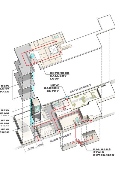
But that hesitancy shows in the provisional design for the next phase. The client is bent on art-world domination; the architects seem halfhearted. Instead of healing the scar left by the Folk Art Museum, they have left a gleaming gap. A triple-height “art bay,” ample enough to accommodate house-size sculptures and outfitted with a glass wall that can be raised like a portcullis, opens directly onto the street. (No tickets needed.) Above that is a white-walled exhibition cube that, with a little deft stagecraft, converts to a black-box theater. These are neat tricks that will foster MoMA’s deepening commitment to performance art, and activate 53rd Street, but they still replace an important work of recent architecture with a pair of stacked glass boxes. It’s a disappointing tradeoff, a Pyrrhic triumph of expansionist logic over irrational affection.
MoMA says it needs to grow now because the last time it expanded, in 2004, attendance nearly doubled, to 3 million visitors a year. The experience of communing with Matisse can now feel like a Black Friday sale at Best Buy. As the director Glenn Lowry acknowledges, building more galleries won’t solve the congestion problem once and for all. So long as tourists keep pouring into New York, as modern art retains its prestige, and as the collection keeps growing, a modest infusion of square footage won’t keep pace with the demand.
Originally, the expansion was to be a generation-spanning affair. Then events took on a momentum of their own. In 2007, MoMA sold the adjacent empty lot to the developer Hines, in exchange for three floors of gallery space in a new residential tower, the 1,050-foot 53 West 53rd Street designed by Jean Nouvel. (Construction on that building is supposed to start in June.) Only after the deal was made did the board recognize that it had tumbled into a major architectural problem: Thanks to the peculiarities of the site, linking the existing galleries to the new ones would mean that crowds would funnel along a single corridor on each floor, then double back, creating nightmarish bottlenecks.
The ah-ha solution arrived when the Folk Art Museum next door spiraled toward bankruptcy. MoMA paid off its $32 million debt and took over the building. Demolish it, and visitors could be channeled along a smoothly flowing loop. That sort of traffic engineering is crucial for a museum to function smoothly, but if you’re going to reconfigure a global art institution on one of Manhattan’s most celebrated blocks, it’s not exactly a sublime source of inspiration. (Besides, having extra space does nothing to untangle the mess of escalators and catwalks in the existing structure.)
The new design does contain several persuasive virtues. It creates new access points, including a free 54th Street entrance to the sculpture garden, now sealed behind a high penitentiary wall. It peels off a strip of the black-glass façade along 53rd Street to soften that NSA-headquarters look. It alleviates the Penn Station–at-rush-hour feeling of the through-block lobby by opening new passageways and sprucing up the box office and coat check. Most of all, it adds more than 30,000 square feet of new exhibition space on three floors. Which is, roughly, the equivalent of one ample Chelsea gallery. A lot of art is going to stay in storage.
The architects accomplish all this not through wholesale reconstruction but by the kind of surgical interventions that Diller Scofidio + and Renfro carried out at Lincoln Center. That renovation turned out to be simultaneously subtle and transformative. It’s possible that as the architects refine their work, MoMA will receive a similarly rejuvenating spa treatment. Maybe seeing the Picassos will get more pleasant, and the whole complex will shed its cold, corporate air. But for now the design feels less like an optimistic hosanna than a mournful chorus of compromises.
Edit, 6:58 p.m.: Jerry Saltz offers an art critic’s take on the news here.


