Last fall, at the Toronto Film Festival, Focus Features picked up the dark comedy Bad Words in a pretty big deal, paying $7 million for Jason Batemans directorial debut. Thats not indie-movie money  thats the sort of cash you drop on a movie youve got big plans for, and indeed, the studio hopes to turn a sizable profit on Bad Words, with a nationwide rollout planned over the next few weeks.
SO WHY IS THAT POSTER SO BUTT-UGLY, YOU GUYS.
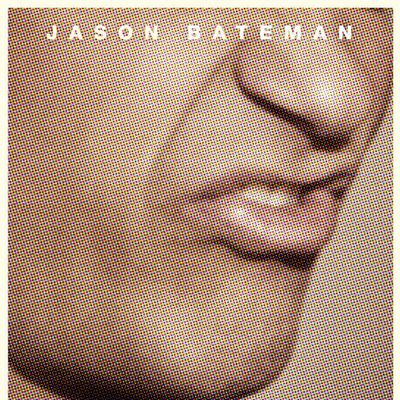
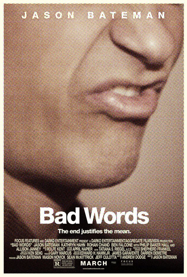
Let this scald your retinas:

Uggggggh.
I see this poster everywhere. Everywhere! The only downside to the perpetually sunny weather weÔÇÖve got in L.A. is that there is no rain or snow to obscure these terrible billboards for Bad Words, which, as I have stated before, are everywhere.
Look at this. Look at it! It is a giant, building-size close-up of Jason BatemanÔÇÖs mouth beginning to say the F-word. No, sir. No, I will not accept this.
Why is this poster so bad? Here are a few key reasons.
1. Because itÔÇÖs bad.
2. Because itÔÇÖs terrible.
3. Ugly color.
4. Jesus Christ on a stick, I donÔÇÖt want to look at a six-story rendition of Jason BatemanÔÇÖs mouth in mid-cuss. Is Bad Words playing in IMAX? No? ThereÔÇÖs probably a reason for that.
5. It doesnÔÇÖt tell us a single goddamned thing. (Sorry about the cussing, but I guess itÔÇÖs apropos, given the subject matter.) This movie has a pretty high-concept premise: Jason Bateman is an adult man who reenters a childÔÇÖs spelling bee competition to seek revenge. Would you know that, looking at this poster? Or would you think that Jason Bateman were maybe playing a drill sergeant, or some sort of Nazi, or a man who suffered an unfortunate lab accident that embiggened a certain section of his face until it was six stories high?
5. That tagline. ÔÇ£The end justifies the mean.ÔÇØ No.
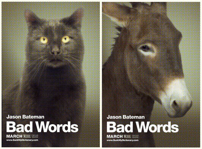
6. Because there are apparently alternate posters for the film that are even worse:

Get it? Get it? OneÔÇÖs a pussy and oneÔÇÖs an ass, ha-ha! Those are bad words, like the title says. DonÔÇÖt let the principal hear you saying them, Billy.
7. The URL that those alternate posters point to is suckmydictionary.com.
I am all for visually striking posters, but this is more of a visual poke in the eyes, and the poke is being delivered by pinking shears, and after youve been poked, you see the world through this off-putting, piss-yellow filter. I brought the Bad Words poster up to my co-worker this morning and she IM-screamed, its STUPID. it doesnt SAY ANYTHING. I asked our photo department to pull art involving the poster and they basically refused. And then, once they finally did pull art, our photo editor was like, I thought the first poster was bad, but the cat and donkey 
The irony here is that the words are not bad. It is the picture that is bad. That is the irony of the Bad Words poster.
Pussy. Ass. Hahahahahaha.
No.

