Photo: Courtesy of David Silverman
Animator David Silverman has been with The Simpsons since the beginning ÔÇö literally: He directed the first episode of the series, as well as subsequent classics ÔÇ£The Way We Was,ÔÇØ ÔÇ£Krusty Gets Kancelled,ÔÇØ and ÔÇ£Homie the Clown,ÔÇØ not to mention The Simpsons Movie and the Academy AwardÔÇônominated short The Longest Daycare. FXXÔÇÖs recent marathon and upcoming ÔÇ£Simpsons WorldÔÇØ experience in the FXNOW app has reignited an interest in the showÔÇÖs earliest days, so Vulture asked Silverman to share the stories behind some previously unreleased sketches and storyboards from his personal collection. Twenty-seven years later, the characters look virtually the same as they did then, an impressive feat when you consider their animation motto at the time was ÔÇ£done equals good.ÔÇØ Click through to see eight early prototypes and to read SilvermanÔÇÖs stories behind each of them.
When we started doing The Simpsons as a TV show, things were moving so fast, there were things that hadnÔÇÖt really been put together, like a design team. So in ÔÇ£Bart the Genius,ÔÇØ the first episode I was doing, I didnÔÇÖt have any designers; they were all freelance. They hired a guy who I thought might be good. Wonderful guy, an older gentleman who designed for Jay Ward back in the day. I thought that maybe that [would] work, but his style was a little too Jay WardÔÇôlike. I love the Jay Ward style, but it wasnÔÇÖt the style we were doing. [The designerÔÇÖs] idea of humor smacked of old-timey cartoon-y [signatures] that you might call ÔÇ£cartoon vaudeville.ÔÇØ
 
I had some ideas about the design and said, ÔÇ£Well, better just go with it,ÔÇØ so I just sort of sat down and sketched this out relatively fast. I can also tell you Springfield Elementary was loosely based on an elementary school I passed on my way to work. ThereÔÇÖs something called Carthay Center Elementary School. I passed by it and said, ÔÇ£Well, that gives me a thought.ÔÇØ
Photo: David Silverman
That was done by Greg Vanzo, who also directed ÔÇ£ThereÔÇÖs No Disgrace Like Home.ÔÇØ He was one of my go-to guys because he really drew very well in a way that I was hoping the characters would look. This scene is Bart saying, ÔÇ£A big, dumb, balding North American ape.ÔÇØ This is my sort of Chuck Jones moment, like he looks at him then scowls in the Chuck Jones way, where nothing moves except for the eyes and the mouth. This is where limited animation is your comedy friend.┬á
 
On Homer looking harsher here than in later seasons:
My first feeling of ÔÇ£this is where I want it to go and have the characters lookÔÇØ was when I did the first episode of the second season, ÔÇ£Bart Gets an F.ÔÇØ If you look at it, I think youÔÇÖll see the characters are really starting to look the way they do now; itÔÇÖs a little less rough around the edges. We were training everybody at the same time. It wasnÔÇÖt like, ÔÇ£Okay, hereÔÇÖs the standard, sit down and draw,ÔÇØ itÔÇÖs like, ÔÇ£WeÔÇÖre making it up as we go along.ÔÇØ We were teaching not only the artists in this country, but the artists overseas.
It was the Wild West. Everything was happening at the same time. I remember one time I was showing a scene to [director] Wes Archer, and I wanted to see if it was any good, and Wes said, ÔÇ£Is it done?ÔÇØ I was like, ÔÇ£What?ÔÇØ He said, ÔÇ£Is it done?ÔÇØ ÔÇ£Uh, yes, itÔÇÖs done.ÔÇØ ÔÇ£Then itÔÇÖs good.ÔÇØ That became our motto: Done equals good.
Photo: David Silverman
I had a lot of fun with that. Because it was a dream sequence, Matt [Groening] was very comfortable with me drawing in my own style. It was purposefully a very different design style than the rest of the show. So I was pretty happy. I think that for as crude as my first outing as a director on the show is, there were a lot of dramatic angles and efforts to make it not look like a normal cartoon show. Remember, this was 1989. Cartoons on the air by and large had a certain sort of flatness to them. No offense to anybody, because they were working in different conditions and on tight deadlines, but there was a shorthand, and a lot of them were master shot, medium shot, and close up. We were trying to be more cinematic, so this is a low-angle perspective shot of Bart.
Photo: David Silverman
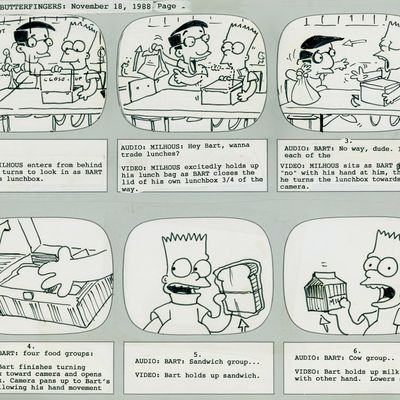
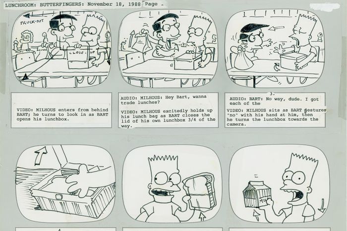
This was the board that went to the ad agency. In the summer of 1988, during the writersÔÇÖ strike, Wes and I spent a week fooling around with drawings for Jell-O, which is funny because their spokesperson at the time was Bill Cosby. We pulled this design from a bunch of drawings Matt had done for a show that he pitched to ABC, a Saturday morning show, that they didnÔÇÖt pick up. Essentially, it would have been Recess. But Milhouse was one of the characters, and we looked at him and said, ÔÇ£LetÔÇÖs use this one.ÔÇØ I was really pleased. If you see the commercial, itÔÇÖs very close to this board.
Photo: David Silverman
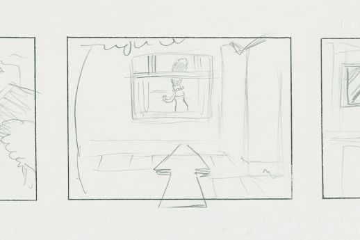
That was a short-lived thing, a notion that you cut to Bart, then you cut to Marge as sheÔÇÖs getting dinner made, or something like that, then you cut to Homer, then back to Marge, where the familyÔÇÖs all frantically going back home and sheÔÇÖs this oasis of calm. Judging by the arrows pushing in, I think this was the opening push-in. This was probably discarded very early. I donÔÇÖt even recall pitching this. ItÔÇÖs a little too saccharine. This was not the subversive, before-its-time approach that would satisfy what we wanted to do.
Photo: David Silverman
This was a lot of fun to design. A lot of these images ended up in the sequence. It shows the looseness of, as thoughts came to mind, putting it down and sketching it out. I seem to get a lot of dream sequences. Albert Brooks [who voiced Jacques] recorded about two hours of material, which I think is all on the DVDs, and because he was recording with Julie Kavner and they were great friends, Albert was cracking her up to the point where she was gasping. They were doing a ÔÇ£WhoÔÇÖs on First?ÔÇØÔÇôtype routine. That rapid back-and-forth had me cutting back and forth. I cut to him, then I cut back to Marge, and she doesnÔÇÖt say anything, just because I thought it was funny. The ad-libbing indicates how youÔÇÖre going to direct.
Photo: David Silverman
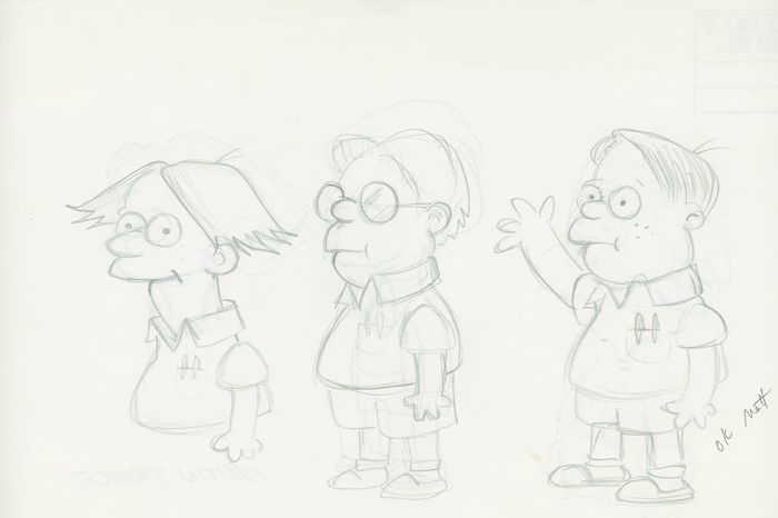
I was kind of doing a variation on G├íbor Csup├│ÔÇÖs design, and his design looks like it came from Rugrats. I was just experimenting and wondering if thereÔÇÖs any way I could work with that, and it didnÔÇÖt really feel like a Simpsons character. So I tried this character in the middle and, well, thatÔÇÖs closer. And that led to the last character, and I thought, Oh, this feels right, with this wide-eyed expression.
Photo: David Silverman
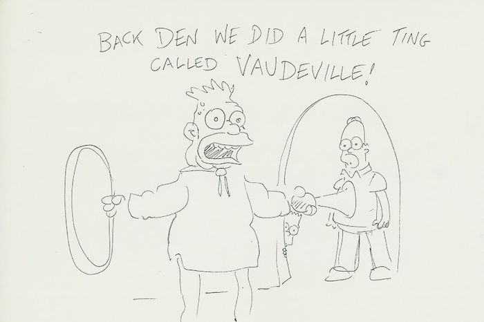
I think we were just clowning around the studio, and for some reason, we kept saying, ÔÇ£Back den, we did a little ting called vaudeville!ÔÇØ That inspired me to draw this very silly drawing. It doesnÔÇÖt mean anything.
Photo: David Silverman


![When we started doing The Simpsons as a TV show, things were moving so fast, there were things that hadnÔÇÖt really been put together, like a design team. So in ÔÇ£Bart the Genius,ÔÇØ the first episode I was doing, I didnÔÇÖt have any designers; they were all freelance. They hired a guy who I thought might be good. Wonderful guy, an older gentleman who designed for Jay Ward back in the day. I thought that maybe that [would] work, but his style was a little too Jay WardÔÇôlike. I love the Jay Ward style, but it wasnÔÇÖt the style we were doing. [The designer's] idea of humor smacked of old-timey cartoon-y [signatures] that you might call ÔÇ£cartoon vaudeville.ÔÇØ
I had some ideas about the design and said, ÔÇ£Well, better just go with it,ÔÇØ so I just sort of sat down and sketched this out relatively fast. I can also tell you Springfield Elementary was loosely based on an elementary school I passed on my way to work. ThereÔÇÖs something called Carthay Center Elementary School. I passed by it and said, ÔÇ£Well, that gives me a thought.ÔÇØ](https://pyxis.nymag.com/v1/imgs/574/8d5/c82d3f32e2f3650d3a573969819c48afe7-18-simpsons-01-genius-school.rhorizontal.w700.jpg)
![That was done by Greg Vanzo, who also directed ÔÇ£There's No Disgrace Like Home.ÔÇØ He was one of my go-to guys because he really drew very well in a way that I was hoping the characters would look. This scene is Bart saying, ÔÇ£A big, dumb, balding North American ape.ÔÇØ This is my sort of Chuck Jones moment, like he looks at him then scowls in the Chuck Jones way, where nothing moves except for the eyes and the mouth. This is where limited animation is your comedy friend.
On Homer looking harsher here than in later seasons:
My first feeling of ÔÇ£this is where I want it to go and have the characters lookÔÇØ was when I did the first episode of the second season, ÔÇ£Bart Gets an F.ÔÇØ If you look at it, I think youÔÇÖll see the characters are really starting to look the way they do now; itÔÇÖs a little less rough around the edges. We were training everybody at the same time. It wasnÔÇÖt like, ÔÇ£Okay, hereÔÇÖs the standard, sit down and draw,ÔÇØ itÔÇÖs like, ÔÇ£WeÔÇÖre making it up as we go along.ÔÇØ We were teaching not only the artists in this country, but the artists overseas.
It was the Wild West. Everything was happening at the same time. I remember one time I was showing a scene to [director] Wes Archer, and I wanted to see if it was any good, and Wes said, ÔÇ£Is it done?ÔÇØ I was like, ÔÇ£What?ÔÇØ He said, ÔÇ£Is it done?ÔÇØ ÔÇ£Uh, yes, itÔÇÖs done.ÔÇØ ÔÇ£Then itÔÇÖs good.ÔÇØ That became our motto: Done equals good.](https://pyxis.nymag.com/v1/imgs/5e6/9ca/99eb4d73f378f95e960045f4ad47b770db-18-simpsons-02-homer-banana.rhorizontal.w700.jpg)
![I had a lot of fun with that. Because it was a dream sequence, Matt [Groening] was very comfortable with me drawing in my own style. It was purposefully a very different design style than the rest of the show. So I was pretty happy. I think that for as crude as my first outing as a director on the show is, there were a lot of dramatic angles and efforts to make it not look like a normal cartoon show. Remember, this was 1989. Cartoons on the air by and large had a certain sort of flatness to them. No offense to anybody, because they were working in different conditions and on tight deadlines, but there was a shorthand, and a lot of them were master shot, medium shot, and close up. We were trying to be more cinematic, so this is a low-angle perspective shot of Bart.](https://pyxis.nymag.com/v1/imgs/ff7/597/bddef78a3dcea6069e8f1f58725cb57ebd-18-simpsons-03-bart-train.rhorizontal.w700.jpg)
![This was a lot of fun to design. A lot of these images ended up in the sequence. It shows the looseness of, as thoughts came to mind, putting it down and sketching it out. I seem to get a lot of dream sequences. Albert Brooks [who voiced Jacques] recorded about two hours of material, which I think is all on the DVDs, and because he was recording with Julie Kavner and they were great friends, Albert was cracking her up to the point where she was gasping. They were doing a ÔÇ£WhoÔÇÖs on First?ÔÇØÔÇôtype routine. That rapid back-and-forth had me cutting back and forth. I cut to him, then I cut back to Marge, and she doesnÔÇÖt say anything, just because I thought it was funny. The ad-libbing indicates how youÔÇÖre going to direct.](https://pyxis.nymag.com/v1/imgs/3e9/a54/22c76396249c9486e54f07f654ccdd79c6-18-simpsons-06-marge-jacques.rhorizontal.w700.jpg)
