In real life and in photographs, Liam Neeson is a very handsome man. And yet, for some reason, when it comes time for NeesonÔÇÖs films to place his comely mug on their posters, they never choose a simple photo. Instead, they almost always go with a bizarre Photoshop painting of NeesonÔÇÖs face that makes him look like a cross between FrankensteinÔÇÖs monster and a potato. Check out some of the worst offenders below. (Some of these are international posters.)
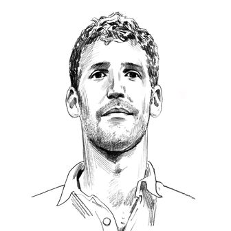
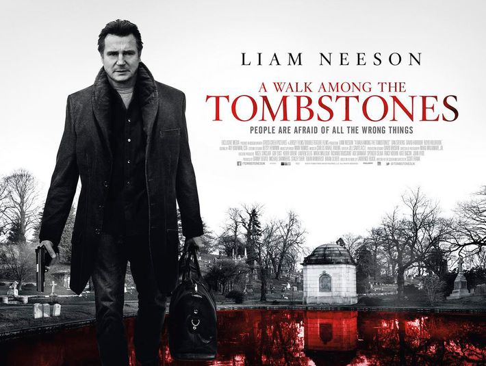
A Walk Among the Tombstones
This is the work of a police sketch artist who has only seen one Liam Neeson film (Darkman, 20 years ago).
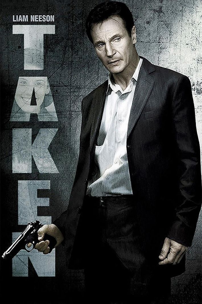
Taken
For this poster, the artist has decided to depict Neeson as Vincent Price.
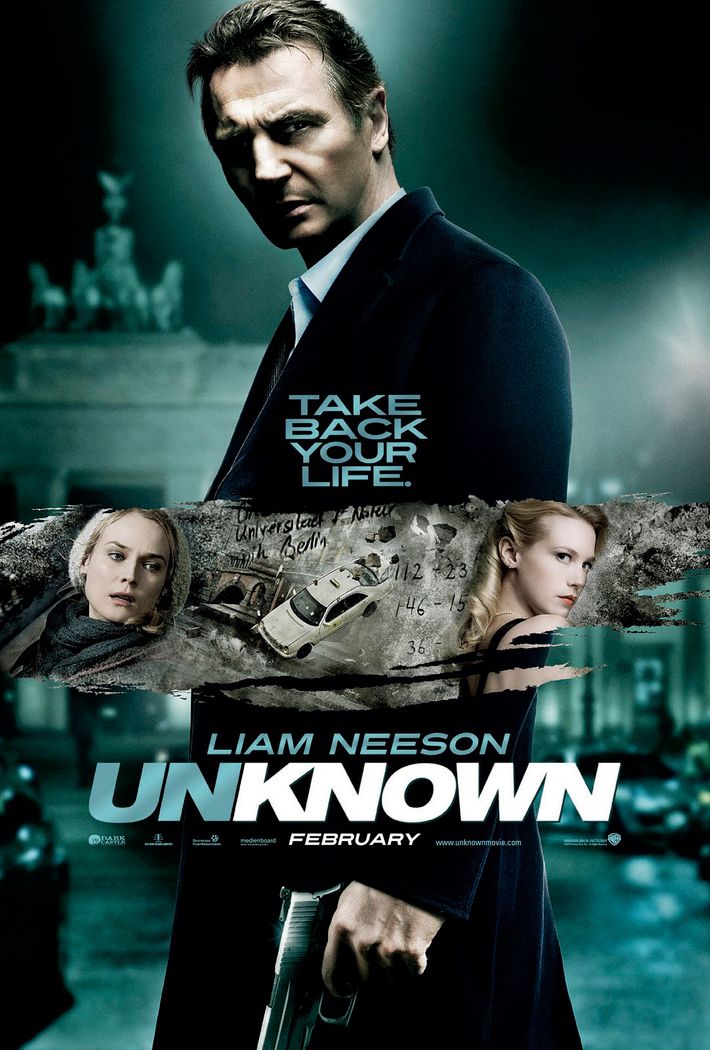
Unknown
Welcome to BerlinÔÇÖs Brandenburg Gate, which is apparently lit like the inside of a high-school boiler room.
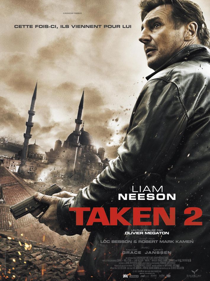
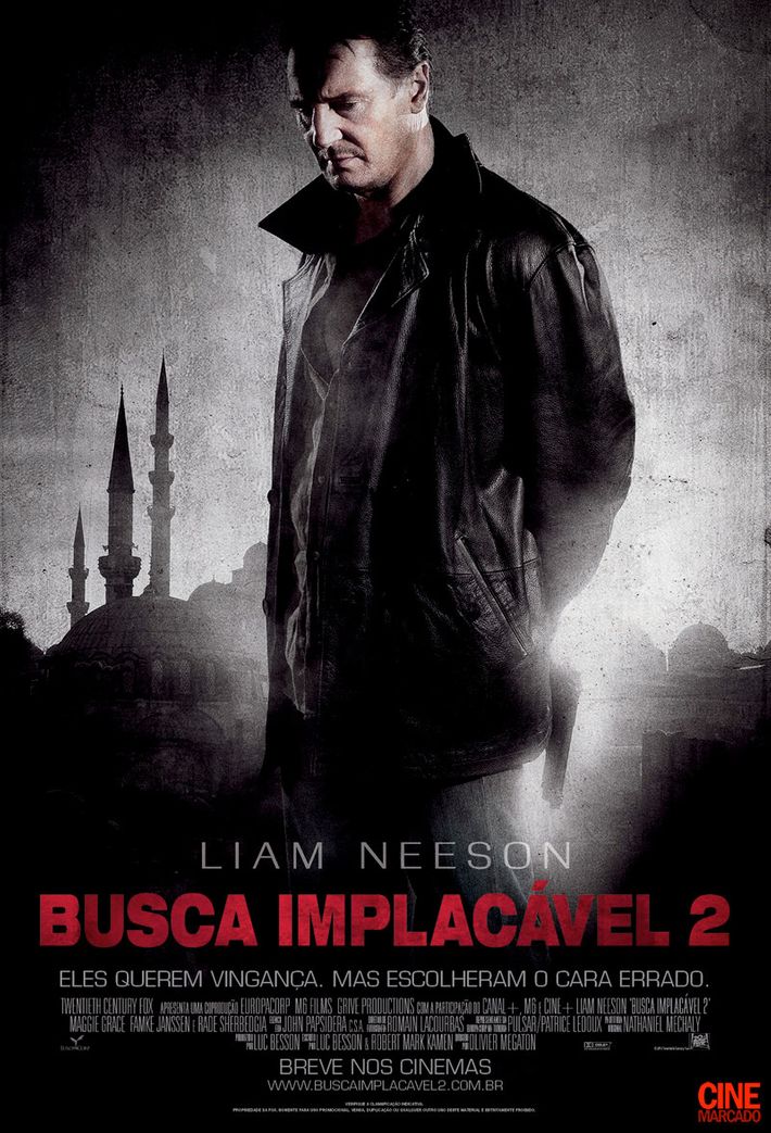
Taken 2
Once again, an impossible dark shadow appears above NeesonÔÇÖs brow. What is he trying to hide?
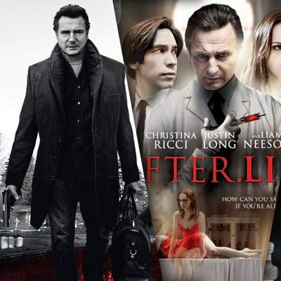
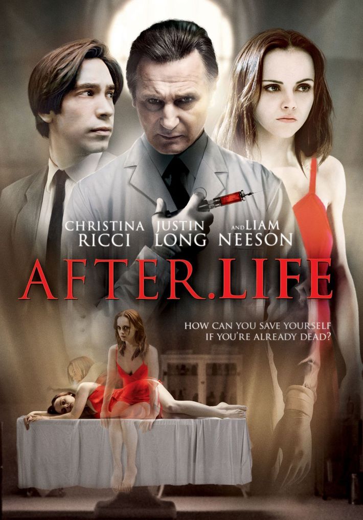
After.Life 
ItÔÇÖs easy to be so distracted by the two Christina Riccis at the bottom there that you overlook the fact that Neeson has been replaced by Steven Van Zandt.┬á
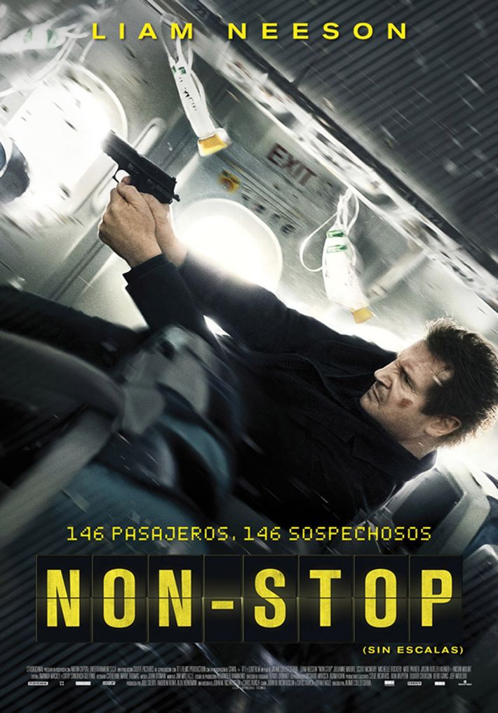
Non-Stop
This is actually a screenshot from the Non-Stop video game (rated 6.3 on IGN for repetitive gameplay and poor AI).
Taken 2
WeÔÇÖll close with this painting from the Taken 2 international poster, which is actually good. It turns out all you need to do to have a good painting of Liam Neeson is to stop trying to make your painting look like a photo and just commit to the whole painting part of the deal.
