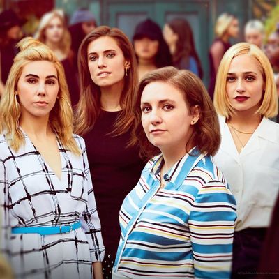
Whenever HBO unveils the official poster for a new season of Game of Thrones, the internet comes perilously close to melting down: ItÔÇÖs an Event. The release of new key art (as such posters are officially labeled in Hollywood) for Girls, by contrast, has been a decidedly more low-key affair since the showÔÇÖs 2012 debut. This doesnÔÇÖt mean the work is any less appreciated by fans, or that HBO exerts any less effort on finding just the right combination of words and picture to set the stage for the season ahead. Indeed, just as the series has put great thought into each weekÔÇÖs opening titles, the posters for Girls have been a careful creative collaboration between the showÔÇÖs main producing brain trust (Jenni Konner, Lena Dunham, and Judd Apatow) and the network. ÔÇ£The show has a very clear and strong voice ÔÇö bold, authentic, and unique,ÔÇØ says Zach Enterlin, HBOÔÇÖs executive vice president for marketing. ÔÇ£And our goal with our campaigns was to kind of evoke that with everything we did. WeÔÇÖd get a sense from them what the arc of that season was, what they were trying to communicate, and we would go back and conceptualize ideas, come back to them, and talk them all through. It was very collaborative.ÔÇØ With Hannah and her sisters calling it a day this Sunday, Vulture caught up with Enterlin and Konner to discuss their partnership and get the behind-the-scenes details about the making of six seasons of Girls poster art.
Season 1
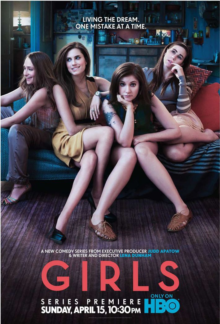
The inaugural poster for Girls was designed to convey what would become a hallmark of the series: authenticity. ÔÇ£We just wanted it to feel naturalistic,ÔÇØ Konner says. ÔÇ£We wanted everyone to look like themselves, or look like their characters.ÔÇØ The result was an image of the four main cast members, close together on a couch, sitting in a recreation of HannahÔÇÖs unglamorous apartment. In addition to announcing what Girls would be, the poster also signaled what the show wouldnÔÇÖt be: Sex and the City for millennials. While Konner says she and Dunham had never considered their series might be compared to HBOÔÇÖs earlier hit, Enterlin admits the potential for such comparisons ÔÇ£was woven into [the marketing teamÔÇÖs] thinkingÔÇØ about the poster. ÔÇ£Clearly the direction we went underscored some of those differences from Sex and the City,ÔÇØ Enterlin explains. ÔÇ£ThatÔÇÖs certainly something that we thought about ÔǪThis show [was] not glamorous New York, but rather an authentic post-college struggle in New York.ÔÇØ That point was underscored by the season-one tagline: ÔÇ£Living the Dream. One Mistake at a Time.ÔÇØ Konner says the tagline was probably the first one Enterlin sent to her and Dunham. ÔÇ£We were like, ÔÇÿGreat!ÔÇÖÔÇØ she says. ÔÇ£We loved it. It was all very easy.ÔÇØ
Season 2
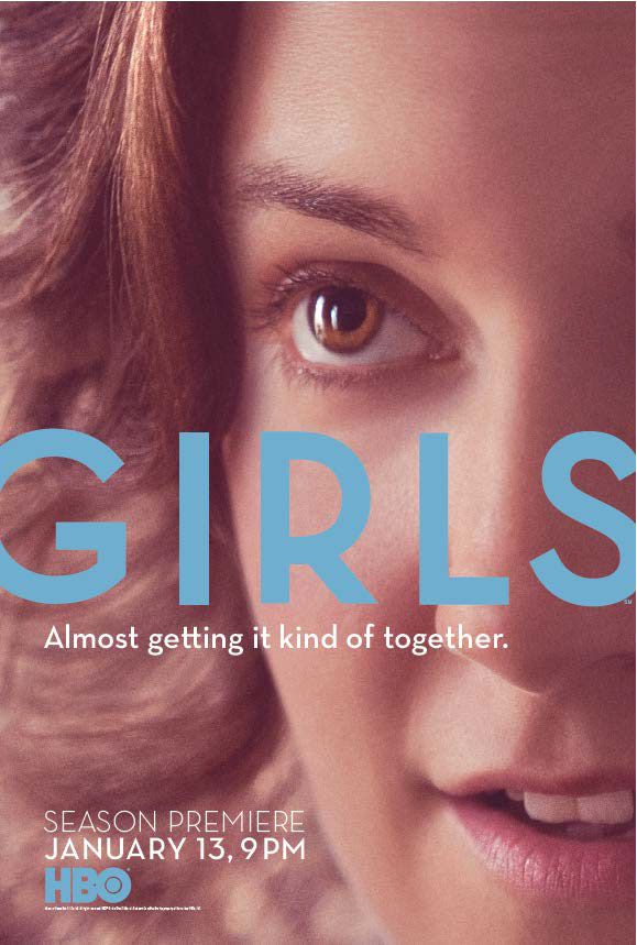
This is the only poster in six seasons to feature a solo shot of Dunham, sans any other cast members. Isolating the Hannah character from her friends telegraphed one of the central themes of season two. ÔÇ£It was just a really lonely season for Hannah, so we all thought it made sense creatively to have her alone on the poster,ÔÇØ Konner says. ÔÇ£ThatÔÇÖs when we did the Patrick Wilson episode, which was entirely Hannah and Patrick Wilson.ÔÇØ The poster also mirrored the enormous fame that came to Dunham after the first season of Girls. ÔÇ£Lena had a breakout moment with season one, and we thought that could be an interesting road, to double down on that,ÔÇØ Enterlin says. ÔÇ£We were also intrigued by the ability to communicate a tone thatÔÇÖs a little bit more intimate, maybe: This is someone you really want to get know more about in a much deeper way.ÔÇØ
Season 3
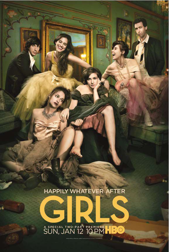
For season three, Enterlin says he and his team ÔÇ£set out to do something entirely differentÔÇØ than with the two previous posters. The result was the first (and only) key art to feature male co-stars Adam Driver and Alex Karpovsky, as well as the most decidedly dressed-up look for the characters. ÔÇ£It was sort of [built] around this high-concept idea of, can we undercut or challenge the aspirational, glamorous lifestyle in a smart way?ÔÇØ Enterlin says, adding that HBO wanted to ÔÇ£do something visually fresh that would help us stand out in the market.ÔÇØ The poster is also a riff on a TV marketing cliche: the cast shoot where everyone gets dressed to the nines (think the famous shot of the Friends cast walking down a fake street wearing formal wear while holding champagne glasses and flowers). ÔÇ£We wanted to include everyone, and we wanted to do a more traditional cast poster that youÔÇÖve seen before,ÔÇØ Konner says. ÔÇ£Except here, itÔÇÖs the Girls version of that.ÔÇØ Also notable: Autumn de Wilde, who photographed DunhamÔÇÖs first big national magazine cover for New York in connection with the 2012 launch of Girls, was recruited to do this poster.
Season 4
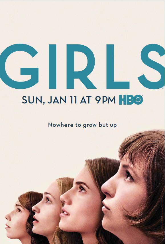
Maturity and growth were big themes for this season ÔÇö Hannah was headed to the Iowa WritersÔÇÖ Workshop ÔÇö and the poster quite literally mirrored that idea, in both image and text. In hashing out the concept, ÔÇ£It was one of those moments where we were like, ÔÇÿNow the girls are really trying to grow up, and this is the beginning of that arc,ÔÇÖÔÇØ Konner says. Enterlin says he and his team ÔÇ£sort of fell in love with the simple, visual metaphor of [the characters] looking up towards their futures. When you now take a step back and look at the entire portfolio, this is another moment where it was a pivot. This is where things were taking a leap forward, and the fact that it stood out visually from everything weÔÇÖd done previously was all part of the plan.ÔÇØ Konner also appreciated the contrast from past marketing efforts. ÔÇ£It was nice to go from remarking on the traditional with season three, to this,ÔÇØ she says.
Season 5
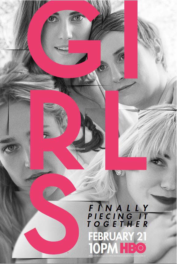
MarnieÔÇÖs ultimately ill-fated marriage was one of the tentpoles of GirlsÔÇÖ penultimate season, and it was also the visual cornerstone of the poster, Konner says. ÔÇ£This is actually a scene we did for MarnieÔÇÖs wedding,ÔÇØ she says, explaining the somewhat gussied-up look of the characters. The art is meant to continue the message of maturity seen in the previous seasonÔÇÖs marketing. The season-five poster ÔÇ£more fully illustrates the charactersÔÇÖ evolution,ÔÇØ Enterlin says. ÔÇ£Their expressions are more confident and relaxed. The black-and-white palette was a purposeful choice, again, to evoke their growth and look a little bit more sophisticated.ÔÇØ Meanwhile, the tagline for the season was a nod to the big relationship steps the characters would take over the next ten episodes. ÔÇ£MarnieÔÇÖs wedding was the beginning [of the season], and Hannah was in a new relationship, and it was the seeds of Adam and Jessa starting their relationship ÔÇö all of these things going on,ÔÇØ Konner says. ÔÇ£All of those things were people trying ÔÇö again, not necessarily successfully ÔÇö to ÔÇÿpiece it together.ÔÇÖÔÇØ
Season 6
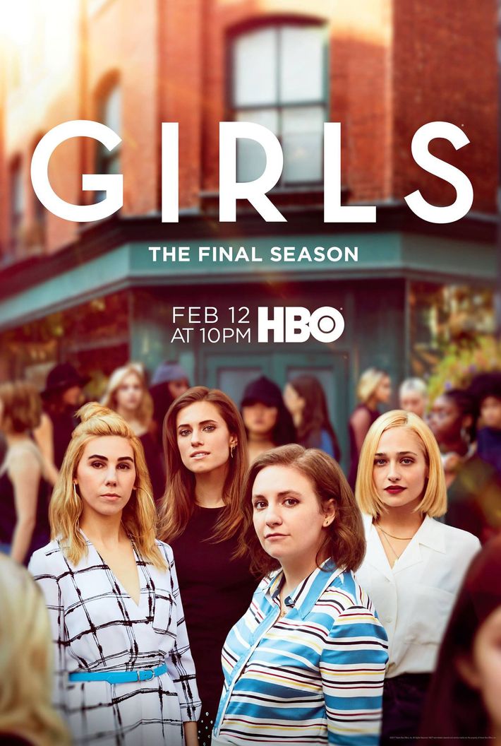
For the final poster, both the Girls creative team and HBO marketing felt strongly about the need to link seasons one and six. ÔÇ£One of the key elements [in the poster] is the background,ÔÇØ Konner explains, noting photographer Danielle Levitt closed off part of a corner in Brooklyn Heights for the shoot. ÔÇ£With younger women coming to Brooklyn, theyÔÇÖre now the old guard of Brooklyn. So itÔÇÖs them standing out from the crowd of the young people.ÔÇØ As for the image of the four main cast members, Enterlin says the idea was to draw as sharp a contrast as possible between the photo used in the season-one poster. ÔÇ£These are not the same women we knew from season one, in any shape or form,ÔÇØ he says. So with ÔÇ£every choiceÔÇØ that was made about the art, the goal was to ÔÇ£show that theyÔÇÖve truly matured and are now much more confident adults,ÔÇØ Enterlin adds. ÔÇ£I think you can see it from their wardrobe to their hair to their makeup to their body language. TheyÔÇÖre much more confident and mature.ÔÇØ Or, as Konner summarizes, ÔÇ£In the first poster, Hannah is looking unconfidently into the camera, and all the girls are looking in different directions. In this one theyÔÇÖre really all looking at the camera, bravely and confidently.ÔÇØ

