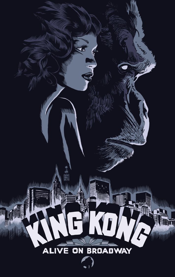
The King Kong musical would like to introduce the story of a woman and a giant ape, and a woman and a giant ape, and a woman and a giant ape. To promote the larger-than-life musical, coming to Broadway with its giant puppet this fall, its creative team decided on a supersized ad campaign, hiring designers Laurent Durieux, Francesco Francavilla, and Olly Moss to create three separate posters for the show.
While the typical show might center a campaign around a single key image, the triptych of takes on Kong will appear together on the theater itself and in tandem across its advertising. ÔÇ£This show, we like to say, is bigger than Broadway,ÔÇØ Jacob Cooper, a creative director at the advertising firm SpotCo said of the work on King Kong. ÔÇ£We want to make sure that everything we put into the marketplace echoes that thinking.ÔÇØ
The phrase may as well apply to KongÔÇÖs intended audience also, since the musicalÔÇÖs hoping to reach people in the ÔÇ£fanboy communityÔÇØ: those who love comic books, movies, and video games, and might not typically bother going to the theater. ÔÇ£We started thinking, Why donÔÇÖt we engage some artists who are really popular and well-known within that community?ÔÇØ Cooper said, noting that each of the Kong artists made their name designing for comics, movies, or other pop-culture mainstays. In another nod to that community, collectible editions of the posters will be given away at New YorkÔÇôarea comic stores on May 5, which happens to be Comic Book Day.
HereÔÇÖs how Kong built its three-part campaign, from sketches to final products.
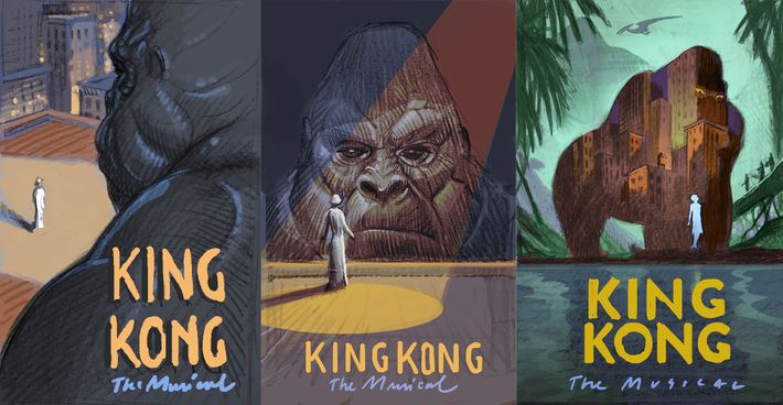
SpotCoÔÇÖs initial designs
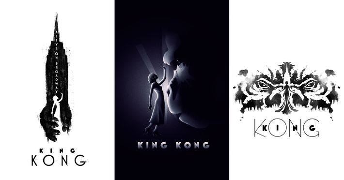
Before approaching the illustrators and designers, SpotCo created the earliest renderings in-house, to offer some ideas. According to Cooper, the musical, which had a 2013 run in Melbourne (though a new creative team will retool it for Broadway), zeroes in on the relationship between Ann Darrow and Kong ÔÇ£more so than any telling of it in the past.ÔÇØ SpotCoÔÇÖs designs all juxtapose the beauty and the beast, while still insisting on AnnÔÇÖs power (Christiani Pitts will play the character on Broadway). Classic Kong posters typically show Ann draped in KongÔÇÖs hand, in mortal danger. ÔÇ£[They] always show her as more of an accessory to him in the story,ÔÇØ Cooper said. ÔÇ£We wanted to make sure that in these posters that she really became the focus.ÔÇØ
Olly MossÔÇÖs design
Moss, who had designed for reissues of Star Wars and Harry Potter (and recently made the poster for DisneyÔÇÖs Frozen musical), sent in designs that emphasized the size difference between the leads and employed the style of a classic movie poster, of the kind that couldÔÇÖve been used for the original film. Cooper took to one that depicts Ann facing off with the ape, his fangs forming the letters of the showÔÇÖs title. ÔÇ£They said, ÔÇÿTry not to make Kong too scary,ÔÇÖÔÇØ Moss said, ÔÇ£which made it surprising to me that that was the one theyÔÇÖd ended up picking.ÔÇØ
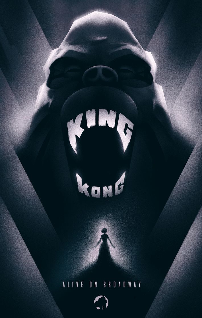
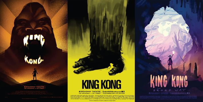
ÔÇ£At one point, we had considered using a similar title treatment on all three posters,ÔÇØ Cooper said, but when MossÔÇÖs came in, they decided to scrap that plan and have each designer do their own title treatment. The posters, Cooper decided, would be unified by the color palette, the shared motif (always Ann and Kong together), and the stamplike Kong logo at the bottom of each poster.
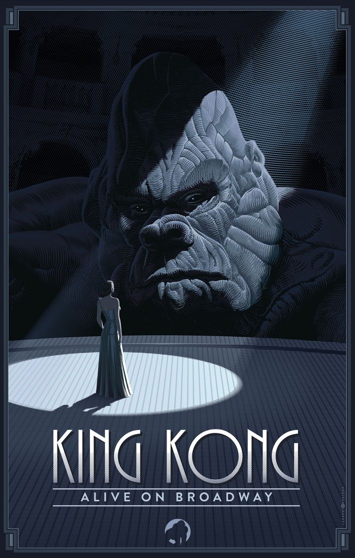
Laurent DurieuxÔÇÖs design
Durieux has designed movie posters for the Godfather series and reimagined the poster for Jaws, and even the 1933 original Kong film. His initial sketches placed Ann and Kong in a variety of scenarios ÔÇö the city, the jungle, and onstage, which became the final choice. ÔÇ£ThereÔÇÖs this kind of quiet intimacy to it, despite the fact that heÔÇÖs huge,ÔÇØ Cooper said. ÔÇ£I loved how LaurentÔÇÖs was this one very specific moment of them kind of seeing each other eye to eye.ÔÇØ
Francesco FrancavillaÔÇÖs design
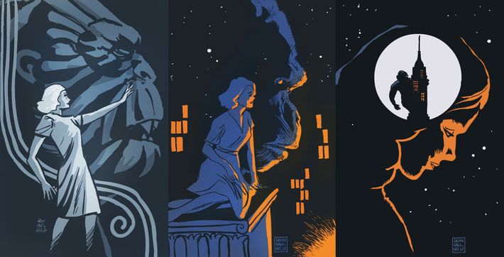
Primarily known as a comic-book artist, Francavilla has drawn for DC, Marvel, Dark Horse, and famously the zombie-filled Afterlife With Archie. While the artists all worked simultaneously, he joined the project third, which meant that his work was designed with some of the other ideas in mind. ÔÇ£The other two posters didnÔÇÖt show the city, and New York is such a character in the story of Kong, so we wanted to make sure that was represented somewhere,ÔÇØ Cooper said. He also worked with Francavilla on the scale of his design in order to emphasize AnnÔÇÖs importance in the story. The final product has them appear nearly the same size. ÔÇ£I was like, ÔÇÿI would just love a poster where they both felt like equals,ÔÇÖÔÇØ Cooper said.
