Game of Thrones executive producers David Benioff and D.B. Weiss are known for their meticulous attention to detail. It should come as no surprise, then, that they’re very involved in the creation of the posters — or key art, in Hollywood parlance — that promote each season of their show. “We’re very invested in the key art, and everything else HBO’s brilliant marketing team does, because we know that image will be the face of the season going forward, probably for as long as anyone watches the show,” Benioff and Weiss told Vulture earlier this week via email.
In theory, creating those Thrones posters shouldn’t have been much of a challenge: With so much spectacle baked into every episode — dragons! Zombies! Sword fights! — there’s never been a shortage of compelling visuals. And yet GOT’s unprecedented creative ambition is exactly why it’s sometimes been hard to figure out how to fit a slew of narrative themes into one poster. “You’re going through a tremendously reductive process,” says HBO program marketing chief Zach Enterlin. “Every season, the richest visuals in the world have to boil down to a single image.”
Cracking the code for each season meant early and frequent collaboration between HBO and the team of Benioff, Weiss, and executive producer Carolyn Strauss. “We communicate with those guys a lot in the lead-up to each season,” Benioff and Weiss said in their email. As for specifics, Enterlin says the process was “pretty identical” from season to season. “Campaigns, in terms of the creative process, would start while a season was still in production. There was a very candid conversation [where] we’d get a sense of the season, and the core ideas and themes [from] Dan and David and Carolyn,” he says. “We’d then work through those ideas on our side, and would share back with them. It was a very iterative process.”
While that did often take a bit of back-and-forth, sometimes, per Benioff and Weiss, landing on the right concept for a poster was remarkably simple. “They very often [got] a hole in one,” the duo said. “Season three, season five, season seven — all of those pieces of key art came to us pretty much fully baked.” As the beginning of the end for Game of Thrones gets underway Sunday, here’s a season-by-season look at how HBO and the show’s producers settled on the winning images.
Season 1
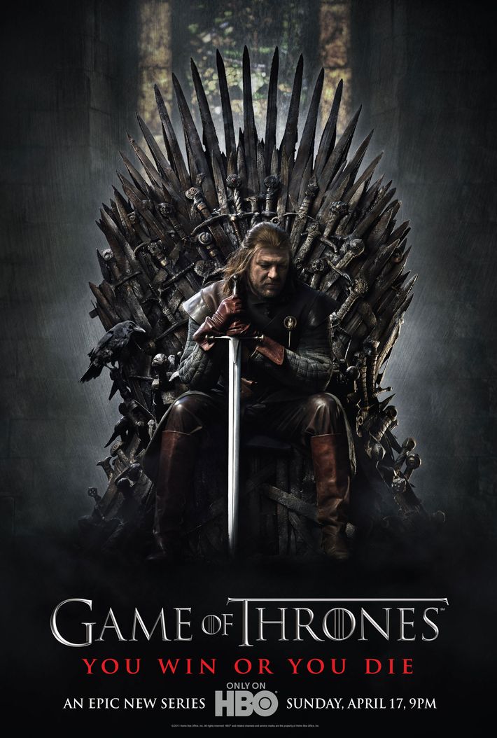
The very first Game of Thrones poster had to walk a tricky line: It needed to get fans of George R.R. Martin’s best-selling novels excited about an adaptation, while also convincing longtime HBO subscribers that the network of The Sopranos or Deadwood hadn’t lost its mind. “There was a lot of discussion on, ‘How do we sell a fantasy series to an HBO audience that isn’t traditionally accustomed to it?’” Enterlin says. Key to this, he says, was figuring out a piece of art that would be “really grounded in the central theme of the series — the battle for the throne — and a real powerful character.” The network and producers settled on an image of Ned Stark (Sean Bean) atop the Iron Throne, warily gazing down with sword in hand. “It’s cinematic and darkly dramatic, and I think suggestive of fantasy but accessible to a broader audience,” Enterlin says.
As audiences would soon discover, putting a specific character at the center of the first poster was also foreshadowing. “We definitely all wanted to put across the idea that Ned was at the center of the story, the way Don Corleone is at the center of The Godfather or Tony is at the center of The Sopranos,” Benioff and Weiss emailed. “It firmly establishes the very thing George’s book so expertly undercuts: the assumption that heroes have some kind of divine dispensation and are immune from catastrophe.” Making Ned the star of the first poster “ultimately made the rug-pull of his death that more compelling,” Enterlin adds. “We were doubling down from moment one: This is the show that would do the unexpected.”
The first poster also contains more copy than those for future seasons. There’s the tagline (“You Win or You Die,” which Enterlin says framed “the stakes of the show in a very accessible way”) plus an on-the-nose explanation of what the program is (“An Epic New Series”), along with the full day, date, and time of the premiere, along with a reminder the show is available “Only on HBO.” While the result is a slightly busier poster, “that’s part and parcel of introducing an audience to the show,” Enterlin says. “As the show became more mature, there was less of a need for additional copy and language to make the point for us.”
Season 2
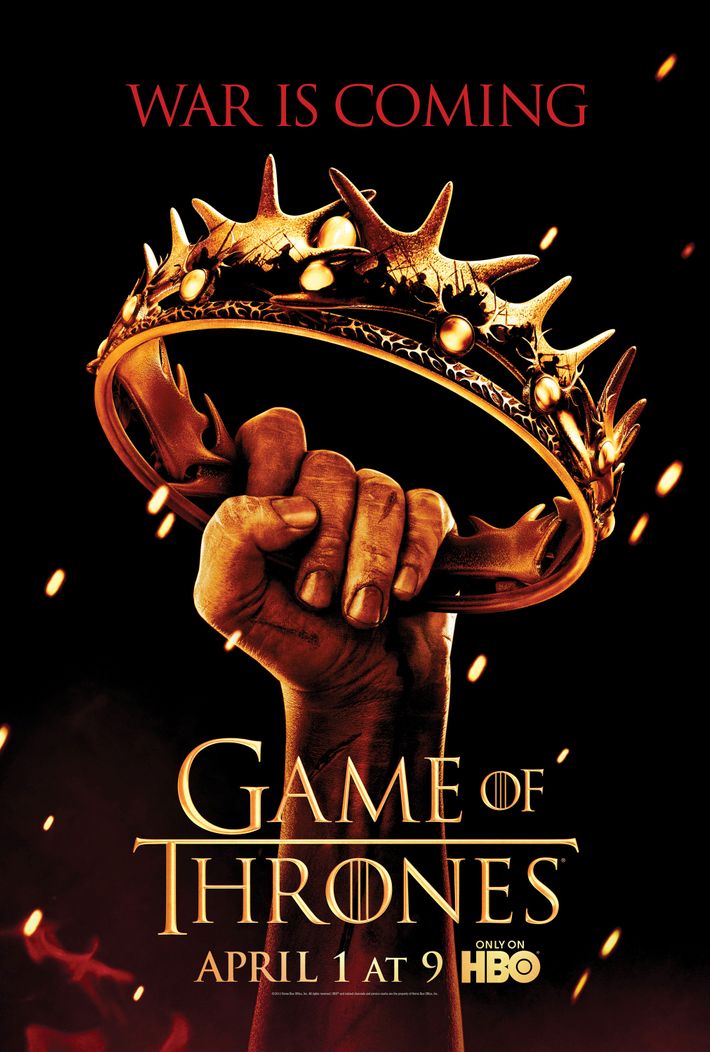
While GOT’s inaugural season did well in the ratings, it wasn’t quite yet a Nielsen blockbuster. Enterlin and his team wanted to continue to use the poster art as a pitch to audiences who hadn’t yet hopped onboard the franchise. They decided to distill the season’s theme to an image (a man’s hand grabbing at a crown) and tagline (“War is Coming”) easily grasped even by folks who had no idea what the words Game of Thrones meant. “We were trying to help our audience wrap their arms around the show, and remind them and potential new viewers that despite this very vast world, there was a truly singular focus on a battle for the crown,” Enterlin says. Once again, the elements worked on a deeper level for fans who’d read Martin’s books. “It also coincided with the second novel in the series, A Clash of Kings [and] very simply set up this idea of impending war,” he explains. The tagline, meanwhile, played on a phrase familiar to loyal fans (“Winter Is Coming”) while “promising action” to a broader audience, Enterlin adds.
Season 3
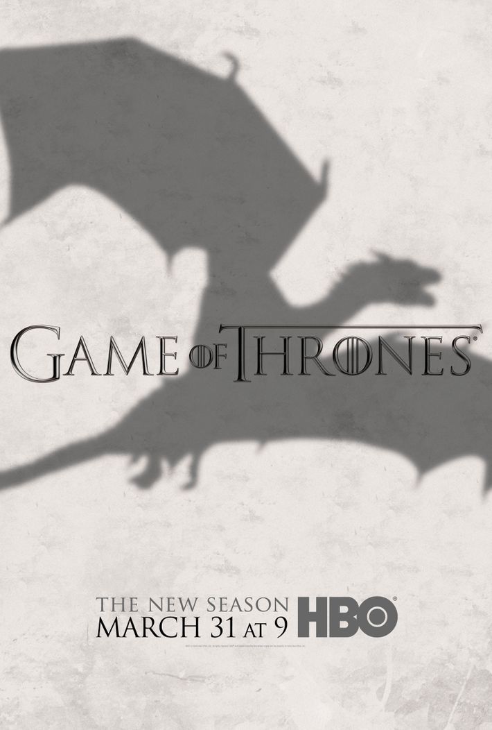
The 2013 launch of the third season stands as a milestone in GOT’s marketing history. Season two had ended with the show’s same-day ratings soaring to a record high, with an audience roughly double what it had been on premiere night in 2011. Instead of primarily aiming to familiarize potential viewers with the series, HBO knew it was now pitching to a devoted fandom — and decided to shift its marketing accordingly. “Season three was a moment when we made a very purposeful decision to lean into the genre elements and aspects of the show,” Enterlin says. The poster was the simplest, most sparse concept to date: a massive dragon’s shadow behind the show’s title, with no tagline (save for the promise of “The New Season”). “Obviously, it stands in contrast to our approach the first couple seasons,” Enterlin says. “It was unique to the show; it stood out in the marketplace; it felt big. And if you don’t even know what this is, it certainly begs curiosity.”
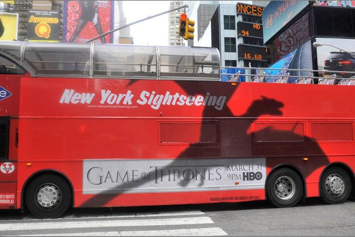
But for the millions now watching the series, the poster offered serious foreshadowing: The dragons, heretofore relatively small and not particularly powerful, would emerge as key characters in season three. The concept also gave HBO a fun tool to play with outside the confines of a poster. “It was very fun to execute in the real world,” Enterlin says of the dragon’s shadow motif. “On billboards that were on the sides of buildings, we made it appear as if it was a real shadow obscuring windows of a building. In magazines and newspapers, it looked as if it was obscuring editorial [copy]. What looks like, in poster format, just a very simple shadow, in execution was pretty disruptive and helped us break out of the confines of traditional advertising.” As for the lack of a tagline for the season, “This one felt so unique and epic, ad copy was almost reductive,” Enterlin remembers. His thinking: “Let this visual speak for itself.”
Season 4
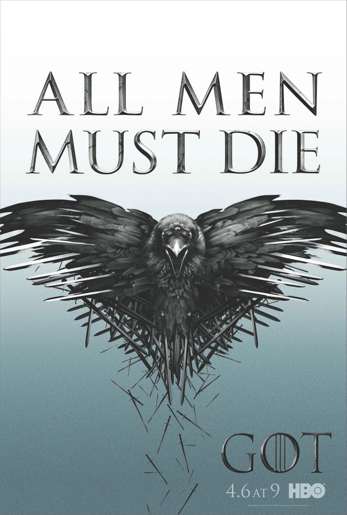
This poster was heavily influenced by a key event from season three: the infamous Red Wedding, where Thrones slaughtered a slew of significant, beloved characters. That event “doubled down [on the idea] that this was a show that was unafraid to kill off major characters,” Enterlin says. HBO’s marketing team did that by making the season’s tagline (“All Men Must Die”) as central to the poster as the image of the Three-Eyed Raven, depicted with swords falling from its body. “It was picking up that moment [from the Red Wedding] and leveraging it, reminding fans that’s what happens in the world of Game of Thrones,” Enterlin says.
Using the Three-Eyed Raven was also a way of making sure the poster had a visual unique to the world of the series. “It was important to us, across the life of the series, that when we weren’t picturing characters, we needed to use iconography that only our show owned, as opposed to a poster of a sword, which could have meaning in other contexts,” Enterlin adds. The season-four poster also saw HBO formally adopting internet shorthand for the show’s title: Rather than Game of Thrones, the series was now just GOT. “We started to see the abbreviation in social [media],” Enterlin says. “We decided we could put more of an emphatic exclamation point on that branding.”
Season 5
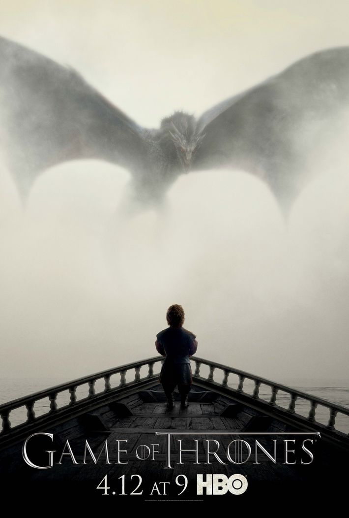
2015 saw the return of a human character to a Game of Thrones poster for the first time since the ill-fated Ned Stark headlined the series launch campaign. This time, it’s Tyrion Lannister (Peter Dinklage), seen from behind and portrayed in shadow looking up at an adult-size Drogon. “This season was very much a narrative forward play,” Enterlin recalls. “We were foreshadowing the long-awaited meeting of Tyrion and Daenerys. And this was a suggestion from Dan and Dave, the general idea of foreshadowing this meeting. We were just incredibly drawn to the simplicity and the juxtaposition of Tyrion and Drogon.” While some seasons required HBO’s various art and design teams and agencies to go through multiple versions of a concept, that was not the case for season five. “We all felt we nailed it in moment one,” Enterlin says.
Season 6
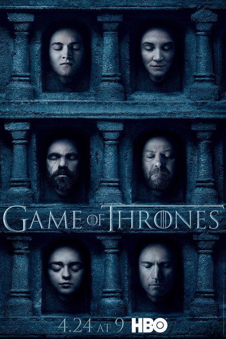
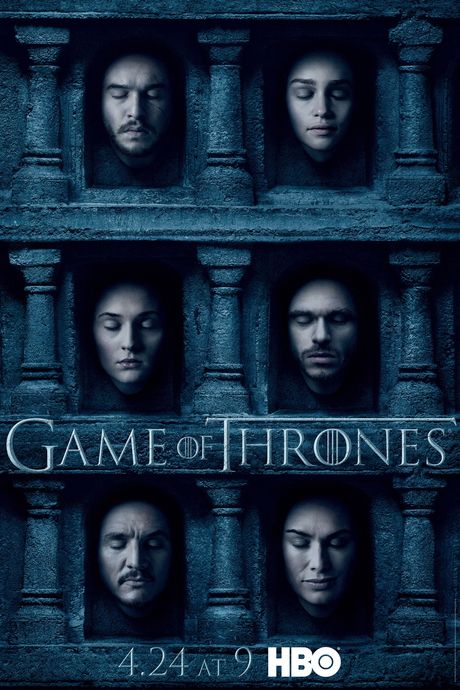
When designing marketing for GOT, HBO and the producers were almost dogmatic about making sure their efforts never looked too much like … well, like typical Hollywood marketing efforts. “You never saw the prototypical TV poster where you create some kind of artificial environment where all the characters are assembled,” Enterlin says. “We were very, very focused from moment one on ensuring we were always organic to the world.” But once the Hall of Faces popped up during season five, the marketing team realized they could finally do their version of an Avengers-like poster, packed with a ton of fan faves. “Here was an organic way for us to include characters who had never met in the show at that point,” Enterlin says. The concept was so rich, HBO produced two versions of the art, allowing a dozen characters to be shown resting in eternal slumber — and setting the fandom afire as folks raced to figure out at what the posters were hinting. “We liked the idea of foreshadowing an even deeper story line for the Hall of Faces in season six,” Enterlin says. “It provided a really juicy format for us to reinforce the idea that no one is safe in Game of Thrones. It was very much debated on the internet as to what [the inclusion of certain faces] meant.”
Season 7
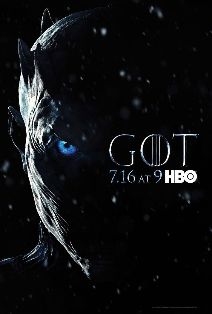
The penultimate Thrones poster was the most pure representation yet of the show marketing itself almost exclusively toward the existing fan base. It’s one very stark image — subtle snowflakes falling across the partial face of the Night King, with a focus on one of his blue eyes — along with the acronym version of the title. Enterlin says the campaign was meant to signal the show’s ending was near. “This was a very visual representation of the idea that winter is finally here,” he says, adding that the poster promises “a real epic showdown” is at hand.
“The Night King is such an incredibly rich character for us, so this just gave us the opportunity to go dark and ominous, and kind of present him as the one true enemy,” Enterlin explains. “In season six, we very much focused on all the battling between the houses and the various factions in the world of the show. In season seven, with this campaign, we were very much reinforcing the idea that there was a higher-level enemy that overrides all.”
Season 8
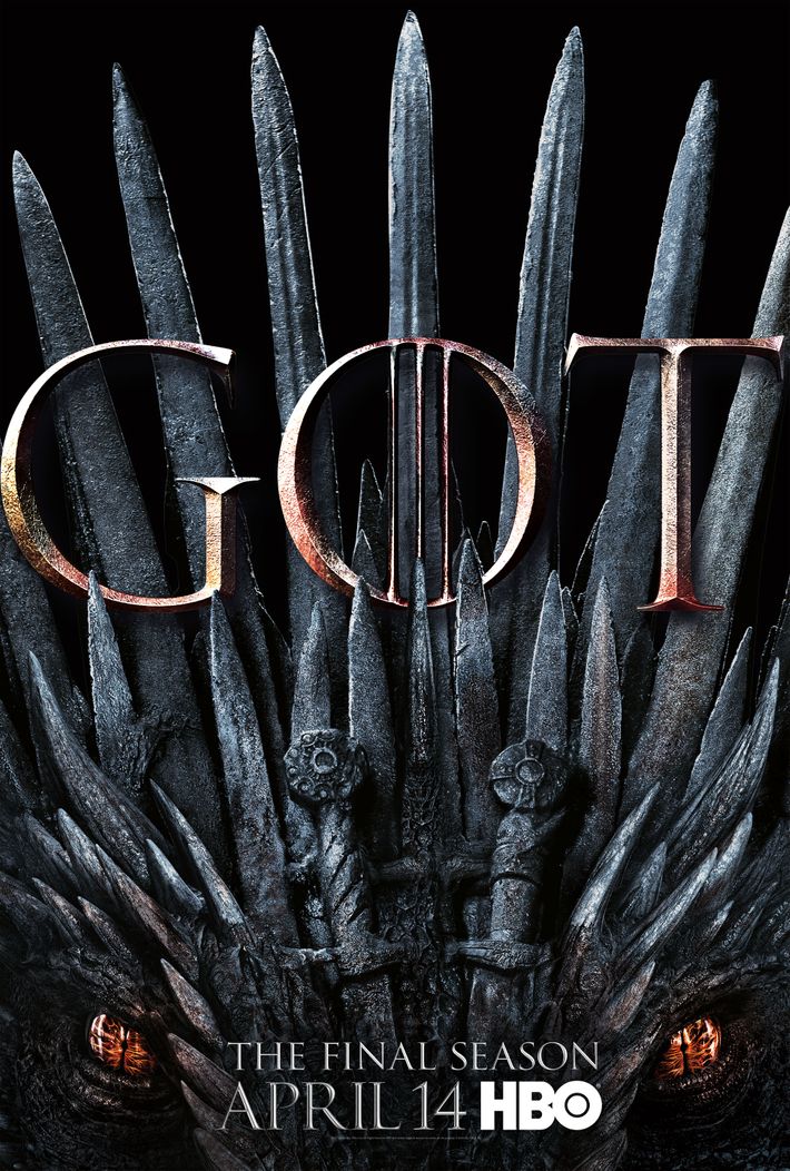
The poster for the final season combines two of the show’s biggest icons — a throne and a dragon — and puts the acronym of the show’s title front and center. “We really wanted something that felt representative of the series overall,” Enterlin says. “We knew we wanted to focus on the throne, but the challenge was, ‘How do we use the throne in a new way?’” Dragons had similarly been used twice before. Putting them together for the first time, however, proved “incredibly compelling,” Enterlin says. What’s more, the way the poster blends two key images into one is subtle, so much so that some viewers might miss the dragon upon first glance. “We loved that idea of discovering that the dragon eyes blend in with the throne,” he says.
The basic idea of the image was also easy to adapt for the 20 character posters HBO produced this season, which sub out the dragon for individual actors sitting on the Iron Throne. “The intent was very much doubling down on the conversation in the world [about] who will end up on the throne,” Enterlin says. As for whether Benioff and Weiss tipped off Enterlin about who actually will end up on the Iron Throne at the conclusion of the show, the exec was coy. “I might or might not know how this season ends,” he laughs. “We can talk after May 19.”


