Font of Knowledge: Futura’s Great Moments in Pop Culture
Futura may never overtake Helvetica for title of Most Ubiquitous Typeface, but it’s had more than its fair share of pop-culture moments in the sun — and the moon: The plaque the Apollo 11 astronauts left on the lunar surface is set in Futura’s elegant, uncluttered letters. The Stanley Kubrick fave popped up in the new trailer for Sleeping Beauty, but that’s hardly its only appearance in recent years:


The trailer for Julia Leigh's Sleeping Beauty uses jumbo-size Futura in contrast with its spooky, moody music.


Ron Swanson's Pyramid of Greatness took its inspiration from John Wooden's Pyramid of Success, but it took its design cues from somewhere far lovelier...
Ron Swanson's Pyramid of Greatness took its inspiration from John Wooden's Pyramid of Success, but it took its design cues from somewhere far lovelier.


The "Facebook font" is actually Klavika, but the iconic The Social Network poster went with classic Futura. (More on the design at FontFeed.)


Lost's opening swirling title is set in Futura, but it was never intended for air — J.J. Abrams designed it on his laptop as a placeholder.


The Hangover (and The Hangover Part II) posters sport an all-caps version. Perhaps it's a nod to the extra-bold condensed variant on the Absolut bottl...
The Hangover (and The Hangover Part II) posters sport an all-caps version. Perhaps it's a nod to the extra-bold condensed variant on the Absolut bottle? Perhaps not.


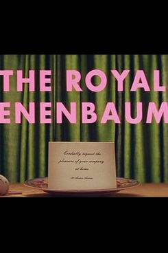
Wes Anderson is a Futura devotee, and it appears in The Royal Tenenbaums at every possible turn, including but not limited to the opening credits, the...
Wes Anderson is a Futura devotee, and it appears in The Royal Tenenbaums at every possible turn, including but not limited to the opening credits, the text on the sides of buses, and in posters and programs throughout the movie.


The movie may have disappointed hard-core Watchmen fans, but there was at least one aspect that was exactly right: The redrawn logotype matched the pr...
The movie may have disappointed hard-core Watchmen fans, but there was at least one aspect that was exactly right: The redrawn logotype matched the pre-digital version of Futura used in the comics.


Does Sandra Bullock's body look weirdly Photoshopped? Maybe. But what clean, easy-to-read type!
1
/
8