At VeniceÔÇÖs enormous, city-filling Biennale art exhibition, there are about 90 national pavilions, in which each country selects one or more artists to exhibit their work. In addition to these, there were more gypsy shows than could be counted. I did not see everything: I was at this art Woodstock for four days, but paid my own way, which meant no expensive water taxis to take me way the hell out to some island show in the lagoon. So while IÔÇÖm sure I ÔÇ£missed the one thing that should have been seen in VeniceÔÇØ (which is what everyone at the airport kept saying as I prepared to board the plane home), I did see some riveting things, some revolting ones, and everything in between. Here are my five personal favorite pavilions and my three least favorite.
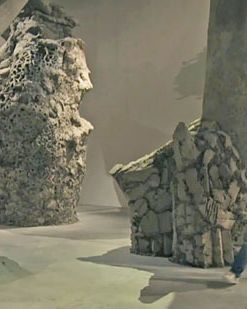
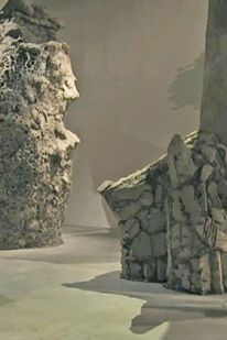
A surprising turn. This young artist created a series of giant
archeological columns that seem to come from 10 million years in the
future ÔÇö or might be the last sculptures on earth. His spatial
dwarfing, mudlike construction techniques, imagination, scale, and
notions of history unfolding, out of control, all made me look forward
to seeing more from this 31-year-old.
An installation of pastel-colored shapes made of soap, paper, and clay
mixed with Vaseline and Venetian marble dust. Dirt on the floor creates
paths; one comes away with the feeling of an artist in sweet control of a
sensitive touch and on her own.
An enormous, labyrinthine, multi-roomed installation that conjures working-class Istanbul and a mad photographerÔÇÖs darkroom. NelsonÔÇÖs brand of hyper-realism isnÔÇÖt to my taste ÔÇö to me, itÔÇÖs a series of stage sets gone bananas ÔÇö but he wowed crowds and took people on some sort of journey to an inner Orientalism of the Mind. So I will bow in this case, without resentment, to the crowd.
Photo: CRISTIANO CORTE/CRISTIANO CORTE
HirschhornÔÇÖs full-on, all-out building-filling installation involves mannequins, aluminum foil, gruesome war pictures, and broken bottles. ItÔÇÖs a true overload, a fabulist fortress of shame, solitude, fury, resolve, and artistic/political ambition. My personal favorite, even when it veers toward the didactic and goes over-the-top.
Photo: FILIPPO MONTEFORTE/2011 AFP
The three videos in this pavilion take the premise that the Jews of the world have right of return to Poland, where they may build settlements. TheyÔÇÖre too HBO-slick and overlong by half, but the gripping idea behind them sticks in the mind ÔÇö even if it would start another world war.
Christian BoltanskiÔÇÖs overblown printing-press contraption whirs at breakneck speed, producing black-and-white baby pictures: ItÔÇÖs Festivalism ÔÇö art made for events like this, and nothing more ÔÇö at its most bloated, bland, and pointless. IÔÇÖm continually baffled by how beloved Boltanski is by the Curatorati. Indeed, I ran into two megacurators in Venice (a former documenta curator and a major London museum director) who said to me, ÔÇ£Boltanski is good, right?ÔÇØ I replied, ÔÇ£You two have been trying to tell me Boltanski is great for twenty years.ÔÇØ HeÔÇÖs not.
Photo: FILIPPO MONTEFORTE/2011 AFP
Far worse than BoltanskiÔÇÖs merely bad art is Vittorio SgarbiÔÇÖs malevolent bad-faith, art-hating arrogance in the ugliest contemporary-art exhibition that I have ever seen.
ArtInfo identifies Mr. Sgarbi, a politician, writer, and collector, as ÔÇ£the Glenn Beck of the Italian art world,ÔÇØ and indeed there
is a kind of paranoid madness present here. His pavilion is an unmitigated visual onslaught installed on walls and curving shelving units. ItÔÇÖs almost all academic kitsch, bad figure painting, or anything the curator imagines as anti-avant-garde. Being reactionary is nothing new, but this is extraordinarily bad. The New York
Times (
in a review that, full disclosure, was by my wife) called the show ÔÇ£unredeemableÔÇØ and a ÔÇ£national scandal.ÔÇØ Is there anything good about this cattle call? Perhaps only that it wonÔÇÖt be surpassed anytime soon.
IÔÇÖve already written about this super-hip artistic duoÔÇÖs gargantuan encapsulation of the Ugly American via tank and treadmill. Had I been the curator, however, I would have tried to stop them there, because everything else theyÔÇÖve done inside their pavilion is obvious, redundant, or silly. The first work you see inside the door is a black-painted, seven-and-a-half-foot replica of the Statue of Freedom (also known as Armed Freedom), the bronze sculpture that has stood atop the U.S. Capitol dome since 1863 ÔÇö but here it rests prone on a tanning bed. Perhaps meant to evoke a president lying in state, it is so visually dead, pedantic, and simplistic that I think it may not even be art. Further along, actual Olympic athletes perform on a set of wooden replicas of business-class airline seats, and in the end itÔÇÖs just pointless and ugly. The ginormous racket-producing tank spectacle outside is more than enough. It may be drop-dead obvious and may be the most expensive thing one could imagine lugging to Venice, but as one of the more obnoxious national acts ever executed at a Biennale ÔÇö making American art spill over, dominate, and colonize the space outside the building ÔÇö it serves as an enticingly odious metaphor for our recent wars and ÔÇ£freedom agenda.ÔÇØ The only thing that could be more poignantly odious (in my Jewish mind) would be to have artists from the Israeli Pavilion located two feet away build a settlement here. Then they could have refused to remove it, citing some ancient literary text.
Photo: FILIPPO MONTEFORTE/2011 AFP


