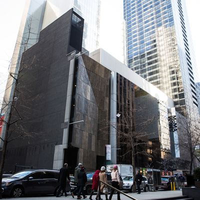
When the Museum of Modern Art wrapped up six months of foregone agonizing and decided to raze the American Folk Art Museum, it claimed to be sacrificing a small work of architecture for the sake of Big Art. MoMAÔÇÖs prescription for the ideal viewing experience is more galleries, more wall space, more hallways, and bigger lobbies. MoMA isnÔÇÖt so much growing as it is engineering itself to pump high-volume crowds as efficiently as possible through its art-lined pipes.
There is a more attractive alternative. The museum could let the Folk Art building stand, perhaps punching open a small ground-floor passageway to supplement the front door. My colleague Jerry Saltz has called it ÔÇ£a useless place for the exhibition of art,ÔÇØ but I wonder. Certainly, keeping it would present curators with an assortment of challenges, but MoMAÔÇÖs vast treasury includes plenty of drawings, design objects, and architectural models that would benefit from a little bespoke intimacy. A flexible museum might find that, rather than compromising a grandiose vision, it had stumbled into an opportunity. The buildingÔÇÖs problem ÔÇö and its promise ÔÇö is that it is small and tight, with odd corners and little flexibility or room to maneuver. But those are liabilities only by a behemothÔÇÖs standards. Some of the stars of MoMAÔÇÖs collection, including the Picasso still life Ma Jolie, began their semipublic lives in the cramped Paris apartment of Gertrude Stein, and may even have been more comfortable there than in todayÔÇÖs sterile galleries.
IÔÇÖm not suggesting that MoMA use the Folk Art building as a VIP lounge for celebrity paintings, but it could function as a cabinet of wonders. An institution where creativity trumps real estate doesnÔÇÖt just build to meet its needs; it adapts to constraints. Think of the Museum of Jurassic Technology, in Los Angeles, a sublimely disorienting warren of connected rooms. Or the Frick Collection, housed in an eccentrically sumptuous mansion that got uncomfortably cramped during its Vermeer show but is otherwise eminently navigable. Or the Cloisters, or the Barnes Collection (both before and after the recent renovation), or any number of castles, chapels, and palazzos in Europe where visitors thread through enchained spaces linked by stairs, landings, and uneven floors. These are all museums whose idiosyncrasies enhance the experience of seeing an object in its home, rather than floating it in a neutral bubble. MoMA has a chance to repeat what it did 75 years and four buildings ago: make room for a little close-up contemplation among the mountain range of midtown.


