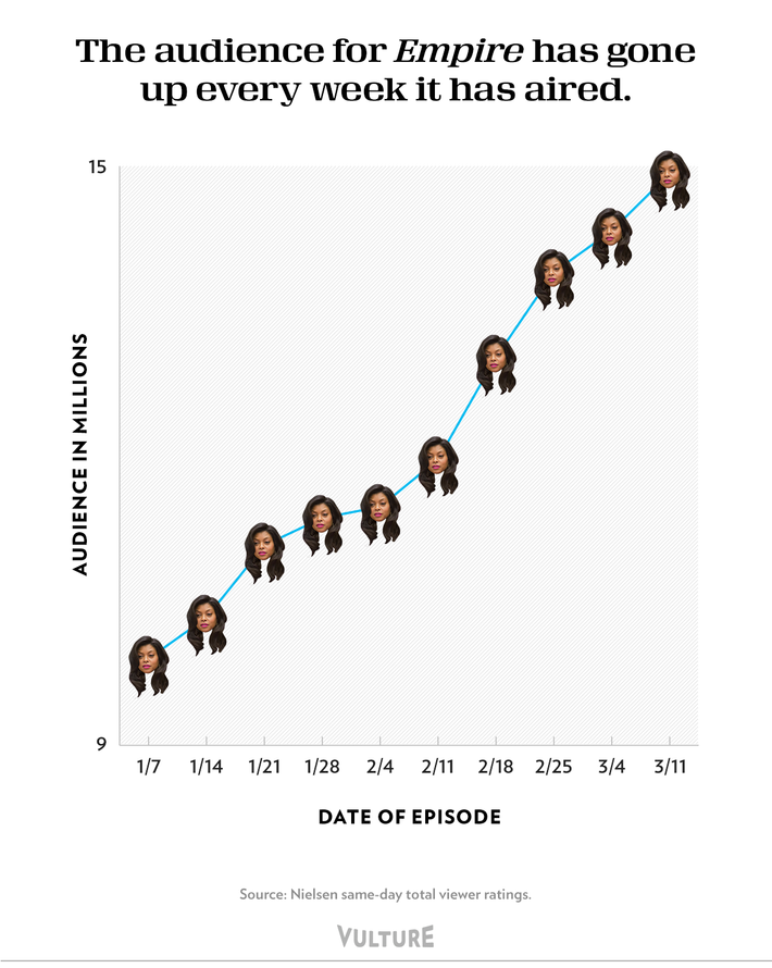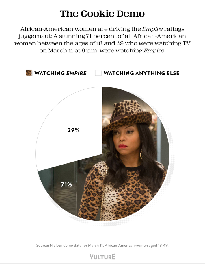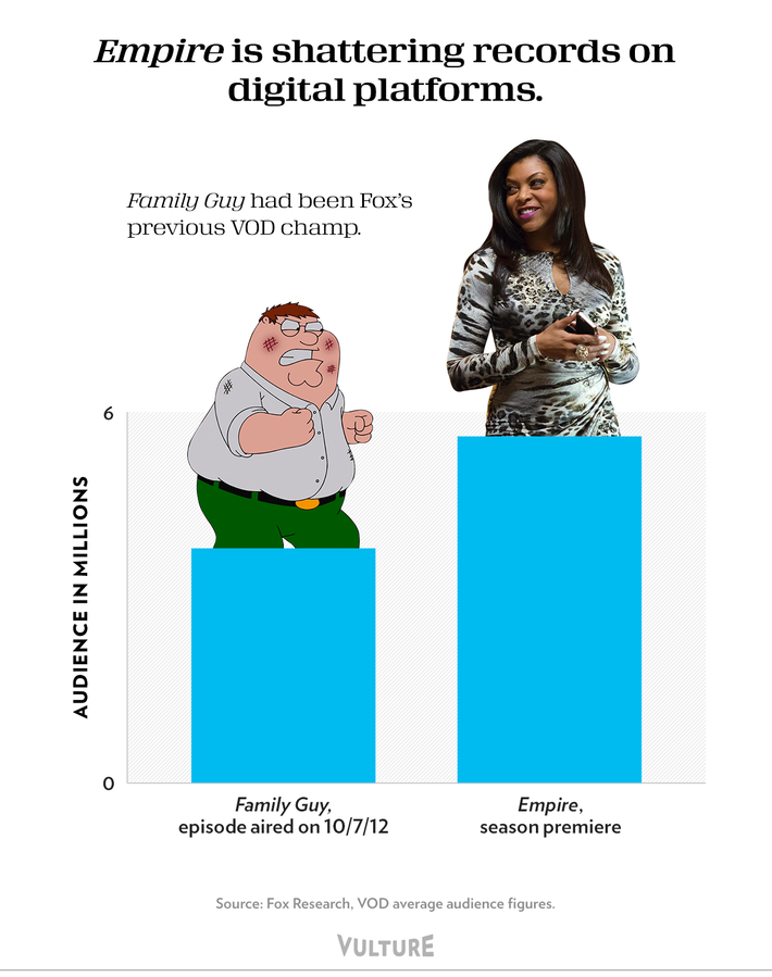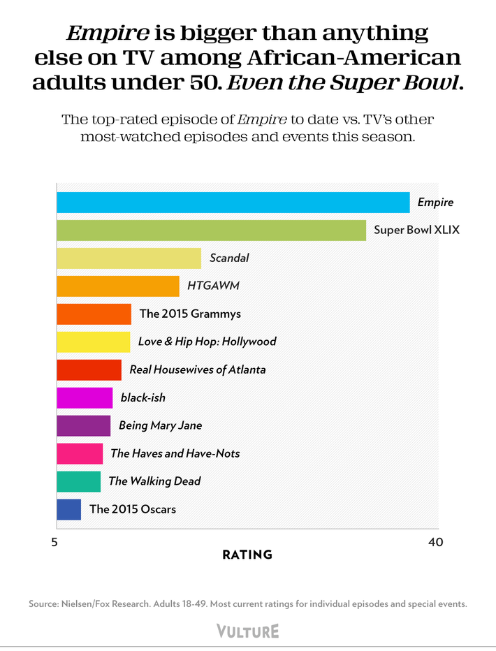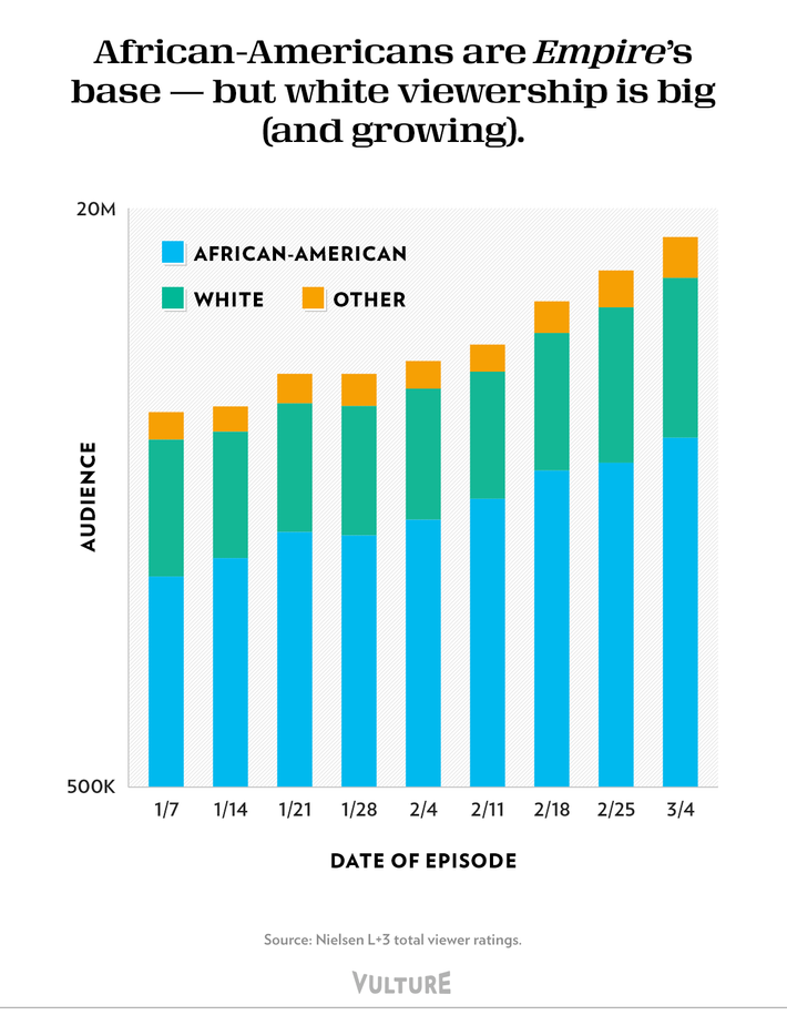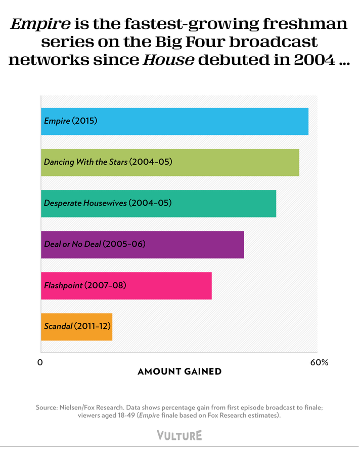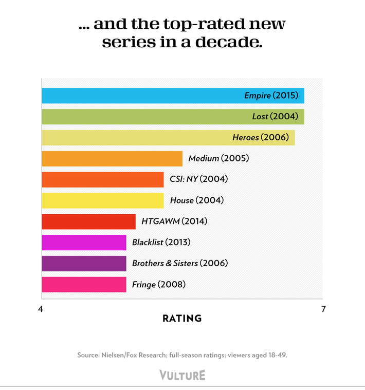
Empire burst onto the pop-culture scene back in January, filling the blank space for an outrageously over-the-top, 1980s-style prime-time soap opera we didn’t even know existed. Vulture has since done our best to chronicle its effect on everything from the TV and music industries to fashion and the national lexicon. But sometimes the best way to measure impact is through the Magical Power of Charts and Graphs. And so here it is — the story of just how massive a hit Empire is after only one season, as told through seven Cookie-powered infographics. Read on to discover who’s watching the show, how they’re watching it, and how it compares to TV’s other big hits of the past decade. (Click here for our analysis of the “Empire Effect.”)
