What’s the main purpose of a television title sequence? For some viewers, it’s a time to situate themselves and unwind before the start of the program. For others, it’s ignored or fast-forwarded through, an unwelcome distraction before the start of the show. Patrick Clair, the brains behind True Detective’s lauded season-one and season-two title sequences, recently spoke with John Horn, host of Southern California’s Public Radio’s arts and entertainment show “The Frame,” to discuss the process behind creating titles. As expected, it’s hard. (Subscribe to “The Frame” at iTunes or Stitcher.)
Opening titles in some ways are a little bit like [a] score, in that if you’re noticing them, something’s gone wrong. In other words, you want to kind of disappear and be part of the fabric of the show, not call attention to yourself. So does that mean while your opening titles are plain, people should be reading the names of the cast and the crew of the show? Or should they be looking at the designs themselves, or a little bit of each?
You know, I think it’s actually a time for people to sit back and relax. I don’t think that they pay a great deal of attention to those names; it’s most important for those names to be there so that people get that recognition. I think it’s good that they’re thinking about the visuals, but the goal is really more to get them in the mind-set that they’re coming back to their show. You don’t want to shock them or challenge them too much, and are more just saying, this is the tone of what you’re about to see, get ready.
Before we get to True Detective season two, let’s talk about True Detective season one. When you’re beginning the process of creating a new title design and you know you only have about a minute and a half to do that, what are the conversations that you want to have with the creative people? What are you going to talk about — tone, theme? What are the kinds of things that you’re going to discuss, and how far ahead of the show’s premiere are you having those conversations?
Look, it always varies. Sometimes it’s a month or two before the show starts, or sometimes, as is the case with True Detective, we had a good six months plus. But I think we’re really blessed as title designers. We come in at a great point in the process — usually the show is fully or partially filmed. The show’s creators have usually been working on the material for years and years, and they’ve been expressing that material through scenes and characters and live-action filmmaking. They’ve usually been thinking of subtext and symbolism and these kinds of deeper themes and what kind of art might represent their show. So we get to come in, they’ve been doing that hard work for one, two, five, ten years sometimes, and they just kind of dump all that thinking on us. And that’s what’s really exciting, when you can take all that symbolism and mine that for inspiration to create something that’s really visual and expressive.
The opening title sequences for True Detective for both season one and season two also have very prominent music in them. At what point do you know what the music’s going to be, and how do you work within the music to create your main titles?
With True Detective, that was specifically really exciting because that was something the show knew they wanted from the get-go, and they were able to come to us. Going to season one, as an example, they had that song, and they also had a series of photographs that were taken back in the ’90s of the area where they were filming. Between that visual inspiration and that musical inspiration, we were really able to understand what was at the heart and soul of the show. That’s how we were able to distill it into a design.
Let’s give a listen to the Leonard Cohen song called “Nevermind” that is at the start of season two of True Detective. When you hear that song, does it conjure up specific images? Is there a rhythm? Is there a pace?
Certainly the music is probably the most important piece of inspiration. I remember when Nic [Pizzolatto] first played me that track this year, we were in a trailer out in the wild on the Santa Monica mountains where we were shooting, and he told me who it was going to be, and I’ve been a Leonard Cohen fan since I was a teenager. I’ve always wanted to have his voice on something I’ve created. We’ve even tried on a couple of other projects to get him involved, and timing didn’t work out, so, then, for this chance to do a True Detective sequence to one of his songs was something truly exciting. You know Cohen’s work is such a strange combination of ’80s synth on one level, and then this kind of dark, brooding insight into character and the nature of humanity on the other. It’s this really strange mix of high and low art. And that was something we could immediately tap into and start to think about — the dark and also light imagery that we could use to visualize Southern California for the show.
Does that mean as you’re kind of creating the opening titles, you’re repeatedly listening to this song out loud, and it’s just like the soundtrack of the office?
Absolutely, it’s just been playing on loop. The guys who sit outside my office want to kill me, I’m sure, but it’s such a beautiful track, I could listen to it forever.
One of the things that you do in your opening titles for this show is you use silhouettes of people, places, and things as kind of a framing device. I’m curious, is that something that you are enamored with generally, or did it feel specifically appropriate to True Detective?
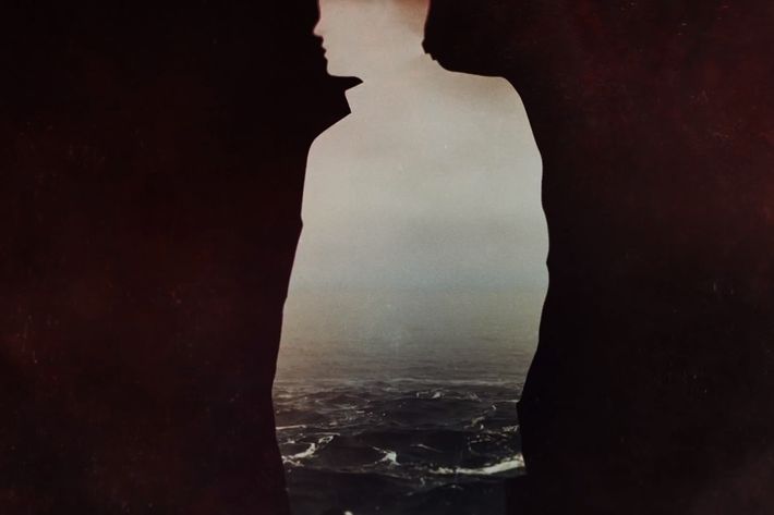
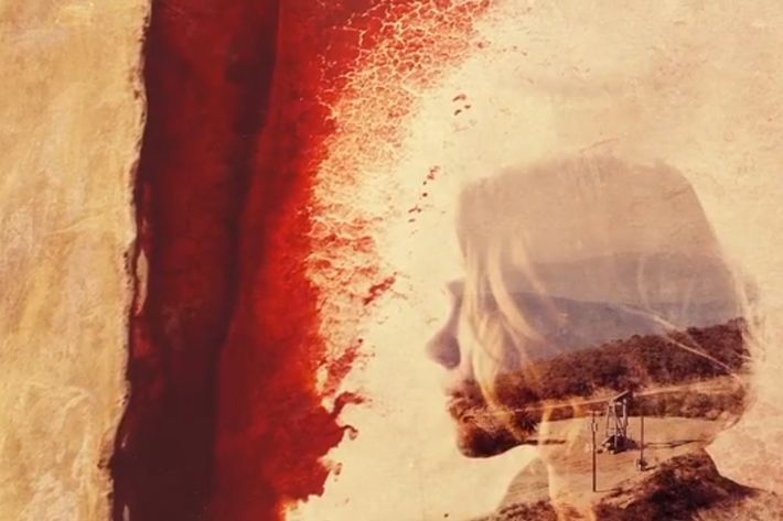
It was absolutely about True Detective. The creative process can be so chaotic and open and all over the place that it’s hard to know how to guide yourself. One way that I like to do it is to just be really super-literal. So when I was first on the phone with Nic for season one, he said, “What we’re trying to do is to use the landscape of Louisiana, the way that it’s poisoned, the way that it’s broken, the way that it’s polluted, to show how these people are poisoned and broken and polluted.” So I kind of interpreted that in this really straightforward way. I was like, “Oh, why don’t we make portraits out of broken landscapes?” And they can be broken portraits with poisoned landscapes. And that kind of led us to this response that hopefully comes across as a little more artful and sophisticated than it sounds, but it kind of just goes straight to the heart of what they’re doing with the live-action drama.
And what was the following conversation about season two?
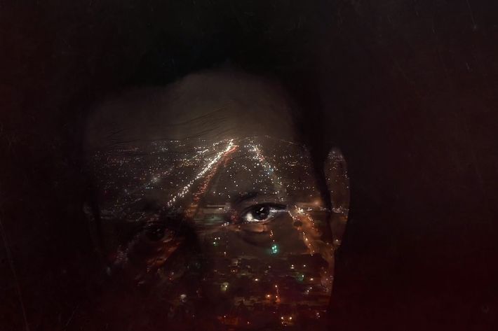
In some ways it’s got to be an evolution, and one of the challenges for us is, how much do we change and how much do we keep the same? And we certainly wanted to retain some of the DNA of season one going into season two. But at the same time, Nic’s got this incredible talent for finding locations and finding worlds that really speak to what’s going on in a very small sense inside his characters. So I think when you look at a lot of shows that might have aerials of freeways, for instance, they’re just there as eye candy. Whereas here, those freeways serve as a metaphor for what’s happening in the character’s lives and the journey they’re going on.
Did your team go out and shoot specific footage for the title sequence, or were you using images from the episodes themselves?
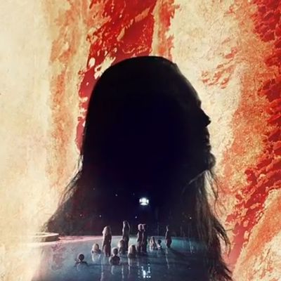
It’s been a combination. We certainly do use some material for the show, but beyond that, I like to go out and hunt for photography that really captures the essence of the location and the people in it. We were lucky this year. We used material from a range of photographers, but there was one in particular, David Maisel, that I know Nic had been looking at when he was developing the visuals for the series itself. We went and got the series of amazing aerials that Maisel has done of California, that have the most vivid colors in them. They have these deep, vibrant golds, these rust reds, the rocky landscapes as seen from high up in the sky. We were able to stitch those together and combine them with imagery from the show to get something that hopefully really sets this sequence apart from the first season.
What were the other themes about California, about the state itself? And how it was going to be represented, not just in the story but in your main titles?
It was a really exciting thing for me, having moved from Australia, and just getting to know California in a very deep sense for the first time. I lived here briefly in the past, but it has been these past 12 months that I’ve come here and stuck myself in it. If you know the 10, the 405, and the 401, you can navigate the city, they are the main landmarks. You so often see California represented in a kind of cliché way that’s all about glamour and fun in the sun, and what I wanted to do was to see that darker, more gothic edge. That more complicated view of California. Something that you don’t notice from Australia is that L.A. is really in a desert. It sounds silly when you’re here … you know, we see strips of green grass and palm trees and it looks so lush, but you come here and the mountains are rocky and vivid. They’re full of golds and rusty reds. It’s a dry, hellish place in some ways, but also a really beautiful place. That was some of the imagery we wanted put into the main titles.

