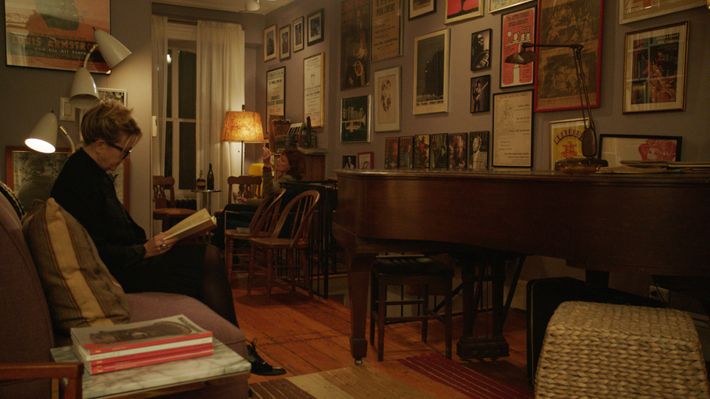
Last week, a brownstone took my breath away. I’m not one of those interiors people, though sure, I’ve tapped through some Instagram home tours, ogled my fair share of spotless Nancy Meyers kitchens. But in 3 Generations — the story of a blended family coming to terms with their teen’s trans identity — a brownstone in New York City’s East Village really won me over. With walls lined with gallery prints and mismatched furniture paired just so, it’s artfully crowded with memories and trinkets. Elle Fanning commits to her performance and Susan Sarandon is reliably great, but make no mistake: The interiors steal this show.
Ray (Fanning) is a trans teen in high school, and he’s convinced his mom that it’s time for him to make the female-to-male transition. But with the way Ray lives — with his mother Maggie (Naomi Watts), grandmother Dolly (Susan Sarandon), and her partner Frances (Linda Edmond), and an absent father, Craig (Tate Donovan) out in the suburbs — his decision to transition becomes everyone’s business. “[Maggie and Ray] live at the top of the brownstone, and [Dolly and Frances] live at the bottom. To get to their space they had to go through other people’s lives,” production designer Stephanie Carroll told me. “We wanted to keep the residences separate. The family would be living in the city, [with] not a lot of money, and they’d live all together, on top of each other.”
When Carroll and director Gaby Dellal found the Stuyvesant Street brownstone that would hold Ray and his family, the producers were skeptical. The owners kept it cluttered — “It was a hoarder’s paradise. The family had lived there probably 90 years” — and it was a cramped space to shoot. “Gaby and I loved it, loved the structure, going up to the top floor, the winding staircase. The place had so many different levels,” Carroll said, “almost like all the levels the characters go through.”
Not a lot of movies show this way of living anymore, where entire families are stuffed into an (admittedly luxuriously bohemian) home, and how it can stunt one generation’s growth — an effect visible in Maggie’s room. “To get to her space she had to go through other people’s lives,” Carroll said. “We liked [that space] a lot because there was a lot of going up and down and up and down the stairs.” The home’s warmly lit clutter turns claustrophobic when Dolly squawks that it’d be easier for Ray to be a lesbian, or when the teen pushes his mother to convince the father he’s never met to allow his transition. Every scene of a wacky bonding moment or a desperate argument seems a little more dire when there’s nowhere to hide in a home full of the baubles and detritus of four lives.

The brownstone has a clear aesthetic, with the exception of Ray’s room. He’s coming of age and transitioning, and his room has a certain blankness — not empty, but almost like it’s waiting to be decorated to match his male presentation. On the wall is a massive abstract art piece that looks like it’s counting down to his transition. The work was made by artist Squeak Carnwath, who agreed to produce a piece for the film at Carroll’s request. “For a low fee, Squeak agreed to let us use some of her art,” Carroll said. “We we put on the wall is an exact replica of her painting to made it look like it’d been painted onto the wall by Ray. Squeak was integral: Ray’s work, in my mind, had to have a feminine and a masculine look to it.”
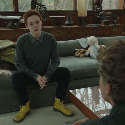
Ray grew up in this home of women, but he needs his father’s signature to allow his transition. Craig’s home and his life is totally opposite: Where the brownstone is stuffed, his home is starkly modernist. Carroll found the Frank Lloyd Wright–designed home in the historic community called Usonia in Pleasantville, New York. The house is open and sophisticated, littered with Craig’s new family’s toys in a way that makes it clear domesticity makes him uncomfortable. He left Maggie when Ray was a baby, and fell out of both of their lives, eventually starting a whole new life with a new woman. “His home had a perfect clean, not cluttered, more sophisticated contrast to the family home in New York City. It fit the father’s character, and could show how different he was from Ray,” Carroll said. “Those big windows, the nature — all the things the other house didn’t really have. The whole Frank Lloyd Wright idea of bringing nature and the interiors as one, how it’s community. To me, it had the opposite feel of the city.” When Ray goes rogue to beg his father to sign the doctor’s form, he moves through the house like a foreigner. This family dynamic, with its clean lines and floor to ceiling windows instead of art hung gallery-style, isn’t what he’s used to.

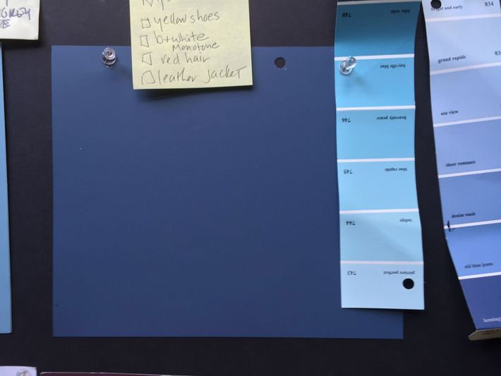
A deep, rich blue works as the movie’s visual through line, popping up in both locations. “That blue seemed perfect for Ray — not too masculine, but feminine, and deep,” Carroll said. She’s worked with Mira Nair (Queen of Katwe) a handful of times using vibrant reds, but 3 Generations let her use more blues in its color scheme. “The the most important thing to me, really, is the color and the shapes,” she said. “Is this a square person? Does this person have round things in their room? It’s all subliminal.”


