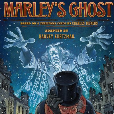
For fans of great comics, Christmas has come early. This week sees the release of Harvey Kurtzman’s Marley’s Ghost, a graphic-novel adaptation of Charles Dickens’s A Christmas Carol, and its title should be mouth-watering for students and admirers of the craft of cartooning. Kurtzman was indisputably one of the finest creators and editors that sequential art has ever known: He was a dynamic writer-artist who tackled war and social injustice with a bracing aesthetic, he was one of the founders of MAD magazine and both contributed to and edited the revolutionary humor publication in its formative years, he wrote Playboy’s groundbreaking Little Annie Fanny strips, and he crafted one of the first comics paperbacks to hit the mass adult market in the form of 1959’s satirical Harvey Kurtzman’s Jungle Book. Since his death, in 1993, his admirers have celebrated his wide range of talents, but ask around in expert circles and one element will come up again and again: his layouts.
Kurtzman was a master at constructing a comics page. Even on projects where he was only billed as the writer, he would typically build blueprints for his artists and insist that they hew to them closely. When he died, he left behind his unfinished Dickens translation, a project he began in 1954 and for which he created 70-odd thumbnail page designs and seven color layouts. Though it never came to fruition in his lifetime due to indifference from the publishing world and Kurtzman’s self-confessed poor salesmanship, it’s been brought back from the dead like the titular Jacob Marley. Under the aegis of digital-comics retailer comiXology, Gideon Kendall has completed pages based on those layouts and created new ones to fill in the gaps, with adapted Dickens text from Josh O’Neill and Shannon Wheeler. The finished product is holiday magic, and one page, in particular, catches the eye. It’s brilliantly laid out, and made all the more notable because Kurtzman didn’t actually do the layout for it — it’s a Kendall original that pays tribute to Kurtzman by being so clever that you’d think the legend had created it himself.
It comes during the Ghost of Christmas Present portion of the well-worn story. The jovial spirit is escorting Ebenezer Scrooge through a holiday party thrown by his the old man’s nephew, Fred. Invisible to the revelers, Scrooge sees them dance, laugh, and — most important — make fun of him in absentia. He finds himself wounded by their barbs, but can do nothing to stop their lampooning. At one point, Fred offers up a new game for them to play. “Now for a lively round of questions,” he says. “Of what — or whom — am I thinking?” The page on which the nephew proposes the game is well-drawn, if unremarkable in its construction. Turn the page, however, and you stumble across something marvelous.

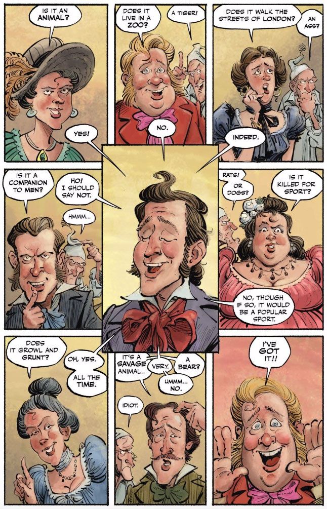
It’s deceptively simple. There are nine panels, arranged in three rows of vertically oriented boxes. The dialogue is plain, with partygoers presenting yes-or-no questions to Fred and Fred responding to them in turn. Each panel centers around a speaker’s face. Yet even a casual reader can see that Kendall has built out a narrative sequence that can only exist in comics form. The panels are only partially presented in chronological order from left to right and row to row. Though the questioners speak and get their answers in that traditionally linear fashion, Fred’s head only exists in one panel: the fifth and central one. The first speaker asks, “Is it an animal?” and though the reply of “Yes!” appears as a dialogue bubble in that first panel, its tail extends beyond the panel border diagonally into panel five. The same goes for all of the other panels on the page except for the last one: the responses appear next to the questions, but those responses all visually emanate from the fifth panel, right in the middle.
In effect, this approach blows up the entire notion of how we perceive time in comics, all while making perfect sense to the reader. You can see clearly that the answers to the questions are being uttered by Fred, and you can see the order in which they’re spoken. But in the act of seeing all that, your eye is darting back and forth from the fifth panel to all the other panels as you go along. To subtly reinforce that something unusual is going on, Kendall makes that key fifth panel larger than all the rest, and has its borders overlap with the ones that surround it. That way, you’re intuitively less confused about where your eye should be drawn. It’s certainly possible that other artists have tried this method of literal time travel, but I can’t think of any obvious examples. It is, at the least, highly unusual and risky, but Kendall pulls it off.
It also makes perfect thematic sense, because Fred is a self-important jerk. Sure, Scrooge sucks, but is it really necessary to drag him this hard and this publicly? Kendall allows us to ruminate on just how pompous Fred is acting by freezing his facial expression. If this were any other visually narrative medium, we’d see Fred’s face shift into variations on his main emotion, but here, he says everything with the same smug self-satisfaction. Even though he only technically has one panel dedicated to him, his stupid face is jamming itself implicitly into seven others via the word balloons (the last panel, for dramatic effect, only has a question, not an answer, inviting you to flip to the next page). Fred is, literally and figuratively, the center of attention on the page, and Kendall’s evocative facial acting shows just how proud the guy is of that fact.
The last thing that the layout allows for is a rarity: it makes ordinary word balloons into an interesting graphic-design element. As anyone with a basic American visual vocabulary knows, such balloons generally have pointed tails that drag out into ovoids. Usually, we barely even notice them unless they’re rendered in unconventional ways — jagged edges, non-monochrome colors, and so on. Here, they have no frills, but since they’re all coming out of one panel in a circular sequence, they form a kind of explosion. Fred’s face is framed not just by the panel border but also by the circle of jutting points, all thrusting forth in a kind of corona. What’s more, none of the ovoid portions appear in his own panel — they all exist next to their corresponding questions. The result is a series of lines blowing outward from this blowhard, which, again, makes perfect thematic sense.
On top of all that, Kendall is simply a very gifted draftsman when it comes to the human face, which he damned well better be, given how crucial facial acting was to Kurtzman’s work. Every visage has a slightly different emotion, ranging from excitement to confusion, and the swooping linework captures those nuances. The whole of Marley’s Ghost is a joy to look at, but in this page, we see work that might make Kurtzman’s ghost particularly proud.

