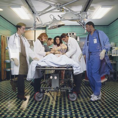
About four minutes into the ER pilot, which aired 25 years ago this week, there is news of a building collapse in downtown Chicago. There are some fatalities and some critical injuries, and all of those critically injured are about to burst through the doors of the emergency room at County General Hospital. When the gurneys roll in, the cameras start rolling right behind them; one even stays parked behind the head of a patient on a stretcher as he’s wheeled down hallways while nurse Wendy Goldman (Vanessa Marquez) tries to get the man’s name and address.
This early sequence captures the chaos of working in a hospital. It also announces that ER is going to be a show that’s constantly in motion, which, in 1994, was a pretty remarkable thing to see on television.
There are a lot of reasons why ER became a huge, instant hit and remained one for a decade-plus. (The drama ended its run in 2009, after 15 seasons.) One is that the medical drama, when done right, will always find an audience. Certainly the cast of ER — which, in its early seasons, included Anthony Edwards, Noah Wyle, Juliana Margulies, Eriq LaSalle, and some guy named George Clooney — was enormously appealing. But I would argue that the directorial style of the series is what hooked people and kept them coming back every week. The way the camera zipped from one moment to the next implied that something unexpected could happen at any time, and it often did. You didn’t want to look away for a second or skip an episode. You might miss something.
“Let’s move” is something the doctors on ER say frequently when they need to work quickly on a patient, but it was also the guiding principle behind how the series operated. You can see that in both the pilot, “24 Hours,” which aired on a Monday night as a two-hour event, and the first official episode, “Day One,” which aired three nights later in ER’s permanent home, the Thursday 10 p.m. slot. Rod Holcomb, a veteran television director who had handled episodes of Quincy, Hill Street Blues, The Greatest American Hero, and China Beach, directed “24 Hours.” Mimi Leder, who got her TV directorial start with L.A. Law and later moved on to China Beach, directed “Day One” and five more episodes in the first season. Leder in particular became key to establishing the look and feel of ER under showrunner John Wells, and you can already see that look and feel developing in those first episodes.
Steadicams were not commonly used in television in the early ’90s, but they were central to ER and became a signature part of its approach, even if the average viewer wasn’t necessarily aware of what how they were being used behind the scenes. When you picture ER, the first images that come to mind are probably of doctors working on a patient while shouting medical terms, as a camera swirls in circles around the operating table. That sense of fluidity was there from the beginning, even in smaller moments, because the cameras refused to just stay still.
In “24 Hours,” there’s a moment when nurse manager Carol Hathaway (Margulies), having finally gotten a second to catch her breath, is walking slowly down the hall while her colleagues keep shouting questions at her. She’s getting bombarded with “Hey, Carol!” after every step she takes, and the relentlessness of that wouldn’t feel nearly as overwhelming if the camera wasn’t moving in front of her, capturing the nurses and medics who keep popping out of doorways seeking her guidance. It’s also an important scene because later, Hathaway becomes the patient being wheeled into County General after she attempts suicide. The idea that life may be asking too much of her is hinted at, gently, in that brief but beautifully executed walk down the hall.
Something similar but even more stressful happens in “Day One,” when the camera follows Dr. Carter (Wyle), still a medical student, from assisting a group of food-poisoned wedding guests to a room nearby, where a patient appears to be flatlining. The camera then follows him back into the hallway, where it’s clear that anyone who could possibly help him is occupied with an unruly patient and attempting to call security. Carter has to act quickly, grab a defibrillator, and use the paddles to shock the patient’s heart back to a normal rhythtm. Again, the quickness with which Carter has to make a decision and then act on it is conveyed all the more powerfully because the camera is zooming along behind him, trying to keep up.
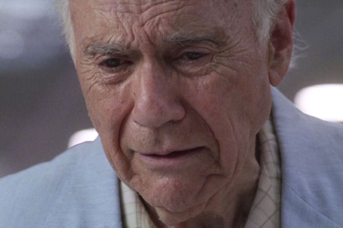
The kind of intricate filmmaking choreography required on ER made it look very different from much of what was on television at the time, and gave it an immediacy that is one of the reasons why the show still holds up as well as it does. But it wasn’t just the obvious tracking shots that distinguished it. The camera shifted in other ways, too, between lovely wide shots — the one in “Day One” that captures Mark Greene (Edwards) walking toward Carter, his reflection captured in a rain puddle, is a real beauty — and extreme close-ups that proved the show wasn’t just about racing around all the time. Sometimes it would slow down and zoom in really close, as it does in that Leder-directed episode when Mr. Franks, a man who’s just lost his wife, sings to her. The camera stays so tight on Mr. Franks, played by the wonderful John Randolph, that his despair fills the screen. ER constantly signaled to us how easy it was to get distracted in an environment where everything’s turning on a dime, but also that it’s important to pay attention to the human consequences of what happens in that same environment.
ER wasn’t the first show whose visual sophistication made people compare it to watching a movie. Miami Vice did that. NYPD Blue did as well. But ER absolutely pushed the bar higher and its influence on the visual style of television has been felt ever since, on shows like The West Wing (ER did more than its share of walk-and-talks before Aaron Sorkin adapted that approach), Grey’s Anatomy, and Friday Night Lights, just to name a few. These days when we watch a drama, we expect it to have the kinetic visual energy that ER possessed. Just look at the shows nominated for Emmys this year for outstanding drama and, for that matter, outstanding comedy. Game of Thrones, Better Call Saul, Russian Doll, Barry, The Marvelous Mrs. Maisel, Pose, Succession: All of them have, on more than one occasion, featured scenes with long fluid camerawork that conveys forward momentum.
The visual style of ER isn’t solely responsible for all of that. But it certainly had an impact. In 1994, when the show debuted, its “let’s move” sensibility didn’t just draw us into our televisions. It made us expect more from them.


