Animator Genndy Tartakovsky is one of our greatest living action directors — a student of Sergio Leone, Akira Kurosawa, and George Lucas who creates family-friendly, populist work that can be described as both terrifying and adorable. Take, for example, the finale of his 2018 movie Hotel Transylvania 3, a DJ battle to control the dance moves of an enormous kraken. As cartoonish as it is, the scene feels as immense as the climax of a live-action Star Wars or Marvel film, yet strangely more real, largely because Tartakovsky’s filmmaking keeps reminding the viewer of how small and fragile the characters are in comparison to the forces they’re struggling against. “There’s this old battle in animation where you’re told that things need to look more real for the audience to feel real emotions,” Tartakovsky tells me. “And it’s complete bullshit.”
The 52-year-old son of Soviet Russian émigrés was a filmmaking prodigy when he started working at Hanna-Barbera right out of college, serving as animation director on 2 Stupid Dogs. He then moved to the Cartoon Network, where he created Dexter’s Laboratory and worked as a director on The Powerpuff Girls, both cult favorites that defined ’90s American TV animation. In 2001, his work took an epic turn with the time-traveling series Samurai Jack, which alternated bursts of apocalyptic mayhem with long, nearly silent scenes. Tartakovsky continued in that vein with two more Cartoon Network action series (Star Wars: Clone Wars and Sym-Bionic Titan), created a more adult-oriented fourth season of Samurai Jack in 2017 on Adult Swim, and then released the gorgeous and bloody Primal, a buddy-action extravaganza about a primitive man and a dinosaur struggling to survive the transition from reptilian to mammalian domination. Long sections of these later shows are told without dialogue, communicating important story information through scenes in which the characters look around and think, rather than explicitly state their concerns. It runs counter to post-millennium cinema and TV that rely on a zippy montage or characters who walk into rooms and verbally announce who they are and what they want, then list which phobias and flaws will impede their quests.
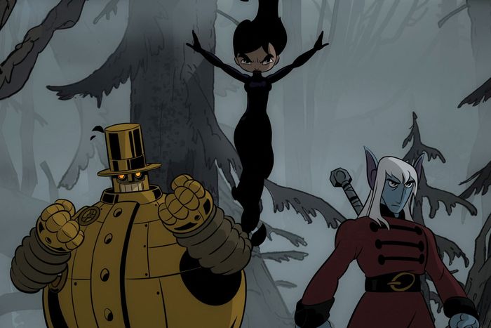
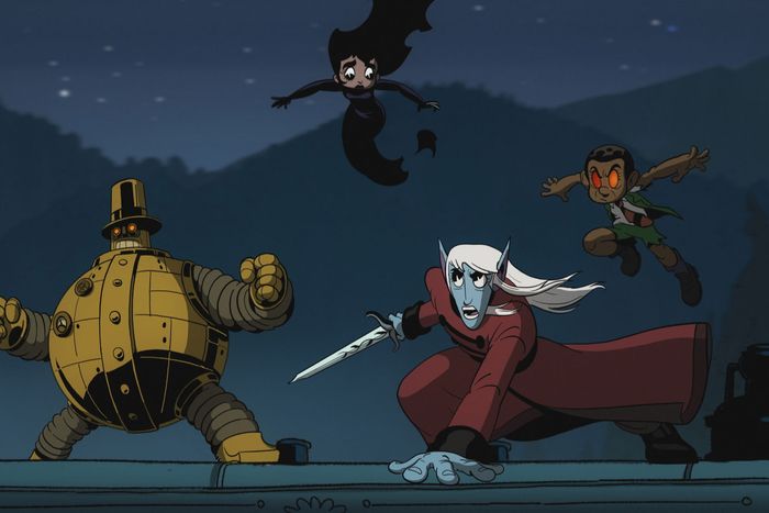
Unicorn: Warriors Eternal (an Adult Swim series streaming on Max) is the culmination of Tartakovsky’s aesthetic, blending the peppy, wide-eyed optimism of Dexter’s Laboratory and The Powerpuff Girls with the brooding majesty of Samurai Jack, Clone Wars, and Primal. It is technically about a monk, an elf, and a sorceress who have been battling ancient evil for centuries in different incarnations, and who find themselves being reawakened in a steampunk alternate-reality version of 1890s England in the bodies of teenagers, with a galumphing robot named Copernicus as their erstwhile guide and protector. But as is always the case in Tartakovsky’s projects, the exact nature of the characters and story don’t come into focus for several episodes, and the audience is expected to pay attention to not just what the characters say and do, but how they move through the world. We spoke to Tartakovsky about the genesis of this project, the evolution of his style, and his thoughts on letting the audience find their way.
You’ve wanted to do this show for a long time, right?
It’s something that I had started in my last days at Cartoon Network. I think it was around 2003, finishing up Clone Wars. A restructuring was happening, executive-wise, when I was starting this project — a project where I really wanted to do something different. I’d dealt with samurais, and space stuff through Star Wars, and I felt like I’d done a lot of superhero stuff. So I thought maybe I should do some stuff with magic. I wanted a bigger story, a grander scale, to push myself.
I started doodling. I doodled this scene of somebody running from a train that was on fire and alive. And I was like, “Yeah, this could be really cool.” And from there it took almost 20 years to finally get it made. I sold it a couple of times, at a couple of different places. I can’t explain why a project goes and why it doesn’t.
Is that how you generate ideas, by doodling?
Yeah. I’ll come up with a general concept or whatever in my head, and if I go, “Oh, that seems like it could be interesting,” then I’ll start drawing. Sometimes the drawing could be of an image that suddenly popped into my head. Sometimes the process works great, other times not at all.
This series seems to me the culmination of everything you’ve done. The character renderings sometimes take me all the way back to Dexter’s Lab or The Powerpuff Girls. But the action is more in a Clone Wars, Samurai Jack, or Primal vein: mythic, beautiful. And at the center of the story you have this band of plucky outsiders reminiscent of your Hotel Transylvania movies.
Little did we know when we were all working on Dexter’s Lab that we were playing around with that balance between comedy, drama, and action. Focusing more so on the comedic, because that was the important part. And the relationship stuff. Remember, I was 25, so I didn’t know anything. But it was all just kind of happening. It was what we liked, right? So we started doing sometimes more dramatic episodes later, but still with a lot of comedy. We also started feeding in more action, because we all liked doing action, especially myself. I like to do action that’s a little more, I don’t know — elevated? I don’t know what the right word is. Caricatured. Melodramatic. Just more fun!
By “elevated,” do you mean like an audio engineer raising the volume on one of three available tracks: comedy, drama, and action?
Yeah. In Primal, what’s really elevated is the action. In Dexter’s Lab, it’s the comedy that’s elevated. For Unicorn, we elevated the drama; we wanted the emotions and the characterization elements to be heightened.
And yet you also have a lot of comedy in Unicorns, some of it big and basic, starting with the pilot. Emma’s father is in tears over her impending wedding and claims it’s an allergic reaction to the flowers on his wife’s hatband, and you show us the hat in close-up, and there are in fact a ridiculous number of flowers on it — and bees.
Yes! And everybody in the scene looks funny! That’s the golden ticket, I always felt: You know Snow White, the Disney feature? The dwarves, who all have these bulbous noses and are incredibly funny, gather around her and they cry. It’s the most emotional thing. Everybody buys into it. But they look ridiculous.
You’re a fan of knucklehead humor and over-the-top sight gags, like the scene in Hotel Transylvania 3 where a chupacabra goes to a bar and the bartender gives him a martini with a full-grown goat sitting in it.
That’s Mel Brooks. My sense of humor is a combination of Mel Brooks, Blake Edwards, Abbott and Costello, Animal House, Stripes, Caddyshack, and the Marx Brothers, plus a little bit of Three’s Company, because it’s what I grew up on; my family emigrated here, and there was just something so hilarious to us about their use of innuendo.
The characters on Three’s Company were constantly eavesdropping on other people and making wrong assumptions.
Definitely! “They’re having sex? Oh, no, wait, they’re just cooking.” Comedy is the hardest thing to do. It’s all subjective, what people think is funny. You could do a scene that’s the funniest thing in the world to you, and other people would see it and go, “You think that’s funny?”
Even if you can’t guarantee that something strikes everyone as funny, are there ways to at least make a gag more likely to connect?
Timing is so important. I used to teach a class in timing for a little while at CalArts. I took a Tex Avery cartoon — because, of all the Looney Tunes directors, he was the most impeccable with timing, along with Chuck Jones — and I reedited it. I took a hold on a shot that was supposed to be 6 frames and extended it to make it 12 frames, then I showed the students the difference and how those 6 frames ruined the gag.
The mix of cartoony draftsmanship and epic action creates a unique tension in your work. In the Unicorn pilot, you do it again: You have warm, goofy family stuff, followed by an epic battle sequence that’s like something you’d see in a dark live-action superhero movie. And, as you say, everyone is kinda funny-looking.
There’s this old battle in animation where you’re told that things need to look more real for the audience to feel real emotions. And it’s complete bullshit. Everything in this series is really cartoony. The characters look like they just walked out of a cartoon by Tex Avery or Chuck Jones, or something Max Fleischer might have made.
That wedding sequence was my proof of concept, by the way. That was the sequence where I wanted to show how all the elements could work together. It takes place in this really old gothic church, and it’s sincere — these two kids really do love each other — and then all of a sudden that’s broken by this robot, Copernicus, coming in. It’s a mystery — you don’t know what’s what. And then Emma transforms, and she’s not who she was anymore.
And at that point, it shifts over to action mode. That moment when she flies up to the stained-glass window and kind of flexes her power and this storm of glass tumbles in midair through the church in super-slow motion reminded of Jackie Chan films that are basically comedies but that will sometimes shift into this serious, “big” mode in the action sequences, like the end of Police Story.
Yes! I also think of John Woo when we’re doing those kinds of scenes. John Woo is the kind of filmmaker who does a funeral sequence and makes it the most cinematic! There’s torrential rain and it’s all in slow motion, and there are all these dissolves. That kind of thing is part of the language that I love. You’re telling the story visually. That’s always the key.
Speaking of visual storytelling: Let’s talk about exposition. It’s a necessary evil, but you don’t handle it in a perfunctory, hacky way: “Hi, big sister, who I haven’t seen in the two weeks since our dad’s funeral! Did you sell the house?”
You’re totally right. I hate overt explanations. Most modern-day movies and television shows, especially animated ones, start with [adopts kid voice] “Hi! My name is This! And I live in this village! And this is my problem! And this is my dad, and I love him, but he doesn’t love my hobby!” We’re five minutes into the movie, I know everything, and mentally I turn off.
It seems to me that in this show, and in most of your other work, the audience kinda doesn’t know exactly what the relationships and rules are, or even what’s going on, for a while. Merlin appears in the pilot of Unicorn and gives us maybe two sentences that are less of an explanation than a teaser for an explanation. There’s not a ton of lore being dumped. By the end, we’re half in the dark about the premise.
Too often in this business, we default to treating the audience like they’re stupid. The audience is actually really smart. From my point of view, you want to give them a little bit, then a little bit more, then a little bit more. That’s something I enjoy as an audience member too. Think about the original Star Wars. It all unravels slowly. You slowly start to understand what’s happening in that world. Same thing with Raiders of the Lost Ark. You start with a mystery. Who is this guy? What’s he doing in the jungle? What’s that thing he’s after?
All storytelling is mystery. Even when you’re doing something that’s mainly comedy or action, you’re still telling a mystery, in a way. The audience will fit all the pieces of the story together. And you know, this could be a fault! I finished this show and I wondered if it was too much, especially coming off Primal, which is the ultimate in simplicity. This one is complex, with the storytelling and everything unfolding — and where it goes, it grows. There are plot twists and a lot of other stuff that I am generally not a fan of but that I felt needed to be there for this one. But I still want to try to give the audience the minimum amount of information that’s needed to draw them in.
That’s storytelling. You’re drawn in. If you don’t trust where the story is going, or if you’re already bored, then I’ve failed.
Most of your work is done in episodes that run 22 minutes, the length of a half-hour show on cable minus commercials. I wonder if you ever chafe at the time constraints and wish you could go for 40 minutes or a full hour.
Yeah, definitely. But I’ve been working in that format for so long — 30 years — that a lot of whatever I come up with fits naturally into that format. When I got into feature films, I had so much confidence, like, Yeah, I’ve been telling stories for years — I can do this. It’s a different beast. Even though you have so much more time to tell stories, you feel like the audience turns off much more quickly in a feature. In a feature film, if you don’t have a proper set up in Act One, Act Two almost doesn’t matter because the audience isn’t locked in, and now everything is boring to them. It took me a while to realize, Oh, shit, this isn’t working — I gotta re-pace things, make all of this different.
Usually, though, I feel like a 22-minute episode is enough time. Seven minutes, the length of a story in Dexter or Powerpuff? That was difficult.
Isn’t seven minutes the standard length of a Looney Tunes short?
Yeah, exactly. Seven minutes is a length that’s built for a chase cartoon. Seven minutes was perfect to do what they were doing. But we were trying to do story, gags, and some emotional stuff, and we couldn’t fit it in. That was an epic struggle for us. Then we started doing 11-minute stories, and that opened us up and we started to learn. By the time I got to Samurai Jack, I thought, okay, I’m done with all the snappy, quick stuff. I realized I needed to slow down, because I really needed to get the audience in, right? Ever since that, I’ve been slowing down.
You also use silence a lot more often. And you don’t score everything. Sometimes a scene will be just sound effects, and nobody’s talking.
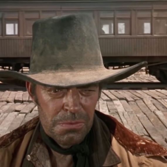
To me, that’s just the most normal thing. I’m a product of ’70s filmmaking. In the ’70s, things were just a little bit more avant-garde. They were experimenting. Sound was a big part of it. Movie storytelling in the 1940s and ’50s was about grandeur, and there was a lot of musical underscoring. When you get to the ’60s and ’70s, the sound of the movies feels more independent — a little more raw, for lack of a better word. The beginning of Once Upon a Time in the West is just guys waiting for a train. You’ve got these incredibly detailed faces. Minimum sound design. But if you watch it, especially on a big screen, you’re sucked in like crazy.
I’m big on pacing, including sound pacing. Whenever I spot something with my composer, I’ll say, “Okay, we’ve had music for five minutes now, my ears need a break.” When I design or write stories, I keep that in mind: It’s about contrast and rhythm. We’re making a song. A good song has quiet parts and loud parts. Classical music, of course, is the best example of that. When I started on Dexter, there were no books about this. There was nobody who was talking about, “This is where you should have music or not have music.” It was the most frustrating thing. I had to rewatch all my favorite movies and pay attention to what they were doing with the music and sound.
What were some of the ones you watched and that maybe shaped your sense of how to use sound and music in a story?
Apocalypse Now is an incredible film. And all of Sergio Leone’s films. And of course, Akira Kurosawa — Leone borrowed from him; the gunfighters in his westerns are Kurosawa’s swordsmen. There’s a scene in Seven Samurai where they’re going to see this old lady, and the only sound is this: [vocalizes ominous didgeridoo-like noise] OhhhhUhhhhhHHHHHHHHHHHH … And it’s supercool and builds tension and weirdness and feeling and mood. Tone. Tone is so important to me now. On Dexter and Powerpuff, I never talked about tone.
Your observations about sound make me remember the scene in Yojimbo where Toshiro Mifune confronts a bunch of guys and slices them all up in one wide shot that lasts maybe ten seconds, and there’s no score, just whacks, grunts, and howling wind.
That scene is great, and it’s an example of how, once you minimize one element in a scene, everything that’s left is heightened. I did things like that in Clone Wars, like in the episode where Anakin Skywalker is on this planet and it starts to rain. There’s no music after that because I wanted the dominant sound to be the sound of rain hitting the lightsabers and sizzling: TzzZZZT!!!!
That was a nice touch, one that I don’t think I’d seen in a Star Wars story before.
It also comes from the limitation of television. When we used to mix Dexter or Powerpuff, the mixers would keep the dialogue the loudest, then the sound effects, then the music. I would say, “Why can’t we have the music as loud as the dialogue?” They said, “Because then you can’t hear the dialogue.” I said, “But this is an action scene and the dialogue is just grunts and stuff.” I got so frustrated that I just started doing action scenes without even the grunts. I would have a whole fight in Samurai Jack with nothing but music and the sound of blades hitting stuff, and there was nothing for the mixer to turn down, because there was no dialogue. I didn’t miss it at all.
So you did your first dialogue-free action scene to solve a persistent sound-mixing problem, and you got a whole aesthetic out of it?
Exactly! Later, I found some good mixers who could give me a better balance. But even on Unicorn, we had to make tough choices and simplify. We might have incredible music and incredible, big sound effects for an action scene, but they would be competing with each other, and we’d have to decide which one to turn down. I decided to play down music in a lot of scenes with Copernicus because I love his sound effects so much.
You didn’t give him facial expressions. I guess he didn’t need them.
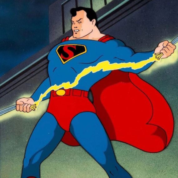
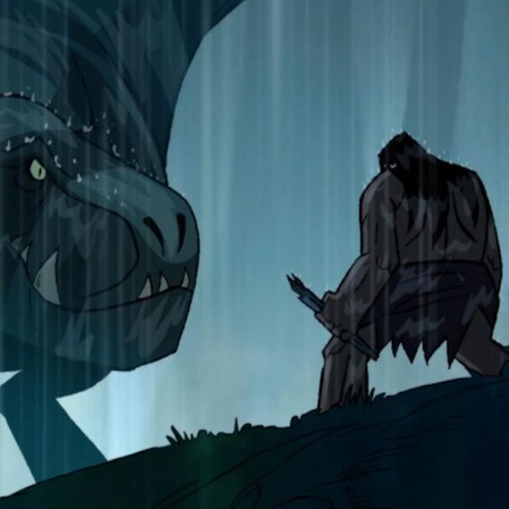
It’s really interesting because as you start each new show, you have to learn how the character stands, how they pose, all those things. We did it with all of them, including Copernicus. It was like going through the struggle with Fang in Primal. I’d never done a dinosaur character before. I had to sketch and sketch and sketch in order to find that language that would define her. Like how Max Fleischer’s Superman stands with his chest out.
Spear in Primal has a bit of that Fleischer Superman vibe.
He has the Charles Atlas body. There was no proper way to work out. He’s climbing mountains. He’s got this weird, bulky body that we would draw a little differently every time. He leans over a lot. Same thing with Copernicus. We figured it out. The silent characters are easier to find and define than the talky characters.
To what degree does character design help dictate not just the movements of characters but the personality development, the action beats, and the rest? Like, do you get four episodes into a story and think, Oh, wow, I could do a perfect little slapstick gag here because of how this character is drawn?
It happens all the time. Steven DeStefano, who designed Unicorn, might design the right character but the wrong posture. I might say, “That’s perfect, but I only want to see him like this …” and he would go, “Aha!” and start adjusting. A good character designer like Steven will start by asking you, “Well, who is this person? What are their traits?” Character design informs posing, and it all works together.
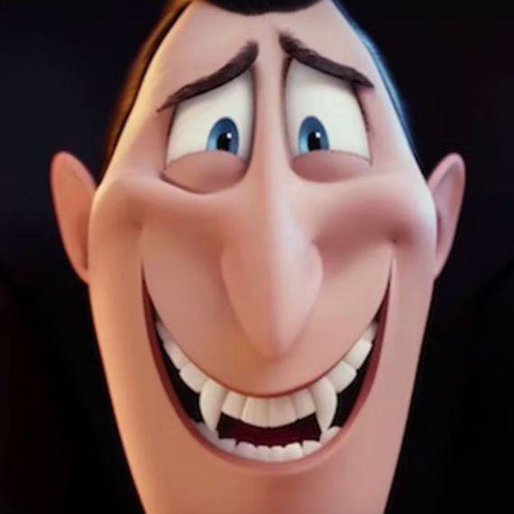
One of my favorite bits of unique character posture is Dracula in the Hotel Transylvania films: When he gets embarrassed, his head sinks down between his shoulders.
We created a language very purposefully for Drac. When he’s talking to his daughter, Mavis, he’s the cowering dad — he’s always hunched down. When he’s talking to his friends or running the hotel, he’s chest-out. It’s all visual support of the character.
Even if the scene is about characters talking, there needs to be something visual that supports the language. All that stuff began in the old days, with theatrical acting on film. Like Yul Brynner as Ramses in The Ten Commandments. He’s posturing the whole time! Nobody would do it nowadays like that, in live action. It looks ridiculous to people now, but it’s great! Same thing with Kurosawa’s samurai characters. It’s bold. In Seven Samurai, each one of the swordsmen has a very distinctive body language. Each character stood and walked a specific way. That’s great character development and great acting. That’s what we’re trying to do in animation.


