This story is the first in a two-part series about the inner workings of Netflix’s homepage. Read the second story here.
Ten years ago, Netflix got the idea that its app should work more like regular TV. This was early on in its transition from DVD delivery to streaming on demand, and product engineers at the company were still figuring out how the platform’s user interface would work. Instead of having subscribers start their streaming sessions scrolling through rows and rows of content, they wondered what would happen if a show or movie simply began playing as soon as someone clicked into the app — you know, like turning on your dad’s boxy old Zenith.
“It was the early days of Netflix having a television user interface, and we saw this as a great possibility,” says Todd Yellin, who as vice-president of product for the streaming giant helps shape how users interact with the platform. They liked the idea so much, they quietly tested it out among a small slice of subscribers.
But users weren’t impressed. “It failed,” the 14-year Netflix vet tells me. “The technology wasn’t as good. And I don’t think consumers were ready for it.”
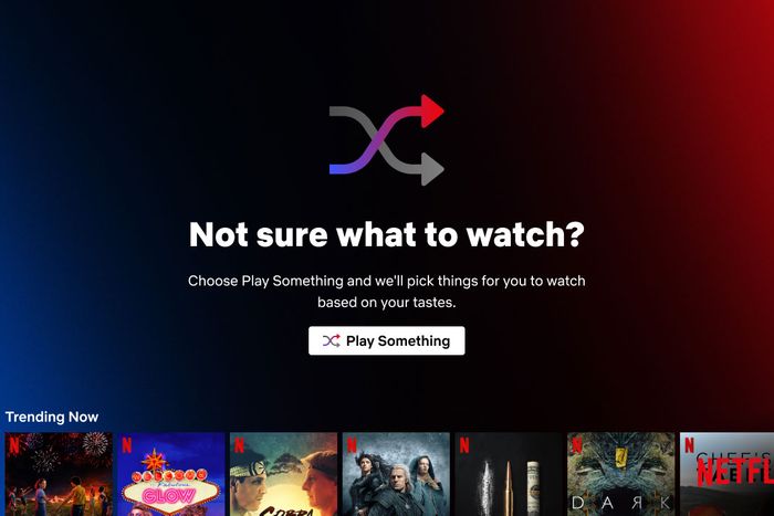
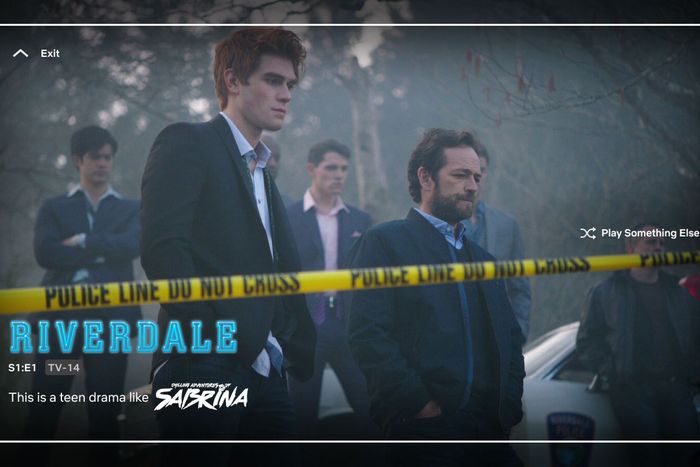
Netflix believes audiences are ready now. Today, the company is launching Play Something, a new viewing mode designed to make it easier for the indecisive among us to quickly find something to watch. As with those early forays into instant-playing content, the goal of this new shuffle feature is to eliminate, or at least ease, the Peak TV-era anxiety so many of us feel while trying to find something to watch. But unlike its past attempt, it won’t be automatic: You’ll have to opt in — either at start-up or when you’re browsing your home page. If you do, the usual page upon page of box art and show descriptions disappears. Instead, the Netflix matrix chooses something it thinks you’ll be into and just starts streaming it, along with an onscreen graphic briefly explaining why it chose that title. Don’t like what you see? A quick button press skips ahead to another selection. If you suddenly decide an earlier selection is actually a better pick, you can also go backward. (The feature will initially be available on all Netflix TV apps and, soon, on mobile for Android devices.)
Netflix has done a lot of things right over its nearly 25-year history, but when it does screw up, the outcry can be impossible to miss. The ruckus over autoplaying trailers went on for years before the company relented and finally allowed subscribers to disable the feature. More dramatically, its 2011 decision to spinoff its DVD-by-mail business into Qwikster prompted a backlash so significant, it nearly crashed the entire company. These errors created headlines because users revolted, and users revolted because the ideas were, in fact, bad.
Netflix is betting Play Something won’t be one of those mistakes. The feature — which has been available to a small sliver of test users since last summer — is one of the most significant additions the company has made to its user experience in years. It also represents a major salvo in the streamer’s increasingly urgent battle against a problem it helped create: decision fatigue. Audiences are under assault, besieged not only by too many shows but, now, too many platforms on which to watch them. Choosing has become a chore, and Netflix knows this. It’s counting on Play Something, as well as several other initiatives, to help fix the issue before it turns into a crisis.
The Paradox of Choice
In the beginning, figuring out what to watch on TV was a relatively simple matter. For the first three decades or so of the medium’s history, the average couch potato could count their viewing options on one hand, maybe two if they lived in a really big city: ABC, CBS, NBC, and a smattering of local independent stations (including, eventually, PBS). But then came the national launch of HBO in 1975, followed by the cable revolution of the 1980s, and by the time Ronald Reagan left office, the majority of American homes had access to dozens of programming options. Bruce Springsteen was soon lamenting the small torture of “57 Channels (and Nothin’ On).”
Things only got more complicated from there. In addition to all the new offerings on linear TV, the rise of home video in the 1980s and ’90s meant consumers could opt to make it a Blockbuster night — and maybe end up wasting an hour figuring out what to rent. Then came the fin de siècle arrival of digital video recorders, ushering in the age of viewing on demand, followed in 2005 by the Apple iTunes Store pioneering (legal) digital downloads of TV shows. By the early ’10s, Hulu, Netflix, and Amazon Prime Video had created a streaming universe where, for just pennies a day, audiences could summon literally thousands of movies and TV series with the press of a few buttons. The dawn of the ’20s brought still more supersize streaming services (Disney+! HBO Max! Peacock?!), all looking to give us yet another viewing option.
The phrase “What should we watch?” has always had the ability to start minor squabbles among couples and families. Now, in the era of streaming, it can prompt existential despair.
Netflix’s Yellin understands this all too well. “Internet TV gives you control: I watch what I want, when I want, and I get this beautiful buffet of content,” he explains. “Some people, they like that choice and they want their choice. But some people get analysis paralysis.” Yellin, imitating an overwhelmed viewer, briefly grabs his face and starts to pretend-scream: “‘Oh, my God, there are so many good choices! I could do this, I could do this, I could do the other thing.’”
A former documentary filmmaker, Yellin has spent his tenure at Netflix obsessing over the most efficient way to connect consumers to content. The company’s human-powered deep tagging of content, so crucial to its recommendation engine? His baby. Making it easier for users to navigate Netflix’s fast-rising sea of content is massively important: The company’s quest to offer more and more and still more programming options has revolutionized how we consume entertainment — but also threatens to turn decision fatigue into downright exhaustion.
“We face countless decisions in our daily routine and, at the end of the day, the on-demand ecosystem puts on extra pressure,” says Elena Neira, a professor at Barcelona’s Open University of Catalonia and the author of Streaming Wars: The New Television. “Finding something to watch is not a lean-back experience anymore; it’s a challenge.” She says the world of never-ending content rows “brings too many alternatives for our brains to handle, and that is when decision fatigue kicks in. We start to feel overwhelmed.” Some of us deal with this fine, but many consumers “don’t want to make a poor choice because we don’t want to waste our time,” Neira explains. “Even if you know you just can skip the bad show you chose and find another one, the fear of getting stuck into this endless loop of indecision [is] exhausting. We freeze.” And that can carry real risks for a streamer. “If you can’t make up your mind, frustration can make you leave and go to another platform,” Neira says.
Critics of Netflix’s omnivorous appetite for content argue decision fatigue is the inevitable outcome of giving consumers too many choices, that endless options lead to audiences feeling buried under the weight of Too Much TV. Yellin thinks this is nonsense. “More and more content — it’s hard to describe it as anything but a good thing. I’m shocked when people don’t think it’s a good thing,” he says. “Because what it’s doing at its core is, it’s giving more gifted storytellers from more diverse backgrounds a chance to tell their stories. It’s giving the viewers more interesting things to choose from.”
The way Yellin and his team of product engineers at Netflix see it, the problem plaguing modern audiences isn’t too many choices. Instead, it’s not having the right tools at their disposal to help them quickly find something they’ll enjoy watching. The TV industry calls this process of connecting consumers to content “discovery,” and it’s not puffery to say Netflix does it better than any other streaming service — by a lot.
Part of its advantage can be chalked up to having been in the direct-to-consumer business longer than any of its rivals: Thanks to its DVD-by-mail service, Netflix was building its recommendation algorithms even before it leapt into streaming. The company also devotes enormous resources to the product and tech side, historically paying market-leading wages for engineers and designers. Back in 2018, Netflix chief content officer and now co-CEO Ted Sarandos told me observers often overlook the role product development has played in building its member base. “A big chunk of the reason why shows work is because the product does such a beautiful job of getting the right people to watch them first. They’re really codependent,” he said. “People underestimate the 4,000 engineers in Silicon Valley who make Netflix work every single time you push play.” (Three years later, in 2021, Netflix says the more precise number of engineers it has is closer to 2,500.)
But Netflix’s intense focus on its product, particularly its user interface, also comes out of necessity. Much like early rivals such as Hulu and Amazon Prime Video, it wants to be what venture capitalist and streaming-industry analyst Matthew Ball calls “the default video experience, i.e., the one reflexively used because you wanted to watch video, rather than just title X.” Casting such a wide net requires a platform which can figure out what its subscribers want and then connect them to that content as efficiently as possible. Had Netflix not invested in discovery and other elements of its product as heavily — and early — as it did, Ball thinks the streamer would have been far less equipped to compete when newer rivals such as HBO Max, Apple TV+, and Disney+ entered the arena. “It enabled Netflix to hold much greater market power, and revenue, by the time this competition arrived in the U.S,” he says.
While Netflix’s current discovery tools work well, they still require users to put in some work browsing the platform’s virtual aisles, or at least expend some brain cells deciding which piece of box art or trailer merits clicking. There was no way to lean back and simply watch TV. Figuring out how to fix that was what led Netflix to launch Play Something.
Project Instant Joy
It’s a week before Thanksgiving, and Cameron Johnson, the Netflix exec who oversees product innovation for the platform’s TV interface, is on Zoom giving me a look at the company’s next big product innovation. A final name for the feature hasn’t been determined. Inside Netflix, the company simply refers to the project as Instant Joy.
About a minute into Johnson’s demonstration, I tell him it reminds me of channel surfing on a regular TV. He tells me that’s exactly what Netflix’s designers were going for. “It’s trying to take what is one of the best things about linear TV, which is immediate entertainment, but make it even better, because it’s personalized,” Johnson says. So unlike old-school TV, Netflix’s version of changing channels makes sure you start at the beginning of a title and not somewhere in the middle. It knows if you’re halfway through a binge, serving up the next episode in your queue rather than one from two seasons ago. And of course, the programs you’re shown are determined by the algorithm, rather than some anonymous network executive. “It uses [member] taste, but it takes away a lot of that decision-making angst,” Yellin explains. In other words, Play Something is meant to evolve the Netflix recommendation engine, not replace it.
Getting to this point took lots of trial and error. “This has been a decade-long journey that we finally cracked,” Yellin says, adding that the concept of instant-play content “was kind of banging around in a lot of product strategy meetings” until around two years ago, when Johnson told him he wanted to explore the idea again. “I said yeah. I was curious,” Yellin says.
First, though, Glen Davis, the Netflix product designer tasked with overseeing the day-to-day development of Instant Joy, says he and his team decided to do a lot of thinking about how the human brain processes choice. “We did a lot of research into the psychology behind theories like decision fatigue and tried to think about how to apply that in the context of Netflix,” Davis tells me. As execs at the company already suspected, subscribers are of two minds when it comes to navigating the service. “There’s the virtue of choice and then there’s the burden of choice, and these kind of live strangely in harmony,” he explains. “The virtue is that users want the power and control of the product. But along with that power and control comes that … frustration that can soak up precious watch time: ‘I’m browsing too long and I’d rather actually be watching right now.’”
The product team also took time to study the competition — not other streaming services, but good, old-fashioned network TV. “One thing that we talked about a lot is, with Netflix, and most streaming services in general, you must choose something before watching. That’s the barrier to entry,” Davis says. “But linear TV, you can turn it on and something is just playing.” That 80-year-old model takes away choice from consumers — you get whatever some programmer decides should be playing at 8 p.m. on a Wednesday — but it is also dramatically simpler.
Having drawn inspiration from its linear predecessors, Netflix designers started sketching out their first rough visual representations of how Instant Joy might work. An early thought among the team was to consider what it would look like if they blew up the established browse-centric Netflix home page and just started from scratch. “Today, you select your profile, you go into the grid of titles … and then from the grid of titles you can get the playback. It’s a very understood paradigm,” Davis tells me one afternoon over Zoom. He then shows me a slide of a very different-looking Netflix home screen, one with the streamer’s kids’ show Carmen Sandiego front and center. It’s a static image, but Davis tells me to “imagine the video is actually playing” as soon as I select my user profile, Zenith-style.
In this vision of a Netflix home page, the now-familiar rows of categories would be invisible at first. Instead, you’d click in, and a title would just start playing, with the show’s title and the words “now playing” appearing in the upper-left-hand corner of the screen. You’d still be able to browse the full content catalogue if you wanted, of course: Icons such as a magnifying glass and a row of boxes would also appear onscreen, reminding users they had other options. But the default would be a personalized Netflix “channel” playing something the algorithm thought you might enjoy. “If we actually built this and shipped it to members today, it would probably be far too jarring,” Davis says, “because it disrupts the expectations of what Netflix is too much.”
And that’s why this idea never made it past the drawing board. Engineers did not bother building a working model of the Carmen Sandiego design, let alone test it with consumers, because all involved knew going in that an instant-start concept represented too much change for members. “We’re not trying to force them into this kind of vision of the future,” Davis says.
Shuffling Toward Success
Still, one thing from that initial, anything-goes mock-up caught everyone’s attention. Buried at the bottom of the screen was a tiny TV set with parallel arrows going right and left, along with the words “Find me something else.” Hit the button, and the user would exit Carmen Sandiego and be taken to a completely different show or movie.
Unlike the bigger redesign, the Instant Joy team decided this idea was worth exploring further. A working prototype was designed and a test launched. “It did not do well,” Davis says. “There were some signals that people didn’t understand what it was for.”
Despite this initial strikeout, “We still felt like there was something really interesting there,” Davis says. “One of the things we did for follow-up testing was … to try to be more clear about what this is, and why you would want to use it.” Netflix commissioned some research around what kind of language might better convey its intentions with this new button, and started brainstorming alternatives to “Find something else.” The new titles were divided between those which indicated what would happen if you pressed the button (“Watch Now,” “Pick for Me,” “Play Something”) and a few others which were a bit more esoteric, though built on functions which exist on other platforms (“Shuffle Play,” “My Channel”).
Some of the research results were surprising to the Netflix team. Despite how common the word is, “Channel did not do well at all,” Davis says. “They had no idea it would actually start playing something.” By contrast, “Shuffle Play” did really well, not only during formal test groups but also in anecdotal evidence Netflix researchers had seen online. (Yes, Netflix reads your tweets.) “A bunch of posts said, ‘I wish Netflix had a shuffle or something because I’m tired of picking what to watch,’” Davis recalls.
In the end, “Shuffle Play” lost out to “Play Something” as the title of the new feature, while retaining the universally familiar shuffle icon as part of the design; the latter name simply performed strongest in testing. Beyond settling on a name, Netflix’s product designers also needed to nail down where in the user interface this new functionality would show up. The initial test of the feature put it below the progress bar of an already-playing title, leading to user confusion. “The first test was overly complicated from a design perspective,” Davis says.
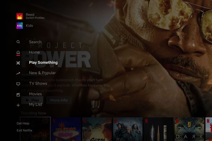
In the next test, Netflix decided to try out multiple entry points. On the main Browse page, it gave the feature its own line on the left-side vertical menu bar and also had it pop up whenever someone scrolled down through ten category rows. There was some psychology behind the positioning of this second entry point. “The hypothesis was that if someone gets down to row ten, maybe they’re a good candidate for this because they’ve done a bunch of browsing already and they’re ready to give it a try,” Davis explains. “And this was actually pretty successful.”
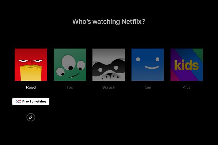
Netflix also tested out a much more prominent point of entry for Play Something: On the very first screen users see when launching the service. “There’s a button under your profile on the profile-selection screen that you can press down to and select, and go directly into the experience,” Davis says. This option, unlike the two in Browse, didn’t come with training wheels. “For people who select that route, they are actually starting in playback,” with no explanation of the feature or what it does. It was the closest Netflix got to that early vision of what instant play might look like, though with one big difference. “It’s more opt-in instead of forcing everyone into that experience,” Davis explains. While he didn’t get specific about how many test users took advantage of the Play Something button, or which entry point was most popular, all three did well enough to make it through to the final version of the product.
Play Something needed a few more tweaks before it was ready for a wider rollout. For instance, Netflix had to figure out what, if anything, would appear onscreen as users shuffled between programs. They settled on a minimalist approach, pairing a graphical representation of a show or movie’s title with a very brief sentence letting you know why the all-knowing Netflix thought you might dig this particular program. The other day when I shuffled into Jane the Virgin, the Play Something genie told me it was “a critically acclaimed show like Emily in Paris.” (No comment.) When I moved on to Scott Pilgrim vs. the World, Netflix told me the movie was “a teen comedy we think you’ll like.” (Fact check: True!) Unlike the small library of factoids available when you’re scrolling through the Browse section of the platform, “We’re intentionally not giving you a lot of information,” Davis says. “We don’t want you to end up pulling back into this same kind of psychological evaluation mode that you’re in in Browse. You entered this mode to not be in that space. We don’t want you comparing and contrasting and thinking, ‘Oh, let me read this and judge Designated Survivor on this synopsis.’ We want you to feel like you can slow down a little bit and just kind of lean into the story.”
Of course, everything about Play Something — including those short and sweet show descriptions — is powered by the same almighty algorithm which determines what shows up on every user’s Browse page. “It’s not just random things that are programmed in,” Yellin emphasizes. As with almost all aspects of Netflix, “We try to leverage their own personal taste and make it as relevant as we can for them.”
“Oh, That’s Always Been There”
The big question, of course, is whether Netflix is able to strike a blow against decision fatigue for enough people. That Play Something is moving from testing to wide rollout suggests the feature is working, at least with a large enough percentage of subscribers. The company does not incorporate new ideas into its interface lightly. “The more controls you add, the more complicated it all gets,” Davis explains. “We try to add just enough control that people can do what they want to do, but not add so much that it becomes like a 747 cockpit.” Plus, removing something from the user experience once it’s gone wide risks alienating subscribers. “Taking away things is really hard, because even if it’s used by a smaller subset of users, they may really like that feature,” Davis says. “Taking that away is painful for them, and that’s not what we want to do for any of our members. So we have to be very careful about the things we add.”
That general sense of caution — and past debacles such as Qwikster — helps explain why Netflix takes so long testing new features, particularly ones which represent as sizable a shift as Play Something. And make no mistake, Netflix brass believe this is a major bit of evolution for the streamer. “We are in a way starting to dip our toe into the realm of playback first,” Davis says. While not as radical as those early designs, a Play Something icon will appear on every user’s profile page. The company’s researchers will undoubtedly be slicing and dicing every bit of data about how many members go directly to shuffle mode, and how often they end up watching what the algorithm autoplays. “You can imagine if this is successful, and enough people begin to use it, then down the road maybe we can kind of push closer to that vision of starting everyone there,” Davis acknowledges. “We wouldn’t attempt that until our members tell us that’s the right thing to do.” Yellin cautions Netflix would need to see a lot more evidence before making such a big leap. “You know, I wouldn’t put in the headline, ‘One day Netflix goes to instant-playing video,’” he tells me. “But it’s in the realm of possibility.”
Despite months of testing and years of research, Netflix execs won’t know how Play Something will play out until it’s available to everyone around the world. It’s possible the base of users who hate auto-playing previews will turn up their noses at the idea of ceding control of their viewing experience. They will almost certainly be the loudest voices on social media (though Netflix can point to plenty of tweets from test users who’ve already embraced the idea). To help sell the feature, the company has enlisted Will Arnett to star in a social media campaign where he voices a weary remote control who begs users to “stop the scroll.”
Yellin is fine with some folks scoffing, mostly because Play Something is not designed to be used by everyone. Subscribers who don’t mind introducing a bit more randomness into their viewing experience will embrace it. And for those who don’t, the traditional way of browsing Netflix will still be there. “We’re not abandoning anything,” he tells me. “We’re complementing what we have. Different people want different experiences.” And whatever the response, Yellin has been around long enough to know that any initial ruckus Play Something causes — pro or con — will likely fade quickly. “The fascinating thing about innovation I’ve noticed is, you make a big change, it creates this huge stir for a day or two — and then it becomes the new normal,” he laughs. “People go like, ‘Oh, that’s always been there.’”


