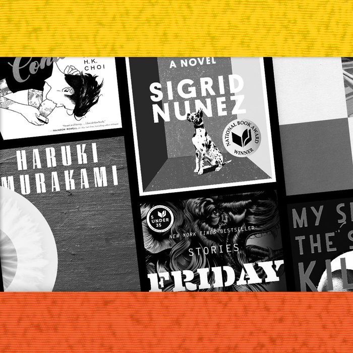
Year-end lists have a way of distilling what’s most memorable about the books we’ve read; one of those elements can be a striking cover that stays with you into the next year and beyond. So we decided to ask cover designers, those unsung heroes of publishing, to demystify the creative process behind our ten favorite covers of the year. Some of the images on this list came together almost effortlessly, while others went through dozens of radical revisions. Fantasy artist Charles Vess spent a year going back and forth with Ursula Le Guin on the look of her dragons before coming up with the illustration that now graces the 50th anniversary edition of Le Guin’s Earthsea cycle. How long and snakelike should their necks be? How narrow their eyes? How prominent their teeth? Below, Vess and nine others tell us about their inspirations, their favorite discarded drafts, and the sometimes torturous process of getting it right by publication date.
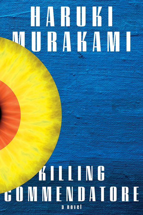
10. Killing Commendatore, by Haruki Murakami (Knopf), cover design by Chip Kidd
“This was the first time in 25 years that Murakami suggested I rethink the cover design. I had to design a cover before the manuscript was available in English; the story is about a portrait painter who discovers a strange painting that depicts the Commendatore run through with a sword. So I came up with the idea of a painting with a blade piercing through it. Murakami wrote back, ‘Well, okay, but once there actually is a manuscript, could you read it and see if you want to do something else?’ Which is his super-polite way of saying, could you try something else? Once I read the manuscript, I realized he was right. What really impressed me about the book is that the narrator is an artist who is constantly evaluating what he’s seeing — the eye represents the narrator — but then the greater universe also very much comes into play. All these strange things happen at night. And of course, Murakami is always talking about the moon. I used a classic example of change of scale and put an eye and the moon together. I thought the cover really needed to be blue, partly because there are references to The Great Gatsby in the text. I used the same blue as the one in that classic — and, I think, awful — edition of Gatsby, and the eye is the same color as those glowing orange eyes.” —Chip Kidd
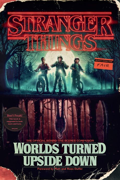
9. Stranger Things: Worlds Turned Upside Down: The Official Behind-the-Scenes Companion, by Gina McIntyre (Del Ray), cover design by Paul Kepple
“A few initial ideas were tossed around, like making the book look like a Trapper Keeper to evoke the ’80s era. Eventually we settled on evoking a vintage Stephen King novel, particularly Needful Things and Pet Sematary, with their intriguing settings, and Firestarter, with its a graphically powerful central figure. And we wanted to give the book an aura, a sense that it had a past as an object. I worked up a sample cover showing how the jacket would be torn and distressed. Kyle Lambert was the natural choice to do the illustration; he had previously created the poster art for Stranger Things. After Kyle worked his magic, I added naturalistic tears and scuffs, especially along the edges. The first finish of the art had the Demogorgon standing directly behind Will, but we ended up deciding not to be so overt. We didn’t want to show the monster on the cover. The Duffer brothers had been inspired by the less-is-more approach of Jaws, and I wanted to take the same tactic. As a finishing touch, we affixed a condition sticker from Melvald’s General Store, where Joyce works in the show.” —Paul Kepple
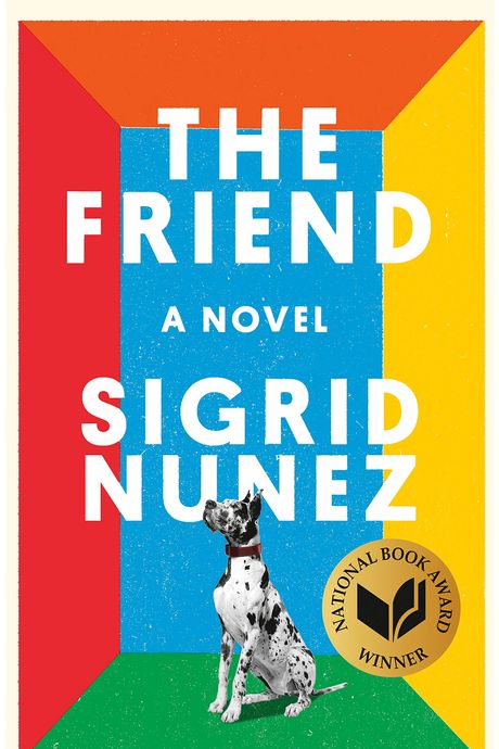
8. The Friend, by Sigrid Nunez (Riverhead), cover design by Nicolas Ortega
“Sometimes it can be really difficult to pin down a book, but this wasn’t one of those really painful ones. This was an early attempt from [designer] Nicolas Ortega. In this story, a woman is mourning the loss of her friend alongside this massive dog she has to live with. There was no way this cover wasn’t going to have a Great Dane on it. There were options we’d tried where the dog was so big it was wrapping all the way around the book, but we found that imagining the dog being confined in this small space gave it this power. The primary colors went along with the simplicity of the idea: It’s a completely imagined space with no detail. I think part of the strength of this jacket is its paring down to the bare minimum. I think that fits the book, which is so emotional even though it’s written in a very reserved tone.” —Helen Yentus, art director
7. The Penguin Book of Japanese Short Stories (Penguin Classics), cover design by Matthew Young
“The brief was very open to begin with: Do something that looks great and would make a lovely gift. My first ideas were full of clichés: designs based on the Japanese flag, geishas, typography. For a long time I became obsessed with the work of Ikko Tanaka, whose posters and book designs show an incredible knack for communicating a lot with very little, often just abstract shapes and colors. We tried to use one of his posters, but unfortunately we couldn’t get permission. I tried creating my own illustration ‘in the style of’ Tanaka, but it just didn’t feel authentic.
We needed a genuine Japanese artist, and there was one illustration which had always stood out in my mind. I had saved it to my Pinterest board years earlier, and even used it as the background on my phone back in 2013: an illustration of a tiny train trundling through the Japanese countryside, with a vibrant color palette of blue, pink, and green. The artist is Hiroyuki Izutsu, an illustrator from Tokyo, and the painting is part of a series in response to the 2011 earthquake and tsunami that devastated parts of the country. Called Don’t Give Up Japan, the paintings aim to show a positive side to life in his native land. It’s not your typical depiction of a densely packed city, neon signs, bullet trains, nor temples, tatami mats, and shōji doors. It’s authentic, just like the stories inside the book.” —Matthew Young
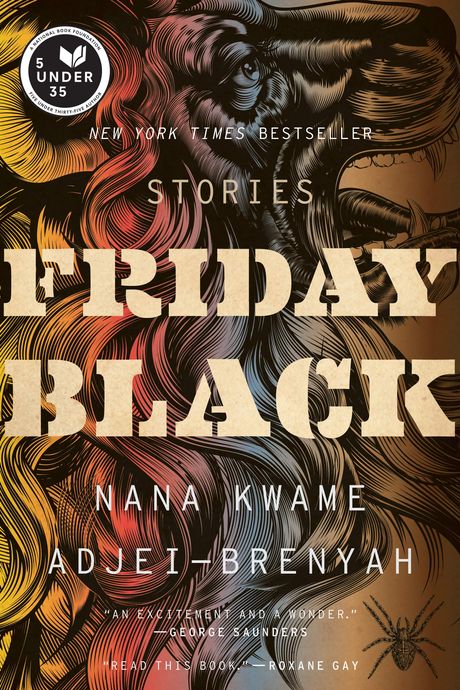
6. Friday Black, by Nana Kwame Adjei-Brenyah (Mariner Books), cover design by Mark Robinson
“The direction was to make it edgy and confrontational, and throughout the process, I probably showed 30 different covers. A lot of the stories inside are edgy and confrontational, so it wasn’t too hard to pick out things from the stories that fit that bill. To be honest, a lot of the early drafts were probably edgier and more confrontational than the final one, which is more subtle I think. The book was originally titled How to Sell a Jacket, after one of the short stories, and for that, I had lots of images of coats and jackets. After we changed the title, I picked a different story for inspiration — ‘The Lion & the Spider.’ I used stock images. I believe the lion is an antique engraving from the 18th century and the spider is something similar. Once you get your image, a lot of the design process is cropping. That part is essential: What are you presenting to the audience? I wanted it to be bright in some places — the title, the edge of the lion’s mane — with the dark imagery of the lion head and the spider behind it. I wanted the colors to be moody. Essentially what I try to do is get the most interesting design out there, and I think (I hope!) in that process it will stand out on the table.” —Mark Robinson
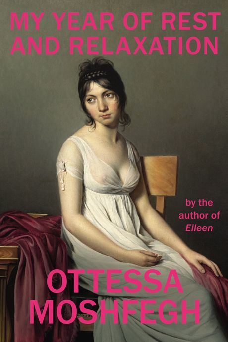
5. My Year of Rest and Relaxation, by Ottessa Moshfegh (Penguin Press), cover design by Darren Haggar
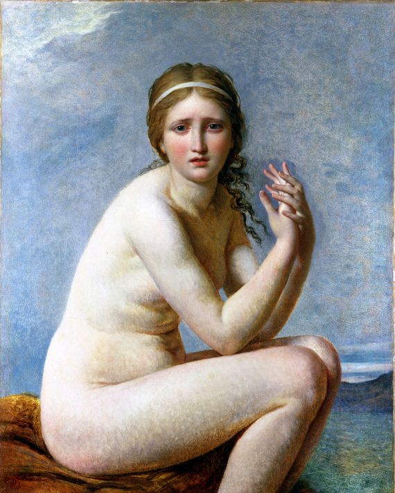
“Ottessa sent a handful of images she thought might work for her cover — historical portraits by Jacques-Louis David that she felt were powerful and attractive, and which could be made weird(er) by the juxtaposition of modern typography.
There was a clear favorite from the three sent. Her expression is priceless. We were all in agreement about that. The modern type treatment was needed to avoid the whole package looking historical. Ottessa requested the neon pink.” —Darren Haggar
{Pictured: Psyche Abandoned, by Jacques-Louis David, a runner-up to the ultimate choice for the cover, David’s Portrait of a Young Woman in White.}
4. Emergency Contact, by Mary H.K. Choi (Simon & Schuster), illustration by GG
“This was a smooth-sailing cover. Mary Choi tossed out a bunch of ideas about what it could be. She said that she pictured the characters as inky black silhouettes, and she imagined the main character had this crazy mass of hair. She also sent along a couple of artists for inspiration, including Edward Gorey and Egon Schiele. When I read the book and read Mary’s thoughts, I knew the perfect illustrator — I thought of GG and no one else. GG is just a genius, and her first round was super-close to what we wanted. We tweaked the characters and their positions a little. We tried it all ways — facing each other, facing away from each other. Facing away from each other was better because we wanted to emphasize that they were in their own worlds but still connected. I wanted to capture that feeling when you are up late at night and all alone and in your own universe with that person on the other end of the phone — that curled-up, sleepy, cozy intimacy. The main character has a rose pink iPhone, so we wanted to riff on that for our palate, and we wanted the white border give it that printmaking feel, so that it looked like a silk screen and showed it off like a piece of art.” —Lizzy Bromley, art director
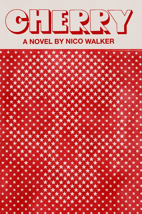
3. Cherry, by Nico Walker (Knopf), cover design by Janet Hansen
“The amount of sketches I did for this book was completely abnormal! It was a bit torturous. I think the challenge was the unique situation. The literary agent was the president of a record label. The first-time author was in prison. I later realized all parties involved did not care if it looked like a book cover or not, and that was really exciting to me. I started to think less about what a book cover should look like and more about the voice of the novel. It needed to look dark (because of all the drugs and war and robbing banks), but not so much so that it loses the love and humor. A skull has been done so many times before, so at first I tried avoiding it. I later realized it was just about showing one in a new and interesting way. Book covers are just flat rectangles, but it’s fun to try to give them some sort of trick to the eye. The novel’s main character gets into a lot of trouble, but is a newbie, or ‘cherry,’ at it all. He’s a ‘cherry’ drug addict. A ‘cherry’ criminal. So the skull is there, but you have to discover it just like he is discovering these dark things within himself. And the stars in combo with the skull could reference America’s hidden darker corners.” —Janet Hansen
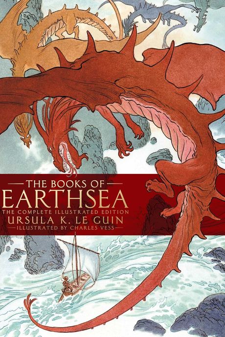
2. The Books of Earthsea: The Complete Illustrated Edition, by Ursula K. Le Guin (Saga Press), illustrated by Charles Vess
“For the first year, Ursula and I exchanged emails about what her dragons looked like. One of my desires was to slip inside of her brain and draw the world that she saw. She became my art director. She was wonderful at it. Ursula would make a comment like, ‘Those robes on Ged look a little bit too Gandalf-y.’ I started off with a stereotypical dragon: long talons, thin and kind of grotesque, and a long face with slanted eyes, which were nothing like her dragons. I went through maybe a dozen different dragons. She was wonderful and opinionated and cranky and very intelligent. In the world she’d developed, the people and the dragons all came from the same entity, and the dragons had chosen flight and freedom, and the people had chosen making things and owning things. Dragons were so important to her. I think it was the fierceness of them — and the flight. I think she’d like to have flown.
Throughout the books, dragons were described in various colors. They were red and blue and they had all these color facets to them. We also had a discussion on whether I’d do the scales. I chose not to because it ends up putting too many details into the picture. If people want to see the scales, they see them. This wasn’t only a collaboration with Ursula, but also the viewer, and I like to leave poetic space for the viewer to participate.” —Charles Vess
1. My Sister, the Serial Killer, by Oyinkan Braithwaite (Doubleday), cover design by Michael Windsor
“There wasn’t much direction: They wanted it to be fun, with a bit of an edge to it. I came up with probably four or five different directions, running from the borderline cheesy to the lewd to maybe a little too chick lit-y. The one on the book was the clear favorite. Within the first few chapters of reading, the specific idea popped into my mind. So much of it is about Korede having to clean up after her sister’s murders. When you see the book from a distance, you think the girl on the cover is the killer, but when you inspect the image, you see the knife reflected in her glasses and the cleaning products and it’s like: What is going on?
I went through hundreds of images, and then, eventually, one spoke to me. The look on the woman’s face just really worked, and I added the reflection in the glasses. I heavily manipulated the colors and the saturation, because I wanted it to be bold and eye-catching. There were some minor changes with the fonts — Oyinkan wanted the type to be more playful. I added the little splatters in Photoshop, which gave this messy, edgy look, without it being red blood splatter. The neon green definitely screams at you. Ultimately, we wanted to have an element of danger, and also to signal to the reader what they were getting into.” —Michael Windsor
All interviews have been condensed and edited for clarity.


