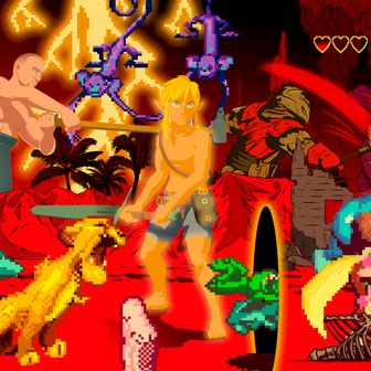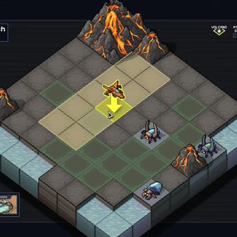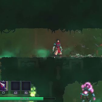
There is a woman in Elden Ring who offers her embrace to all intrepid travelers of the Lands Between. She can be found in Roundtable Hold, the moldering bastion of an ancient order of knights that serves as the game’s hubzone. Players come here to reinforce weapons, to complete questlines, and — if the mood suits them — to accept a hug from a mysterious old crone in a black shawl, sitting quietly on a cot in one of the Hold’s dusty apartments. She pulls you close to her bosom, whispers a few elliptical koans into your ear, then releases you back into your adventure. Nothing about this encounter alters the scope of Elden Ring, save for the tiny, almost imperceptible icon that has suddenly materialized below your health bar.
That icon, as it turns out, represents a minor tax on your character’s total hit points. It is transmitted to any character who shares that quiet moment with the crone, and it is entirely possible to finish Elden Ring without realizing that your lifeforce has been enfeebled by her treachery. It’s easy to lift the curse: Player inventories contain an item called “Baldachin’s Blessing”; cast it and your vigor will be restored. But the game never prompts you with that solution or even tips that there’s a problem in the first place. Elden Ring, as always, keeps its players in the dark.
The infamous hug was at the heart of a backlash that consumed Elden Ring after it received a round of rave reviews upon its release in February. FromSoftware, the studio behind Elden Ring and other modern classics like Dark Souls, Bloodborne, and Sekiro: Shadows Die Twice, has achieved mythical status among gamers for its sphinxlike design principles. Levels are labyrinthine and proudly Machiavellian; an enemy in the first Dark Souls can permanently sever half your health bar with a debuff; the cure is sold by a nondescript merchant on the other edge of the continent. Worldbuilding is teased out through cryptographic item descriptions and environmental context clues. Want to unlock Bloodborne’s True Ending? First you must retrace your steps back to the very beginning of the game to find and consume three pieces of an eldritch umbilical cord. FromSoftware gives no quarter to its audience; its catalogue is free of waypoints, quest logs, tutorials, or expository labels. You either figure out what that lady did to you in Roundtable Hold or you don’t. Elden Ring doesn’t care either way.
The studio’s indifferent approach to game development has been surprisingly influential for the rest of the industry. 2023’s most important release is The Legend of Zelda: Tears of the Kingdom, a sequel to the vaunted Breath of the Wild, which gives players a wide expanse of Hyrule and asks them to find their own version of fun. Inquisitive players will slowly decipher the game’s toolbox and learn how to fuse together automotive contraptions from the plywood and battery engines lying around the arena. Others might miss that opportunity — or, perhaps more likely, be simply unwilling to summon the patience to understand the systems — rendering the game an empty, solidarity experience. Although Tears of the Kingdom is an inherently kinder game than Elden Ring, Nintendo, much like FromSoftware, has constructed a masterpiece out of liberation and frustration. Not everyone is equipped to come along on the ride.
Last March, a number of professional game developers criticized what they felt was Elden Ring’s poor user interface. “[It’s] so bad I can only imagine FromSoft’s devs smoking at their desk and using CRT monitors,” tweeted Ahmed Salama, a UX director at Ubisoft Stockholm. Blake Rebouche at Guerilla Games agreed, bemoaning Elden Ring’s “quest design.” These complaints make sense when you understand the full context. Both Ubisoft and Guerilla are responsible for a number of vast open-world games that operate on a wholly different wavelength from Elden Ring. In Assassin’s Creed, Ubisoft’s flagship franchise, the world map is speckled with markers denoting collectibles, raids, loot to be plundered, and NPCs to converse with. There is never a moment when you are disoriented; the developers would never dare saddle the player with a furtive, debilitating status effect to saturate the vividness of the fiction.
Developers are not wrong for thinking that Elden Ring is punishing in the way it withholds information — but ironically to fans of FromSoftware, those very hindrances are crucial to the game’s appeal. Last year, an image went viral on Twitter parodying what Elden Ring might look like if it was developed by Ubisoft. The immense, arcane vistas are now cluttered in a miasma of meters, doodads, and button prompts. A compass at the top of the screen keeps track of all the enemies in our wake; text in the corner reminds us to visit the Elden Shop, where we will surely spend a tranche of in-game currency on a brochure of cosmetics — all tiered by rarity, of course. To the Elden Ring community, this would be a fundamental desecration of the game’s veiled splendor. The fans have made themselves clear: They relish a video game that leaves them feeling a little lost, or confused, or unsure about where to go next, even if that sensation is completely antithetical to the tenets of modern game design.
“It’s the idea of a game being this large, complex thing that exists stoically, without interacting with you, that you can explore. It makes you feel like an archaeologist, rather than exploring something linear that presents its entirety on its face,” says Andrew Shouldice, the programmer, designer, and artist behind 2022 standout Tunic. “The joy of discovery, I think, is dependent on the possibility of you not having found it. Otherwise it doesn’t really feel like a discovery. There need to be things that don’t want to be found, and they can’t talk to you as a player before they’re found.”
Tunic elevates Elden Ring’s difficulty to a comical degree. It is, on the surface, a top-down Zelda facsimile, except that everything in the game is written in an imaginary, glyph-based language. The player has no guidance in navigating this world, so they feel around in the shadows, generating their own postulations about the game’s esoteric secrets, letting Tunic’s opacity seep into their skin. When you put the pieces together — when you figure out, say, the fast-travel system that’s lying in plain sight — your imagination is nudged further down the rabbit hole. What else could they possibly be hiding? Shouldice believes this is one of the most sacred sensations in gaming, and perhaps a tradition that has fallen by the wayside.
“If you’re playing the original Legend of Zelda for the first time and you didn’t know there were walls you could bomb open, you accidentally do it for the first time, and you’re like, Holy shit. Every wall is suddenly a question mark,” he says. “That feeling, where you turn back and look at everything differently, is the most exciting thing to me.”
Alex Beachum, co-creative lead on 2019’s sublime Outer Wilds, goes further. He tells me that his design philosophy doubles as a protest against the trends he’s witnessed at big-budget, triple-A studios. “There’s the modern open-world game, where you can’t see the map because of all the UI icons on it,” says Beachum. “I hate that stuff so much. I’m the guy who modded The Witcher III to get rid of the mini-map.” Outer Wilds takes place in a tiny, overlooked solar system — five planets, three moons, and a comet — which you probe with a modest wooden space shuttle. You blast off in any direction, and about ten hours later you may finally solve the mystery of our collective cosmic existence. The game is hugely ambitious and dogmatically hands-off in its interface.
“The goal was to make an exploration game that was driven by player curiosity and nothing else,” says Beachum. “There are no quest markers, because then players would just be following the markers, and not of their own volition.”
Like Elden Ring, Outer Wilds has been regarded as a masterpiece because of the way the environment seems to crack open in strange and fascinating ways the more you tug at it with your mouse and keyboard. But I’ve also spoken to plenty of people who bounced off of the game entirely. Maybe they found themselves marooned in deep space with no recourse, or maybe they missed a keystone to an early puzzle, which sent them off course and left them adrift. The latent wonders of Outer Wilds never grabbed them, so they moved on to other games and other responsibilities. Beachum made peace with that inevitability long ago; not everyone is meant to solve this mystery.
“It used to be way worse, but by the end of the development, fewer people were falling off the bandwagon. Every game is like that to a certain extent. It’s a fool’s errand to try to make a game for everyone, because that will make it the blandest thing,” he says. “We’re constantly trying to make people curious, but I’ve always wondered what our curiosity conversion rate is. I want to know how many people go in without a lot of natural curiosity and we hook them, rather than people who are always going to like our game.”
Beachum tells me about one memorable playtest, as Outer Wilds was rounding into shape, with a focus group that featured a staunch Call of Duty loyalist. Beachum did not expect him to fall in love with a tender space opera that included no combat, a lot of reading, and a layman’s lesson in quantum entanglement — but somehow the game got its hooks in him. The frustration morphed into bliss, as it has for so many gamers before.
Still, as someone who adores Outer Wilds, and Tunic, and Elden Ring, it’s hard for me to assert that anyone who doesn’t savor their inscrutable riddles is wrong. That accursed hug only increased my appetite for more of From Software’s twisted ciphers, and maybe that makes me the weirdo. (Many of these concerns also tie in to a larger conversation about accessibility. Recently, studios have introduced a suite of options designed to make their games more playable for disabled participants — high-contrast modes for visually impaired gamers, universal subtitles for deaf gamers, and so on.)
Sometimes a studio’s attempts to create a truly self-directed world can backfire and the wide-open panoramas actually impede a player’s ability to mesh with the setting. After all, nothing reminds you that you’re playing a video game, with all sorts of video game-y problems, than being unable to determine what action is required to proceed to the next level. But I will say that towards the end of Elden Ring, you might find yourself in a secret arena called the Consecrated Snowfield. The steps it takes to arrive there are ridiculously cryptic, to the point of being almost impossible without a guide, but if you make it to the edge of the tundra, your character will pass through a secluded portal into a place known as the Haligtree — a massive, verdant redwood, pockmarked with oozing funguses, with entire townships resting on its branches. The enemy encounters there are extremely difficult, punctuated by the single hardest boss ever constructed by FromSoftware.
It’s one of the most memorable sequences I’ve ever played through on my PC.
And yet the Haligtree can be completely overlooked if you never stumble across it. The credits will still roll at the end of Elden Ring with an entire unexplored universe resting on your hard drive. You may then comb over the YouTube walkthroughs and Fandom pages afterward marveling at everything you missed — the overwhelming scale of it all burbling in your chest. All those unknown elements in the game can be frustrating, yes, but also alluring. Perhaps that’s one secret to great game design: the majesty doesn’t need to be played in order to be felt.


