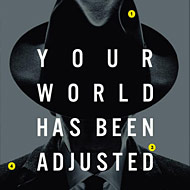
After having its release date pushed back more than a few times, the Matt Damon–Emily Blunt thriller The Adjustment Bureau arrives in theaters in a week and a half. Its first poster featured Blunt and Damon running over rooftops while a huge, fedora-wearing shadow menacingly loomed over them. The vibe was all Hitchcock, the color scheme all Mad Men. But, it turns out, maybe not quite Mad Men–y enough. With its premiere date approaching, The Adjustment Bureau went out and got a whole new set of posters (that are currently plastered all over the New York City public transportation system). We deconstruct one of the new images and what it’s trying to sell you.
1. The fellas on Mad Men may have stopped wearing fedoras a little after JFK gave them up, but they once wore them proudly, and these hats just emit an early sixties Mad Men vibe. Especially when they’re plopped on the shadowed face of a guy who could very well be Roger Sterling. (John Slattery, who plays Sterling on Mad Men, is also in Adjustment.) Takeaway: The Adjustment Bureau, starring the cast of Mad Men!
2. Uppercase red font on a movie poster can be a tip-off you’re going to see a broad comedy. In this case, it’s a tip-off that you’re going to see something like Mad Men, which has the same color scheme on its posters. (If only it were a movie about newspapers, it might also be a nice visual joke on “black, white, and read all over.) Takeaway: The Adjustment Bureau, as classy as Mad Men!
3. A centered, sans serif font and commanding language slammed over a large image of someone’s face. Hmmm, where have we seen that recently? Hello, The Social Network! Takeaway: The Adjustment Bureau, as smart and in your face as The Social Network!
4. The Adjustment Bureau’s silhouette is, yup, another nod to Mad Men and its own iconic silhouette of the back of Don Draper’s head. The Adjustment Bureau’s comes in gray, not black, but that only helps it make its point. Takeaway: The Adjustment Bureau, as mysterious as Mad Men!

