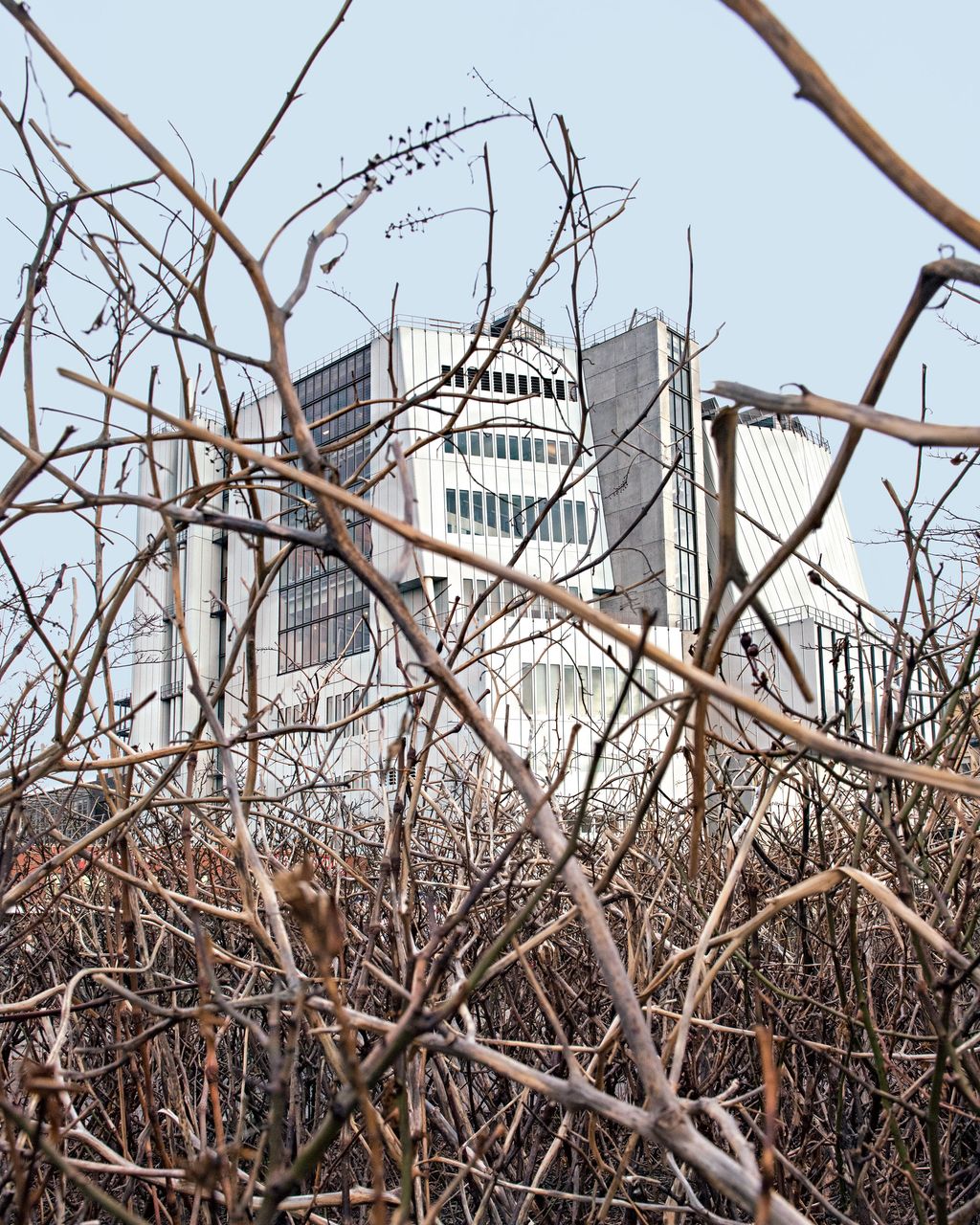
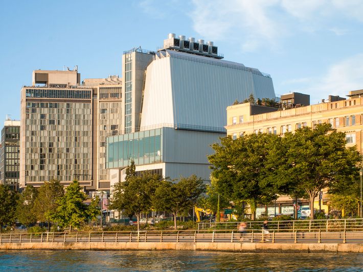
I’ve been watching Renzo Piano’s new Whitney Museum of American Art take shape for two years, waiting for its jumble of forms and facets to make sense. The fences are gone and the steel skin’s been shined, but it remains a complicated contraption, ungainly on all sides. From West Street, where immense stacked gallery windows stare over the traffic, it resembles a double-decker tour bus waiting to turn. The Washington Street side bristles with fire-escape-like staircases. The building is slotted between High Line and highway like a piece of advanced hardware on a megamotherboard. Once it ages a bit, it will start evoking our Apple moment, when high-tech containers, from phones to cruise ships, had to have satiny metal casings and dark, silky screens. There’s nothing seamless about this awkward kit of protruding parts and tilting surfaces, though: The thing might have arrived in an Ikea flat pack and then been prodigiously misassembled.
To understand why an architect known for refined museums would produce such a deliberately clunky building, it helps to start on the eighth floor, where Charles Demuth’s 1927 painting My Egypt holds pride of place. Demuth turned a grain elevator into a cathedral, scored by angling rays of sunshine, and Piano, too, has built an apparatus that manages light and aspires to monumentality. Demuth aestheticized the industrial machine; Piano has built a machine for the aesthetic-industrial complex.
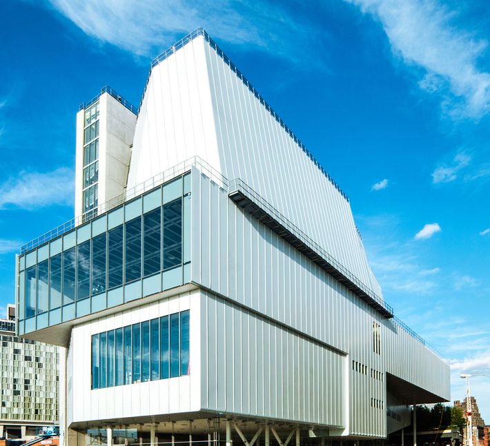
The Whitney decided to bust out of the Upper East Side in part because the administrators and board craved a powerful new exhibition tool. They got what they wanted: something big, wired, and tough, with galleries that convert from unbroken floors to intimate vestibules — the last word in versatility. Artists can string sculptures up from the ceiling, gouge the recycled-pine floors, and dazzle drivers below. The $422 million building is engineered to absorb punishment, move crowds, and adapt to whatever insanity future creators can dream up. A concrete spine (containing elevators and stairs) joins two volumes, their work spaces and galleries squared up as if to point out that art, even old art, is always a work-in-progress. The public will mostly see the downtown half’s exhibition spaces; the uptown side is where conservators, curators, and administrators will all work so close to the art that they can refresh themselves with a peep at a Rothko anytime.
There’s a reason that museums all over the country keep turning to Piano: He knows what he’s doing. I toured the building with director Adam Weinberg and chief curator Donna De Salvo, and their pleasure in the possibilities was palpable. In the galleries, light doesn’t have just a single source or flavor; it streams in through windows, ricochets off neighboring buildings, sneaks around temporary walls, and gets focused by ceiling-mounted spots. In the Breuer building, Mark di Suvero’s Hankchampion,a straining, muscular barn-beast made of salvaged wood, sat grimly rooted to the stone floor. In the new Whitney, it practically hovers above the shadow it casts on the pale planks. Even a detail as subliminal as the reveal, the thin strip of airspace between the wall and the floor that most visitors will never notice, had its size calibrated and recalibrated to suit a particular Carl Andre copper sculpture that creeps along the floor. American art has never looked so good — especially on the fifth floor, an 18,000-square-foot open space with vast windows at either end. From time to time, this ultimate art receptacle will be left open as an unencumbered plain, one where scrims block the sun on a schedule managed by computer.
Even when they’re divided up by temporary partitions, the galleries are like landscapes: You don’t only see what’s in front of you but also catch tantalizing glimpses two rooms away. Turn a corner, and you come to an unexpected bower, like the bay where Jay DeFeo’s The Rose, a Lee Bontecou void, and Louise Nevelson’s Dawn’s Wedding Chapel II combine into a mini-essay on powerful female artists whose work bursts off a wall. You hardly need a new temple for that, but the newfound flexibility gives license to experiment.
Yet even as he lavishes attention on the visitor’s experience, Piano seems to be wondering whether intense communion with art is still enough to keep the public engaged. Maybe a perpetually distracted audience demands even more distractions. Majestic windows and broad terraces beckon visitors to step outside for a view of the museum’s native turf. Flâneurs promenade on the High Line below, the Cubist cityscape poses in the foreground, and in the distance the World Trade Center gleams. “When you have a museum experience, you need to intersperse it with rest,” he told me, and indeed he’s composed a symphony full of rests. The new Whitney is a wonderful place for people who get easily bored by art.
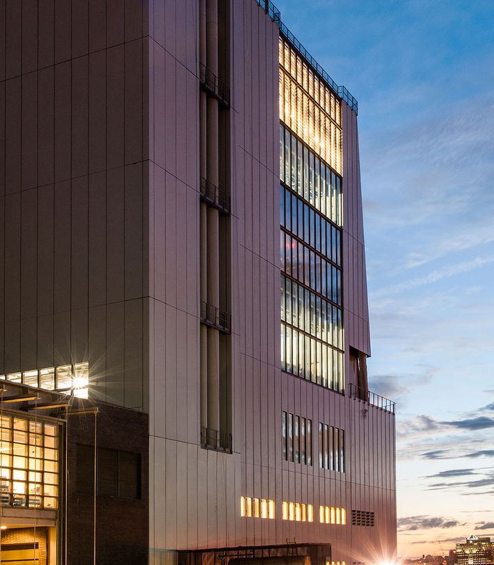
That pair of dueling thought bubbles — come see how much art we have; you hardly need to look at it — is one of several loudly mixed messages that make the museum so disappointing. Marcel Breuer’s old Whitney was (is) a rude, charming beast, leaning brawnily over Madison Avenue as if challenging us to call it ugly. Piano’s new Whitney is so sensitive to its location and earnest mission, so generous in its supply of views, light, and convenience, that it mistakes virtue for personality.
Memories of the museum’s wonderful old home clank around the new one, the way family history can haunt a newborn. Although he has echoed details like the lobby gallery and the giant elevator, Piano has in some ways designed an anti-Breuer, one that retreats rather than widening as it rises. Whereas Breuer doled out windows, keeping the artistic experience sequestered, Piano interweaves interior and exterior into a building that aspires to be lovingly urban. He could hardly have asked for a more promising spot in which to flirt with the city: One side faces rooftops and water towers, the other the open sunset. The architect pulls up and peels back his building to make it as friendly as he can. Since Gansevoort Street is narrow, Piano widens it into what Italians call a largo. He pushes the façade back from the curb, using the extra sidewalk space for a heated café, separating public and private space with the most minimal of membranes. He’s co-opted the street for a front yard.
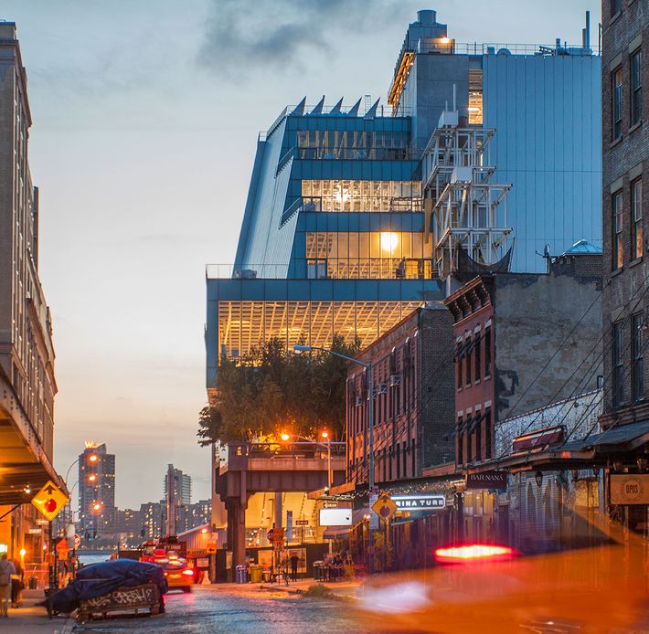
The intermingling of collection and city is not superficial. It’s a statement that art is inseparable from its terroir. An eighth-floor gallery conveys the early 20th century’s excitement about Manhattan’s magnetism. There, a panel recounts the excitement of the French artist Francis Picabia when he visited in 1913. “You of New York should be quick to understand me and my fellow painters,” he told a reporter. “New York is the Cubist, the Futurist city. It expresses in its architecture, its life, its spirit, the modern thought.”
When Piano and Richard Rogers designed the Centre Pompidou in Paris in the 1970s, they turned circulation into spectacle by placing the elevators and escalators in see-through tubes on the façade. At the Whitney, Piano has rediscovered what he calls architecture’s fourth dimension, the “poetry of movement.” A window above each elevator offers a view of the whirring mechanism. Exterior stairways provide a vertical counterpoint to the horizontal parade of the High Line. “Standing on one of the terraces, you watch people pass in and out and through the building,” Piano says. “That makes it a social place. You have a relationship not just with the art and the city but with other visitors too, like in those opera houses where you’re positioned to look at other audience members.”
The Whitney’s new neighborhood is also, more or less, where its story begins. Edward Hopper painted Early Sunday Morning, his portrait of sleepy brick storefronts on Seventh Avenue, just a few blocks from here in 1930. The Whitney — newly opened near Washington Square, to incubate creativity among the bohemians — bought it a few months later. The new building offers a panoramic version of an audio guide. Made right here!,these terraces proclaim. And in fact this locavore approach works beautifully for small regional institutions like, say, the Parrish Art Museum on Long Island. But the Whitney fled uptown in 1954 and returns as a vast and complex institution with innumerable intertwined traditions. Does it need pointing out that New York art isn’t only from below 14th Street, and American art isn’t only from New York? In fact, as the inaugural exhibition makes clear, American art can be made by people who come here from all over the world.
Does seeing Early Sunday Morning here mean more than seeing it on Madison Avenue? Maybe. But museums exist to beam us from the actual world into the imagination. The Met’s medieval rooms don’t need a cathedral town just outside to work their magic. By opening the Whitney to the city, Piano makes American art seem more tribal. For all the building’s flexibility, he has baked in a curatorial strategy that De Salvo and her successors can modify only by deploying a yellowing set of shades. Piano has provided both distraction and its antidote — a museum in conflict with itself.
*This article appears in the April 20, 2015 issue of New York Magazine.
