It’s hard to describe, much less understand, how time works in comics. It’s a medium built on static images, so you might assume that each panel represents a frozen moment in time. But that’s far from the truth.
Consider, for example, the concept of the speech bubble: We’re supposed to believe that the words within one are being spoken during the period depicted in the panel, meaning time is somehow passing while the figures don’t move. Similarly, consider the question of how much time passes between two given panels. If we see two images of a person in wildly different locations, we assume significant amount of time has passed. And if we see two images of the same person in nearly the same position and location, we assume little time has passed. But in the latter case, how little time? There is no easy answer. As the great cartoonist Will Eisner was fond of pointing out, comics require different perception skills than prose, ones that involve “reading” images and their sequence.
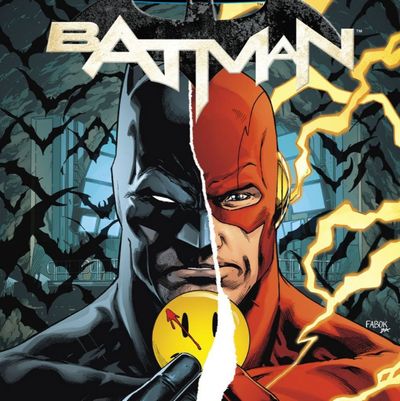
Though we may not know exactly why we perceive time in one way or another across a page of comics art, we can admire creators who force us out of our comfort zone and force us to rethink the way we process procession and rhythm. That’s precisely what writer Tom King and penciler Jason Fabok do in today’s 21st issue of Batman, constructing one of the most remarkably innovative fight sequences published in recent years. Not only is it thrilling, it’s also a dissection of the assumptions of sequential art.
The actual narrative of the issue, though fun, is somewhat inconsequential to our analysis here. In brief: Batman is analyzing a mysterious clue that he’s found and calls the Flash for assistance; Flash says he can be in the Batcave in exactly 60 seconds; right after that, Flash villain Reverse-Flash shows up instead and beats the crap out of the Caped Crusader. Reverse-Flash, possessing super-speed, issues a rapid-fire series of punches.
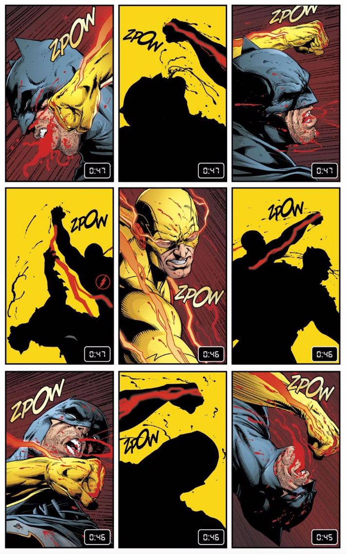
What makes the page — a simple nine-panel grid with zero dialogue or narration — noteworthy is a series of numbers. Once Flash tells Batsy that he’s going to be around in a minute, a little non-diegetic timer starts up in the bottom-left of each subsequent panel, counting down from 1:00 to zero. Initially, each panel depicts the clock ticking down by one second from the previous panel. King and letterer Deron Bennett thus give us a rare bit of forced perception of time: We’re not left to subconsciously imagine the rhythm of what we’re seeing, as we usually are in comics.
Then they start to mess with us in the page of note. Reverse-Flash shows up and once he starts punching, that one-second pace changes. Four punches are thrown while the timer reads “0:47.” Four more come during “0:46.” In the final panel, with a delightfully odd ZPOW sound effect, a punch lands with “0:45.” Poor Bruce Wayne seems nearly done for. In the next page, the timer goes back to a second-by-second pace while Reverse-Flash talks to his foe at a speed that must be agonizingly slow to the speedster, but is normal for us mortals. The fight resumes, and once again, the timer slows down — except when Batman tosses his punches, which each take a full second.

The point is somewhat obvious, of course: Reverse-Flash is punching really fast; so fast that he can hit Batman four times in a single second. But ponder how that’s conveyed. My knowledge of comics history is not encyclopedic, but I’ve never seen anything like this. Sure, in comics about ultrafast characters, we’ll sometimes see their speed conveyed by having other characters barely move or objects barely fall while they move from one location to another between panels. But it’s novel to see speed conveyed purely through the mix of text and imagery. Without the numbers, it’s just another fight scene (though one beautifully and brutally rendered by the talented Fabok); with them, it becomes experimental art.
Therein lies the reason why this page merits a long look. Mainstream superhero comics rarely make any attempt to question their own tropes on a technical level. Yes, there are plenty of metatextual gags about the narrative and character tropes of superhero fiction, but those are easy to make. To dive into the mechanics of comics art is another thing entirely, and it’s usually reserved for more outré work from indie publishers — and when such innovations occur, they often run the risk of alienating a reader with their complexity, density, or flashiness. Such deconstructionist artwork all too often exists merely to show off how smart the creator is.
Instead, King and Fabok have given us a pulpy page that can be appreciated by anyone. I mean, it’s just a series of nine rectangles, for Pete’s sake, and no characters walk across panel borders or talk backwards or anything like that. It’s just an action sequence, yet far more than one.
It’s also nice to see time made so central to the issue, as it has a complicated connection to Alan Moore, Dave Gibbons, and John Higgins’s seminal Watchmen, which also depicted clocks and countdowns of various kinds, and also sought to poke at what makes superhero comics tick (sorry, sorry). King has already established himself as one of mainstream comics’ best storytellers; here, he establishes himself as a teacher, too.

