Survey the first edition hardback covers of Haruki Murakami’s books throughout the years, and you’ll see a dazzling array of designs and motifs as unique and varied as the content of the writer’s stories. Some of the covers are simple illustrations or collages, others are complex objects, layered with cutouts revealing illustrations hidden behind the dust jacket. All have a tinge of the surreal and a sense of mystery, and since 1993, all of them are the work of Chip Kidd, an associate art director at Knopf who insists he has no style, though everything he touches is very, very stylish. As Murakami once put it, a sense of “inimitable, cozy alienation” hangs over each of Kidd’s book covers — a description that also applies to Murakami’s best novels.
Kidd has designed some of the most iconic book covers in the world — see: Jurassic Park — but his covers for Murakami hold a special place in his heart. Over the 25 years they’ve worked together, Kidd and Murakami have become friends. “It’s almost like he’s the Japanese Clark Kent,” mused Kidd, who also designed the cover for Superman: The Complete History, “because he’s so mild-mannered, but what he does is so incredibly powerful.”
Kidd’s process is highly intuitive and unique to each project. Often it comes together quickly; occasionally, he’s struggled. Murakami, though, is almost always pleased with the results. One time, and one time only, the author gently suggested in an email that he start over from scratch. Ahead of the release of Murakami’s latest, Killing Commendatore, next month, Kidd walked us through how he conceived ten of his most iconic covers.
The Elephant Vanishes (1993)
This was my introduction to Murakami. I remember thinking I’d never read short stories quite like these before. There’s a sense of the unexpected, or the mundane, that’s transformed into something extraordinary. For this one, I wanted to suggest an elephant without showing one because of the nature of the story, and the fact that it disappears. I decided to do a collage. I had these drawings of oil drums, and I just began to see a way to suggest an elephant with the drums. I’ll be honest: I’m not entirely sure what my subconscious was thinking.
Ever since I was a kid, I was fascinated with Japan and with manga, but I’d never read any contemporary Japanese prose fiction. I loved this view of contemporary Japan that was realistic and surreal at the same time. Looking back at this cover, though, I do think it’s odd that it doesn’t look Japanese in any way. Many of the other covers I did for Murakami do have some kind of Japanese sensibility to them, but this one just didn’t. I’m glad it exists, but I’m sure I would do it differently today.
The Wind-up Bird Chronicle (1997)
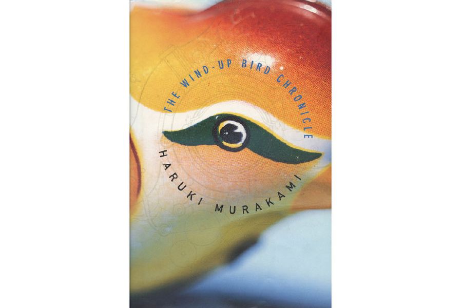
This was the real breakthrough design — the most ambitious I’d ever attempted. I wanted to make something very unique, and it was the first book of his where I really considered the entire book as an object of art. I had fun with the page numbers — they revolve like a flip book. They trail around the margins of the pages, and there’s a sort of winding clockwork sense to them.
Now that I think about it, the cover is almost a reference to The Elephant Vanishes because there is a mechanical animal on it, but I took a completely different approach. In this one, the narrator keeps hearing what he imagines to be a wind-up bird, but he never gets to see it. In one sense, I went out on a limb by being so literal. I found this little wind-up toy bird at a store in L.A., and Geoff Spear [Kidd’s long time collaborator] photographed it. It helps that the bird was so small, because it’s just a cardinal rule of design: If you take something tiny and blow it up, it becomes more interesting, because you force the viewer to look at it more closely, and the image, wrapping around the book, becomes almost abstract. Then I asked my friend Chris Ware, the celebrated graphic novelist, to imagine what the inner workings of the mechanical bird might look like. We used a lamination with a tiny bit of metal flake in it over that image so that it glistens — a visual metaphor for the way the bird sounded, at least in my mind. It’s a visual chirping. Then when you take the jacket off, you get the inside of the bird.
There’s no way I’d get away with a cover like this now, because Murakami’s name is so small. Now, the most important language on the front of any of his books is his name.
Sputnik Sweetheart (2001)
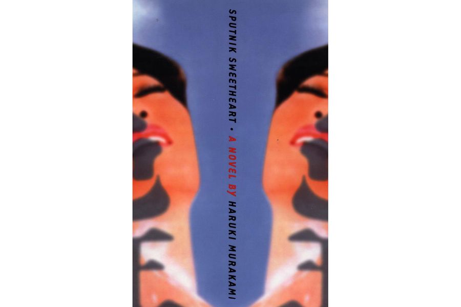
In this one, I took a piece of preexisting art and reworked it. In the title story, the woman feels like she’s split in two, and there’s another version of her in the world. So I used duplication to create symmetry. I collect vintage Japanese ephemera, and this is an illustration from the ’60s, I believe. I wanted something colorful, with a Japanese pop sensibility to it. Although certain themes appear in Murakami’s work again and again, I never want to repeat myself or replicate anything I’ve done for him before. I always start over with a fresh visual sensibility, because I think he starts over.
Kafka on the Shore (2005)
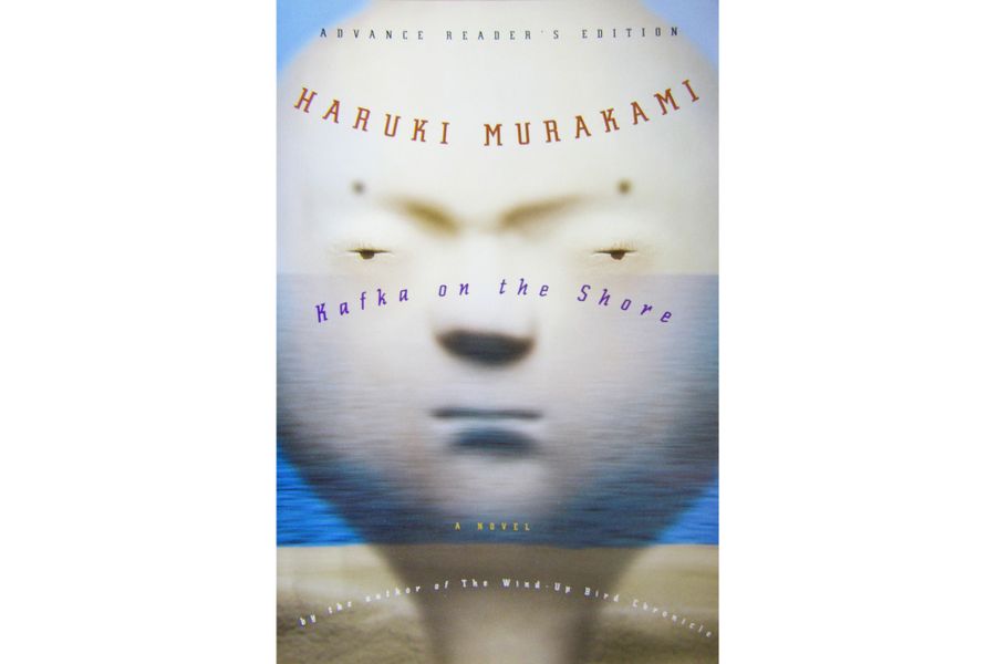
I love all of Murakami’s books, but this one is probably my favorite, and that can be a real problem. It becomes very intimidating. I saw the wooden head sculpture on a website called Giant Robot, and it just reminded me so much of one of the main characters, Nakata, who is really smart, but he’s treated like a simpleton. I wanted to give him a background because there’s so much going on in the text, so we created a fake shoreline in the studio — it’s actually glass thrown out of focus — and then I layered him over it. The overall effect is serene, but there’s also something sort of numbing and eerie about it, and almost sinister. For the title, I used that old trick — when you put type into an arc, it changes our perception of it and gives it a slight sense of whimsy. The connection between the title and the image is a bit mysterious, but I think together, they form a new idea, and that’s always been very important to me.
I decided to put the cat on the back of the cover because it is one of his themes, but I didn’t want it to be shoved into the reader’s face. After that, cats were pretty much out. You can do anything once, but then you’ve got think of something else.
After Dark (2007)
The title here is totally literal — the book is about a guy wandering around Tokyo at night. I happened to be in Tokyo while I had the the manuscript, and I’d spend all night wandering around taking pictures. The one I ended up using, I took outside a pachinko parlor with those striped frosted-glass doors. I wanted to take a picture of the parlor itself, but the doors would close each time I tried. Later on, I realized this was perfect: The striped glass hides what’s really going on beneath the surface, and I wanted that sense of mystery and disorientation. A great book jacket needs to make you wonder what’s going on inside, and make you want to investigate it.
1Q84 (2011)
Complex stories demand a complexity to the design, but it can’t become so complex that it doesn’t work graphically. I’d wanted to do something with semi-transparent vellum for a long time, where the book jacket lines up with the binding cover to make a single image, but if you separate the two, the image falls apart. I’ve been doing this for 32 years, and after a while it’s like, what haven’t we done yet? But you can’t just paste a concept like that onto anything, and this one seemed like a perfect match. The story weaves different story lines together, and there’s this woman, Aomame, who believes she’s slipped into an alternative reality. Initially, I wanted to have the binding cover show a cityscape of Tokyo at night, but it was just too busy, so we decided to go with a face. It’s a cliché, but it’s true: You cannot go wrong with the face. There’s been conjecture about whether or not this picture is Aomame, but it’s really just a suggestion of her.
There’s also a bit of an echo of Sputnik Sweetheart here – with the face on the back, I’m riffing on the theme of duplication, but as a piece of design, I think this one is much better.
Colorless Tsukuru Tazaki and His Years of Pilgrimage (2013)
When I get the manuscript, I always make notes in the margins. I’m looking for visual clues, and in this one, there’s a great line about the five friends at the heart of the book — that they’re so close, they’re like five fingers on a hand. Four of the friends all have names that are translated as colors. Mr. Red, Mr. Blue, Miss White, Miss Black, and the fifth, the narrator, doesn’t, so he’s called Colorless — and he’s the one who eventually gets shunned, and he doesn’t know why. The book is his quest to find out. The jacket has cutouts, and on the outside, it shows the five fingers of the hand, but when you take the jacket off, you see that the fingers are really four train lines running parallel to each other, and the fifth train line — the colorless one — intersects all four. And this is basically what happens in the book — Colorless tracks down each of his friends to find out why they did what they did.
One of my favorite things about this one is the way that the train lines wrap around, from the front to the back, on the spine. I love the little window on the spine. The title is so small, I wonder, how did we get away with that? I was going for something that was very three-dimensional, and its amazing in retrospect how abstract it is. But no one seemed to have a problem with it. And if I may say, it also debuted at No. 1 on the New York Times best-seller list, and I take a perverse pride in the idea that as long as I’ve been doing this work, this is the weirdest looking New York Times best seller I’ve ever seen.
The Strange Library (2014)
This was a dream job. I could have done anything with it — Sonny [Mehta, the editor-in-chief of Knopf] told me he’d bought a 32-page manuscript from Murakami, and he wanted me to turn it into something. It was like, “Make an art project!” The story is very slight, and a little bit Edgar Allen Poe. It’s about this little boy who’s trapped in a library, and I wanted the reader to feel trapped in this strange place with the narrator. I hope that when you read the book, you feel contained inside it, and maybe a little bit paranoid, like this strange figure is staring at you.
For this, I used all the Japanese ephemera I’ve been collecting for decades in Japan. The eyes are a blown-up game piece from a Japanese kids’ board game from 1962, and the dog’s mouth was a picture from a Japanese magazine from around 1950, blown up super-huge. I didn’t want to literally illustrate the story, but there are some visual cues about what’s going on in the text, and some of it is allegorical. But most of all, I wanted it to be a really nice object.
Men Without Women (2014)
I was personally really struggling with this one. I did toy with having some sort of cat on this one, but it was very abstract, and eventually I gave up on it because it just wasn’t doing what it needed to do. The title is quite literal, and I was thinking about the idea of a person missing where your heart used to be, and I began to think about this cover as a puzzle I was trying to solve. I realized that the men in these stories, they’re trying to solve it, too.
In the end I decided to base the cover on a photograph of the two of us [Kidd and Murakami]. It was taken by his wife at a sushi restaurant in Tokyo — it has personal meaning for me, but you don’t need to know any of that for it to work. Then I drew over the photograph — I thought it needed to be drawn, as opposed to just silhouetting the photograph, because there’s a certain messiness to this that’s necessary: These characters’ lives are a mess. And then the puzzle piece is vaguely anthropomorphic. It started out as the kanji for “woman,” and I just started drawing on it to evolve it into a puzzle piece. If you turn the book over you can see that it actually looks a bit like a woman in a kimono, but it’s just a suggestion.
I tried it first with a white background, but it was just too cold. And honestly, I’m kind of obsessed with primary colors, and that warm yellow is very hard to literally not warm up to. The concept and the illustration is potentially upsetting, so I wanted the color to counterbalance that feeling and juxtapose it.
Killing Commendatore (2018)
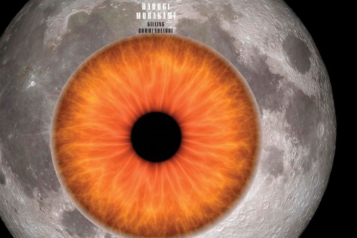
This was the first time in 25 years where Murakami actually suggested I rethink the cover design. The problem was, for various logistical reasons, I had to design a cover before the manuscript was available to read in English. The story is about a portrait painter who moves to the mountains after his wife leaves him, and there he meets a mysterious neighbor and discovers a strange painting in the attic of his new house that depicts the commendatore run through with a sword. I had to do something, and I came up with the idea to show a painting with a blade piercing through it. We sent it off to Murakami, and eventually he wrote back with a note that basically said, “Well, okay, but once there actually is a manuscript to read, could you read it and see if you want to do something else?” Which is his super-polite way of saying, could you try something else? And you know, once I read the manuscript, I realized he was right. The first attempt was too lurid. It wasn’t special enough. There was a sense of mystery, as well as regret, and I wanted to capture that.
What really impressed me about the book is that this narrator is an artist, and he’s constantly evaluating what he’s seeing, and I just kept coming back to the moon. Murakami is always talking about the moon! I’d used a moon on the inside cover of IQ84, but I’d never put on one the book itself before. I ended up using a pretty classic change of scale — I shrunk the moon, and then I blew up the eye, and I put them together. In the book, all these strange things happen at night, and then in the glaring light of day they’re gone. There’s also a perversity to it, which I like. When you pick up the volume from the shelf, you don’t realize that the image you’re touching is an eye. I like how mysterious it is, because one of the briefs for any book design is: If somebody looks at the book, and doesn’t know what it’s about, is it going to intrigue them?


