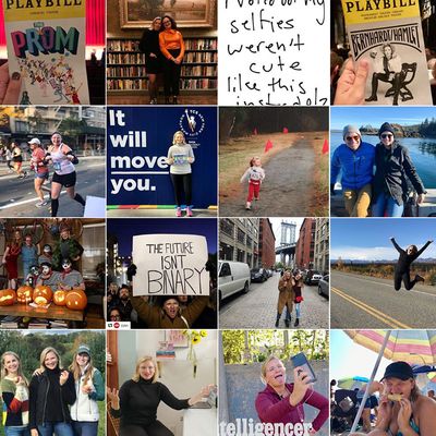
What does your Instagram grid look like? In my experience, there are only two options: A unified aesthetic experience — an endless sea of perfectly curated photos in homogenous colors that all seem to blur together as though they were all shot on the exact same date and time in the same place, each of those photos given a thick white border that runs together, so when you look at them all together the photos appears as though they’ve been collaged atop a clean page — and, well, a mess.
I am a mess. There’s no unifying theme behind my posts. I don’t post at the most ideal time for likes. The color scheme is all over the place; a photo of me in a pool on the last, good day of summer is seated next to a #TBT of my friends and I dressed in crazy costumes working college orientation which is perched atop a black and white shot from a Taylor Swift concert. Some are cropped into the ubiquitous Instagram square shape, while others are wide portraits. There are too many back to back photos with particular friends. I never use the same filter settings to ensure the photos are all muted and faded in the same way.
I wish I weren’t a mess. There’s a satisfying calm that washes over me whenever I land on an Instagram profile from somebody who has taken the time and put in the effort to make it look nice as a whole. Seeing all the images zoomed out you realize the grid matters as much, if not more, than every individual post. I also imagine there’s a delicious smugness that comes from having such a feed, too. I yearned for both of those things.
And so I tried to change. Once. For all of a week in November, 2017 I decided I’d join the legion of identical looking but oh-so-satisfying Instagrammers who takes the time to use a third-party app and give each of my photos over the aforementioned white borders. I did it for a total of two posts before I gave up. One was a picture of a neon “No Dancing” sign in my favorite neighborhood bar and the other was a picture of my “I Voted” sticker. The next time I posted – a shot from a Friendsgiving in my apartment – I completely forgot about my new lifestyle and shared the picture without cropping it onto the appropriate background. Frankly, I was a little relieved. I never bothered again.
I’ll be the first to admit that the problem was partly my content. Even if I ever managed to nail the style part of being good at Instagram, my images are mostly photos of Playbills and post-run selfies rather than beautiful grain bowls and healthy succulents. But really, my problem was with the grid: Are you supposed to delete all your Instagram pictures from the time in your life before you started designing your feed? It appeared from lots and lots and lots of scrolling that the Instagrammers I followed never had lives that didn’t involved white-bordered photos. Did they just instinctively know to start doing it when they started using the app? Did they archive all their old pictures and start fresh one random November day? And what do you mean there is no way to batch delete Instagram pictures? You’re telling me I have to do each one of these INDIVIDUALLY? Oh, fuck that.
It’s not just white-bordered photos that stress me out. There are people who only post vertical images. Or people who only post in black and white. Or people who crop larger pictures into tiles and post them all at once so they look like sections of photos when viewed in the feed but like a perfect image when viewed on the grid. Crude Instagram pointillism. Five days as a white border user was too much for me. There’s no way in hell I could ever commit to anything that was even more nuanced.
And if I really think about it, I’m not sure I’d want to, anyway. I didn’t delete my old pictures when I gave the white borders a try. Partly because I am lazy, but partly because even though they don’t look particularly cohesive, I like having a photo record of my life. Or, at least, since sophomore year of college. The messy grid and changing aesthetic mores tell a much more realistic story about me and my life than a hopelessly unified one. (Should I, maybe, delete some of the more embarrassing college photos populating the bottom of my grid? Yes, but that opens up a whole, different can of worms! If I delete some photos, or even just one photos, the whole grid shifts a little. Removing a picture from 2015 you’ve decided isn’t on par with yourself in 2018 means things end up positioned next to pictures that might look worse than what you deleted.)
Looking for guidance, I spoke with my younger sister, who, in addition to having innate online skills that come with being younger, is also a professional Instagram user. “I hate those. They are so 2012,” she told me, to my relief. “Nobody should even care about grid layout anymore.”
I was free. Well, almost. I still have those two, white-bordered pictures sitting on my grid looking like a very weird corner where my account was hacked temporarily by somebody with a better aesthetic than myself. I’m not sure if I should delete them or not. I probably shouldn’t. How else will I remember that time I tried to make my Instagram look good and convince myself it’s not worth it the next time the thought pops into my mind?

