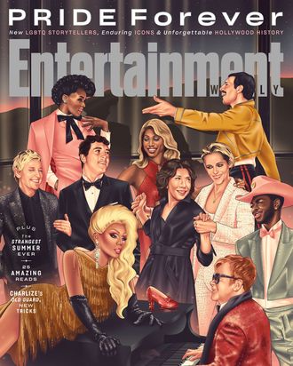
Today’s distraction from the world’s impending doom came in the form of Entertainment Weekly’s Pride Month issue, which has a cover that can generously be described as “socially distanced.” Rather than staging a photo shoot (which can still be done), the magazine ordered an illustration of a party featuring 18 past and present LGBTQ stars. And it is cursed. “The cover — and indeed our entire Pride cover package —was created in collaboration with LGBTQ illustrators in an effort to make the Pride experience richer for folks stuck in their homes,” EW editor JD Heyman wrote in a post. The magazine calls it “the kind of bash we’d all dream of going to,” but we can think of about 9,000 other places we’d rather be. Here are the highs and lows of this instantly iconic illustration of our current times.
Low: The salmon color story
Salmon is the color of heterosexual men’s shorts. Salmon dilutes the radical possibilities of the color pink. Salmon is a tool of the oppressor class.
Low: Lil Nas X’s dickprint
It’s literally low. It’s low-hanging fruit.
Low: Brick
It took me 20 looks at this cover before I finally noticed the brick everyone was talking about, sitting behind Lil Nas X and his pronounced dick. At least it’s not Roland Emmerich?
Low: Is that a chandelier or a coronavirus?
While most people saw the reflection of a spacey chandelier in the window, I see a coronavirus coming up over the horizon, because nothing is sacred from this pandemic anymore. Sure, everyone can be safe and gay inside, but outside, COVID-19 awaits.
Low: Hollywood only knows the same 15 gay stars
In the year of our Lord 2020, why do we keep seeing magazine covers with a fracker and someone who won’t pay her TV staff on them? Give the gays the representation we deserve: the cyclops from Onward.
Low: K-Stew’s oddly angular face
This is the only magazine cover with Kristen Stewart on it that I won’t immediately be pasting on my ceiling. This is why you don’t try to visually depict God. They should’ve just painted a burning bush in the middle of the room, and we all would’ve been like, Oh, that’s Kristen Stewart. Of course.
Low: This middle-school-hallway-mural-of-historical-figures aesthetic
My high school had a terrible mural like this that the school paper wasn’t allowed to make fun of because one of the artist’s cousins still went there, so I’m glad I get to make fun of this one now.
Low: Ellen’s menacing visage
How did an illustration of Ellen DeGeneres come to set drunk? Why would the artist give her a lazy eye?
Low: Those shadows
These shadows, and the way they in no way relate to the “chandelier” as a light source, confirm our working theory that it’s a big ol’ floating ’rona.
Low: Ryan Murphy wearing Liberace’s cape
EW tells me Ryan Murphy isn’t just wearing any pink glittery cape but the same Liberace-inspired one he wore to the Met Gala last year. I’d rather have a cartoon version of the iconic performer than someone who just half-assed another TV show.
Low: Doing Rock Hudson dirty
It seems as though many people encountering this cover on Twitter are unclear as to who that hunk o’ man candy on Ellen’s arm even is. Some have guessed Billy Eichner, others John Mayer (ally representation?), but the best working theory is Fred Boop.
Low: John Waters staring directly at us
I hope he’s in on this joke.
Low: Everyone touching everyone
If the coronavirus is just going to be sitting outside like that, nobody needs to be touching this much.
Low: Ricky Martin
That, sir, is a Property Brother.
High: EW’s entire art department when it conceived this.

