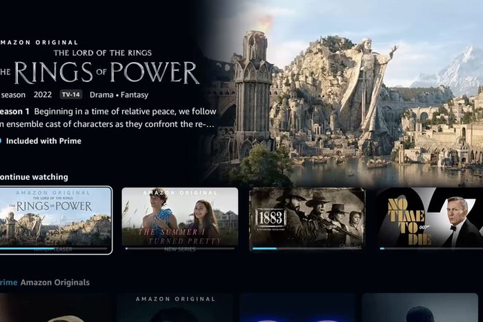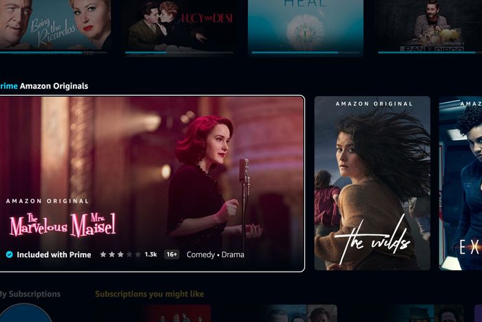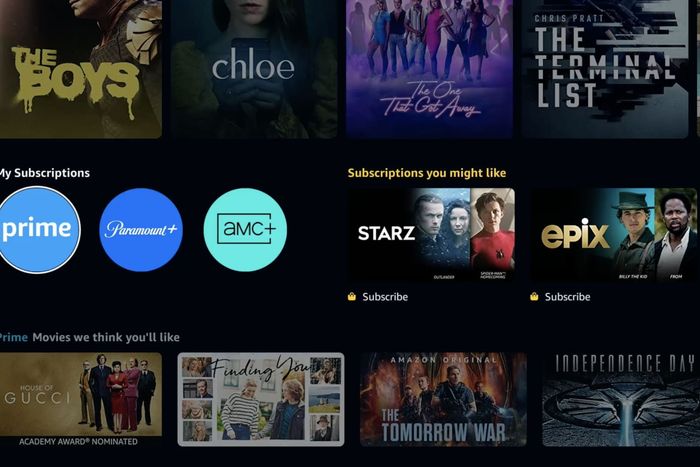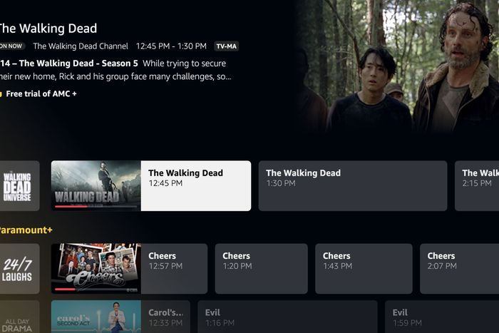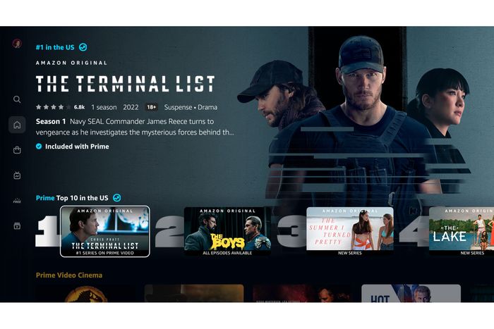
Just weeks before the launch of its new Lord of the Rings series and the debut of Thursday Night Football, Prime Video is giving its user interface a major face-lift. Starting today, subscribers to the Amazon-owned streamer will begin seeing a retooled design aimed at addressing years of complaints about its nonintuitive navigation, wonky search engine, and generally outdated appearance. In addition to aesthetic updates, the new interface has been built to showcase two areas expected to be key to Prime’s growth in coming years: sports and live TV.
Amazon was an early pioneer of the streaming-video space, starting in the mid-aughts with its first online video store (remember Amazon Unbox?) and continuing in 2011 with its move to offer free streaming of thousands of titles with a Prime subscription, followed by the first Amazon originals in late 2013. But even though the Prime offering has expanded exponentially since the days of Alpha House and Mozart in the Jungle, the basic underpinnings of the user interface have changed little since then save for a few cosmetic alterations such as modified fonts and autoplay trailers.
The UI debuting this week recognizes how much the service has evolved, and it appears to be the most significant reimagining of the user experience in at least eight years. “Part of this redesign is making sure that customers have a real clear understanding of the breadth of our content and also understand what’s included with their Prime subscription,” says Helena Cerna, Prime Video’s global director of product. While Prime did not allow us to do a hands-on interaction with the new interface, Cerna did provide Vulture with an online preview, walking us through the biggest changes:
The navigation menu
There’s a completely new navigation menu, including a vertical sidebar that lets users immediately access a search function, live TV, sports, Freevee content, the Prime Video store, and their watchlist as well as quickly return to the home page. “We spent a lot of time with this experience and really focused on understanding how customers were engaging with our selection,” Cerna explains. “And we focused on simplifying the experience with the changes in the core navigation.” Vertical sidebars have become the industry standard since Netflix rolled one out four years ago this month; the newer services Disney+, HBO Max, and Paramount+ included the feature when they launched. With Prime jumping onto the trend, Hulu and Peacock remain the only major U.S. streamers without a sidebar. (One thing worth noting: At least for now, the Prime sidebar does not let users jump directly to the “movies,” “TV shows,” or “sports” content categories; those are accessed by a horizontal menu bar that appears on the home page.)
Scrollable titles
The endless rows and rows of static, postage-stamp-size tiles on Prime are no more. In their place, tiles now expand into landscape mode as users scroll, giving a more dynamic experience by allowing them to see more information about a title at once. There are also bigger carousels scattered throughout — the company calls them “Super Carousels” — allowing Prime to show off featured content. And like Netflix, Prime will incorporate a “Top 10” feature into its interface, letting users see which originals are most popular at the moment and which movies are selling fastest in the Prime Video store. Amazon has actually been testing top-ten lists on the website version of Prime for a while now, but this will mark the first time users on living-room devices will see them on the app.
“Included with Prime” clarity
One big complaint from Prime Video users over the years has been that it isn’t always clear whether a title on the platform is included for free with a subscription or requires purchase, particularly when hunting for shows through the search function. To fix this, the tiny, often hard-to-see “Prime Video” check-mark logo squeezed into the upper left-hand corner of a content tile will be replaced by a clear line of text saying “Included with Prime” along with a blue checkmark that will sit just below a title. And if something requires additional payment or a subscription, Prime will add a line of type saying as much as well as a little gold shopping-bag icon. Of course, Amazon being Amazon, the new interface is optimized for generating sales: The design better showcases the Amazon Channels program, which lets users add content from third-party streamers such as AMC+ or BritBox into their Prime navigation.
Live TV
Live TV gets its own section on Prime, including a cablelike program guide showing off dozens of virtual channels that have actually been available on the service for a couple of years now. Channels and live events offered with Prime will be blended with those that come with a subscription to, say, Paramount+, which has its own robust live offering. “In usability testing, we repeatedly heard the phrase, ‘Wow, I didn’t even know Prime Video had live TV,’” Cerna says, hinting that Prime has plans to expand its live offerings further in coming years. “The live-TV page is really just us getting started on what could be a lean-back experience,” she says.
New hub for sports
Sports content gets special attention in the remodeled app, with new landing pages meant to show off all of Prime’s offerings (including Thursday Night Football) as well as what’s available on other apps such as Paramount+ or MLB TV. Users can search by sports league or channel and can easily access Prime’s roster of sports documentaries. An NFL landing page will offer scores and clips from across the league.
More “to follow”
Cerna says work on the new app began about 18 months ago, just a few months after she returned to Amazon after a stint at Hulu. “With the scale of our service — thousands of devices on which we are distributed, millions of customers, over 200 territories — we really have been taking our time with it,” she says. In addition to all the engineering work involved, the design process included listening to customer feedback and “spending a lot of time testing and understanding how they navigate,” Cerna says. The central mission of the project was figuring out “how we can make this experience more effortless, more cinematic and immersive, and help customers really understand what’s available to them through Prime and their various subscriptions.”
Because Prime Video has a potential audience in excess of 200 million users — the entire Amazon Prime subscriber base — the new UI won’t suddenly pop up everywhere at once. The first phase of the rollout begins today and will focus on the “living room” experience: smart TVs and folks who do their streaming with devices such as Roku, Apple TV, Chromecast, and, of course, Amazon’s own Fire TV. Mobile users with Android devices will begin seeing the updated app in the coming days, and changes will continue in waves throughout the summer. And while Apple TV users will get the update in this first push, if you stream Prime via an Apple iOS phone or iPad or via the Amazon website, you’ll have to wait a bit longer: The timetable for the rollout on those platforms is simply, per Amazon, “to follow.”


