Spider-Man, Spider-Man, he does whatever a spider can — but with the web-slinger’s latest feature outing, Spider-Man: Into the Spider-Verse, an elite creative team set out to redefine just what a spider could do.
The blockbusting animated feature instantly won over audiences (not to mention awards voters, who honored the film at the Golden Globes, the Critics’ Choice Awards, and elsewhere) with its vibrant and unorthodox visual style, widely hailed as a return to the origins of the vintage comic-book aesthetic. But achieving a distinctive look with a basis in the old school required some technological advances from the new school — and a team of digital artists with the skill to shrink the space between the two until it vanished completely.
THE APPROACH
Vulture caught up with the film’s VFX supervisor, Danny Dimian, who described how he and his team created an entirely new breed of mainstream American animation, in which computerization and personalization harmonize to create an exhilarating work of pop art. An old hand in the trade of animated special effects, Dimian previously worked on such hits as Cloudy With a Chance of Meatballs and Hotel Transylvania; in the Spider-Verse gig, he recognized an unprecedented opportunity to stretch his talents and try something different.
“The biggest difference between [live-action special effects and animation special effects] is the amount of artistic interpretation that you do as the supervisor,” Dimian explained. “[Producers] Chris Miller and Phil Lord wanted to find a new visual language with which to tell superhero stories. We saw a lot of interesting things in the artwork, and wanted to make it move, behaving properly in a world that the audience can be a part of.”
Lord and Miller, the wisecrackers responsible for the success of the Jump Street and the Lego Movie franchises, wanted to chart new formal territory with the latest IP thrown their way. Even from his earliest days, Spider-Man had a rich history of experimentation in his artwork, its wild colors and near-Impressionistic dynamism clearing a path for the free-floating psychedelia of the Doctor Strange books in the later ’60s. Lord and Miller knew that a cartoon, unbound from the tiresome constraints of our reality, could be the Spidey project to harness the full potential of this illustrative mode. At the same time, they had to keep one eye on an emotionally coherent script, and not let their ambitions as technical pioneers run away with them.
“Creatively, the biggest challenge was to make sure that all these different ideas we were trying fit together,” Dimian recalled. “We wanted to break the mold — ‘break the machine,’ we would say. There were a few things, as a VFX supervisor, I was trying to ensure. First and foremost was to support the story. We want to be out-there, but not so crazy or disjointed that it takes away from the story.”
THE CHARACTER DESIGNS
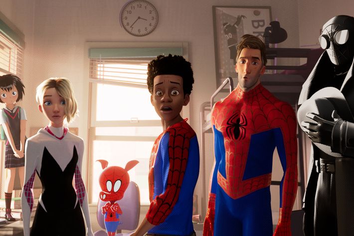
They contrived a script that would give them ample opportunity to indulge their most out-there ideas while staying true to the heart and soul of the Spider-Man character. A dimension-tangling collider transports alternative-universe Spider-persons to the New York of teen Miles Morales, the scientific mumbo jumbo clearing a way for abstraction and detail on a level seldom seen in a movie ostensibly marketed to kids.

At a time when the entertainment industry has grown obsessed with photo-realism, no matter how deep we must plumb the uncanny valley, Lord and Miller dared to invest in the unrealistic. Each inter-dimensional visitor has a look and texture all their own — the flatness and thick lines of porcine pulverizer Spider-Ham give him a Saturday-morning feel, while the hard-boiled Spider-Man Noir is all chiaroscuro, all the time. The Spider-Verse team had no interest in placing their Miles within a uniform, perfectly polished environment, either.
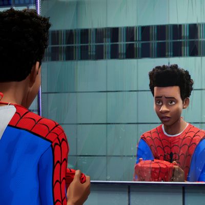
Miles and the residents of his world move at a shuddering, uneven pace that some decried as distracting or glitchy upon the first trailer’s release. In the theater, however, a viewer quickly acclimates to a risky creative choice that pays dividends by faithfully mimicking the more interpretive qualities of comics and video games.
“The film’s general animation style, that’s Miles,” Dimian says. “The whole movie is grounded with what we call stepped animation. That means the animation doesn’t change every single frame; characters will be held up for one frame, two frames, three frames, so that their motion looks jittery. We didn’t use motion blur, either. We were trying to find the right spirit, in the way that all animated productions go through a period of free-form exploration. We were going through styles and ideas looking for something that felt right, and found that the traditional rendering techniques just weren’t working for us.”

THE KIRBY DOTS
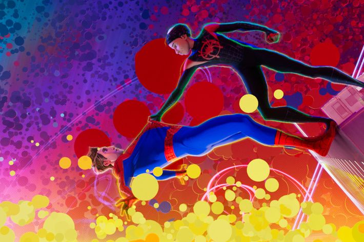
Specifically, they were after a “crispness and sharpness” unattainable through the usual means of animation, which proved critical during the eye-popping grand finale. A showdown inside the collider involved epileptic fits of rapid-fire neon that would have been completely incoherent under more traditional methods. In the capable hands of Dimian and his fleet of experts, the culminating set piece is an Ecstasy-rave fantasy equal parts Stan Lee derring-do and 2001: A Space Odyssey’s Stargate sequence.
As Dimian tells it, it was no easy feat: “The final battle was the most interesting challenge for a couple reasons. We had already used up a lot of our ideas, and had to figure out how we could turn the dial up to 11, as they say. That scene uses every technique we had, both in the design and choreography. So much went into making the battle dazzling while keeping track of the emotional roots the characters have in it.”
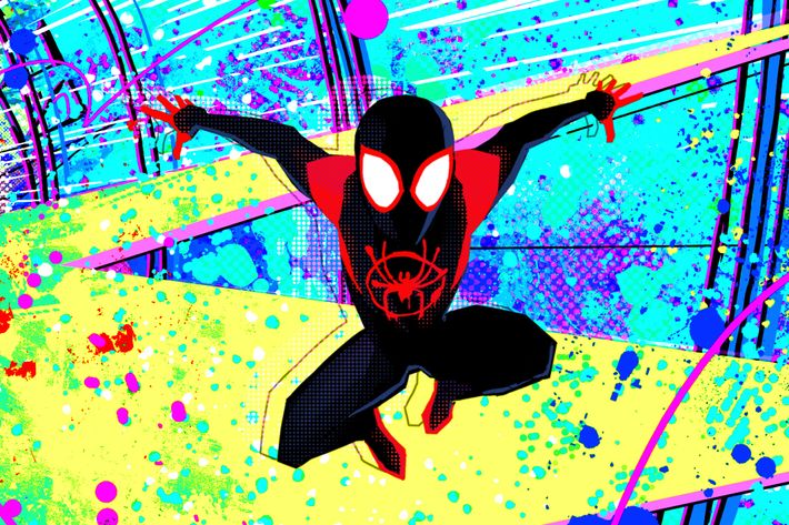
The short-circuited splotches of Day-Glo may be the secret weapon in the stylistic pandemonium. “A lot of what people have responded to is the palette,” Dimian continues, “that we’ve got lots of crazy colors going on. These effects have been based on the illustrations of Jack Kirby, a pioneer of comic-book art and a great artist in his own right. He used these splats and blobs in the way he’d represent energy that came to be called Kirby Dots, and we found inspiration in those. As the collider begins to go crazy and reality breaks down, the Kirby Dots show the atomic structure getting warped.”
THE 2-D/3-D MANIPULATION
“Early on, we were looking at what we liked about comic-book illustration,” Dimian remembers. “There was something we liked about the specific styles in the artwork that we wanted to make part of this movie. It brought a sense of wonder, and gives you a feel for the hand of the artist and its imperfections. That’s how we did the linework, embracing the hand-drawn look instead of a clean, mechanical look. In the older comic books that we were rifling through, sometimes the printing was a little off, and there would be color separations. Blues and pinks would be offset. We wanted to replicate that, and an unintended consequence of that was giving 2-D projection a sort of 3-D look.”
He’s referring to the very first matter I brought up, an unusual effect in which digital manipulations of perspective and color create the coming-at-you sensation of 3-D, even for audiences at 2-D screenings. Their tinkering with red and blue evokes the mid-century cardboard glasses handed out before the era’s most gimmicky picture shows. As soon as I was certain the distended hues hadn’t been an error on the projectionist’s part, this gambit felt like a groundbreaker; imagine my surprise when Dimian revealed it to be a happy accident.
“The ‘3-D’ effect you’re talking about: Sometimes it looks red and blue, but that’s more of an allusion to the colors of Spider-Man’s costume,” he confesses. “Instead of using 3-D itself, that’s more of a focus-based effect. We wanted to simulate a camera racking focus, in conjunction with the Spider-Sense concept.”

Dimian and his team wrote entire programs for the express purpose of bringing their vision to life, not only innovating new applications but birthing the technology itself. Their proprietary tools gave artists more hands-on power than ever, and accordingly, the final product has a human touch missing from some of the more slickly made animation. Lord, Miller, Dimian, and their team bet that moviegoers would respond to something out of the ordinary if it had been made with care and imagination, and it’s been heartening to see them proven right. Perhaps the years to come will see a continuation of this adventurous spirit, and a decline in major studios’ fear toward anything not in the Pixar (or, more frequently, off-brand-Pixar) mold. Try a little spontaneity, Dimian suggests, it won’t kill you. “It became a mantra for the production,” he stated. “Embrace any imperfections that work.”

